What determines interest rates and how lower private sector profitability, changes in the institutional infrastructure governing our economies, major geopolitical conflicts, and climate change, could usher in a ‘sea change’ of higher interest rates[i].
The simplest possible explanation of what drives interest rates is the demand and supply of capital and its mirror image debt. I find this to be also the most relevant one.
There are many other variables that matter, which fall under the broad umbrella of economic activity. These factors determine the ability to pay/probability of default and may impose a certain ‘hurdle rate’ (inflation), but it is important to understand that they are a consideration of mostly the supply side of capital.
So, what is a ‘normal’ interest rate? Obviously, when capital is ‘scarce’ (relative to the demand for debt), as indeed for the majority of time of human existence and ‘capital markets’, creditors are ‘in charge’, nominal interest are high and real interest rates are positive. So, that is the norm. But in times of peace and prosperity, as during the time of Pax Britannica (most of the 19th century), and Pax Americana (since the 1980s, and particularly since the end of the Cold war) surplus capital accumulates which gradually pushes interest rates lower as the debtors are ‘in charge’. The norm then could be zero and even negative nominal interest rates.
While indeed the norm is for interest rates to be positive, there is no denying that if one were to fit a trend line of global interest rates in the last 5,000 years[ii], the line would be downward sloping. That should be highly intuitive as human society evolution brings longer lasting periods of peace and prosperity (the spikes higher in interest rates throughout the ages are characterised with times of calamities, like wars or natural disasters, which destroy capital).
What is the function which determines that outcome? The surplus capital inevitably creates a huge amount of debt. This stock of debt eventually rises to a point which makes the addition of more debt an ‘impossibility’. It is important to understand that this happens on the demand side, not on the supply side – it is current debt holders who find it prohibitive to add to their current stock of debt, in some cases, at any positive interest rates.
Richard Koo called this phenomenon a balance sheet recession when he analysed the behaviour of the private corporate sector in Japan after the 1990s collapse. We further saw this after the mortgage crisis in the US in 2008 when US households started deleveraging. Not surprisingly interest rates during that time gravitated towards 0%.
The importance of 0% and particularly negative interest rates is not only that this is where the demand of debt and supply of capital clears, but, more importantly from a ‘fundamental’ point of view, this is the point where the current stock of debt either stops growing (0%) or even starts to decrease (negative interest rates). Positive interest rates, ceteris paribus, on the other hand, have an almost in-built automated function which increases the stock of debt (in the case of refinancing, which happens all the time – rarely is debt repaid).
Because our monetary system is credit based, i.e., money creation is a function of debt origination and intermediation, this balance sheet recession, when the demand for credit from the private sector is low or non-existent, naturally pushes down economic activity, which, ceteris paribus, results in a low, and sometimes negative, rate of inflation.
So, you see, it is low interest rates which, in this case, determine the inflation rate. This comes against all mainstream economic thinking. I am sure, a lot of people, would find this crazy, moreover, because this is also what Turkish President Erdogan has claimed, and it is plain to see that he is ‘wrong’.
However, there is a reason ‘wrong’ above is in quotation marks. You see, this theory of low interest rates determining the rate of inflation, and not the other way around, holds under two very important conditions. First, and I already mentioned this, the monetary mechanism must be credit-based. This ensures that money creation is not interfered by an arbitrary centrally governed institution, like … the government, and is market-based, i.e., there is no excess money creation over and above economic activity.
In light of a long history of money waste, this sounds like a very reasonable set-up, except in the extreme cases when the stock of debt eventually piles up, pushing down the demand for more credit, slowing down money creation and thus economic activity. In times like these, it is the rate of money creation which determines and guides economic activity rather than the other way around (as it should be). Unless there is an artificial mechanism of debt reduction, like a debt jubilee, the market finds its own solution of zero or negative interest rates to resolve the issue.
And the second condition for the above theory to hold is the supply side of the economy must be stable. Don’t forget that inflation is also independently determined by what happens on the supply side: a sudden negative supply shock would push inflation higher. That the balance sheet recessions in Japan, and later on in the rest of the developed world, coincided with a positive supply shock accentuated its disinflationary impact.
To go back to Turkey, Erdogan’s monetary experiment is not working because 1) Turkey’s economy is not in a balance sheet recession (private sector debt is not big, and there is plenty of demand for credit), and 2) Turkey’s economy was hit by a large negative supply shock in the aftermath of the breakdown of global supply chains on the back of Covid/China tariffs, and, more particularly for Turkey being a large energy importer, in the aftermath of the Russian sanctions on global oil prices. A related third reason why low interest rates in Turkey have failed to push inflation lower is the fact that institutional trust is low. In other words, the low interest rates are not market-based, but government-based (market-based interest rates are in fact much higher).
What has happened in the developed world, on the other hand, is, since Covid not only the economies have experienced a massive negative supply shock, but also monetary creation, for a while (well, most of 2020-21) became central-government-based (in the form of huge household transfers). In other words, even though private debt levels remain excessive, their negative effect on economic activity has been offset by other forms of money creation. This not only managed to reverse the disinflationary trend from before, but, when combined with the negative supply shock, it provoked a powerful inflationary trend.
Going forward, unless there is a repeat of the central-government-based money creation experiment under Covid, the demand for credit, and thus the growth of money creation, will remain low, as private sector debt levels remain too high. This does not bide well for economic growth and is disinflationary by default. At the same time, however, the effects of the negative supply shock are likely to be longer lasting given that the reorganization of the global supply chains is still an ongoing process. This is inflationary by default – if that means also lower private sector profits, thus lower capital surpluses, then interest rates should continue to be elevated.
When it comes to the developed world the black swan here is an eventual outright debt reduction (debt jubilee) – the will have a corresponding effect of an artificial capital surplus reduction as well. Maybe this is counterintuitive, but if you have followed my reasoning up to here, that would mean higher interest rates going forward.
An alternative black swan is a direct capital surplus reduction, caused by either lower corporate profitability, lower asset prices, or indeed an artificial or natural calamity, like war or a natural disaster, which have the unfortunate ability to destroy capital. In that sense, it is uncanny that our present circumstances are characterised by a war in Europe, a potential war in Asia and the looming threat of climate change[iii].
Howard Marks certainly did not mean literal ‘sea change’ in his latest missive, but this might ironically be one of the main determinants of higher interest rates in the future.
For more on this topic you might also find these posts interesting:
[iii] We live by the sea, literally. When we bought the house in 2007, the sea was about 100 meters from the fence of our garden, in normal times. This has now been reduced at least by half. In the last three years, the sea has often come into our garden, which has prompted us to spend money on reinforcing the fence etc., which has naturally reduced our capital surplus.
Either the peak in the Fed Funds rate is much higher, or the UST yield curve, 2×10, is too inverted. Whatever the case is, it’s extremely unlikely that the Fed eventually ends up cutting just the 150bps priced in at the moment.
Or to be more precise, unless there is a modern debt jubilee (a central bank/Treasury debt moratorium) or a drastic capital destruction caused by a total collapse in the global supply chains, continuation of war in Europe/Asia or a natural disaster (climate change, etc.), the Fed is more likely to pause the hikes next year, wait, and eventually cut by more than the 150bps priced in the market but less than in the past.
In other words, the shape of the current Eurodollar curve is totally ‘wrong’, just like it had been wrong in the previous three interest rate cycles but for different reasons.
The current UST 2×10 curve inversion is pretty extreme for the absolute level of the Fed Funds rate. At -70bps, it is the largest inversion since October 1981 but back then the Fed Funds rate was around 15%. The maximum inversion of the UST 2×10 curve was -200bps in March 1980 when the Fed Funds rate was around 17%. The Fed Funds rate reached an absolute high of almost 20% in early 1981.
Back then the Fed was targeting the money supply, not interest rates, so you can see the curve was all over the place and thus comparisons are not exactly applicable. But still there were plenty of instances thereafter when the Fed moved to targeting the Fed Funds, and the Fed Funds rate was much higher than now, but the curve was much less inverted before the cycle turned.
Take 1989 when the 2×10 UST curve was around -45bps but the Fed Funds rate at the peak was around 10% (almost double the projected peak for the current cycle). The Fed ended up cutting rates to almost 3% in the following 3 years. Or take the peak in Fed Funds rate in 2000 at 6.5% and a UST 2×10 yield curve inversion of also around 45bps. The Fed proceeded to cut rates to 1% in the following 4 years.
Finally, take the peak in Fed Funds rate at 5.25% in 2006-7 and a UST 2×10 yield curve inversion of around -15bps. The Fed ended cutting rates to pretty much 0% in the following 2 years. In the 2016-18 rate hiking cycle, when the Fed Funds rate peaked at 2.5%, the UST 2×10 yield curve never inverted.
So, today we have a peak in the Fed Funds rate of around 5%, so comparable to the 2007 and 2000 cycles, but a much deeper curve inversion, more comparable to the 1980s. If we go by the 2000 and 2007 scenarios, the Fed cut rates by around 500bps; in the 1980s the Fed cut much more, obviously, from a higher base. In this cycle, if the peak is indeed around 5%, 500bps is the maximum anyway the Fed can cut. That is also the minimum which is “priced in” by the current curve inversion. But the actual market currently and literally prices only 150bps of cuts.
Again, neither of the past interest rate cycles are exactly the same as the current, so straight comparisons are misleading, but somehow, it seems that the peak Fed Funds rate today plus the current pricing of cuts in the forward curve do not quite match the current UST 2×10 curve inversion – either the peak is too low, or the curve is too inverted.
What I think is more likely to happen is the Fed hikes to more or less the peak which is priced in currently around 5% but it does not end up cutting rates immediately. The market is currently pricing peak in May-June next year and cuts to start pretty much immediately after; by the end of 2023 there are 50bps of cuts priced in.
In the last three rate cycles (2000, 2008, 2019) there was quite a bit of time after rates peaked and before the Fed started cutting. The longest was in 2007 – 13 months, then in 2019 it was 8 months and in 2000 it was 6 months. Before 2000 the Fed started cutting rates pretty much immediately after the end of each rate hiking cycle, so very different dynamics.
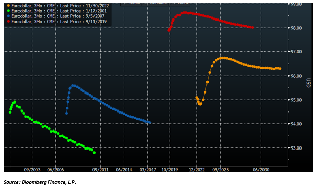
Here are how the Eurodollar curves looked about six months before the peak in rates in each of these cycles. The curve today somewhat resembles the curve in 2006, in a sense that the market correctly priced the peak in rates in 2007 followed by a cut and then a resumption of hikes. But unlike today, the market priced pretty much only one cut and then a resumption of hikes thereafter. In the interest rate cycles in either 2000 or 2018 the market continued to price hikes, no cuts at all, and a peak in the Fed Funds rate not determined.
Source: Bloomberg Finance, L.P.
And here are how the curves looked after the first cut in each of these cycles (the colours do not correspond – please refer to the legend in the top left corner, but the sequence is the same – sorry about that). The market didn’t expect at all the size of cuts that happened in either of these cycles. Notice that the curve in the current cycle still does not look at all like any of the curves in the previous cycles (noted that in six months’ time, the current Eurodollar curve is also likely to look different from now, but nevertheless, there are much more cuts priced now than in any of the other three cycles).
Source: Bloomberg Finance, L.P.
The point is that the market has been pretty lousy in the past in predicting the trajectory of the Fed Funds rate.
It is strange that the market never priced the pause in any of the actual past three interest rate cycles, and it is even stranger that it is not pricing it now either, given that there has been consistently a pause in the past.
In none of the past three cycles did the market price any substantial cuts; in fact, we had to wait for the first actual cut for any subsequent cuts to be priced – that is also weird given that the Fed ended up cutting a lot.
This time around, the market is pricing more cuts and well in advance but not even as close to that many as in the previous cycles.
However, I do not think we go back to the zero low bound as in the past three cycles. To summarize, the current UST 2×10 yield curve is too much inverted and the Fed would eventually cut rates more than what is currently priced in, but much less than in other interest rate cycles and after taking a more prolonged pause.
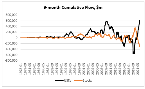
Foreigners have bought record amount of USTs this year: if we look at the nine-month cumulative flow in USTs (YTD as per TIC data), it is at a record high, marginally beating 2009. This is actually in stark contrast to what they have done with US equities: the nine-month cumulative flow in stocks is at a record low, easily beating the previous low in 2018.
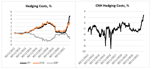
While it is more difficult to compare stocks across countries, as there are a lot more idiosyncratic factors at play, with bonds it is a little bit more straightforward, once we take hedging costs into consideration. And by that measure, USTs are the most expensive they have been at least in the last 10 years.
Here at the USD hedging costs for foreign based investors based in these jurisdictions (the calculation is done using 3m FX forward points and – so, an investor buys USD and immediately sells it 3m forward – converted into a ‘yield’/carry, annualized). I have chosen here the largest foreign buyers of USTs: Japan, China, the United Kingdom, and Europe (I have excluded the Cayman Islands which is another large buyer of US assets because even though classified as a foreigner in the TIC data, the hedge funds there are almost all USD-based).
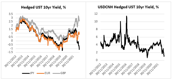
Hedging costs in Japan and China are the highest in the last 10 years; hedging costs for EUR-based investors are close to the highs; hedging costs for GBP-based investors are substantially off their highs. This is what a foreign investor is getting in yield if he or she invests in UST 10yr.
This is in nominal terms – do not be confused by the fact that a JPY-based investor will receive a negative 1.2% yield if he or she invests in UST10yr hedged into JPY for one year. A European would do slightly better, and a Brit would do even better than a European; in fact, until recently a Brit buying USTs hedged in GBP could have picked the highest yield in the last 10 years!
But USTs are really not that attractive anymore to a CNH-based investor – even though he or she still picks up a decent 1% hedged, which is more than a European would gain, this is the second lowest yield in the last 10 years. In fact, this is the same for a Japanese investor – the only other time UST10yr fully hedged yield has been lower was during the height of the Covid crisis in 2020.
Foreigners are much better off buying their own government bonds than UST10yr, if they do indeed hedge the currency risk. In almost all these four cases (GBP is the exception but only recently) foreign bonds offer a record pick up to fully hedged USTs.
So, how do we reconcile the record buying of USTs YTD by foreigners with these findings? First, the hedge funds in the Cayman Islands have been large buyers of USTs but, as mentioned above, they are USD-based. Once we exclude them (and they have bought 40% of the USTs from ‘abroad’ YTD), foreign buying of USTs is not that high. UK-based accounts have actually been the largest buyers of USTs from abroad (pretty much bought the other 60% of the USTs). I think some of those accounts in the UK are actually USD-based. There is also the peculiarity of the UK Gilts market this year – about 40% of the total YTD buying of USTs by UK-based accounts happened in the two months before the LDI crisis.
As to the two behemoths in the UST market, Japan, and China, yes, they have been net sellers of USTs this year, in line with what the relative valuation above would have predicted. Where does that leave USTs? Looking at the sectoral balances in the US, the private sector still has a sizable $1.4Tn of surplus (as of Q2 this year), and as we have seen above, USD-based investors have not been shy to pick up these relatively high yields in the UST market.
The prevailing sentiment among the people I speak to (predominantly hedge fund managers) is to sell this rally. The reasons given are (also see below for a complete list): 1) One CPI is unlikely to change the Fed’s interest rate trajectory (basically we are data dependent), 2) China has not changed its zero-Covid strategy in earnest, 3) There is still a risk of a winter energy crisis in Europe, 4) JPY weakness will not reverse before YCC is over.
All these are valid, but I will stick with a risk-on attitude a bit longer. In any case, what caused this drastic change in sentiment?
Positioning was really lopsided. See this article citing research from GS which believes CTAs were forced to buy $150Bn in equities and $75Bn in bonds. Real money is also very light risk after being forced to reduce exposures throughout the year. But what were the main drivers which changed sentiment to begin with?
It was weird to see markets actually not really selling off after Powell’s hawkish FOMC press conference. Perhaps the fact that we had a bunch of FOMC members (see here and here, for example), calling for a slowing down of the pace of Fed Fund Rate (FFR) increases, may explain to some extent the positive reaction at the time. And of course, the catalyst came when the US CPI was released lower than expected.
FFR actually does not give anymore a precise indication of the stance of US monetary policy – this is the conclusion of a new paper by FRBSF. If all data such as forward guidance and central bank balances sheet effect are taken into account, the FFR is more likely already above 6% vs the current target of 3.75-4% (the paper puts the FFR at 5.25% for September and I add the 75 bps of hikes since then).
This means monetary policy today is even more restrictive than at the peak before the 2008 financial crisis and approaching levels last seen during the tech bust in 2000. The findings in the paper make intuitive sense. Quoting from the paper:
“[W]hen only one tool was being used before the 200s, the stance of monetary policy was directly related to the federal funds rate. However, the use of additional tools and increased policy transparency by FOMC participants has made it more complicated to measure the stance of policy.”
The new tools the authors refer to are mainly forward guidance, which started to be actively used after 2003, and central bank balance sheet management, which started after 2008. The proxy FFR (see chart above) actually includes a lot more, a total of 12 market variables, including UST yields, mortgage rates, borrowing spreads, etc. It is perhaps intuitively easier to see that monetary policy was much looser at times when the FFR was at the zero-low bound and QE was in full use than it is a lot tighter today when FFR is firmly in positive territory and QT is in order, but the logic is the same.
So, I think somehow or other, the market now believes that we have seen the peak in FFR (forward) – that provided the foundation of the risk bounce.
The third pillar of support came from Europe. First, European energy prices (see a chart of TTF) have come a long way down from their peak in the summer (almost full inventories and mild weather helped). Second, the UK pension crisis was short-lived after the change in government and did not have any spill-over effects on other markets. And third, there is genuine hope of a negotiated solution of the war in Ukraine after the Ukrainian army made some sizable advances in reclaiming back lost territory, with both the US and Russia urging now for possible talks. My personal view is that the quick withdrawal of Russia from these territories is a deliberate act to incentivize Ukraine to come to the negotiating table – even though the latter does not seem eager too . Yesterday’s missile incident, and Ukraine’s quick claim that it is Russia’s fault, which is contrary to what preliminary investigation has led to so far, might be a testament to that.
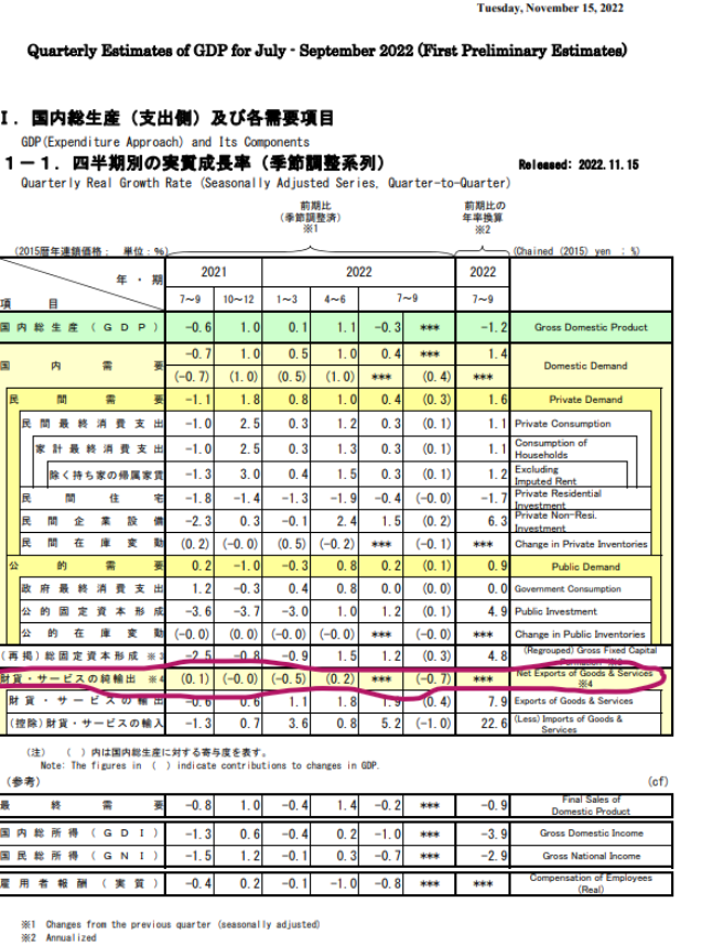
Finally, and that falls under positioning, there is the unwind of USDJPY longs spurred by heavy intervention by Japanese authorities. If there is any proof that policy makers are taking the plunge in the Yen seriously it is in the details of Japan’s Q3 GDP which shrunk unexpectedly by 1.2% (consensus was for a 1.2% increase). The bad news came almost entirely from the negative contribution of net trade. Net trade has been a drag on GDP for the last four quarters primarily from the rise in imports, i.e., the weakness in the Yen. The good news is that the economy otherwise is doing fine: private demand had a big bounce from the previous quarter and has been a net positive overall (all data can be found here): in other words, the problem is the Yen, and YCC makes that worse.
Another piece of data, released last week, which caught our attention, is Japan FX Reserves. The decline from the high in July 2020 is $241Bn, about 18% – that is a substantial amount. The interesting thing, and we kind of know this from the TIC data is that the decline is coming entirely from the sale of foreign securities; deposits actually went up marginally (some of the decline is also valuation). But we know now that when Japan was intervening in USDJPY in September/October, it was selling securities, not depos – most analysts thought Japan would first reduce depos, while intervening, before selling their security portfolio. All data is here.
In summary, CTAs’ sizable wrong way bets long USD and short equities and bonds and real money light risk exposure overall coincided with dovish economic data, reopening China and improving geopolitics (all of these happening on the margin).
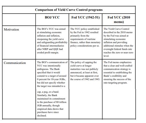
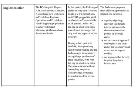
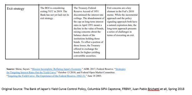
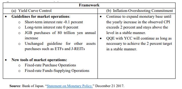
Yield Curve Control (YCC) or Yield Curve Targeting (YCT) – going forward, unless quoted, I will use YCC – is the latest unconventional tool in the modern central bank monetary arsenal. It was first used in 1942 by the Fed, and more recently, by BOJ in 2016, and RBA this year. YCC was first considered in the USA after the 2008 financial crisis, and again after the Covid crisis this year.
There is very little reason for the Fed to adopt YCC in the current environment given no pressure on the yield curve and government finances. On the other hand, there are other, better, tools to stimulate the economy and allow inflation to stay high. If it were eventually to adopt YCC, it is the long-end of the yield curve which will benefit the most from it.
YCC Options
In a 2010 memo, the Fed discussed “strategies for targeting intermediate- and long-term interest rates when short-term interest rates are at the zero bound”. The memo breaks down the choice of YCC into two possibilities:
targeting horizon: which yields along the curve should be capped; and
“hard” vs. “soft” targets: the former would require the Fed to keep yields at a specific level all the time, while under the latter, yields would be adjusted on a periodic basis.
In addition, the memo lists three different implementation methods:
policy signaling approach: keep all short-term yields, in the time frame during which the Fed plans not to raise rates, at the same level as the Fed’s target rate (Fed funds, IOER, etc.);
incremental approach: start with capping the very short-end rate and progressively move forward as needed; and
long-term approach: cap immediately the long-end of the curve.
During the Covid crisis in 2020, there was a very extensive discussion on YCC at the June FOMC meeting, according to the minutes. In fact, there was a whole section on it, going though the other current and past experiences of YCC and listing the pros and cons. While the 2010 memo had zero effect on market sentiment, investors took this most recent development very positively. However, the market was ostensibly disappointed after the release of the July minutes, where the Fed hinted that YCC might not be happening after all, at least for now:
“…many participants judged that yield caps and targets were not warranted in the current environment but should remain an option that the Committee could reassess in the future if circumstances changed markedly.”
Reality, however, is that the July 2020 minutes did not say anything that different from the June 2020 minutes. Here is the relevant quote from the latter:
“…many participants remarked that, as long as the Committee’s forward guidance remained credible on its own, it was not clear that there would be a need for the Committee to reinforce its forward guidance with the adoption of a YCT policy.”
Compare to this quote from the July FOMC minutes:
“Of those participants who discussed this option, most judged that yield caps and targets would likely provide only modest benefits in the current environment, as the Committee’s forward guidance regarding the path of the federal funds rate already appeared highly credible and longer-term interest rates were already low.”
Despite these mentions of YCC by the Fed in its latest FOMC meetings, unlike 2010, we know very little this time about the Fed’s intentions how to structure and implement YCC, if needed. The Jackson Hole meeting revealed some of the main conclusions of the FOMC’s review of monetary policy strategy, tools, and communications practices, especially on average inflation targeting (AIT) but there was no light shed on what the Fed is thinking about YCC.
Taking the example of Japan, YCC is a natural extension of BOJ monetary policy: QE (quantitative easing: start in 1997, but officially only in 2001), QQE (quantitative and qualitative easing: stat 2013), QQE+NIRP (negative interest rate policy: start January, 2016), QQE+YCC (start September, 2016). In effect, BOJ moved from targeting the 0/N rate (QE) to targeting quantity of money (monetary base in QQE), to a mixture of quantity and O/N (QQE+NIRP) to a mixture of quantity and short and medium-term rates (QQE+YYC, in reality, even though the quantity is still there, the focus is more on the rates)
RBA took a short cut, skipped QQE+NIRP and went straight to QQE+YCC, targeting only the 3yr rate. According to the June FOMC minutes, see above, it looks like the Fed might also skip, at least, NIRP:
“…survey respondents attached very little probability to the possibility of negative policy rates.”
In addition, it seems the Fed is more inclined to look at capping short-term yields:
“A couple of participants remarked that an appropriately designed YCT policy that focused on the short-to-medium part of the yield curve could serve as a powerful commitment device for the Committee.”
While capping long-term yields could result in some negative externalities:
“Some of these participants also noted that longer-term yields are importantly influenced by factors such as longer-run inflation expectations and the longer-run neutral real interest rate and that changes in these factors or difficulties in estimating them could result in the central bank inadvertently setting yield caps or targets at inappropriate levels.”
YCC can be implemented in different formats and its goals can also differ.
The original YCC in the 1940s USA was all about helping the Treasury fund its large war budget deficit. Frankly, this ‘should’ be the main reason YCC is implemented. Indeed, it was exactly in this light that Bernanke suggested YCC is an option in our more modern times in his famous speech in 2001, “Deflation: make sure it does not happen here”:
“…a pledge by the Fed to keep the Treasury’s borrowing costs low, as would be the case under my preferred alternative of fixing portions of the Treasury yield curve, might increase the willingness of the fiscal authorities to cut taxes.”
The point is, if the goal was to stimulate the economy, push the inflation rate up and the unemployment rate down, forward guidance (which is what QQE is) and possibly NIRP (not applicable for every country though) are better options (see quotes above from the June/July FOMC minutes).
YCC is the option to use only once the economy has picked up and inflation is on the way up but years of QE has left the government debt stock elevated to the point that even a marginal rise in interest rates would be deflationary and push the economy back to where it started. In other words, YCC is giving the chance for the Treasury to work out its heavy debt load. Most likely, this would be happening at the expense of a short-term rise in inflation over and beyond what is originally considered prudent but on a long-enough time frame, average inflation would still be within those ‘normal’ limits, as long as the central bank remains credible, of course. Again, the post WW2 YCC should be a good reference point for such a scenario.
The Original YCC
The initial proposal to peg the US Treasury yield curve was first presented at the June 1941 FOMC meeting by Emanuel Goldenweiser, director of the Division of Research and Studies.
“That a definite rate be established for long term Treasury offerings, with the understanding that it is the policy of the Government not to advance this rate during the emergency. The rate suggested is 2 1/2 per cent. When the public is assured that the rate will not rise, prospective investors will realize that there is nothing to gain by waiting, and a flow into Government securities of funds that have been and will become available for investment may be confidently expected.”
The emergency hereby mentioned was, of course, WW2. The war started in September 1939 and by late 1940, Britain was running out of money to pay for equipment. In a speech on October 30, 1940, President Roosevelt first promised Britain every possible assistance even though Britain lacked the financial resources to pay. The Lend-Lease Act, passed by Congress in March 1941, eventually signalled that it would finance whatever Britain required. US direct involvement in WW2 after the bombing of Pearl Harbour ensured the country, itself, would have to spend heavily in the war effort.
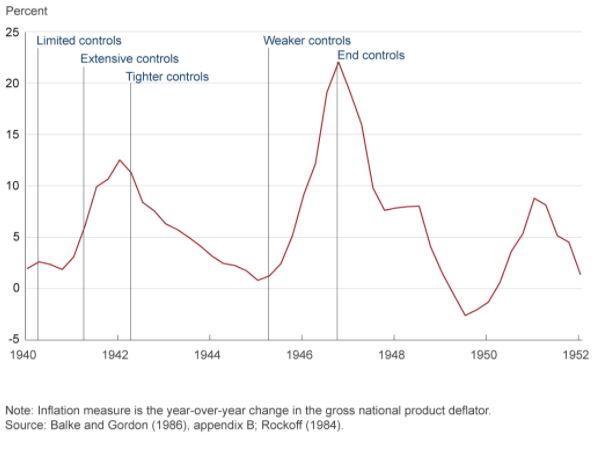
That was the context of the YCC which followed in 1942. In addition, US economic circumstances leading to the decision to peg the US Treasury curve were actually not that different to today. The US banking system was flush with liquidity on the back of large gold inflows, inflation was around 2% and the shape of the yield curve (the very front end) was not that dissimilar: the front end was around 0%, the 5yr around 65bps, and the long bond at 2.5%. With the start of the war, inflation picked up but there were price controls put in place which limited its rise. Government debt to GDP, however, was actually much lower than today and it got to present levels only by the end of the war.
By the time the actual peg went in place, the curve had steepened, especially the 10yr had gone to 2% as inflation really accelerated. Inflation eventually reached a staggering 12.5% in 1942 at which point even more price controls were imposed.
Some FOMC members at that time regarded such a steep yield curve as inconsistent with the policy objectives (keeping inflation under control in the context of the US Treasury issuance program) and insisted on a horizontal structure of managing the curve. And that is in spite of the fact that the decision to peg interest rates was never officially announced. In fact, US Treasury Secretary, Henry Morgenthau’s preference was for a continuation of what today we regard as quantitative easing (QE), i.e. Fed using a quantity rather than rates target.
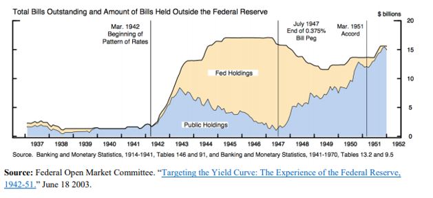
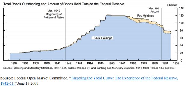
Under the peg, the Fed, instead, had to buy whatever the private sector sells as long as yields were above the stipulated levels. Naturally, investors were riding the positively sloped yield curve, selling the front end and buying the long end. The Fed was forced to accumulate a lot of T-Bills as a result.
However, its holdings of coupons were never that large.
With the end of the war, inflation started picking up again and the Fed eventually took off the yield peg in the front end in July 1947. The peg in the long end stayed until the March 1951 US Treasury Accord. By that time, US public debt to GDP had shrunk back to 73% from more than 100% at the end WW2.
The 1951 Fed-Treasury Accord did not completely end Fed’s management of the yield curve, however. Fed’s new chairman, Willian Martin, wanted to confine market operations in the front end of the curve only, insisting that this will eventually also affect the long end. This ‘bills only’ policy lasted until 1961 and it provided a turn in how the Fed views its involvement in the US Treasury market: from helping the Treasury finance the government’s debt to a more traditional approach to monetary policy focusing on price stability and employment.
Even that was not the end of Fed’s direct involvement. From 1961 till 1975, the Fed engaged in the so called, ‘even keel’ operations. Under these, the Fed supplied reserves and refrained from any policy decisions just before US Treasury auctions and even immediately after (until the time primary dealers were able to sell their inventory to the private sector).
The set-up for YCC in the 1940s has many similarities not only with present day USA but also with Japan, where public debt to GDP at 250% is even higher that US at its peak. However, as discussed below, the rationale for YCC in Japan, is nevertheless different.
YCC in Japan
With QQE starting in April 2013, BOJ indicated it would be buying 60-70Tn Yen of assets per year. On JGBs, the plan was to slowly lengthen the duration to flatten the curve until inflation surpassed 2%. This was an upgrade from the previous inflation target range of 1-2%. BOJ also added an estimated time target of when it expected that to occur (initially 2015). For all intends and purposes, this was QE plus forward guidance, plus average inflation targeting in one.
A substantial reduction in the price of oil and a consumption tax hike in April 2014 exacerbated the dis-inflationary environment and forced BOJ to increase the annual purchases to 80Tn Yen later that year, extend duration (up to 40 years, average duration moved from 3 years to 7 years) and initiate ETFs and J-REITs purchases. In the meantime, the monetary base and the balance sheet were exploding, latter reaching almost 100% GDP. In effect, through QQE, BOJ moved from targeting the uncollateralized O/N rate to targeting the monetary base.
By 2015, these efforts by BOJ seemed to have worked. Inflation rose from -0.6% in 2013 to 1.2%, unemployment went down. However, subsequent decline in inflation to 0.5% in 2016 threw some doubt over the efficacy of these monetary policy efforts. By then, BOJ holdings of JGBs were approaching 50% of the overall market, contributing to declining market liquidity. 10yr JGB had gone from 75bps to almost 0%. They eventually broke the zero-bound after the BOJ initiated QQE+NIRP by lowering the marginal rate on excess reserves to -0.1% from 0.1%.
The practical consequences of QE+NIRP was a push up of the duration and risk curve (into sub-debt, credit card loans, equities, etc.) and out of the country into international assets. As banks’ JGB holdings gradually dwindled, banks had trouble finding assets for collateral purposes, a fact which, together with the flat yield curve interfered with the monetary transmission mechanism. Eventually, BOJ was buying more and more JGBs from pension funds and insurance companies. As these financial entities don’t have an account at the BOJ, it was banks’ deposits which were increasing. MMFs funds decision to stop taking in more deposits after NIRP, moved even more money into the banking system which further lowered their profitability.
Unlike US, where a large majority of financial assets are owned by other entities, Japan has a bank-based financial system. Even though NIRP did trigger the “loss reversal rate” (loss of bank profits below a certain level of interest rates, causes tighter lending conditions), reality was that only a very small portion of the banks’ deposits, about 4%, i.e. the so-called policy rate balance, were charged the negative rate. Majority were still charged at the 0.1%, about 80%, or so-called basic balances at the BOJ. The rest were charged 0%.
But the effect on the banks was highly uneven. Regional banks suffered more as big banks could find higher yields abroad, for example. So, despite best efforts by BOJ to help the banks with the tiering system, overall bank profitability still fell.
This was the context for YCC which Japan launched in September 2016. The economy was still in need for more stimulus but the way BOJ was providing it, didn’t work, and, if anything, worsened matters as the flat yield curve hindered the monetary transmission mechanism, and the negative interest rate worsened Japanese banks’ profitability. BOJ need to slow down its purchases of JGBs, and thus lower balance sheet growth. The way it was planning to do this was to move away from a quantity target back to an interest rate target with the novelty of adding a long-end one.
In addition to YCC, BOJ provided more clarity to its inflation targeting framework: it added an inflation overshooting commitment. This meant that inflation had to surpass 2% for some time so that average inflation rises to 2%. This brought it even closer to how AIT in the US is supposed to work.
YCC also resulted in a de facto BOJ balance sheet tapering – annual purchases went from 80Tn Yen in 2014 to eventually 16Tn Yen in 2019 – as BOJ didn’t have to interfere as much to keep interest rates within their targets. This was despite the fact that BOJ never actually changed its quantity target, which actually did create a lot of confusion – in March this year, the central bank even scrapped the upper limit on annual purchases. But there was no practical doubt that BOJ had moved on from a quantity to a rates target.
Despite the fact that YCC was initiated to steepen the yield curve, BOJ never really had to do anything in that regard. BOJ interventions were done through two tools: 1) fixed rate purchase operations and 2) fixed rate funds supply operations. The former was used only to bring 10yr JGBs below 10bps.
Benefits and Disadvantages of YCC
Historical analysis shows that a credible central bank can indeed control nominal interest rates. However, by default, it is fully in charge, strictly speaking, only of interest rates ceilings (bond vigilantes are indeed only a gold standard phenomenon; they are redundant in a free floating, irredeemable money monetary system). That is notwithstanding side effects such as higher inflation – which indeed might be one of the goals – or weaker currency.
Interest rate floors are a lot more difficult to control, as to do that, the central bank must be in possession of fixed income assets for sale. Central bank balance sheets may not have a higher bound, but they do have a lower band. When BoJ set on the steepen the yield curve, it indeed opened itself to such a risk, but it did have a very large balance sheet at the time (luckily it never had to go through selling JGBs). In theory a central bank can get around that problem by enlisting the help of the Treasury which can issue more bonds as the yield target breaks that lower bound limit. But then again, there might be negative side effects, such as deflation and a higher debt burden, which this time would be going against said goals.
When it comes to real yields, things get more complicated as inflation is added to the variables that need to be controlled. Historical experience suggests that structural shifts in inflation expectations are more likely to follow rather than lead spot inflation. Very generally speaking, it is a lot easier for a credible central bank to control an inflation ceiling than an inflation floor for somewhat similar reasons (see above). It seems that for a central bank to be able to control the floors of either real or nominal yields, it has to become ‘incredible’ (pun intended)!
Using these conclusions above, it seems to me that there is little upside to resort to YCC, if the goal was just to push inflation up. YCC is very much a complementary tool in that respect. However, YCC can be very effective in allowing inflation to go up alongside helping the Treasury fund. It is very much the main tool here.
One of the challenges of YCC is to keep the central bank balance sheet from expanding too much. Unlike limited QE, there is indeed a risk of it having to purchase large quantities of bonds to keep the interest rate ceilings. There is also the question of exit. Unlike QE which simply smoothed the yield curve, YCC provides a hard ceiling and thus the possibility of a large break higher in yields once the controls are lifted.
What Should the Fed Do?
The fact there was no specific feature on YCC at the Jackson Hole meeting this year (going by the first day of the meeting at this point), makes me think that this is not a monetary policy tool which is high on Fed’s agenda at the moment. Fed is more inclined to first try AIT and more direct forward guidance, as indeed Japan did pre-YCC. However, judging from the June 2020 FOMC minutes, if YCC were to be implemented, it would be on the short-end of the US treasury market, following the Australian model:
“Among the three episodes discussed in the staff presentation, participants generally saw the Australian experience as most relevant for current circumstances in the United States.”
The Australian model though combines YCC with a calendar-based forward guidance. It is not clear how that will work if the Fed adopts an outcome-based forward guidance first, as this is what is favored currently by most FOMC participants.
Also, the Fed must be careful as to exactly what shape yield curve it wants to eventually have. The 1940s YCC flattened the curve, while both Japan and Australia YCC steepened it. The US yield curve is currently flatter than the 1940s US curve but steeper than either Japanese or Australian one at the time YCC was announced. Going for the Australian example of pegging the front end, it will most likely steepen the curve as it did in Australia.
Prior to Jackson Hole, the OIS curve was indicating that there would be no rate hikes in the next 5 years. Post, market is not 100% sure, which means chairman Powel communication was not so clear. The 5y5y forward, which is probably the best proxy of the Fed’s terminal rate is still around 65bps: the curve is well anchored all the way to 10yr which is a great outcome given the massive supply of US Treasuries.
How much benefit would the curve get from pegging any yields up to 10 year? I don’t think a lot. It is the 30 year that the Fed might consider pegging eventually; below 1.5% today, it is still relatively low. The 30-year Treasury is where really proper market demand and supply meet and it thus becomes the focal point for the monetary – fiscal interplay.
If the Fed is planning to do YCC, it should peg the 30-year US Treasury, just like it did in the 1940s. For everything else, the Fed has better tools at its disposal.
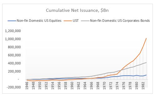
At $3.2Tn, US Treasury (UST) net issuance YTD (end of June) is running at more than 3x the whole of 2019 and is more than 2x the largest annual UST issuance ever (2010). At $1.4Tn, US corporate bond issuance YTD is double the equivalent last year, and at this pace would easily surpass the largest annual issuance in 2017. According to Renaissance Capital, US IPO proceeds YTD are running at about 25% below last year’s equivalent. But taking into consideration share buybacks, which despite a decent Q1, are expected to fall by 90% going forward, according to Bank of America, net IPOs are still going to be negative this year but much less than in previous years.
Net issuance of financial assets this year is thus likely to reach record levels but so is net liquidity creation by the Fed. The two go together, hand by hand, it is almost as if, one is not possible without the other. In addition, the above trend of positive Fixed Income (FI) issuance (both rates and credit) and negative equity issuance has been a feature since the early 1980s.
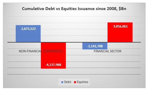
For example, cumulative US equity issuance since 1946 is a ($0.5)Tn. Compare this to total liquidity added as well as issuance in USTs and corporate bonds.*
The equity issuance above includes also financial and foreign ADRs. If you strip these two out, the cumulative non-financial US equity issuance is a staggering ($7.4)Tn!
And all of this happened after 1982. Can you guess why? SEC Rule 10b-18 providing ‘safe harbor’ for share buybacks. No net buybacks before that rule, lots of buybacks after-> share count massively down. Cumulative non-financial US equity issuance peaked in 1983 and collapsed after. Here is chart for 1946-1983.
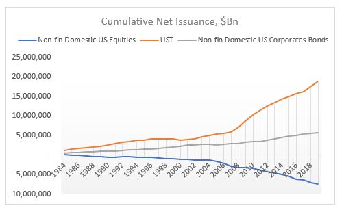
Equity issuance still lower than debt issuance but nothing like what happened after SEC Rule10B-18, 1984-2019.
Buybacks have had an enormous effect on US equity prices on an index basis. It’s not as if all other factors (fundamentals et all) don’t matter, but when the supply of a financial asset massively decreases while the demand (overall liquidity – first chart) massively increases, the price of an asset will go up regardless of what anyone thinks ‘fundamentals’ might be. People will create a narrative to justify that price increase ex post. The only objective data is demand/supply balance.
*Liquidity is measured as Shadow Banking + Traditional Banking Deposits. Issuance does not include other debt instruments (loans, mortgages) + miscellaneous financial assets. Source: Z1 Flow of Funds
Fed is now probably considering which is worse: a UST flash crash or a risky asset flash crash. Or both if they play their hand wrong.
Looking at the dynamics of the changes in the weekly Fed balance sheet, latest one released last night, a few things spring up which are concerning.
1.The rise in repos for a second week in a row – a very similar development to the March rise in repos (when UST10yr flashed crashed). The Fed’s buying of Treasuries is not enough to cope with the supply hitting the market, which means the private sector needs to pitch in more and more in the buying of USTs (which leads to repos up).
This also ties up with the extraordinarily rise in TGA (US Treasury stock-piling cash). But the build-up there to $1.4Tn is massive: US Treasury has almost double the cash it had planned to have as end of June! Bottom line is that the Fed/UST are ‘worried’ about the proper functioning of the UST market. Next week’s FOMC meeting is super important to gauge Fed’s sensitivity to this development
2.Net-net liquidity has been drained out of the system in the last two weeks despite the massive rise in the Fed balance sheet (because of the bigger rise in TGA). It is strange the Fed did not add to the CP facility this week and bought only $1Bn of corporate bonds ($33Bn the week before, the bulk of the purchases) – why?
Fed’s balance sheet has gone up by $3tn since the beginning of the Covid crisis, but only about half of that has gone in the banking system to improve liquidity. The other half has gone straight to the US Treasury, in its TGA account. That 50% liquidity drain was very similar throughout the Fed’s liquidity injection between Sept’19-Dec’19. And it was very much unlike QE 1,2,3, in which almost 90% of Fed liquidity went into the banking system. See here. Very different dynamics.
Bottom line is that the market is ‘mis-pricing’ equity risk, just like it did at the end of 2019, because it assumes the Fed is creating more liquidity than in practice, and in fact, financial conditions may already be tightening. This is independent of developments affecting equities on the back of the Covid crisis. But on top of that, the market is also mis-pricing UST risk because the internals of the UST market are deteriorating. This is on the back of all the supply hitting the market as a result of the Treasury programs for Covid assistance.
The US private sector is too busy buying risky assets at the expense of UST. Fed might think about addressing that ‘imbalance’ unless it wants to see another flash crash in UST. So, are we facing a flash crash in either risky assets or UST?
Ironically, but logically, the precariousness of the UST market should have a higher weight in the decision-making progress of the Fed/US Treasury than risky markets, especially as the latter are trading at ATH. The Fed can ‘afford’ a stumble/tumble in risky assets just to get through the supply in UST that is about to hit the market and before the US elections to please the Treasury. Simple game theory suggest they should actually ‘encourage’ an equity market correction, here and now. Perhaps that is why they did not buy any CP/credit this week?
The Fed is on a treadmill and the speed button has been ratcheted higher and higher, so the Fed cannot keep up. It’s a dilemma (UST supply vs risky assets) which they cannot easily resolve because now they are buying both. They could YCC but then they are risking the USD if foreigners decide to bail out of US assets. So, it becomes a trilemma. But that is another story.
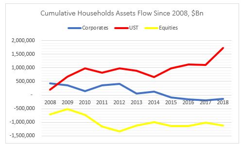
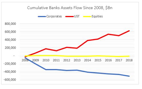
Households have massively deleveraged: sold about $1Tn of US equities and bought about $2Tn of USTs. The have also marginally divested from corporate bonds.
Banks have deleveraged as well: bought about $0.5Tn of UST while
selling about the same amount of equities. The have also marginally divested
from corporate bonds.
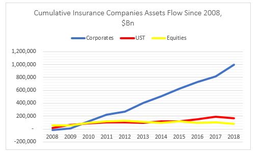
Insurance companies have put on risk: bought about $1Tn of
corporate bonds and small amounts of both equities and USTs.
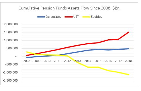
Mix bag for pension funds with a slight deleveraging: bought $0.5Tn
of corporate bonds but sold about $1Tn of equities. But also bought $1.5Tn of
USTs.
Mutual funds have put on risk: bought about $1Tn of corporate
bonds and small amount of equities. Also bought more than $1.5Tn USTs.
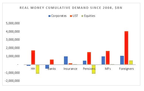
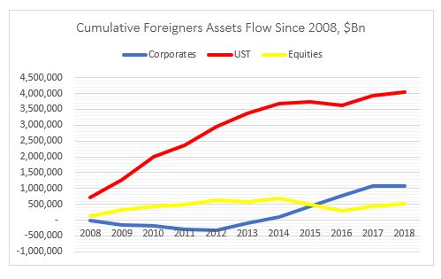
Finally, foreigners have also put on risk: bought $1Tn of
corporate bonds, $0.5Tn of equities and $4Tn of USTs.
Overall, the most (disproportionate) flows went into USTs, followed by US
corporates. Demand for equities was actually negative from real money.
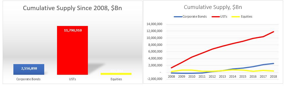
What about supply?
Issuance of USTs was naturally the dominant flow followed by US corporates and US equities.
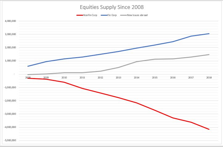
On the US equities side, however, there is a very clear distinction between US non-financial corporate issuance, which is net negative (i.e. corporates bought back shares) and US financial and US corporate issuance abroad, which is net positive. In other words, the non-corporate buybacks (more than $4Tn) were offset by the financial sector (ETF) and ‘ADRs’ issuance.
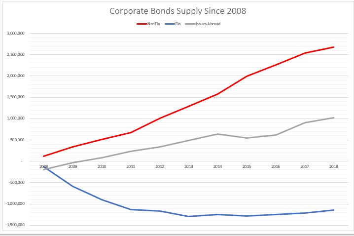
The opposite is happening on the corporate supply side. Non-financial corporates have done the majority of the issuance while the financial sector has deleveraged (reduced debt liabilities).
In other words, non-financial corporates have bought back their shares at the expense of issuing debt, while the financial sector (ETFs) has issued equities and reduced their overall indebtedness.
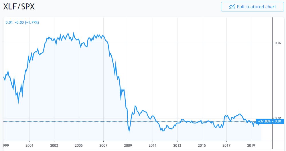
No wonder, then that financial sector shares have underperformed the overall
market since 2009.
Putting the demand and supply side together this is how the charts look.
On the equities side, the buying comes mostly from ETFs (in ‘Others’ – that is basically a ‘wash’ from the issuance) and foreigners. The biggest sellers of equities are households and pension funds. The rest of the players, more or less cancel each other out.
So, households and pension funds, ‘sold’ to ETFs and foreigners.
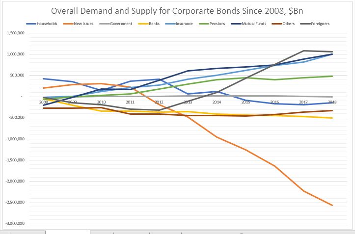
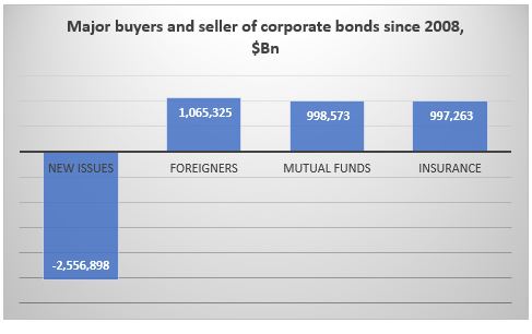
On the corporate bonds side, the main buyers were foreigners, mutual funds
and insurance companies. Pension funds also bought. The main seller were the
banks. ‘Others’ (close end funds etc.) and households also sold a small amount.
So, here it looks like foreigners, mutual funds and insurance companies ‘bought’
mostly at new issue or from the banks.
Finally, on the USTs side, everybody was a buyer. But the biggest
buyer by large were foreigners. Mutual funds, pension funds, the Fed and
households came, more or less, in equal amount, second. And then banks, ‘Others’
and insurance companies.
Kind of in a similar way, everyone here ‘bought’ at new issue.
Conclusion
It’s all about demand and supply.
In equities, real money has been a net seller in general, while the biggest buyer has been non-financial corporates themselves in the process of share buybacks. The financial sector has been a net issuer of equity thus its under-performance to the non-financial corporate sector. Equity real money flow is skewed mostly on the sell side.
Real money flow in corporate bonds is more balanced, but with a net
buying bias.
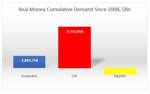
USTs real money flow is skewed completely on the buy side.
Overall, since 2008 real money has sold equities, bought a bit of corporate
bonds and bought a lot of UST: it does not seem at all that real money
embraced the bullish stance which has prevailed in the markets since March 2009.
*Data is from end of Q4’08 till Q4’18, Source for all data is Fed Z1 Flow of Funds
Why do smart people do obviously ‘irrational’ things? It must be the
incentive structure, so for them they do not seem irrational. So, I am wrecking
my brain over China’s decision to issue EUR-denominated bonds (and a few weeks
ago USD-denominated ones), in light of its goal of CNY and CGBs
internationalization, 40-50bps over the CGB curve (swapped in EUR).
The rationale China is putting forward is that enables it to diversify its investor
base on the back of the trade tensions! Seriously? Do they really mean that or
are they getting a really bad advice? Wasn’t the intention to actually go the
other way as a result of the trade war? Didn’t China want to be become more
self-reliant? In any case, China does not need foreign currency funding given
its large, positive NIIP. China has the opposite problem. It has too much idle
domestic savings and not enough domestic financial assets. This, among other
things, creates a huge incentive for capital flight which, despite its closed
capital account, China is desperately trying to prevent.
In that sense, China does need foreign investor but to
invest in CGBs (and other local, CNY-denominated bonds) to act as a buffer to
the potential domestic capital outflow as the capital accounts gates slowly
open up. It is for this reason that BBGAI and JPM have started including CGBs
into their indices this year.
It is for this reason SAFE decided to scrap the quota restrictions on both QFII and RQFII in
September. It is for this reason that Euroclear signed a memorandum of understanding
with the China Central Depository & Clearing to provide cross-border
services to further support the evolution of CIBM. That opens up the path for
Chinese bonds to be used as collateral in international markets (eventually to
become euro-clearable), even as part of banks’ HQLA.
All these efforts
are done to make access to the local fixed income market easier for foreign
investors. And now, what does China do after? Ahh, you don’t need to go through
all this, here is a China government bond in EUR, 50bps cheaper (than if you go
through the hassle of opening a Bond Connect account and hedging your CNY back
in EUR).
This not
only goes against China’s own goals regarding financial market liberalization but
also against the recent trend of other (EM) markets preferring to issue in domestic
currency than in hard currency. And while other EMs may not have had the choice
to issue in hard currency from time to time, China does. And while the investor
base for other EMs between the domestic and the hard currency market is indeed
different, and the markets are very distinctive, China does not have much of an
international investor base. Issuing in the hard currency market may indeed ‘crowd
out’ the domestic market. Especially when you come offering gifts of 50bps in a
negative interest rate environment.
Credit impacts the real economy in a different way depending
on whether it is to households or to corporates (see Atif Mian’s work, also his
interview here).
Very generally speaking, credit to households affects the economy directly
through the demand-side channel, while credit to corporates – through the
supply-side channel directly, and only then, potentially, indirectly through
the demand-side channel.
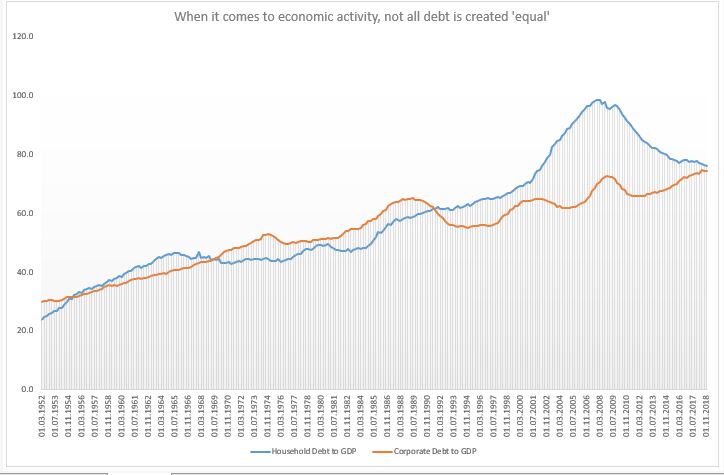
Household debt to GDP was flat for two decades between mid-1960s and mid-1980s; and then it doubled; corporate debt for GDP, on the hand, was flat also for two decades after the S&L crisis, and even now it is only a few per cents higher. But the demand-side reduction from the household debt channel post 2008 is rather unique.
Given that the US was running a negative output gap for most of the period post 2008 (and it might still do, even though official estimate is for a small positive), it was the demand-side that needed some catching up to. Instead, the opposite was essentially happening: credit to households was decreasing relative to credit to corporates. As far as credit was concerned, it was primarily the supply side that was getting stimulated (of course, the question is how much stimulus was really created given that a lot of the corporate debt went to share buybacks).
The other theory, one to which I subscribe, is that the modern economy is essentially always experiencing a demand gap. When real wages stopped growing in the 1990s, post the the financial liberalization of the 1980s, household credit experienced a massive run-up. The demand gap left from the stagnation in real incomes was filled with household debt. Until the sudden stop in 2008.
Household debt to GDP did not grow between 1960s-1980s but real household income did, so there was no demand gap either. Post 2008, though, neither of these two options were available which left the US economy in a demand insufficiency. The ‘stimulus’ provided was mostly through the supply side with very little follow through into the demand side which meant lackluster economic growth.
The bottom line is that the type of credit creation matters.
The central bank affects directly only the supply of credit (and in some cases,
even less so) thus, it has limited ability (none?) to decide on whether credit
goes to firms or households. We may get a lot more from lower interest rates if
policy makers start thinking more holistically about the whole process of
credit creation. Banks do not care where credit goes
(why should they?) as long as they get their money back.
But with overall debt in the economy climbing higher and higher, it is essential to think how we can get the most out of it. And if the market can’t do that (it can’t), someone else should step in.
All this does not mean that US households should get even more indebted! On the contrary, the decline in household debt to GDP is good news only if it were also followed by a similar rise in real household income. And it the private market can’t do that either (it seems, it can’t), then we need to rely on the official sector to take on that burden.