European leaders keep talking about energy security, but it seems to me that, when it comes to Russian energy, it was them who took their countries from a state of relative stability to a state of extreme uncertainty. Two main points I want to make: 1) I am not aware of Russia ever unilaterally stopping or even threatening to stop the flow of energy to Europe before the Ukraine war started this year; 2) even if it was smart to diversify their energy sources (and let’s face it, even for Germany only about 50% of the imported gas was from Russia before the war), it would have been smarter to do it gradually, having secured plentiful of alternative resources in advance.
Two further points. First, it seems to me that there was a lot of scaremongering about the relative dependence of Europe on Russian energy in the last few years, which obviously subsequently affected European energy policy making. There was only one instance when Russian gas did not reach Europe. In January 2009, Russian gas flow through Ukraine was halted for about two weeks because Ukrainian gas company Naftogaz had refused to pay its debt to Gazprom for previous supplies. In addition, there were many documented instances when Ukraine was siphoning transit Russian gas thus threatening European deliveries.
“If the Nord Stream and South Stream had been in place on 1 January [2009], the consequences of this dispute would barely have registered in the majority of European countries”;
“One certain outcome of the dispute is that there will be an even greater determination from Gazprom – and perhaps also from European countries – to build the North Stream and South Stream transit avoidance pipelines, which will impact heavily on Ukraine’s gas transit business.”;
“The problem for the Ukrainian side is that this crisis will have hardened Russian determination to greatly reduce its transit dependence by building the Nord Stream and South Stream pipelines; a development with serious financial consequences for a country in an already difficult economic situation.”
You see, Russia was working to increase European energy security, NOT to decrease it!
Of course, there are many other reasons for the construction of NS1/NS2 and South Stream/Turk Stream. On the technical side, the pipelines through Ukraine/Poland were very old, built during Soviet times, subject to constant leaks and reliant on Ukrainian/Polish work for maintenance (hardly forthcoming in those days). On the financial side, it was not in the interest of Russia to continue paying transit fees if there were an alternative. Finally, the new gas transit lines allowed for a higher capacity, a more direct and faster route to the main European market. Better, cheaper, faster, more -> European energy security was getting enhanced!
So, the second point I wanted to make is, with that background in mind, it should become clearer the incentives behind some of the events that subsequently transpired. Obviously, Ukraine and Poland had the most to lose if the new gas transit lines to Europe became a reality. It was not just the transit fees but the fact that both countries were in an extremely privilege situation when it comes to their own energy security – before the 2009 Russia-Ukraine gas conflict, they were paying the cheapest gas prices in all of Europe (they actually continued to pay low prices even after – pretty much until NS1 went on line – you can see the data here https://ec.europa.eu/eurostat/web/energy/data/database ).
But there was one other important event which took place at about the same time: the oil and gas shale revolution in the USA. All of a sudden, both Poland and Ukraine had a potential way out of the energy conundrum they put themselves in, and that outcome actually worked wonderfully also for the US, which saw an opportunity in selling energy to Europe. It should be no surprise that Poland and Ukraine have also seen more shale exploration than any other European country (brownie points for remembering that Hunter Biden went on the board of the Ukrainian gas company Burisma in … yes, 2014, AFTER the Maidan revolution of the same year).
US focus on Ukraine, however, dates further back than that. Here is some more context.
Ukraine was always seen as an integral part of NATO#s expansion eastward. I actually think the 2004 Orange Revolution was the turning point in everything that followed thereafter. In 2004 the Ukraine Presidential election was initially won by the pro-Russian candidate Viktor Yanukovych, but after protests for seeming fraud in the election process (some would claim that these were supported by the US, see this https://carnegieendowment.org/2019/06/20/thirty-years-of-u.s.-policy-toward-russia-can-vicious-circle-be-broken-pub-79323 and this https://www.youtube.com/watch?v=QeLu_yyz3tc – both are reputable US sources), the victory was given to the pro-West candidate, Viktor Yushchenko. Yushchenko’s wife worked in the White House in the Office of Public Liaison during the administration of Ronald Reagan, in the U.S. Treasury in the executive secretary’s office during the administration of George H. W. Bush and on the staff of the Joint Economic Committee of the United States Congress!
One of the things Yushchenko did, was rehabilitate Bandera as a national hero. One of the last things Petro Poroshenko did when leaving office in 2019 was to ban the use of the Russian language. The Ukraine-Russia ethnic split in the country was obvious and it was profound. It dates back to the Holodomor in the 1930s and is probably the basis for the hatred some Ukrainians still harbour towards Russia. Anyway, that is another story.
So, Yanukovych wins back the Presidency in 2010, this time without a doubt, but the country is in dire straits economically. The financial package from the IMF is with draconian conditions, while that from the EU is not enough, so Yanukovych chooses the more generous financial offer from Russia eventually in 2014. What followed is the ‘Maidan’ when power reverted back to the pro-Western candidate, Yatsenyuk.
And, yes, not without some help, perhaps – Victoria Nuland, married to Robert Kagan one of the top neo-con founders of PNAC (project for the new American century – see this https://en.wikipedia.org/wiki/Project_for_the_New_American_Century ). In this story, she is famous for the “F..k the EU” expletive when she was discussing the structure of the new Ukrainian government with US ambassador to Ukraine, Geoffrey Pyatt (that was pre-Maidan) – see here https://www.nbcnews.com/video/audio-of-leaked-nuland-conversation-162208835907 . That was not Nuland’s first rodeo in Ukraine – she had been involved in Ukrainian politics for some time before, directing money in helping Ukraine move closer to the West (see here https://2009-2017.state.gov/p/eur/rls/rm/2013/dec/218804.htm ). Yatsenyuk immediately announces that Ukraine will seek entry into NATO and the country ends its ‘non-aligned’ status.
The Maidan narrative was that overthrowing the democratically elected government in 2014 was morally right. That’s fine, but why then, a free referendum in which Crimea overwhelmingly voted to cede from Ukraine and become part of Russia thereafter was illegal? Which auto-determinations should be allowed and which not? As if Russia would have realistically allowed its own Black Sea naval headquarters to be based in a country potentially part of NATO!? After Maidan, there was never going to be any solution to the fate of Eastern Ukraine without the Minsk Agreement which Ukraine never implemented even though it agreed to it.
The build-up to the current war started with Ukraine in March 2021 adopting a new military strategy by decree, in which one of the goals was the dis-occupation and re-integration of Crimea. In June 2021, NATO reiterated “the decision made at the 2008 Bucharest Summit that Ukraine will become a member of the Alliance with the Membership Action Plan (MAP) as an integral part of the process” (see here https://www.nato.int/cps/en/natohq/news_185000.htm) .
In November 2021, Putin declared that Ukraine’s acceptance into NATO constituted a red line, whose crossing would have grave consequences (he highlighted concerns about the potential arrival of long-range hypersonic missiles with the ability to reach Moscow in ‘five minutes’ – see the Cuban Crisis and the concept of nuclear primacy as part of PNAC above).
In December 2021, Russia officially asked for guarantees that NATO eastward expansion would stop, and if this was not given, Russia would not accept it (Putin: “there is nothing that is not clear about this”). In January 2022, Russia accused the US of provoking a war: “You are almost calling for this, you are waiting for it to happen, as if you want your words to become a reality” (Russian ambassador to UN).
In February 2022, Russia made its final appeal, “Do you understand that if Ukraine becomes part of NATO/EU and it seeks to take back Crimea, European countries will automatically enter a military conflict with Russia, in which there will be no winner?” (Putin, in address to nation). And then Russia asked for a written guarantee that Ukraine would not become part of NATO. This was Blinken’s response: “From our perspective, I can’t be clearer, NATO’s door is open, remains open, and that is our commitment.”
And just like in 1962, during the Cuban Crisis, when the US was left with no other option but to invade Cuba, Russia’s only remaining option was to enter Ukraine before the situation became even more serious. Unfortunately, unlike in 1962, diplomacy did not work this time.
It is amazing to me how Ukraine managed to ‘blackmail’ Europe when it comes to its energy policy. Hats off to the Americans who eventually simply took advantage of the situation allowing them to capture new energy and defence markets. Eventually, it all went pear shaped when European leaders decided to follow an (outdated) ideology (‘communism is the enemy’) to solve modern-day logistical and economic problems.
After SEC finalized the rules relating to the Holding Foreign Companies Accountable Act (HFCA) in December last year, the next shoe to drop would be the Public Company Accounting Board (PCAOB) to identify which ADRs become ineligible for US listing. That latter would very much depend on which accounting firm does the ADR company audits – is there adequate disclosure primarily on foreign government ownership and the use of VIE structures. After that the companies have three years to comply with the rule (regulators may shorten that to 2 years). If the authorities are still not happy with the disclosures, the ADRs get delisted. So, the earliest delisting is 2024 at the moment.
This paper analyses case studies on Chinese companies that delisted from US exchanges in the past. There have been 80 such companies between 2001 and 2019 of which 29 are still operating, 26 are out of business, 14 relisted in HK/China, 11 were acquired. About ¼ of those companies actually had a positive performance (IPO price minus stock delisting price). Moreover, companies that relist themselves on Chinese stock exchanges (including Hong Kong) or get acquired by private equities have already shown positive returns before delisting, on average.
In 2015 alone, 29 Chinese ADRs announced their decisions to delist and go private. A similar wave of Chinese ADRs announcing to delist and go private also occurred during the 2011-2014 period. This paper suggests that the wave of Chinese ADRs announcing to delist and go private in 2015 was mainly motivated by the Chinese government’s economic policies and regulatory changes. In that sense, it is different from the wave of going private during 2011-14, which was more likely motivated by undervaluation. It looks like the potential 2024 delisting would be caused by US regulators.
One option after delisting from US exchanges is an equivalent listing in HK. This is the default assumption of many foreign investors who have been switching to a HK listing already. But for those that don’t have a HK listing already, a listing on the A-share market either directly – an extremely cumbersome process as it would require the unwinding of the VIE structure, in most cases – or indirectly, via a CDR is a real possibility. CDRs are akin to ADRs and allow foreign-incorporated Chinese companies to list at home (the VIE structure remains intact – Ninebot a small scooter maker became the first such company to issue CDRs in September 2020). This could work well for Chinese internet ADRs which generally trade at a discount compared now to similar names in the A-share market.
Could forced delisting be averted? Possibly, if the US and China find a way to resolve their differences before the period of non-compliance is enforced. For example, in Europe, China was able to negotiate an arrangement known as “regulatory equivalence” whereby EU regulators accepted the auditing work done by the foreign accounting firm. This is extremely unlikely in the US given the current tensions between the two countries and the example of recent Chinese accounting irregularities (Luckin Coffee).
Another option is for Chinese companies listed in the US start to start complying with the necessary regulatory requirements. That is also extremely unlikely because it would require Chinese companies to hand over data and materials viewed as critical to national security by the Chinese government.
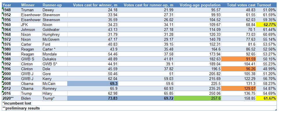
If Biden does indeed go on to win the US presidential race of 2020, his winning record would be just about average among all other US presidents since WW2.
Almost 74m Americans voted for Biden – the highest votes cast for a president ever (first number column in the table below). We should celebrate that but we should also put it in the context of the overall statistics.
The incumbent president, Trump, won the second highest vote count ever, after Biden (second column), so more votes than the winner of any of the other presidential races before. The third highest absolute votes won by a president was Obama’s in his first term in 2008.
The above comparison should be put into the context of the American voting age population increasing naturally over the years (third column). In addition, total votes cast also tends to rise. But not necessarily, the latter may not keep up at the same pace of increase as voting age population – voter turnout decreases – or it may indeed go down in absolute terms – as it happened during the elections in 1988, 1996 and 2012 (foutyh column). This year’s election indeed had one of the highest turnouts of any election after WW2 (came second only to JFK-Nixon in 1960 – fifth column).
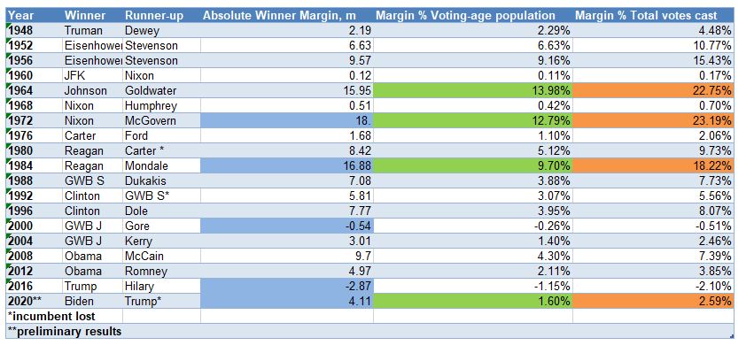
One way to account for the bias of naturally increasing absolute numbers is to take the difference between winner’s and runner-up’s votes = the winner’s margin. At around 4m, Biden’s margin is actually not that high: it is 12th out of 19 US presidential elections post WW2 – not that great (first number column below). Note that Trump’s win over Hilary Clinton had the worst absolute margin (negative) ever. Nixon in 1972 had the highest absolute margin of any US President, followed by Reagan in 1984. Most of us remember the contested election in 2000 between Bush Jnr and Gore (also negative margin), but I personally was surprised to find out that JFK in 1960 barely defeated Nixon.
Still even a winner’s margin carries a bit of bias of large numbers. So, next we calibrated it against voting age population (second column) and total votes cast (third column). Biden’s lead over Trump slumps one spot (from above) to 13th . The best winner’s margin still goes to Nixon in 1972 (using voting age population) and Johnson in 1964 (using total votes cast). Reagan in 1984 maintains third place in both cases.
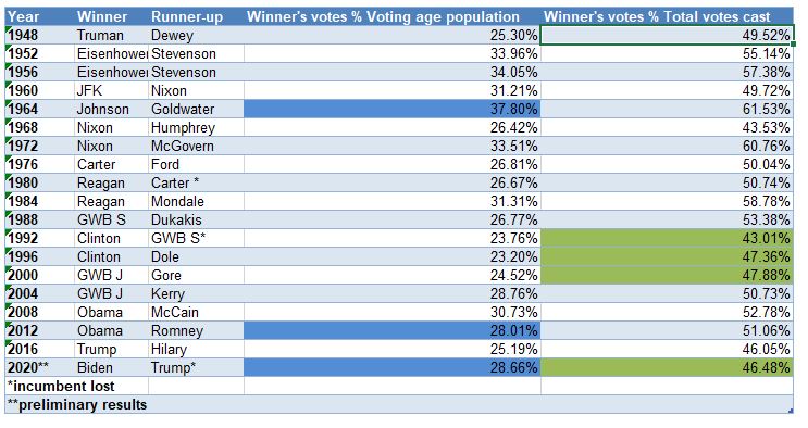
How popular was really Biden relative to all other presidential winners? That record 74m votes cast looks just about average if we take into consideration either voting age population or total votes cast – Biden comes in the middle of all US Presidents after WW2. That was not surprising for me (he did get just marginally higher votes than Obama though). It was not surprising that Johnson got the top spot as well, as we got a hint above. What was surprising is how unpopular Clinton was (during both terms). Trump and Bush Jnr bring up the rear here.
Despite all the euphoria you may see in the media about Biden’s most likely presidential win in 2020, he not only underperformed pollsters’ forecasts and peoples’ expectations but, so far, even the hard results give him a mediocre ranking among all presidents’ post WW2.
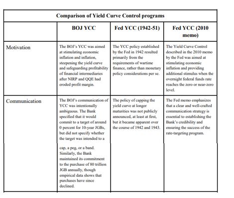
Yield Curve Control (YCC) or Yield Curve Targeting (YCT) – going forward, unless quoted, I will use YCC – is the latest unconventional tool in the modern central bank monetary arsenal. It was first used in 1942 by the Fed, and more recently, by BOJ in 2016, and RBA this year. YCC was first considered in the USA after the 2008 financial crisis, and again after the Covid crisis this year.
There is very little reason for the Fed to adopt YCC in the current environment given no pressure on the yield curve and government finances. On the other hand, there are other, better, tools to stimulate the economy and allow inflation to stay high. If it were eventually to adopt YCC, it is the long-end of the yield curve which will benefit the most from it.
YCC Options
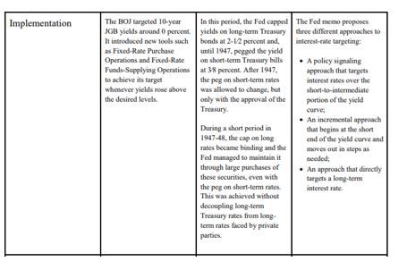
In a 2010 memo, the Fed discussed “strategies for targeting intermediate- and long-term interest rates when short-term interest rates are at the zero bound”. The memo breaks down the choice of YCC into two possibilities:
targeting horizon: which yields along the curve should be capped; and
“hard” vs. “soft” targets: the former would require the Fed to keep yields at a specific level all the time, while under the latter, yields would be adjusted on a periodic basis.
In addition, the memo lists three different implementation methods:
policy signaling approach: keep all short-term yields, in the time frame during which the Fed plans not to raise rates, at the same level as the Fed’s target rate (Fed funds, IOER, etc.);
incremental approach: start with capping the very short-end rate and progressively move forward as needed; and
long-term approach: cap immediately the long-end of the curve.
During the Covid crisis in 2020, there was a very extensive discussion on YCC at the June FOMC meeting, according to the minutes. In fact, there was a whole section on it, going though the other current and past experiences of YCC and listing the pros and cons. While the 2010 memo had zero effect on market sentiment, investors took this most recent development very positively. However, the market was ostensibly disappointed after the release of the July minutes, where the Fed hinted that YCC might not be happening after all, at least for now:
“…many participants judged that yield caps and targets were not warranted in the current environment but should remain an option that the Committee could reassess in the future if circumstances changed markedly.”
Reality, however, is that the July 2020 minutes did not say anything that different from the June 2020 minutes. Here is the relevant quote from the latter:
“…many participants remarked that, as long as the Committee’s forward guidance remained credible on its own, it was not clear that there would be a need for the Committee to reinforce its forward guidance with the adoption of a YCT policy.”
Compare to this quote from the July FOMC minutes:
“Of those participants who discussed this option, most judged that yield caps and targets would likely provide only modest benefits in the current environment, as the Committee’s forward guidance regarding the path of the federal funds rate already appeared highly credible and longer-term interest rates were already low.”
Despite these mentions of YCC by the Fed in its latest FOMC meetings, unlike 2010, we know very little this time about the Fed’s intentions how to structure and implement YCC, if needed. The Jackson Hole meeting revealed some of the main conclusions of the FOMC’s review of monetary policy strategy, tools, and communications practices, especially on average inflation targeting (AIT) but there was no light shed on what the Fed is thinking about YCC.
Taking the example of Japan, YCC is a natural extension of BOJ monetary policy: QE (quantitative easing: start in 1997, but officially only in 2001), QQE (quantitative and qualitative easing: stat 2013), QQE+NIRP (negative interest rate policy: start January, 2016), QQE+YCC (start September, 2016). In effect, BOJ moved from targeting the 0/N rate (QE) to targeting quantity of money (monetary base in QQE), to a mixture of quantity and O/N (QQE+NIRP) to a mixture of quantity and short and medium-term rates (QQE+YYC, in reality, even though the quantity is still there, the focus is more on the rates)
RBA took a short cut, skipped QQE+NIRP and went straight to QQE+YCC, targeting only the 3yr rate. According to the June FOMC minutes, see above, it looks like the Fed might also skip, at least, NIRP:
“…survey respondents attached very little probability to the possibility of negative policy rates.”
In addition, it seems the Fed is more inclined to look at capping short-term yields:
“A couple of participants remarked that an appropriately designed YCT policy that focused on the short-to-medium part of the yield curve could serve as a powerful commitment device for the Committee.”
While capping long-term yields could result in some negative externalities:
“Some of these participants also noted that longer-term yields are importantly influenced by factors such as longer-run inflation expectations and the longer-run neutral real interest rate and that changes in these factors or difficulties in estimating them could result in the central bank inadvertently setting yield caps or targets at inappropriate levels.”
YCC can be implemented in different formats and its goals can also differ.
The original YCC in the 1940s USA was all about helping the Treasury fund its large war budget deficit. Frankly, this ‘should’ be the main reason YCC is implemented. Indeed, it was exactly in this light that Bernanke suggested YCC is an option in our more modern times in his famous speech in 2001, “Deflation: make sure it does not happen here”:
“…a pledge by the Fed to keep the Treasury’s borrowing costs low, as would be the case under my preferred alternative of fixing portions of the Treasury yield curve, might increase the willingness of the fiscal authorities to cut taxes.”
The point is, if the goal was to stimulate the economy, push the inflation rate up and the unemployment rate down, forward guidance (which is what QQE is) and possibly NIRP (not applicable for every country though) are better options (see quotes above from the June/July FOMC minutes).
YCC is the option to use only once the economy has picked up and inflation is on the way up but years of QE has left the government debt stock elevated to the point that even a marginal rise in interest rates would be deflationary and push the economy back to where it started. In other words, YCC is giving the chance for the Treasury to work out its heavy debt load. Most likely, this would be happening at the expense of a short-term rise in inflation over and beyond what is originally considered prudent but on a long-enough time frame, average inflation would still be within those ‘normal’ limits, as long as the central bank remains credible, of course. Again, the post WW2 YCC should be a good reference point for such a scenario.
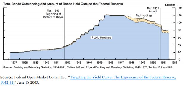
The Original YCC
The initial proposal to peg the US Treasury yield curve was first presented at the June 1941 FOMC meeting by Emanuel Goldenweiser, director of the Division of Research and Studies.
“That a definite rate be established for long term Treasury offerings, with the understanding that it is the policy of the Government not to advance this rate during the emergency. The rate suggested is 2 1/2 per cent. When the public is assured that the rate will not rise, prospective investors will realize that there is nothing to gain by waiting, and a flow into Government securities of funds that have been and will become available for investment may be confidently expected.”
The emergency hereby mentioned was, of course, WW2. The war started in September 1939 and by late 1940, Britain was running out of money to pay for equipment. In a speech on October 30, 1940, President Roosevelt first promised Britain every possible assistance even though Britain lacked the financial resources to pay. The Lend-Lease Act, passed by Congress in March 1941, eventually signalled that it would finance whatever Britain required. US direct involvement in WW2 after the bombing of Pearl Harbour ensured the country, itself, would have to spend heavily in the war effort.
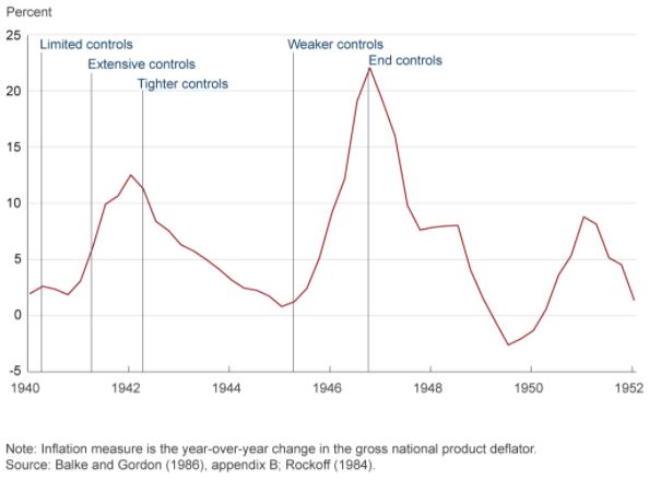
That was the context of the YCC which followed in 1942. In addition, US economic circumstances leading to the decision to peg the US Treasury curve were actually not that different to today. The US banking system was flush with liquidity on the back of large gold inflows, inflation was around 2% and the shape of the yield curve (the very front end) was not that dissimilar: the front end was around 0%, the 5yr around 65bps, and the long bond at 2.5%. With the start of the war, inflation picked up but there were price controls put in place which limited its rise. Government debt to GDP, however, was actually much lower than today and it got to present levels only by the end of the war.
By the time the actual peg went in place, the curve had steepened, especially the 10yr had gone to 2% as inflation really accelerated. Inflation eventually reached a staggering 12.5% in 1942 at which point even more price controls were imposed.
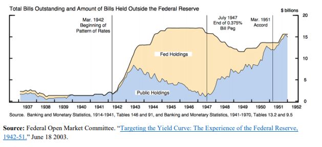
Some FOMC members at that time regarded such a steep yield curve as inconsistent with the policy objectives (keeping inflation under control in the context of the US Treasury issuance program) and insisted on a horizontal structure of managing the curve. And that is in spite of the fact that the decision to peg interest rates was never officially announced. In fact, US Treasury Secretary, Henry Morgenthau’s preference was for a continuation of what today we regard as quantitative easing (QE), i.e. Fed using a quantity rather than rates target.
Under the peg, the Fed, instead, had to buy whatever the private sector sells as long as yields were above the stipulated levels. Naturally, investors were riding the positively sloped yield curve, selling the front end and buying the long end. The Fed was forced to accumulate a lot of T-Bills as a result.
However, its holdings of coupons were never that large.
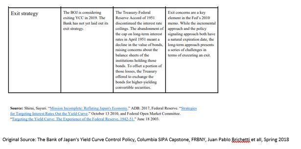
With the end of the war, inflation started picking up again and the Fed eventually took off the yield peg in the front end in July 1947. The peg in the long end stayed until the March 1951 US Treasury Accord. By that time, US public debt to GDP had shrunk back to 73% from more than 100% at the end WW2.
The 1951 Fed-Treasury Accord did not completely end Fed’s management of the yield curve, however. Fed’s new chairman, Willian Martin, wanted to confine market operations in the front end of the curve only, insisting that this will eventually also affect the long end. This ‘bills only’ policy lasted until 1961 and it provided a turn in how the Fed views its involvement in the US Treasury market: from helping the Treasury finance the government’s debt to a more traditional approach to monetary policy focusing on price stability and employment.
Even that was not the end of Fed’s direct involvement. From 1961 till 1975, the Fed engaged in the so called, ‘even keel’ operations. Under these, the Fed supplied reserves and refrained from any policy decisions just before US Treasury auctions and even immediately after (until the time primary dealers were able to sell their inventory to the private sector).
The set-up for YCC in the 1940s has many similarities not only with present day USA but also with Japan, where public debt to GDP at 250% is even higher that US at its peak. However, as discussed below, the rationale for YCC in Japan, is nevertheless different.
YCC in Japan
With QQE starting in April 2013, BOJ indicated it would be buying 60-70Tn Yen of assets per year. On JGBs, the plan was to slowly lengthen the duration to flatten the curve until inflation surpassed 2%. This was an upgrade from the previous inflation target range of 1-2%. BOJ also added an estimated time target of when it expected that to occur (initially 2015). For all intends and purposes, this was QE plus forward guidance, plus average inflation targeting in one.
A substantial reduction in the price of oil and a consumption tax hike in April 2014 exacerbated the dis-inflationary environment and forced BOJ to increase the annual purchases to 80Tn Yen later that year, extend duration (up to 40 years, average duration moved from 3 years to 7 years) and initiate ETFs and J-REITs purchases. In the meantime, the monetary base and the balance sheet were exploding, latter reaching almost 100% GDP. In effect, through QQE, BOJ moved from targeting the uncollateralized O/N rate to targeting the monetary base.
By 2015, these efforts by BOJ seemed to have worked. Inflation rose from -0.6% in 2013 to 1.2%, unemployment went down. However, subsequent decline in inflation to 0.5% in 2016 threw some doubt over the efficacy of these monetary policy efforts. By then, BOJ holdings of JGBs were approaching 50% of the overall market, contributing to declining market liquidity. 10yr JGB had gone from 75bps to almost 0%. They eventually broke the zero-bound after the BOJ initiated QQE+NIRP by lowering the marginal rate on excess reserves to -0.1% from 0.1%.
The practical consequences of QE+NIRP was a push up of the duration and risk curve (into sub-debt, credit card loans, equities, etc.) and out of the country into international assets. As banks’ JGB holdings gradually dwindled, banks had trouble finding assets for collateral purposes, a fact which, together with the flat yield curve interfered with the monetary transmission mechanism. Eventually, BOJ was buying more and more JGBs from pension funds and insurance companies. As these financial entities don’t have an account at the BOJ, it was banks’ deposits which were increasing. MMFs funds decision to stop taking in more deposits after NIRP, moved even more money into the banking system which further lowered their profitability.
Unlike US, where a large majority of financial assets are owned by other entities, Japan has a bank-based financial system. Even though NIRP did trigger the “loss reversal rate” (loss of bank profits below a certain level of interest rates, causes tighter lending conditions), reality was that only a very small portion of the banks’ deposits, about 4%, i.e. the so-called policy rate balance, were charged the negative rate. Majority were still charged at the 0.1%, about 80%, or so-called basic balances at the BOJ. The rest were charged 0%.
But the effect on the banks was highly uneven. Regional banks suffered more as big banks could find higher yields abroad, for example. So, despite best efforts by BOJ to help the banks with the tiering system, overall bank profitability still fell.
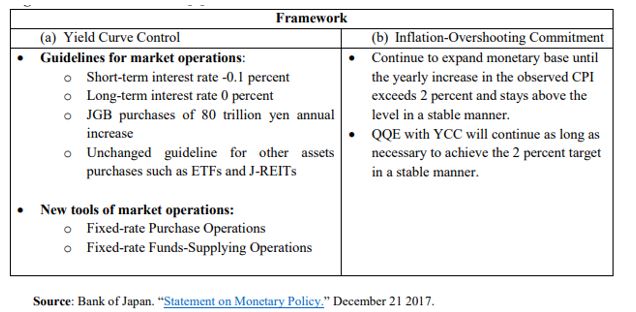
This was the context for YCC which Japan launched in September 2016. The economy was still in need for more stimulus but the way BOJ was providing it, didn’t work, and, if anything, worsened matters as the flat yield curve hindered the monetary transmission mechanism, and the negative interest rate worsened Japanese banks’ profitability. BOJ need to slow down its purchases of JGBs, and thus lower balance sheet growth. The way it was planning to do this was to move away from a quantity target back to an interest rate target with the novelty of adding a long-end one.
In addition to YCC, BOJ provided more clarity to its inflation targeting framework: it added an inflation overshooting commitment. This meant that inflation had to surpass 2% for some time so that average inflation rises to 2%. This brought it even closer to how AIT in the US is supposed to work.
YCC also resulted in a de facto BOJ balance sheet tapering – annual purchases went from 80Tn Yen in 2014 to eventually 16Tn Yen in 2019 – as BOJ didn’t have to interfere as much to keep interest rates within their targets. This was despite the fact that BOJ never actually changed its quantity target, which actually did create a lot of confusion – in March this year, the central bank even scrapped the upper limit on annual purchases. But there was no practical doubt that BOJ had moved on from a quantity to a rates target.
Despite the fact that YCC was initiated to steepen the yield curve, BOJ never really had to do anything in that regard. BOJ interventions were done through two tools: 1) fixed rate purchase operations and 2) fixed rate funds supply operations. The former was used only to bring 10yr JGBs below 10bps.
Benefits and Disadvantages of YCC
Historical analysis shows that a credible central bank can indeed control nominal interest rates. However, by default, it is fully in charge, strictly speaking, only of interest rates ceilings (bond vigilantes are indeed only a gold standard phenomenon; they are redundant in a free floating, irredeemable money monetary system). That is notwithstanding side effects such as higher inflation – which indeed might be one of the goals – or weaker currency.
Interest rate floors are a lot more difficult to control, as to do that, the central bank must be in possession of fixed income assets for sale. Central bank balance sheets may not have a higher bound, but they do have a lower band. When BoJ set on the steepen the yield curve, it indeed opened itself to such a risk, but it did have a very large balance sheet at the time (luckily it never had to go through selling JGBs). In theory a central bank can get around that problem by enlisting the help of the Treasury which can issue more bonds as the yield target breaks that lower bound limit. But then again, there might be negative side effects, such as deflation and a higher debt burden, which this time would be going against said goals.
When it comes to real yields, things get more complicated as inflation is added to the variables that need to be controlled. Historical experience suggests that structural shifts in inflation expectations are more likely to follow rather than lead spot inflation. Very generally speaking, it is a lot easier for a credible central bank to control an inflation ceiling than an inflation floor for somewhat similar reasons (see above). It seems that for a central bank to be able to control the floors of either real or nominal yields, it has to become ‘incredible’ (pun intended)!
Using these conclusions above, it seems to me that there is little upside to resort to YCC, if the goal was just to push inflation up. YCC is very much a complementary tool in that respect. However, YCC can be very effective in allowing inflation to go up alongside helping the Treasury fund. It is very much the main tool here.
One of the challenges of YCC is to keep the central bank balance sheet from expanding too much. Unlike limited QE, there is indeed a risk of it having to purchase large quantities of bonds to keep the interest rate ceilings. There is also the question of exit. Unlike QE which simply smoothed the yield curve, YCC provides a hard ceiling and thus the possibility of a large break higher in yields once the controls are lifted.
What Should the Fed Do?
The fact there was no specific feature on YCC at the Jackson Hole meeting this year (going by the first day of the meeting at this point), makes me think that this is not a monetary policy tool which is high on Fed’s agenda at the moment. Fed is more inclined to first try AIT and more direct forward guidance, as indeed Japan did pre-YCC. However, judging from the June 2020 FOMC minutes, if YCC were to be implemented, it would be on the short-end of the US treasury market, following the Australian model:
“Among the three episodes discussed in the staff presentation, participants generally saw the Australian experience as most relevant for current circumstances in the United States.”
The Australian model though combines YCC with a calendar-based forward guidance. It is not clear how that will work if the Fed adopts an outcome-based forward guidance first, as this is what is favored currently by most FOMC participants.
Also, the Fed must be careful as to exactly what shape yield curve it wants to eventually have. The 1940s YCC flattened the curve, while both Japan and Australia YCC steepened it. The US yield curve is currently flatter than the 1940s US curve but steeper than either Japanese or Australian one at the time YCC was announced. Going for the Australian example of pegging the front end, it will most likely steepen the curve as it did in Australia.
Prior to Jackson Hole, the OIS curve was indicating that there would be no rate hikes in the next 5 years. Post, market is not 100% sure, which means chairman Powel communication was not so clear. The 5y5y forward, which is probably the best proxy of the Fed’s terminal rate is still around 65bps: the curve is well anchored all the way to 10yr which is a great outcome given the massive supply of US Treasuries.
How much benefit would the curve get from pegging any yields up to 10 year? I don’t think a lot. It is the 30 year that the Fed might consider pegging eventually; below 1.5% today, it is still relatively low. The 30-year Treasury is where really proper market demand and supply meet and it thus becomes the focal point for the monetary – fiscal interplay.
If the Fed is planning to do YCC, it should peg the 30-year US Treasury, just like it did in the 1940s. For everything else, the Fed has better tools at its disposal.
“For example, it is habitually assumed that whenever there is a greater amount of money in the country, or in existence, a rise of prices must necessarily follow. But this is by no means an inevitable consequence. In no commodity is it the quantity in existence, but the quantity offered for sale, that determines the value. Whatever may be the quantity of money in the country, only that part of it will affect prices, which goes into the market commodities, and is there actually exchanged against goods. Whatever increases the amount of this portion of the money in the country, tends to raise prices. But money hoarded does not act on prices. Money kept in reserve by individuals to meet contingencies which do not occur, does not act on prices. The money in the coffers of the Bank, or retained as a reserve by private bankers, does not act on prices until drawn out, nor even then unless drawn out to be expended in commodities.”
John Stuart Mill, Book III, Chapter VIII, Par.17, p.20
In his latest Global Strategy Weekly, Albert Edwards explains why he thinks the surge in the money supply is deflationary. As usual he is going against the consensus here even though he gives credit to people like Russell Napier who correctly identifies the changing nature of US money supply but concludes that this is highly inflationary. I think Albert is right for the wrong reasons, and Russell is wrong for the right reasons.
Albert Edwards is right when he says that ‘despite massive stimulus, deflation will nimble on for a while yet until capacity constraints become binding further down the road’ (emphasis mine). Yet in his view, deflation will persist because of keeping zombie companies alive by cheap credit. While, I have no doubt that this is invariably true, its effect on the deflation-inflation dynamics is weak because credit creation is now a much smaller part of the money supply than in the past.
Which is where Russell Napier comes in. He is right in his view that ‘politicians have gained control of money supply’ but wrong to believe that this will inevitably cause a rapid rise in inflation unless, indeed, capacity does become binding.
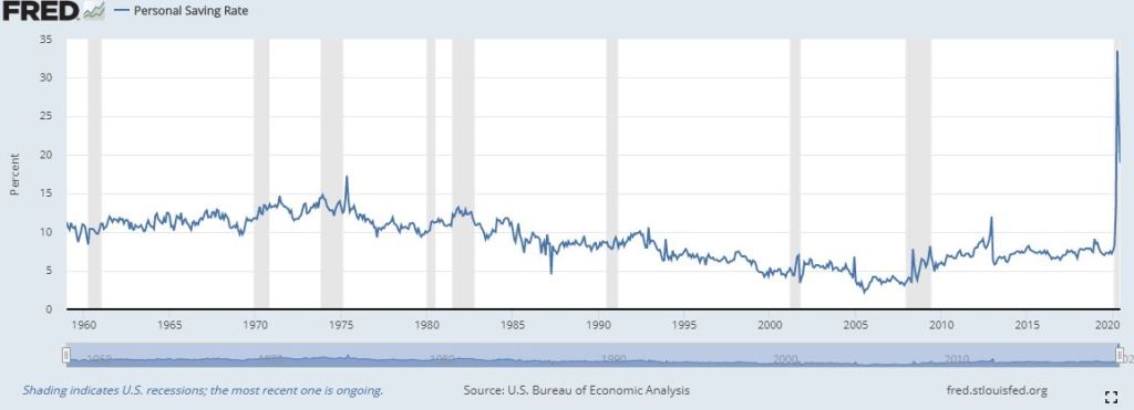
Reality is that money supply is now turned around on its head. While in the past, pre-2008, the delta of money supply consisted mostly of loans, after 2008 and during QE 1,2,3, it moved to loans plus QE-generated deposits. During the Covid crisis, it shifted further away from loans by adding even Government-generated deposits to the QE-time mix.
It is ironic that we had to go through QE, when the power of loan creation on money supply started to wane, for us to truly acknowledge their significance in the process of money creation in the first place. Loans create deposits – yes. But under QE, if Fed buys from a non-bank, the proceeds go in a deposit at a bank without the corresponding increase in loans. If it buys from a bank, reserves at the Fed go up.
Source: FRB H.8
Things get more complicated when the government hands out free cash as it also goes on a deposit (Government-generated deposits) with no corresponding loan creation.
Source: FRED, FRB H.8
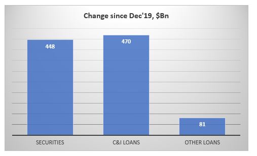
Of those bank credits, actually, only about half are loans, the other half are securities. So, in fact loans have created only about 1/6 of the money supply YTD (would be even less if measured after the Fed/Treasury initiated their programs in March).
Source: FRB H.8
What about inflation? Difficult to see how this massive rise of money supply can produce any meaningful push in inflation given that the majority of that cash is simply being saved/invested in the market rather than consumed.
Moreover, this crisis is hitting the service sector much more than any other crisis in the past. And unlike the manufacturing sector, which tends to be more cyclical, this decline in services may be structural as the virus changes our consumer preferences in general, but also in light of the new social distancing requirements. Some of these services are never coming back. This is deflationary, or at minimum it is dis-inflationary overall for the economy.
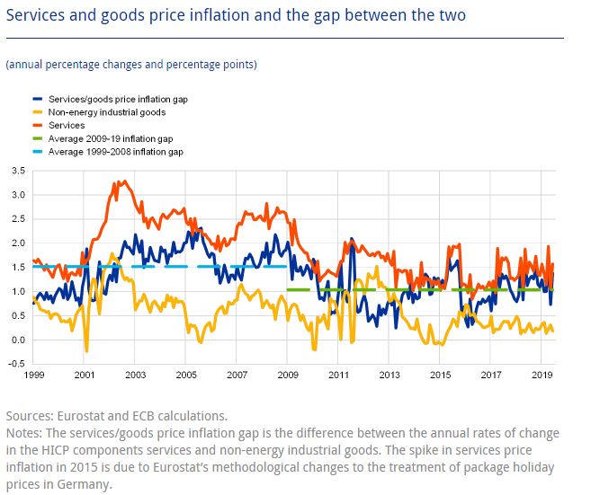
Services price inflation tends to be much higher than manufacturing price inflation. This paper from the ECB has documented that this is a feature for both EU and US economy and has been prevalent for the past 20 years.
However, as the paper demonstrates, the gap between the services and good price inflation has been narrowing recently, starting with the 2008 crisis. I believe that after the Covid crisis, the gap may even disappear completely.
For a sustained rise in inflation, we need a ‘permanent’ rise in free government handouts as that would increase the chance of some of it eventually hitting the real economy. Reality is that, even if this happens, the output gap is so big that inflation may take a lot longer to materialize than people expect. However, anything that shrinks the supply side of the economy (supply chains breakdown, regulations, natural disasters, social disorder, etc.) would have a much bigger and direct effect on inflation.
Bottom line is, as the speed of technological advances accelerates, and with no barriers to that, inflation in the 21st century becomes much more a supply-side than a demand-side (monetary) phenomenon.
When we talk about the European Union, we often lament that there are no fiscal transfers from the ‘rich countries of the North’ to the ‘poor countries of the South’, assuming that indeed this is so. But is this really so, and how have things changed since the inception of the EUR?
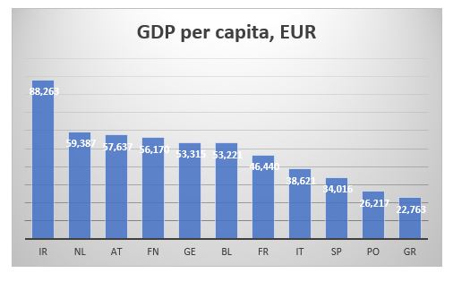
To measure wealth across countries, economists normally use GDP per capita. This is how some of the major EU countries rank according to this measure.
More or less, as expected, the bottom is taken by the four Mediterranean countries, while the north and core are at the top. However, GDP is a flow variable, measuring how much economic activity was created during a specific year. It tells us nothing about pre-existing wealth or, in fact, current debts.
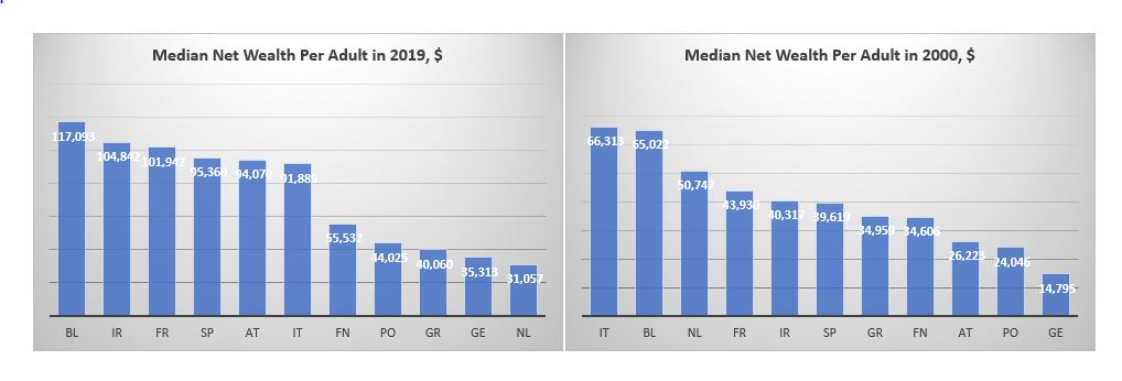
A much better measure to use for that purpose, would be CSFB data for net wealth per adult. CSFB publishes two sets of data: mean and median net wealth per adult. Here is the data for the same set of countries as above.
The two data sets give a slightly different view. Looking at the mean net wealth, the bottom three countries in 2000, Finland, Greece and Portugal, are still the bottom three countries in 2019, though in slightly different order. The Netherlands was the wealthiest country in both 2000 and 2019. However, the top three in 2000 was also comprised by Italy and Belgium, while in 2019, they were replaced by France and Austria.
According to median net wealth, however, two things stand out. First, the Netherlands was top three in 2000 but last in 2019 (the data for the Netherlands does look strange; the median net wealth collapses after 2011; I wonder if it is a question of CSFB changing something in their model). Second, Italy was top in 2000 but right in the middle of the rankings in 2019.
The other striking takeaway is that whether we look at mean or median net wealth, Germany is not that rich at all: it is much closer to the bottom of both sets of data. What about the North vs South divide? Portugal and Greece do seem poor but Span and Italy are more often seen in the top half of the rankings than in the bottom.
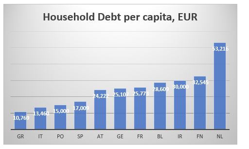
Part of the confusion when it comes to classification between the ‘rich’ North and the ‘poor’ South comes from looking only at the asset side of household balance sheets. Using BIS data for household debt and World Bank population statistics we can also calculate household debt per capita for each of these countries. This is the ranking according to this measure (the lower debt per capita the better).
The Mediterranean countries are better off than the core and the north as they have much less household debt per capita. This might be almost counterintuitive: the more assets one has, the more liabilities, they might also have.
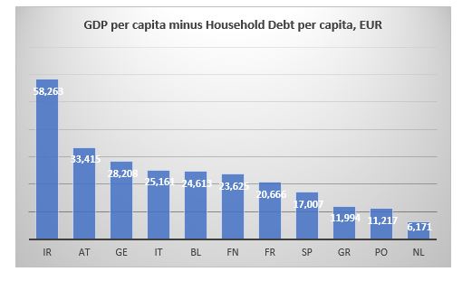
We can also cross check the CSFB data above by combining the GDP per capita and the household debt per capita data to arrive at an approximation of a net wealth per capita. As discussed, we have to bear in mind that GDP is a flow variable, while debt is a stock variable, so we are not comparing exactly apples to apples. Here is the ranking according to the difference between GDP and Debt per capita.
The Netherlands is bottom just like in the median net wealth data from CSFB. Portugal and Greece bring up the rear which is also consistent with previous findings. The top three are slightly different. Ireland is top here and was second in the median net wealth data from CSFB. But here Germany is third while it was more towards the bottom in the previous case.
And here is the ranking according to ratio of household debt to GDP to capita ratio.
The Netherlands is bottom again, with Portugal and Finland bringing up the rear, so, similar to the CSFB data. The top is a bit more mixed but Ireland still figures in both sets of data.
Bottom line is that there is a much less clear differentiation between the North and the South when it comes to net wealth per adult/capita than what we tend to assume.
How have some of the other major countries fared?
Mean wealth (top table below) in the US is almost twice as big as the average mean wealth of these European countries, but median US wealth (bottom table) is less than that respective average. Japan’s median wealth has barely risen from 2000 (at least compared to any of the other countries shown here) but it is almost twice as big as US’. The median Brit is richer than the average median European but only marginally so compared to the Spanish or Italian. Finally, despite its phenomenal growth since 2000, China is still twice less rich that Greece, which is the ‘poorest’ of the European countries above.
As if rates going negative was not enough of a wake-up call that what we are dealing with is something else, something which no one alive has experienced: a build-up of private debt and inequality of extraordinary proportions which completely clogs the monetary transmission as well as the income generation mechanism. And no, classical fiscal policy is not going to be a solution either – as if years of Japan trying and failing was not obvious enough either.
But the most pathetic thing is that we are now going to fight a pandemic virus with the same tools which have so far totally failed to revive our economies. If the latter was indeed a failure, this virus episode is going to be a fiasco. If no growth could be ‘forgiven’, ‘dead bodies’ borders on criminal.
Here is why. The narrative that we are soon going to reach a peak in infections in the West following a similar pattern in China is based on the wrong interpretation of the data, and if we do not change our attitude, the virus will overwhelm us. China managed to contain the infectious spread precisely and exclusively because of the hyper-restrictive measures that were applied there. Not because of the (warm) weather, and not because of any intrinsic features of the virus itself, and not because it provided any extraordinary liquidity (it did not), and not because it cut rates (it actually did, but only by 10bps). In short, the R0 in China was dragged down by force. Only Italy in the West is actually taking such draconian measures to fight the virus.
Any comparisons to any other known viruses, present or past, is futile. We simply don’t know. What if we loosen the measures (watch out China here) and the R0 jumps back up? Until we have a vaccine or at least we get the number of infected people below some kind of threshold, anything is possible. So, don’t be fooled by the complacency of the 0.00whatever number of ‘deaths to infected’. It does not matter because the number you need to be worried about is the hospital beds per population: look at those numbers in US/UK (around 3 per 1,000 people), and compare to Japan/Korea (around 12 per 1,000 people). What happens if the infection rate speeds up and the hospitalization rate jumps up? Our health system will collapse.
UK released its Coronavirus action plan today. It’s a grim reading. Widespread transmission, which is highly likely, could take two or three months to peak. Up to one fifth of the workforce could be off work at the same time. These are not just numbers pulled out of a hat but based on actual math because scientist can monitor these things just as they can monitor the weather (and they have become quite good at the latter). And here, again, China is ahead of us because it already has at its disposal a vast reservoir of all kinds of public data, available for immediate analysis and to people in power who can make decisions and act fast, vert fast. Compare to the situation in the West where data is mostly scattered and in private companies’ hands. US seems to be the most vulnerable country in the West, not just because of its questionable leadership in general and Trump’s chaotic response to the virus so far, but also because of its public health system set-up, limiting testing and treating of patients.
Which really brings me to the issue at hand when it comes to the reaction in the markets.
The Coronavirus only reinforces what is primarily shaping to be a US equity crisis, at its worst, because of the forces (high valuation, passive, ETF, short vol., etc.) which were in place even before. This is unlikely to morph into a credit crisis because of policy support.
Therefore, if you have to place your bet on a short, it would be equities over credit. My point is not that credit will be immune but that if the crisis evolves further, it will be more like dotcom than GFC. Credit and equity crises follow each other: dotcom was preceded by S&L and followed by GFC.
And from an economics standpoint, the corona virus is, equally, only reinforcing the de-globalization trend which, one could say, started with the decision to brexit in 2016. The two decades of globalization, beginning with China’s WTO acceptance in 2001, were beneficial to the USD especially against EM, and US equities overall. Ironically, globalization has not been that kind to commodity prices partially because of the strong dollar post 2008, but also because of the strong disinflationary trend which has persisted throughout.
So, if all this is about to reverse and the Coronavirus was just the feather that finally broke globalization’s back, then it stands to reason to bet on the next cycle being the opposite of what we had so far: weaker USD, higher inflation, higher commodities, US equities underperformance.
Following up on the ‘easy’ question of what to expect the effect of the Corona Virus will be in the long term, here is trying to answer the more difficult question what will happen to the markets in the short-to-medium term.
Coming up from the fact that this was the steepest 6-day stock market decline of this magnitude ever (and notwithstanding that this was preceded by a quite unprecedented market rise), there are two options for what is likely to happen next week:
During the weekend, the number of Corona Virus (CV) cases in the West shoots up (situation starts to deteriorate rapidly) which causes central banks (CB) to react (as per ECB, Fed comments on Friday) -> markets bounce.
CV news over the weekend is calm, which further reinforces the narrative of ‘this too shall pass’: It took China a month or so, but now it is recovering -> markets rally.
While it is probably obvious that one should sell into the bounce under Option 1, I would argue that one should sell also under Option 2 because the policy response, we have seen so far from authorities in the West, and especially in the US, is largely inferior to that in China in terms of testing, quarantining and treating CV patients. So, either the situation in the US will take much longer than China to improve with obviously bigger economic and, probably more importantly, political consequences, or to get out of hand with devastating consequences.
It will take longer for investors to see how hollow the narrative under Option 2 is than how desperately inadequate the CB action under Option 1 is. Therefore, markets will stay bid for longer under Option 2.
The first caveat is that if under Option 1 CBs do nothing, markets may continue to sell off next week but I don’t think the price action will be anything that bad as this week as the narrative under Option 2 is developing independently.
The second caveat is that I will start to believe the Option 2 narrative as well but only if the US starts testing, quarantining, treating people in earnest. However, the window of opportunity for that is narrowing rapidly.
What’s the medium-term game plan?
I am coming from the point of view that economically we are about to experience primarily a ‘permanent-ish’ supply shock, and, only secondary, a temporary demand shock. From a market point of view, I believe this is largely an equity worry first, and, perhaps, a credit worry second.
Even if we Option 2 above plays out and the whole world recovers from CV within the next month, this virus scare would only reinforce the ongoing trend of deglobalization which started probably with Brexit and then Trump. The US-China trade war already got the ball rolling on companies starting to rethink their China operations. The shifting of global supply chains now will accelerate. But that takes time, there isn’t simply an ON/OFF switch which can be simply flicked. What this means is that global supply chains will stay clogged for a lot longer while that shift is being executed.
It’s been quite some since the global economy experienced a supply shock of such magnitude. Perhaps the 1970s oil crises, but they were temporary: the 1973 oil embargo also lasted about 6 months but the world was much less global back then. If it wasn’t for the reckless Fed response to the second oil crisis in 1979 on the back of the Iranian revolution (Volcker’s disastrous monetary experiment), there would have been perhaps less damage to economic growth. Indeed, while CBs can claim to know how to unclog monetary transmission lines, they do not have the tools to deal with supply shocks: all the Fed did in the early 1980s, when it allowed rates to rise to almost 20%, was kill demand.
CBs have learnt those lessons and are unlikely to repeat them. In fact, as discussed above, their reaction function is now the polar opposite. This is good news as it assures that demand does not crater, however, it sadly does not mean that it allows it to grow. That is why I think we could get the temporary demand pullback. But that holds mostly for the US, and perhaps UK, where more orthodox economic thinking and rigid political structures still prevail.
In Asia, and to a certain extent in Europe, I suspect the CV crisis to finally usher in some unorthodox fiscal policy in supporting directly households’ purchasing power in the form of government monetary handouts. We have already seen that in Hong Kong and Singapore. Though temporary at the moment, not really qualifying as helicopter money, I would not be surprised if they become more permanent if the situation requires (and to eventually morph into UBI). I fully expect China to follow that same path.
In Europe, such direct fiscal policy action is less likely but I would not be surprised if the ECB comes up with an equivalent plan under its own monetary policy rules using tiered negative rates and the banking system as the transmission mechanism – a kind of stealth fiscal transfer to EU households similar in spirit to Target2 which is the equivalent for EU governments (Eric Lonergan has done some excellent work on this idea).
That is where my belief that, at worst, we experience only a temporary demand drop globally, comes from, although a much more ‘permanent’ in US than anywhere else. If that indeed plays out like that, one is supposed to stay underweight US equities against RoW equities – but especially against China – basically a reversal of the decades long trend we have had until now. Also, a general equity underweight vs commodities. Within the commodities sector, I would focus on longs in WTI (shale and Middle East disruptions) and softs (food essentials, looming crop failures across Central Asia, Middle East and Africa on the back of the looming locust invasion).
Finally, on the FX side, stay underweight the USD against the EUR on narrowing rate differentials and against commodity currencies as per above.
The more medium outlook really has to do with whether the specialness of US equities will persist and whether the passive investing trend will continue. Despite, in fact, perhaps because of the selloff last week, market commentators have continued to reinforce the idea of the futility of trying to time market gyrations and the superiority of staying always invested (there are too many examples, but see here, here, and here). This all makes sense and we have the data historically, on a long enough time frame, to prove it. However, this holds mostly for US stocks which have outperformed all other major stocks markets around the world. And that is despite lower (and negative) rates in Europe and Japan where, in addition, CBs have also been buying corporate assets direct (bonds by ECB, bonds and equities by BOJ).
Which begs the question what makes US stocks so special? Is it the preeminent position the US holds in the world as a whole? The largest economy in the world? The most innovative companies? The shareholders’ primacy doctrine and the share buybacks which it enshrines? One of the lowest corporate tax rates for the largest market cap companies, net of tax havens?…
I don’t know what is the exact reason for this occurrence but in the spirit of ‘past performance is not guarantee for future success’s it is prudent when we invest to keep in mind that there are a lot of shifting sands at the moment which may invalidate any of the reasons cited above: from China’s advance in both economic size, geopolitical (and military) importance, and technological prowess (5G, digitalization) to potential regulatory changes (started with banking – Basel, possibly moving to technology – monopoly, data ownership, privacy, market access – share buybacks, and taxation – larger US government budgets bring corporate tax havens into the focus).
The same holds true for the passive investing trend. History (again, in the US mostly) is on its side in terms of superiority of returns. Low volatility and low rates, have been an essential part of reinforcing this trend. Will the CV and US probably inadequate response to it change that? For the moment, the market still believes in V-shaped recoveries because even the dotcom bust and the 2008 financial crisis, to a certain extent, have been such. But markets don’t always go up. In the past it had taken decades for even the US stock market to better its previous peaks. In other countries, like Japan, for example, the stock market is still below its previous set in 1990.
While the Fed has indeed said it stands ready to lower rates if the situation with the CV deteriorates, it is not certain how central bankers will respond if an unexpected burst of inflation comes about on the back of the supply shock (and if the 1980s is any sign, not too well indeed). Even without a spike in US interest rates, a 20-30 VIX investing environment, instead of the prevailing 10-20 for most of the post 2009 period, brought about by pulling some of the foundational reasons for the specialness of US equities out, may cause a rethink of the passive trend.
The market has been predicting the coming collapse of China ever since it joined the WTO in the early 2000s and people started paying attention to it*. The logic being, with the collapse of the Soviet Union in 1989, China would be next: the free market must surely assure the best societal outcome. But with the re-emergence of China thereafter, and, especially, that it is still ‘going strong’ now, on top of the slowdown (‘secular stagnation’ or whatever you want to call it) of the developed world, I think the verdict of what the best model of resource optimization is, is still out.
The Soviet models of resource optimization in the 1960s and 1970s were very sophisticated for their time (and even ours): In the late 1950s, Kitov proposed the first ever national computer network for civilians; in the early 1960s, Kantorovich invented linear programming (and got the Nobel prize in Economics); shortly after Glushkov introduced cybernetics.
Kitov’s idea was for civilian organizations to use functioning military computer ‘complexes’ for economic planning (whenever the latter are idle, for example during the night). Kantorovich brought in linear programming which substantially improved the efficiency of some industries (he is the central character in a very well written book about the Soviet planning system called ‘Red Plenty’). Glushkov combined these two ideas and his OGAS (The All-State Automated System for the Gathering and Processing of Information for the Accounting, Planning and Governance of the National Economy) was intended to become a real-time, decentralized, computer network of Soviet factories. The idea was very similar to a version of today’s permissioned blockchain: the central computer in Moscow would grant authorizations but users could then contact each other without going through Moscow.
The Soviet planning system failed not necessarily because it would not work (limited, though, as it was in terms of computational power and availability of data) but because of politics: Khruschev, who had taken over after WW2 and denounced the brutality of Stalin, was ousted by Brezhnev. The early researchers were pushed aside (in fact, those Brezhnev years were characterized by fierce competition among scientists for preferential political treatment). One could say, the Soviets’ model of resource optimization failed because it was not socialist enough (compared to how the Internet took root in the US on the back of well-regulated state funding and collaboration amongst researchers). In other words, the 1970s Soviet Union was a political rather than a technical failure.
I should know, I guess. I grew up in one of the Soviet satellites. My father was in charge of a Glushkov-style information data centre within a large fertilizer factory. When we were kids, we used to build paper houses with the square punched cards he would sometimes bring home from work. Later on, when I became a teenager, my father would teach computer programming as an extracurricular activity in my local school (I never learned how to program – I preferred to spend my time playing Pacman instead!). At that time, Bulgaria used to produce the PC, Pravetz (a clone of Apple II), which was instrumental in the economy of all the countries within the Soviet sphere of influence.
By the time I was graduating from high school, though, things had begun deteriorating significantly: even though everyone had a job, ‘no one was working’ and there was not much to buy as the shops lacked even the essentials. Upon graduation and shortly after the ‘Iron Curtain’ fell down, I left to study in America.
Eventually, I ended up spending much more time in the ‘trial and error’ economy of the developed world, working at the heart of the ‘free market’ in New York and London. I am certainly not unique in that sense as many people have done this exact same thing, but it does allow me to make an observation about the merits of the planned economy vs the free market.
My point is the following. The problem of the planned economy was not so much technical misallocation of resources, but, ironically, one of proper distribution of the surplus. The Soviet system did not exactly create an extreme inequality, like the one there is now in America (even though some people at the top of the Party did get exorbitantly rich) but instead of using the production surplus for the betterment of the life of the population NOW, politicians continued to be obsessed with further re-investment for the future. There was perhaps a justification for that but it was purely ideological, a military industrial competition with America, nothing to do with reality on the ground.
So, while the Soviets were perhaps winning that competition (Sputnik, Gagarin, Mir, etc.), the plight of the common people was not getting better. And while they ‘couldn’t’ simply go in the street and protest or vote the ruling party out, they expressed their anger by simply pretending to work. Of course, that eventually hurt them more as the surplus naturally started dwindling, productivity collapsed and the quality of the finished products deteriorated. The question is, given a chance, would the planned optimization process have worked? If Glushkov’s decentralized network with minimum input from humans had been developed further, would the outcome now be different?
There is a lesson here somewhere not just for China but also America. Both have created massive surpluses using the two opposing optimization solutions. And both are running the risk of squandering that surplus, in a similar fashion to the Soviet Union of the 1980s, if they don’t start distributing it to the population at large for general consumption. In both cases this means transferring more income to ‘labour’: in China away from the state (corporates), in America away from the capital (owners). But because the differences at the core of the two systems, it is easier for China to do this consciously; in America, the optimization process of the free market, unfortunately, ensures that the capital vs labour inequality goes further to the extreme.
So, can China then pull it off?
While I am not privy to the intricacies of their ‘planned’ resource optimization model, just like in the Soviet Union, the risks there seem more political. But after an additional 50 years of Moore’s law providing computational power and after digitalization has allowed access to data the Soviets could never even dream of, China stands a much better chance of making it than the Soviet Union ever did.
*I actually use “The Coming Collapse of China”, Gordon Chang, 2001 as a reference point
According to John Authers at Bloomberg, data from CrossBorder Capital, going back to January 1969, shows that we have been recently experiencing Fed’s greatest liquidity boost ever. I have no reason to doubt CrossBorder Capital or their proprietary model of measuring liquidity. But there are many ways of defining, as well as measuring, liquidity. So, I decided to simply look at what exactly the Fed has done since it started expanding its balance sheet in September last year.
Source: FRB H41, beyondoverton
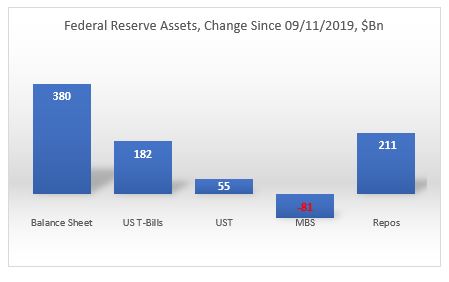
Fed has indeed been doing more than $100Bn worth of repo operations on a daily basis recently, but those operations are only temporary, i.e. they can not be taken cumulatively in ascertaining the effect on liquidity. In fact, the Fed’s balance sheet has increased by $380Bn, and only 55% of which came from O/N and term repo operations ($211Bn). The other 45% came from asset purchases. On the asset purchases, the Fed bought mostly T-Bills ($182Bn), some coupons ($55Bn) while letting its MBS portfolio slowly mature (-$81Bn).
However, not all of that increase went towards interbank liquidity. In fact, only about 50% of that increase ($198Bn) went towards bank deposits. The TGA account increased by $167Bn; that drained liquidity. Reverse repos decreased by $20Bn (FRP by $17Bn and others by $3Bn), which added liquidity. Finally, $37Bn went towards the natural increase in currency in circulation.
Source: FRB H41, beyondoverton
Fed actually started increasing its T-Bill and UST portfolio already in mid-August, three weeks before the repo spike. Part of that increase went towards MBS maturities. But by the end of August, Fed’s balance sheet had already started growing. By the third week of September, also the combined assets portfolio (T-Bills, USTs, MBS) started growing as well, even though MBS continued to decrease on a net basis.
Source: FRB H41, beyondoverton
Fed’s repo operations started the second week of September. They reached a high of $256Bn in the last week of December. At the moment they are at the same level where they were in the first week of December ($211Bn).
Source: FRB H41, beyondoverton
On the liability side, the TGA account actually bottomed out two weeks before the Fed started buying USTs and T-Bills, while the FRP account topped the week the Fed started the repo operations. Could it be a coincidence? I don’t think so. My guess is that the Fed knew exactly what was going on and took precautions on time (we might find eventually if it did indeed nudge foreigners to start moving funds away from FRP).
Source: FRB H41, beyondoverton
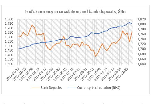
Finally, while currency in circulation naturally increases with time, bank deposits also bottomed out the week the Fed started the repo operations in September, but strangely enough, they topped the first week of December (for the time being).
Source: FRB H41, beyondoverton
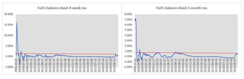
So, while the Fed’s liquidity injection since last September was substantial relative to both the decrease in liquidity before that (starting in 2018 when the decrease in the Fed’s balance sheet became consistent) and, to a certain extent, since the end of the 2008 financial crisis, it is difficult to make a claim that this is the greatest liquidity boost ever. The charts below show the 4-week and 3-month moving average percentage change in the Fed’s balance sheet. The 4-week change in September was indeed the largest boost in liquidity since the immediate aftermath of the 2008 financial crisis. The 3-month change though isn’t.
Source: FRB H41, beyondoverton
The Fed pumped more liquidity in the system during the European debt crisis. In the first four months of 2013, not only the growth rate of the Fed’s balance sheet was higher than in the last four months now since September 2019, but also the absolute increase in Fed’s assets and US bank deposits. Moreover, there were no equivalent increases in either the TGA or the FRP accounts.
Final note, if the first week of January is any guide, it might be that a big chunk of the Fed’s balance sheet increase might be behind us, if only for the time being. Fed’s balance sheet decreased by $24Bn, which is the largest absolute decrease since the last week of July 2019, i.e. before the start of the most recent boost in liquidity. I actually do expect the Fed’s balance sheet to keep growing but at a much smaller scale and mostly through asset purchases rather than repos.