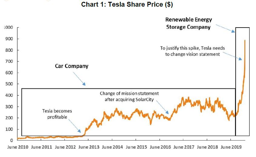
Tags
European leaders keep talking about energy security, but it seems to me that, when it comes to Russian energy, it was them who took their countries from a state of relative stability to a state of extreme uncertainty. Two main points I want to make: 1) I am not aware of Russia ever unilaterally stopping or even threatening to stop the flow of energy to Europe before the Ukraine war started this year; 2) even if it was smart to diversify their energy sources (and let’s face it, even for Germany only about 50% of the imported gas was from Russia before the war), it would have been smarter to do it gradually, having secured plentiful of alternative resources in advance.
Two further points. First, it seems to me that there was a lot of scaremongering about the relative dependence of Europe on Russian energy in the last few years, which obviously subsequently affected European energy policy making. There was only one instance when Russian gas did not reach Europe. In January 2009, Russian gas flow through Ukraine was halted for about two weeks because Ukrainian gas company Naftogaz had refused to pay its debt to Gazprom for previous supplies. In addition, there were many documented instances when Ukraine was siphoning transit Russian gas thus threatening European deliveries.
The 2009 gas standoff between Russia and Ukraine was the main reason Russia decided to redirect its gas supplies to Europe away from Ukraine – that was the beginning of the Nord Stream 1 (NS1) and South Stream gas projects. There is a good paper which you can read here https://www.oxfordenergy.org/publications/the-russo-ukrainian-gas-dispute-of-january-2009-a-comprehensive-assessment/ documenting all this.
Here are the important bits:
- “If the Nord Stream and South Stream had been in place on 1 January [2009], the consequences of this dispute would barely have registered in the majority of European countries”;
- “One certain outcome of the dispute is that there will be an even greater determination from Gazprom – and perhaps also from European countries – to build the North Stream and South Stream transit avoidance pipelines, which will impact heavily on Ukraine’s gas transit business.”;
- “The problem for the Ukrainian side is that this crisis will have hardened Russian determination to greatly reduce its transit dependence by building the Nord Stream and South Stream pipelines; a development with serious financial consequences for a country in an already difficult economic situation.”
You see, Russia was working to increase European energy security, NOT to decrease it!
Of course, there are many other reasons for the construction of NS1/NS2 and South Stream/Turk Stream. On the technical side, the pipelines through Ukraine/Poland were very old, built during Soviet times, subject to constant leaks and reliant on Ukrainian/Polish work for maintenance (hardly forthcoming in those days). On the financial side, it was not in the interest of Russia to continue paying transit fees if there were an alternative. Finally, the new gas transit lines allowed for a higher capacity, a more direct and faster route to the main European market. Better, cheaper, faster, more -> European energy security was getting enhanced!
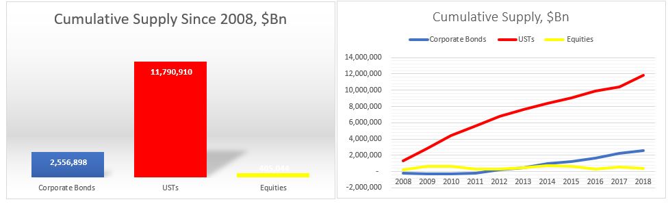
So, the second point I wanted to make is, with that background in mind, it should become clearer the incentives behind some of the events that subsequently transpired. Obviously, Ukraine and Poland had the most to lose if the new gas transit lines to Europe became a reality. It was not just the transit fees but the fact that both countries were in an extremely privilege situation when it comes to their own energy security – before the 2009 Russia-Ukraine gas conflict, they were paying the cheapest gas prices in all of Europe (they actually continued to pay low prices even after – pretty much until NS1 went on line – you can see the data here https://ec.europa.eu/eurostat/web/energy/data/database ).
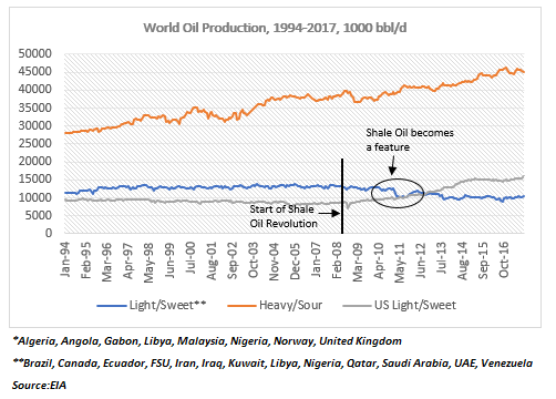
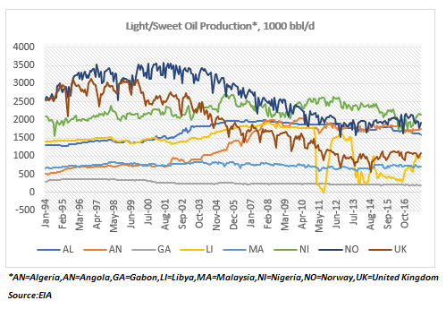
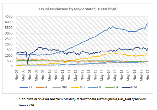
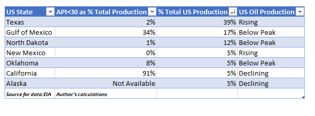
But there was one other important event which took place at about the same time: the oil and gas shale revolution in the USA. All of a sudden, both Poland and Ukraine had a potential way out of the energy conundrum they put themselves in, and that outcome actually worked wonderfully also for the US, which saw an opportunity in selling energy to Europe. It should be no surprise that Poland and Ukraine have also seen more shale exploration than any other European country (brownie points for remembering that Hunter Biden went on the board of the Ukrainian gas company Burisma in … yes, 2014, AFTER the Maidan revolution of the same year).
US focus on Ukraine, however, dates further back than that. Here is some more context.
Ukraine was always seen as an integral part of NATO#s expansion eastward. I actually think the 2004 Orange Revolution was the turning point in everything that followed thereafter. In 2004 the Ukraine Presidential election was initially won by the pro-Russian candidate Viktor Yanukovych, but after protests for seeming fraud in the election process (some would claim that these were supported by the US, see this https://carnegieendowment.org/2019/06/20/thirty-years-of-u.s.-policy-toward-russia-can-vicious-circle-be-broken-pub-79323 and this https://www.youtube.com/watch?v=QeLu_yyz3tc – both are reputable US sources), the victory was given to the pro-West candidate, Viktor Yushchenko. Yushchenko’s wife worked in the White House in the Office of Public Liaison during the administration of Ronald Reagan, in the U.S. Treasury in the executive secretary’s office during the administration of George H. W. Bush and on the staff of the Joint Economic Committee of the United States Congress!
One of the things Yushchenko did, was rehabilitate Bandera as a national hero. One of the last things Petro Poroshenko did when leaving office in 2019 was to ban the use of the Russian language. The Ukraine-Russia ethnic split in the country was obvious and it was profound. It dates back to the Holodomor in the 1930s and is probably the basis for the hatred some Ukrainians still harbour towards Russia. Anyway, that is another story.
So, Yanukovych wins back the Presidency in 2010, this time without a doubt, but the country is in dire straits economically. The financial package from the IMF is with draconian conditions, while that from the EU is not enough, so Yanukovych chooses the more generous financial offer from Russia eventually in 2014. What followed is the ‘Maidan’ when power reverted back to the pro-Western candidate, Yatsenyuk.
And, yes, not without some help, perhaps – Victoria Nuland, married to Robert Kagan one of the top neo-con founders of PNAC (project for the new American century – see this https://en.wikipedia.org/wiki/Project_for_the_New_American_Century ). In this story, she is famous for the “F..k the EU” expletive when she was discussing the structure of the new Ukrainian government with US ambassador to Ukraine, Geoffrey Pyatt (that was pre-Maidan) – see here https://www.nbcnews.com/video/audio-of-leaked-nuland-conversation-162208835907 . That was not Nuland’s first rodeo in Ukraine – she had been involved in Ukrainian politics for some time before, directing money in helping Ukraine move closer to the West (see here https://2009-2017.state.gov/p/eur/rls/rm/2013/dec/218804.htm ). Yatsenyuk immediately announces that Ukraine will seek entry into NATO and the country ends its ‘non-aligned’ status.
The Maidan narrative was that overthrowing the democratically elected government in 2014 was morally right. That’s fine, but why then, a free referendum in which Crimea overwhelmingly voted to cede from Ukraine and become part of Russia thereafter was illegal? Which auto-determinations should be allowed and which not? As if Russia would have realistically allowed its own Black Sea naval headquarters to be based in a country potentially part of NATO!? After Maidan, there was never going to be any solution to the fate of Eastern Ukraine without the Minsk Agreement which Ukraine never implemented even though it agreed to it.
The build-up to the current war started with Ukraine in March 2021 adopting a new military strategy by decree, in which one of the goals was the dis-occupation and re-integration of Crimea. In June 2021, NATO reiterated “the decision made at the 2008 Bucharest Summit that Ukraine will become a member of the Alliance with the Membership Action Plan (MAP) as an integral part of the process” (see here https://www.nato.int/cps/en/natohq/news_185000.htm) .
In November 2021, Putin declared that Ukraine’s acceptance into NATO constituted a red line, whose crossing would have grave consequences (he highlighted concerns about the potential arrival of long-range hypersonic missiles with the ability to reach Moscow in ‘five minutes’ – see the Cuban Crisis and the concept of nuclear primacy as part of PNAC above).
In December 2021, Russia officially asked for guarantees that NATO eastward expansion would stop, and if this was not given, Russia would not accept it (Putin: “there is nothing that is not clear about this”). In January 2022, Russia accused the US of provoking a war: “You are almost calling for this, you are waiting for it to happen, as if you want your words to become a reality” (Russian ambassador to UN).
In February 2022, Russia made its final appeal, “Do you understand that if Ukraine becomes part of NATO/EU and it seeks to take back Crimea, European countries will automatically enter a military conflict with Russia, in which there will be no winner?” (Putin, in address to nation). And then Russia asked for a written guarantee that Ukraine would not become part of NATO. This was Blinken’s response: “From our perspective, I can’t be clearer, NATO’s door is open, remains open, and that is our commitment.”
And just like in 1962, during the Cuban Crisis, when the US was left with no other option but to invade Cuba, Russia’s only remaining option was to enter Ukraine before the situation became even more serious. Unfortunately, unlike in 1962, diplomacy did not work this time.
It is amazing to me how Ukraine managed to ‘blackmail’ Europe when it comes to its energy policy. Hats off to the Americans who eventually simply took advantage of the situation allowing them to capture new energy and defence markets. Eventually, it all went pear shaped when European leaders decided to follow an (outdated) ideology (‘communism is the enemy’) to solve modern-day logistical and economic problems.