• About
  • BeyondOverton Travel
    • Silk Road (1): If Turkey is in crisis, it’s not obvious visiting it
    • Silk Road (2): Could beautiful nature and ancient history create a false sense of entitlement?
    • Silk Road (3): Fast Car
    • Silk Road (4):We took a bus ride to Iran
    • Silk Road (5): Border bothers
    • Silk Road (6): Chevrolet Land
    • Silk Road (7): Free-roaming camels and wild horses
    • Silk Road (8): China West to East
    • Silk Road (9): I have not told half of what I saw
  • BLOG
  • g88kboy Travel
    • On the Silk Road
    • Bulgaria : The Chicken crossed the Road
    • Turkey : The Country, not the Bird
    • Georgia on my Mind
    • Armenian Ayran
    • Iran – The Curious Land
    • An American in Azerbaijan
    • Uzbekistan: Golden Teeth and Neon Signs
    • Kazakhstan: Thirty Sweating Seniors
    • China Part One – Pandas Are Extinct
    • China Part Two: My TED Talk (Deep Analysis)
    • Phillipines – They Relax, I (pretend to😉) Study
    • Singapore: flashing trees and a torrent of tears
    • Malaysia: That ain’t no croc, it’s a log
    • Brunei: The Instinctive Fight for Superior Domination
    • Phillipines: Hello Friend Again
  • Outside the window
    • Bulgaria
    • Turkey
    • Georgia
    • Armenia
    • Iran
    • Azerbaijan
    • Uzbekistan
    • Kazakhstan

BeyondOverton

~ let's move this window

BeyondOverton

Monthly Archives: February 2018

Not all oil is ‘created equal’

28 Wednesday Feb 2018

Posted by beyondoverton in Energy

≈ Leave a comment

  • Not all oil is ‘created equal’: US WTI and European Brent are light and sweet, most of OPEC is heavy and sour, Russia’s is kind of in the middle. These distinction matter not only because of the different qualities, but more importantly, because of whether the oil is refinery-ready.
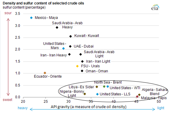
Diagram 1

  • Therefore, direct comparisons between OPEC and US Shale Oil, for example, is like comparing apples and oranges -> same category but very different at the same time. Instead, US Shale Oil’s direct competitors are the ones in the circle above (see also Chart 4, see below).
  • If we grossly oversimplify and break world oil production into two categories: Light/Sweet are all US competitors (circled above), with API>35, and Heavy/Sour are mostly OPEC/Russia/Canada with API<35, as per above diagram, this is how it would look over time.
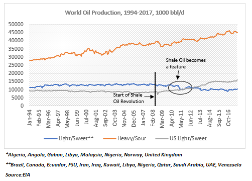
Chart 1

  • US’ main oil competition started reducing production at about the same time the US shale revolution first geared its head above the horizon post the 2008 financial crisis; then, as US shale production really took off in 2011-12, the rest of global Light/Sweet production dutifully collapsed.
  • Heavy/Sour Production is the dominant feature here, equal to 63% of total world oil production, vs 37% for Light/Sweet. However, it is off the peak reached in 2011 when US shale oil production really took off.

Chart 2

  • The recent rise of Light/Sweet oil production relative to Heavy/Sour is a combination of both OPEC cuts since November 2016 and a continuous in increase in US Shale Oil production. However, the increase in US Shale Oil since the 2008 financial crisis is more or less offset by the decrease in rest of the world Light/Sweet production.
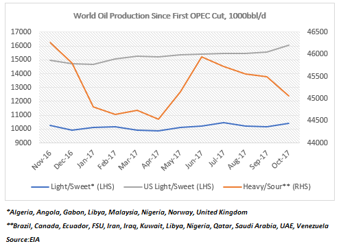
Chart 3

  • In fact, Norway peaked in the early 2000s; Nigeria: in mid-2000s; UK in the mid-1990s; Algeria, Angola et all, all peaked towards the late 2000s. But the one that really stands out is Libya: before it collapsed in 2011, Libya was one of the largest Light/Sweet oil producers.
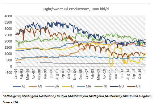
Chart 4

  • Because US used to import a lot of heavy OPEC oil in the past, most of US refineries are suited to low API oils. In fact, the average API of oil that enters US refineries is about 31. This is lower than European refineries, used mostly to Brent, with API of around 36.
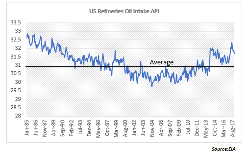
Chart 5

  • The problem is this adjustment is far from easy. Only a very small portion of US oil is refinery-ready. And that proportion is decreasing as more lighter shale oil is produced year after year: majority of US production is now in the 40-45 API range; only 13% is refinery-good.

Chart 6

  • So, US refineries need to keep importing more Heavy/Sour oil just so that they are able to refine the domestic shale oil. The other alternative is to export the crude shale oil directly to be refined abroad. But there are very few refineries even abroad that can accommodate Light/Sweet.
  • Why is US oil getting lighter and lighter? Because of shale oil and specifically because of Texas: it is the largest producer of US oil, a title it took over from the Gulf of Mexico in 2011 when US shale oil production took off.
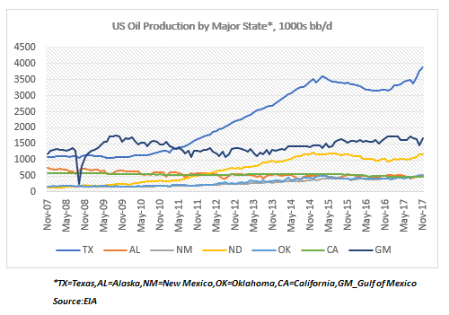
Chart 7

  • And Texas oil production continues to rise thanks to the Permian Basin: Eagle Ford is off the peak and barely rising. In fact, the Permian Basin and the Gulf of Mexico are now the only two major oil producing regions in the US really growing.

Chart 8

  • The problem with Texas oil production rising is that only 2% of it is refinery-ready. In fact, of the three largest oil producing regions in the US, two are below their peaks, and only one, Gulf of Mexico, has a low enough API to be refinery ready.
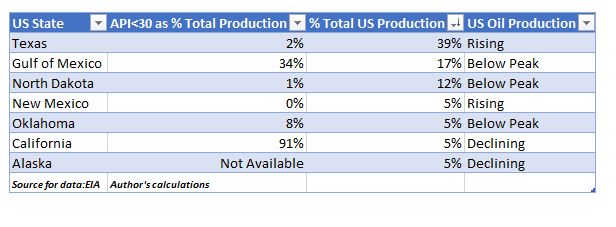
Table 1

  • New Mexico shale oil production is rising but none of it practically is refinery-ready; North Dakota and Oklahoma are below peak and only 1% and 8% of their oil, respectively, is refinery-ready; California and Alaska, which are producing more conventional oil, have been on a decline for a while.

Bottom line:

  1. US and OPEC are not really in competition because they produce completely different crude oils. Moreover, US refineries and a large number of other refineries around the world are more suited to OPEC oil than to US shale oil.
  2. US shale oil API is rising because the old shale oil wells are depleting much faster and the new ones, where the oil is even more difficult to reach, have a higher API->that will put further strain on US refineries (increased Heavy/Sour imports).

Chart 9

What happens when oil production in the Permian Basin also starts to decline?

How energy efficient is the US economy?

26 Monday Feb 2018

Posted by beyondoverton in Energy

≈ Leave a comment

  • How energy efficient is the US economy? At first glance – very: total energy consumption reached a high in 2007, before the financial crisis of 2008, and currently it is below even the pre-Dotcom crisis of 2000. GDP, on the other hand, is up 35% and 90%, respectively, since then.

Chart 1

  • However, we measure energy in energy units, BTUs, but we measure GDP in monetary units, USD. So, the picture changes if we account for the cost of energy indeed: as it rises above GDP (as during the 1970s oil crises, and post the 2008 financial crisis), the economy collapses; when it is lower (1990s), the economy prospers.

Chart 2

  • The energy ‘efficiency’ of the US economy may be just another way of looking at the increasing costs of energy. The economy is ultimately not just an energy system, but a surplus energy system, i.e. what matter is the net energy available: if it takes a lot more energy to extract the new energy, then a lot of that energy is wasted in the process (that is another way of saying that the energy return on energy invested, or EROI, is increasingly decreasing).

Diagram 1

  • Shouldn’t energy be part of the Production Function, Y(L,K)? What about n(et)E(nergy)? In other words, if it takes increasingly more energy to generate the energy needed for output to grow, then energy costs will also be rising and this may cause potential GDP (and productivity) to decrease.
  • In the past, energy consumption would dip after every single recession and subsequently rise, but that trend changed after the Dotcom bust and today we are still below those levels, 18 years ago. Yes, GDP is substantially higher, but GDP growth rate is also substantially lower (see Chart 1).
  • The fact that US has become a major producer of shale oil is not helping because there’s been no corresponding decline in the cost of energy. In fact, the opposite is true, as EROI of shale oil is much lower than conventional oil (see Diagram above). In addition, there are issues of transportation and refining.
  • Because shale oil is much lighter and thus not refinery-ready, oil prices may even have to rise further: the seemingly large oil glut we have had over the last year or so is masking the fact that shale oil cannot be currently so easily refined and prepared for consumption.
  • We can see this also in the data. Despite the rise in shale oil production, total fossil fuel consumption has actually gone done since 2000. While nuclear energy is unchanged, this has coincided with a surge in renewables energy consumption.

Chart 3

  • Digging deeper within fossil fuels, petroleum consumption is lower than the peak, pre the financial crisis in 2008, and, interestingly, lower than the peak in the late 1970s oil crisis. Similarly, for coal, where the decline post the financial crisis of 2008 is even more pronounced.

Chart 4

  • The oil vs. natural gas consumption going in the opposite direction has a lot to do with their diverging costs: on an energy equivalent basis, natural gas is currently much cheaper than oil.

Chart 5

  • The surge in renewables consumption has all to do with the rise in wind and, to some extent, solar. Biomass, which generally is the largest renewable consumed, has also gone up at the expense of hydro (2nd largest).

Chart 6

  • Renewables consumption rise started in the early 2000s, at the same time when fossil fuels consumption started to decline; again, diverging costs of the two have a lot to do with this phenomenon: since the 2000s, the cost of solar energy has collapsed by about 25x, the cost of wind energy has halved, while the cost of oil has more than doubled.
  • So, all this talk about shale making US energy independent, the question is at what cost? Technology is indeed making shale oil extraction possible, but it’s not like the cost of oil is going down (in fact it has gone up) =>Peak oil=Peak ‘cheap’/easily extractable oil (see Diagram 1 above, the newest forms of energy have also the lowest EROIs).
  • Aren’t we better off in the long run focusing on renewables, where technology is actually making energy costs go down, instead of flogging a dead horse in the name of an old paradigm of fossil fuel?
  • Finally, even if we assume that the US is indeed becoming more energy efficient, energy consumption per capita is still the highest in the world. In fact, 2x higher than Japan’s, which comes in second place.

Chart 7

Subscribe

  • Entries (RSS)
  • Comments (RSS)

Archives

  • January 2023
  • December 2022
  • November 2022
  • August 2022
  • February 2022
  • April 2021
  • November 2020
  • October 2020
  • September 2020
  • August 2020
  • July 2020
  • June 2020
  • May 2020
  • April 2020
  • March 2020
  • February 2020
  • January 2020
  • December 2019
  • November 2019
  • October 2019
  • May 2019
  • March 2019
  • February 2019
  • January 2019
  • December 2018
  • November 2018
  • October 2018
  • September 2018
  • August 2018
  • June 2018
  • May 2018
  • March 2018
  • February 2018
  • January 2018
  • November 2017
  • October 2017
  • September 2017
  • August 2017
  • July 2017
  • June 2017

Categories

  • AI
  • Asset Allocation
  • blockchain
  • China
  • De-urbanization
  • Debt
  • Decentralization
  • EM
  • Energy
  • Equity
  • FX
  • g88kboy
  • Monetary Policy
  • Politics
  • Questions
  • Quotes
  • The last man standing will laugh
  • Travel
  • UBI
  • Uncategorized
  • VR

Meta

  • Register
  • Log in

Blog at WordPress.com.

  • Follow Following
    • BeyondOverton
    • Join 73 other followers
    • Already have a WordPress.com account? Log in now.
    • BeyondOverton
    • Customize
    • Follow Following
    • Sign up
    • Log in
    • Report this content
    • View site in Reader
    • Manage subscriptions
    • Collapse this bar
 

Loading Comments...