• About
  • BeyondOverton Travel
    • Silk Road (1): If Turkey is in crisis, it’s not obvious visiting it
    • Silk Road (2): Could beautiful nature and ancient history create a false sense of entitlement?
    • Silk Road (3): Fast Car
    • Silk Road (4):We took a bus ride to Iran
    • Silk Road (5): Border bothers
    • Silk Road (6): Chevrolet Land
    • Silk Road (7): Free-roaming camels and wild horses
    • Silk Road (8): China West to East
    • Silk Road (9): I have not told half of what I saw
  • BLOG
  • g88kboy Travel
    • On the Silk Road
    • Bulgaria : The Chicken crossed the Road
    • Turkey : The Country, not the Bird
    • Georgia on my Mind
    • Armenian Ayran
    • Iran – The Curious Land
    • An American in Azerbaijan
    • Uzbekistan: Golden Teeth and Neon Signs
    • Kazakhstan: Thirty Sweating Seniors
    • China Part One – Pandas Are Extinct
    • China Part Two: My TED Talk (Deep Analysis)
    • Phillipines – They Relax, I (pretend to😉) Study
    • Singapore: flashing trees and a torrent of tears
    • Malaysia: That ain’t no croc, it’s a log
    • Brunei: The Instinctive Fight for Superior Domination
    • Phillipines: Hello Friend Again
  • Outside the window
    • Bulgaria
    • Turkey
    • Georgia
    • Armenia
    • Iran
    • Azerbaijan
    • Uzbekistan
    • Kazakhstan

BeyondOverton

~ let's move this window

BeyondOverton

Monthly Archives: May 2020

Mirror, mirror on the wall, who is the wealthiest of them all?

18 Monday May 2020

Posted by beyondoverton in Politics, Questions

≈ Leave a comment

When we talk about the European Union, we often lament that there are no fiscal transfers from the ‘rich countries of the North’ to the ‘poor countries of the South’, assuming that indeed this is so. But is this really so, and how have things changed since the inception of the EUR?

To measure wealth across countries, economists normally use GDP per capita. This is how some of the major EU countries rank according to this measure.


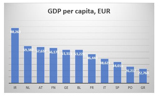
AT=Austria, BL=Belgium, FN=Finland, FR=France, GE=Germany, GR=Greece, IR=Ireland, IT=Italy, NL=Netherlands, PO=Portugal, SP=Spain

More or less, as expected, the bottom is taken by the four Mediterranean countries, while the north and core are at the top. However, GDP is a flow variable, measuring how much economic activity was created during a specific year. It tells us nothing about pre-existing wealth or, in fact, current debts.

A much better measure to use for that purpose, would be CSFB data for net wealth per adult. CSFB publishes two sets of data: mean and median net wealth per adult. Here is the data for the same set of countries as above.

The two data sets give a slightly different view. Looking at the mean net wealth, the bottom three countries in 2000, Finland, Greece and Portugal, are still the bottom three countries in 2019, though in slightly different order. The Netherlands was the wealthiest country in both 2000 and 2019. However, the top three in 2000 was also comprised by Italy and Belgium, while in 2019, they were replaced by France and Austria.

According to median net wealth, however, two things stand out. First, the Netherlands was top three in 2000 but last in 2019 (the data for the Netherlands does look strange; the median net wealth collapses after 2011; I wonder if it is a question of CSFB changing something in their model). Second, Italy was top in 2000 but right in the middle of the rankings in 2019.

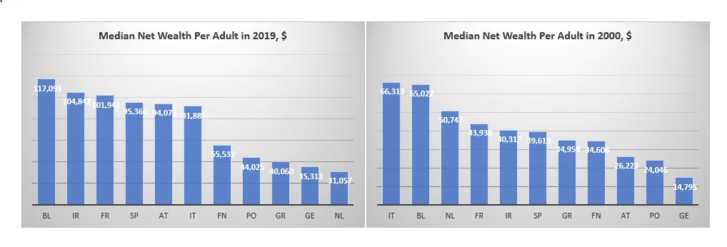
The other striking takeaway is that whether we look at mean or median net wealth, Germany is not that rich at all: it is much closer to the bottom of both sets of data. What about the North vs South divide? Portugal and Greece do seem poor but Span and Italy are more often seen in the top half of the rankings than in the bottom.

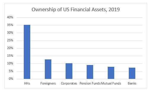
Part of the confusion when it comes to classification between the ‘rich’ North and the ‘poor’ South comes from looking only at the asset side of household balance sheets. Using BIS data for household debt and World Bank population statistics we can also calculate household debt per capita for each of these countries. This is the ranking according to this measure (the lower debt per capita the better).

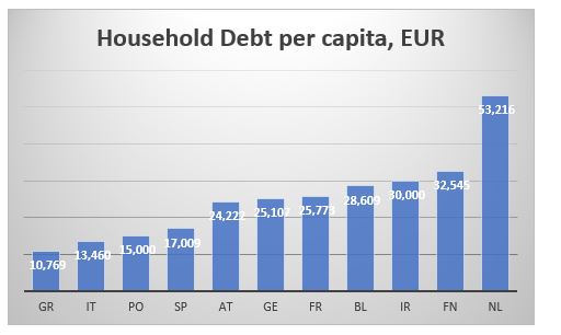
The Mediterranean countries are better off than the core and the north as they have much less household debt per capita. This might be almost counterintuitive: the more assets one has, the more liabilities, they might also have.

We can also cross check the CSFB data above by combining the GDP per capita and the household debt per capita data to arrive at an approximation of a net wealth per capita. As discussed, we have to bear in mind that GDP is a flow variable, while debt is a stock variable, so we are not comparing exactly apples to apples. Here is the ranking according to the difference between GDP and Debt per capita.

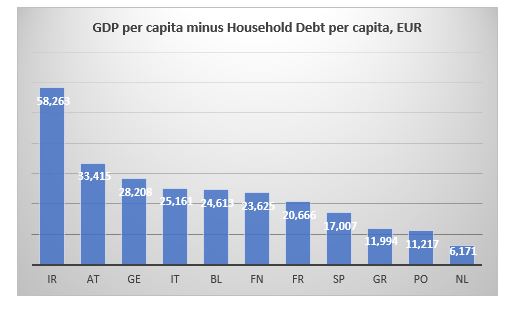
The Netherlands is bottom just like in the median net wealth data from CSFB. Portugal and Greece bring up the rear which is also consistent with previous findings. The top three are slightly different. Ireland is top here and was second in the median net wealth data from CSFB. But here Germany is third while it was more towards the bottom in the previous case.

And here is the ranking according to ratio of household debt to GDP to capita ratio.

The Netherlands is bottom again, with Portugal and Finland bringing up the rear, so, similar to the CSFB data. The top is a bit more mixed but Ireland still figures in both sets of data.

Bottom line is that there is a much less clear differentiation between the North and the South when it comes to net wealth per adult/capita than what we tend to assume.

How have some of the other major countries fared?

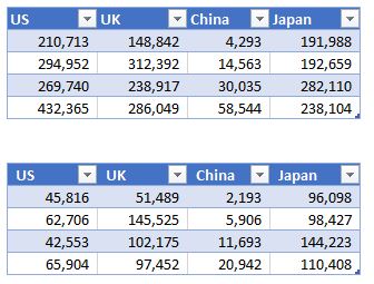
Mean wealth (top table below) in the US is almost twice as big as the average mean wealth of these European countries, but median US wealth (bottom table) is less than that respective average. Japan’s median wealth has barely risen from 2000 (at least compared to any of the other countries shown here) but it is almost twice as big as US’. The median Brit is richer than the average median European but only marginally so compared to the Spanish or Italian. Finally, despite its phenomenal growth since 2000, China is still twice less rich that Greece, which is the ‘poorest’ of the European countries above.

Will the US pull the plug on investing in China?

14 Thursday May 2020

Posted by beyondoverton in Asset Allocation, China

≈ Leave a comment

Tags

corona virus

It has been going on now for a year, at least: after stopping Chinese companies on several occasions from buying specific US assets, the US administration has been also looking into banning outward US investments in Chinese assets.

The fund in the spotlight is the Federal Government Thrift Savings Plan Fund (TSPF) – the largest defined contribution plan in the world with assets of about $558Bn. The assets are split in five core funds and one additional overlapping fund as following:

Of those above, it is the I Fund that is now in the spotlight. For the moment, it has no exposure to China as it is invested in MSCI ex US EAFE.

TSPF is an outlier amongst most large retirement plans that it still has no EM exposure. In June 2017, external consultants, Aon Hewitt, made a recommendation to the board to switch to MSCI ex US All Country which is a much broader index followed by all large retirement plans. One characteristic of this index is that it includes many EMs (and yes China). The board studied the proposal and made the decision to switch in November 2017 with a target for that sometime in 2019*.

As the US-China trade war was going in full swing, the threats of possible ramifications on US investments in China started coming in, and the I Fund never made that switch.

How big is this potential US investment?

The MSCI ex US All Country is still about 75% developed markets (DM). But China is about 11% weight (second largest now), which is rather big given the recent index inclusion (the weightings have increased progressively in the last two years). That means the I Fund would have between $6Bn exposure to Chinese equities.

Adding the L Fund exposure. The L Fund will have 9% in the I Fund (from 8% currently). Therefore, given the AUMs in each above, it will have between $1-2Bn Chinese equities exposure. So, total TSPF exposure will be max $8Bn. Note, however, the L Fund’s expected exposure going forward: projections are for a substantial reduction in the G Fund weights at the expense of all others. So, potentially the future Chinese exposure can grow substantially as also China’s weight in the MSCI ex US All Country index also grows.

What is that in the context of the big flow picture?

China is in the cross hairs of deglobalization which started before the Covid crisis, but now, that process is accelerating in direct proportion to the anger towards China amongst some of the major global players, especially the USA. In the USA, globalization coincided with financialization which promoted major capital inflows to offset the trade account outflows. Financialization is now on the wane in the USA (as per the regulations post 2008, and accelerated further post the Covid crisis), while on the rise in China (see flows below).

As the Chinese economy has been catching up to the US (and possibly the Covid crisis also accelerated this process as well), it is likely that we may see a reversal of some of these past flows, namely, a reduction in China’s current account surplus at the expense of net foreign inflows.

Equities

  • Last year passive index inflows in China A shares were $14Bn; total inflows were about $34Bn
  • Total foreign investment in Chinese A shares is about $284bn
  • Foreign equity inflows this year are still a positive $5Bn despite the Covid crisis: according to HSBC data, March recorded an outflow (largest ever) but all other months were inflows, with April inflow more or less cancelling the March outflow.

Fixed Income

  • Total foreign holdings are also around $283Bn, 70% of which are in GGBs.
  • Inflows into GGBs have been consistently positive since the index inclusion announcements last year and the year before.
  • According to Barclays, YTD net Inflows are at $17Bn (5x more than at same time last year) despite a net outflow in March (but that was only because of selling in NCDs).
  • Average monthly inflows in Chinese FI is about twice that in equities.

Domestic Flows

  • March registered the largest domestic outflow ($35Bn) of any month since the 2016 CNY crisis (largely due to southbound stock connect flow (mainland residents bought the largest amount of HK stocks on record).
  • According to HSBC, FX settlement data shows that, most likely, domestic corporates have actually been net sellers of foreign currency in Q1 this year. 

Economics

While Chinese exports are expected to decline going forward, in the short term, so are imports, especially after the collapse in oil prices. However, it is inevitable that if globalization does indeed start reversing, China’s current account will shrink and possibly go into a deficit. 

Conclusion

What happens to the overall flow dynamics then, really depends on whether foreigners continue to invest in Chinese assets (and expecting that domestic residents might look to diversify their portfolios abroad once the capital account is fully liberalized, if ever). A potential ban on US Federal Government investments in China might indeed be driven by short-term considerations and emotions following the Covid-19 pandemic developments, however, unless it is followed by also a ban encompassing all US private investment, it is unlikely to amount to anything positive for the US. Moreover, it could actually give the wrong signal to foreign investments in the US, that the administration is becoming not so ‘friendly’. That could spur an outflow of foreign money from US assets, something that I discussed at length here.

*See the memo from that meeting here: https://www.frtib.gov/MeetingMinutes/2017/2017Nov.pdf

Beware of foreigners bearing gifts

07 Thursday May 2020

Posted by beyondoverton in Asset Allocation, Equity

≈ 2 Comments

Tags

corporate bonds

There have been two dominant trends in the last four decades. The breakdown of the Bretton Woods Agreement in the early 1970s, the teachings of Milton Friedman, and the policies of Ronald Reagan, eventually ushered in the process of US financialization in the early 1980s. The burst of the Japan bubble in 1990, the Asian and EM financial crises of the mid-1990s, the dotcom bubble, and, finally, China’s entry into WTO in the early 2000s, brought in the era of globalization. This whole period has greatly benefited US, US financial assets and the US Dollar.

An unwind of these two trends of financialization and globalization is likely to have the opposite effect: causing US assets and the US dollar to underperform. From a pure flow perspective, going forward, foreigners are likely to invest less in the US, or may even start selling US assets outright. They are such a large player that their actions are bound to have a big effect on prices.  

Foreigners have played an increasingly bigger role in US financial markets. In terms of ownership of US financial assets, if they were an ‘entity’ on its own, they would be the second largest holder of US financial assets in the US, after US households.

Foreigners owned about 2% of all US financial assets between 1945 and the 1980s. That number doubled between 1980 and 1990 and then tripled between 1990 and 2019!

As of the end of 2019, there were a total of $271Tn US financial assets by market value. Non-financial entities owned the majority, $129Tn, followed by the financial sector, $108Tn, and foreigners $34Tn.

The financial crisis of 2008 ushered in a period of financial banking regulation (on the back of the US authorities’ bail-out), which has slowly started to dismantle some of the structures built in the previous period starting in the 1980s. The Covid-19 pandemic and the resulting government bailout of the whole US financial industry, this time, are likely to intensify this regulation and spread it more broadly across all financial entities. As a result of that, there have been already calls to rethink the concept of shareholders primacy which had been a bedrock of US capitalism since the 1980s.

In addition, the withdrawal of the UK from the EU in 2016, followed shortly by the start of a withdrawal of the US from global affairs with the election of Donald Trump, ushered in the beginning of the process of de-globalization. The US-China trade war gave a green light for many companies to start shifting global supply chains away from China. The Covid-19 pandemic intensified this process, but instead of seeking a new and more appropriate location, companies are now reconsidering whether it might make sense to onshore everything.

What we are seeing is the winding down of these two dominant trends of the last 40 years: financialization and globalization. The effects globally will be profound, but I believe US financial assets are the most at risk given that they benefited the most in the previous status quo.

De-financialization is likely to reduce shareholder pay-outs (both buybacks and dividends) which have been at the core of US equities returns over the years. The authorities are also likely to start looking into corporate tax havens as a source of government cash drain in light of ever-increasing deficits. As a result, and as I have written before, I expect US equities to have negative returns (as of end of 2019*) for the next 5 years at least.

De-globalization is likely to reduce the flow of US dollars globally. Foreigners will have fewer USD outright to invest in US assets. Those, which are in need to repay USD debt, may have to sell US assets to generate the USDs. Indeed, the USD may strengthen at first but as US assets start to under-perform, the selling by foreigners will gather speed causing both asset prices as well as the USD to weaken further.

For example, foreigners are the third largest player in US equities, owning more than $8Tn as of the end of 2019. See below table for some of the largest holders.

As a percentage of market value, foreigners’ holdings peaked in 2014, but they are still almost double the level of the early 1990s and more than triple the level of the early 1980s. Last year, foreigners sold the most equities ever. Incidentally, HHs which have been a consistent seller of equities in the past, but especially since 2008, bought the most ever. Pension Funds and Mutual Funds, though, continued selling.

Foreigners are the largest holder of US corporate bonds, owning almost $4Tn as of end of 2019, more than ¼ of the market.

As a percentage of market value, foreigners’ holdings peaked in 2017, but they are still more than double the level of the early 1990s and 8x the level of the early 1980s.

Foreigners are also the largest holders of USTs, owning almost $6.7Tn as of end of 2019, more than 40% of the overall market.

As a percentage of market value, foreigners’ holdings peaked in 2008, at 57%! At today’s level, they are still about double the levels of the early 1990s and early 1980s.

There is a big risk in all these markets if the trends of the last four decades start reversing. US authorities are very much aware of the large influence foreigners have in US markets. The Fed’s swap and repo lines are not extended abroad just for ‘charity’, but primarily to ‘protect’ US markets from forced foreign selling in case they cannot roll their USD funding.

The UST Treasury market seems to be the most at risk here given the mountain of supply coming this and next year (multiple times larger than the previous record supply in 2008 – but foreigners back then were on a buying spree). The risk is not that there won’t be buyers, eventually, of USTs as US private sector is running a surplus plus the Fed is buying by the boatload, but that the primary auctions may not run as smoothly.

It was for this reason, I believe, that the authorities exempted USTs from the SLR for large US banks at the beginning of April. If that were not done, PDs might have been totally overwhelmed at primary auctions given the increased supply size, the fact that the Fed can’t bid and if foreigners start take up less. It is not clear, still, even with the relaxed regulation, how the primary auctions will go this year. We have to wait and see.

*See ‘Stocks for the long-run: be prepared to wait’, at https://www.eri-c.com/news/380

**All data is from the Fed Flow of Funds data at https://www.federalreserve.gov/datadownload/Choose.aspx?rel=Z.1

Subscribe

  • Entries (RSS)
  • Comments (RSS)

Archives

  • January 2023
  • December 2022
  • November 2022
  • August 2022
  • February 2022
  • April 2021
  • November 2020
  • October 2020
  • September 2020
  • August 2020
  • July 2020
  • June 2020
  • May 2020
  • April 2020
  • March 2020
  • February 2020
  • January 2020
  • December 2019
  • November 2019
  • October 2019
  • May 2019
  • March 2019
  • February 2019
  • January 2019
  • December 2018
  • November 2018
  • October 2018
  • September 2018
  • August 2018
  • June 2018
  • May 2018
  • March 2018
  • February 2018
  • January 2018
  • November 2017
  • October 2017
  • September 2017
  • August 2017
  • July 2017
  • June 2017

Categories

  • AI
  • Asset Allocation
  • blockchain
  • China
  • De-urbanization
  • Debt
  • Decentralization
  • EM
  • Energy
  • Equity
  • FX
  • g88kboy
  • Monetary Policy
  • Politics
  • Questions
  • Quotes
  • The last man standing will laugh
  • Travel
  • UBI
  • Uncategorized
  • VR

Meta

  • Register
  • Log in

Blog at WordPress.com.

  • Follow Following
    • BeyondOverton
    • Join 73 other followers
    • Already have a WordPress.com account? Log in now.
    • BeyondOverton
    • Customize
    • Follow Following
    • Sign up
    • Log in
    • Report this content
    • View site in Reader
    • Manage subscriptions
    • Collapse this bar
 

Loading Comments...