The normal interest rate

Tags

,

What determines interest rates and how lower private sector profitability, changes in the institutional infrastructure governing our economies, major geopolitical conflicts, and climate change, could usher in a ‘sea change’ of higher interest rates[i].

The simplest possible explanation of what drives interest rates is the demand and supply of capital and its mirror image debt. I find this to be also the most relevant one.

There are many other variables that matter, which fall under the broad umbrella of economic activity. These factors determine the ability to pay/probability of default and may impose a certain ‘hurdle rate’ (inflation), but it is important to understand that they are a consideration of mostly the supply side of capital.

So, what is a ‘normal’ interest rate? Obviously, when capital is ‘scarce’ (relative to the demand for debt), as indeed for the majority of time of human existence and ‘capital markets’, creditors are ‘in charge’, nominal interest are high and real interest rates are positive. So, that is the norm. But in times of peace and prosperity, as during the time of Pax Britannica (most of the 19th century), and Pax Americana (since the 1980s, and particularly since the end of the Cold war) surplus capital accumulates which gradually pushes interest rates lower as the debtors are ‘in charge’. The norm then could be zero and even negative nominal interest rates.

While indeed the norm is for interest rates to be positive, there is no denying that if one were to fit a trend line of global interest rates in the last 5,000 years[ii], the line would be downward sloping. That should be highly intuitive as human society evolution brings longer lasting periods of peace and prosperity (the spikes higher in interest rates throughout the ages are characterised with times of calamities, like wars or natural disasters, which destroy capital).

What is the function which determines that outcome? The surplus capital inevitably creates a huge amount of debt. This stock of debt eventually rises to a point which makes the addition of more debt an ‘impossibility’. It is important to understand that this happens on the demand side, not on the supply side – it is current debt holders who find it prohibitive to add to their current stock of debt, in some cases, at any positive interest rates.

Richard Koo called this phenomenon a balance sheet recession when he analysed the behaviour of the private corporate sector in Japan after the 1990s collapse. We further saw this after the mortgage crisis in the US in 2008 when US households started deleveraging. Not surprisingly interest rates during that time gravitated towards 0%.

The importance of 0% and particularly negative interest rates is not only that this is where the demand of debt and supply of capital clears, but, more importantly from a ‘fundamental’ point of view, this is the point where the current stock of debt either stops growing (0%) or even starts to decrease (negative interest rates). Positive interest rates, ceteris paribus, on the other hand, have an almost in-built automated function which increases the stock of debt (in the case of refinancing, which happens all the time – rarely is debt repaid).

Because our monetary system is credit based, i.e., money creation is a function of debt origination and intermediation, this balance sheet recession, when the demand for credit from the private sector is low or non-existent, naturally pushes down economic activity, which, ceteris paribus, results in a low, and sometimes negative, rate of inflation.

So, you see, it is low interest rates which, in this case, determine the inflation rate. This comes against all mainstream economic thinking. I am sure, a lot of people, would find this crazy, moreover, because this is also what Turkish President Erdogan has claimed, and it is plain to see that he is ‘wrong’.

However, there is a reason ‘wrong’ above is in quotation marks. You see, this theory of low interest rates determining the rate of inflation, and not the other way around, holds under two very important conditions. First, and I already mentioned this, the monetary mechanism must be credit-based. This ensures that money creation is not interfered by an arbitrary centrally governed institution, like … the government, and is market-based, i.e., there is no excess money creation over and above economic activity.

In light of a long history of money waste, this sounds like a very reasonable set-up, except in the extreme cases when the stock of debt eventually piles up, pushing down the demand for more credit, slowing down money creation and thus economic activity. In times like these, it is the rate of money creation which determines and guides economic activity rather than the other way around (as it should be). Unless there is an artificial mechanism of debt reduction, like a debt jubilee, the market finds its own solution of zero or negative interest rates to resolve the issue.

And the second condition for the above theory to hold is the supply side of the economy must be stable. Don’t forget that inflation is also independently determined by what happens on the supply side: a sudden negative supply shock would push inflation higher. That the balance sheet recessions in Japan, and later on in the rest of the developed world, coincided with a positive supply shock accentuated its disinflationary impact.

To go back to Turkey, Erdogan’s monetary experiment is not working because 1) Turkey’s economy is not in a balance sheet recession (private sector debt is not big, and there is plenty of demand for credit), and 2) Turkey’s economy was hit by a large negative supply shock in the aftermath of the breakdown of global supply chains on the back of Covid/China tariffs, and, more particularly for Turkey being a large energy importer, in the aftermath of the Russian sanctions on global oil prices. A related third reason why low interest rates in Turkey have failed to push inflation lower is the fact that institutional trust is low. In other words, the low interest rates are not market-based, but government-based (market-based interest rates are in fact much higher).

What has happened in the developed world, on the other hand, is, since Covid not only the economies have experienced a massive negative supply shock, but also monetary creation, for a while (well, most of 2020-21) became central-government-based (in the form of huge household transfers). In other words, even though private debt levels remain excessive, their negative effect on economic activity has been offset by other forms of money creation. This not only managed to reverse the disinflationary trend from before, but, when combined with the negative supply shock, it provoked a powerful inflationary trend.

Going forward, unless there is a repeat of the central-government-based money creation experiment under Covid, the demand for credit, and thus the growth of money creation, will remain low, as private sector debt levels remain too high. This does not bide well for economic growth and is disinflationary by default. At the same time, however, the effects of the negative supply shock are likely to be longer lasting given that the reorganization of the global supply chains is still an ongoing process. This is inflationary by default – if that means also lower private sector profits, thus lower capital surpluses, then interest rates should continue to be elevated.

When it comes to the developed world the black swan here is an eventual outright debt reduction (debt jubilee) – the will have a corresponding effect of an artificial capital surplus reduction as well. Maybe this is counterintuitive, but if you have followed my reasoning up to here, that would mean higher interest rates going forward.

An alternative black swan is a direct capital surplus reduction, caused by either lower corporate profitability, lower asset prices, or indeed an artificial or natural calamity, like war or a natural disaster, which have the unfortunate ability to destroy capital. In that sense, it is uncanny that our present circumstances are characterised by a war in Europe, a potential war in Asia and the looming threat of climate change[iii].

Howard Marks certainly did not mean literal ‘sea change’ in his latest missive, but this might ironically be one of the main determinants of higher interest rates in the future.

For more on this topic you might also find these posts interesting:

It would take a ‘revolution’ to wipe out negative rates

Negative interest rates may not be a temporary measure

Inflation in the 21st century is a supply-side phenomenon

‘State’ money creation – this ghost from the past is badly needed for the future


[i] This post was inspired by Howard Mark’s latest, Sea Change, and, more particularly, by his interview on the subject.

[ii] https://www.businessinsider.com/interest-rates-5000-year-history-2017-9?r=US&IR=T

[iii] We live by the sea, literally. When we bought the house in 2007, the sea was about 100 meters from the fence of our garden, in normal times. This has now been reduced at least by half. In the last three years, the sea has often come into our garden, which has prompted us to spend money on reinforcing the fence etc., which has naturally reduced our capital surplus.

Don’t fight Powell

Tags

,

After reading John Authers’ piece this morning, I was not really planning to write a note on yesterday’s FOMC meeting. I think he summed up the Fed’s actions very well and correctly analysed the market’s reactions. And I would say that indeed the mantra “Don’t fight the Fed” should be valid in general. But that holds true only if we understand what the Fed is trying to achieve. Here is a more nuanced view on the matter.

If the Fed had only raised the dot plot in the face of slowing down inflation since the last SEP (and obviously reiterated that there would be no cuts next year, etc.), I would have concluded that the Fed intends to keep hiking, regardless, bound not to repeat the ‘mistakes’ of the late 1970s. Don’t fight the Fed in this case would have been the right strategy.

However, raising the dot plot in the face of slowing inflation but also alluding to a smaller hike than priced in the next FOMC meeting (see Authers’ note above) introduces a decent amount of confusion as to exactly what the Fed’s intentions are. It could be that most Fed members had made up their mind about the dot plot before the surprise slowdown in inflation this week and didn’t bother/didn’t have the time to adjust their view thereafter. The intention for a smaller hike next allows Fed officials to change their mind. So, in this case the market’s reaction (nothing really changed post the meeting[i]) might be justified.

It could also be that Fed officials took the lower-than-expected CPI in stride and concluded that it alone does not warrant a change in view. That also signifies that during the previous SEP, the Fed made a mistake in its projections of the terminal Fed rate (it should have been ‘much’ higher). Does that mean “Don’t fight the Fed” holds in this instance? It appears so, but then again, if the Fed made a mistake in the past and was quick to acknowledge it, then it is also possible that the Fed is again making a mistake. The market’s reaction is thus dubious, neither ‘wrong’, nor ‘right’.

The final possibility is that the Fed has literally and figuratively lost the plot (pun intended) and is planning to stay hawkish (not necessarily continue to hike, but certainly not cut) until the inflation rate crosses back below 2%, regardless of what happens to the economy. It must be clear that in this case “Don’t fight the Fed” firmly holds.

I have no idea what most of the other FOMC members’ intentions are but listening to Fed Chairman Powell’s press conference, I am pretty sure what his are: I think he is firmly in the last camp above. Here is why.

In his opening statement, Powell made several references to the fact that the “labor market remains extremely tight with the unemployment rate near a 50-year low, job vacancies still very high, and wage growth elevated”. In the Q&A session, similar, “I’ve made it clear that right now, the labor market is very, very strong. You’re near a 50 year low: you’re at or above maximum unemployment in 50 years.” I’ve written on this before, i.e., why not only I disagree that the labour market is so tight but that it is actually slowing down.

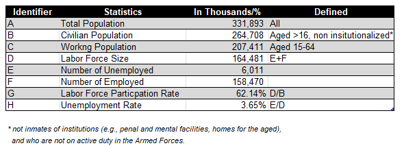
However here is some additional color, which shows that it is not that straightforward, and we have to give at least some credit to Chairman Powell. So, when it comes to the US labor market statistics the table below provides the basics. Bear these in mind as we go along.

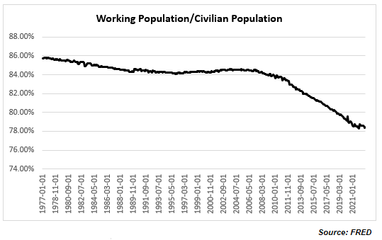
Strictly speaking, Chairman Powell is right that “the labor market continues to be out of balance, with demand substantially exceeding the supply of available workers” (in his opening statement; he goes in more detail on this in the Q&A session particularly in a question from Market Watch). Look at the ratio of Working Population to Civilian Population which is at nearly 50yr low

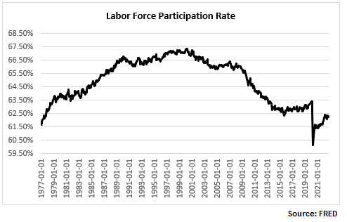
And within the Working Population the actual Labor Force Size only managed to get just above its pre-Covid level this August and has started to decline again since then, so that the ratio between the two is still below the pre-Covid level (and as a matter of fact still below the high reached at the onset of the 2000 recession).

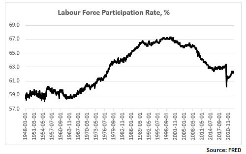
And here is the now more familiar labor force participation rate (LFPR), still way below the pre-Covid high and substantially below the pre-2000 recession high.

So, when Powell refers to the “labor market is 3.5m people smaller than it should have been based on pre-pandemic levels” this is what he has in mind: strictly speaking, if we adjust the LFPR to its pre-Covid high, the labor force would have been about 3.021m people more. But that is on the supply side, and we are going to go through this more later on.

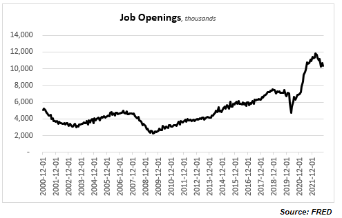
But let’s look at the demand side as well. As per Powell, again in the answer to the journalist from Market Watch, “you can look at vacancies”. Here they are.

Powell is right to an extent: there are still more that 10m job openings. This is down from nearly 12m from the highs in March, and job openings are never zero, but even the current number puts job openings at about 5.8m additional vacancies over the pre-Covid average.

So, the question really is to square the demand and the supply side of labor. Obviously, it is not that straightforward. It is normal to have people unemployed at the same time as vacancies unfilled, but the state of the labor market post Covid is more unusual, also because the unfilled vacancies are not pushing real wages up. Which is why some people have suggested that rather than a wage issue it is really a skill mismatch issue (plenty of studies done on this post the 2008 recession), or indeed Covid-related issue (even Powell referred to this as a cause in his Q&A).

Chairman Powell lamented yesterday that the LFPR is not going up, “contrary to what we thought”. But if it does go up, does it mean the headline statistics will indicate the labor market is tightening or loosening? I ran some hypothetical numbers regarding this below.

The second column in the table above indicates a hypothetical LFPR per the time period in column one. The third column is the actual labor force as a result (in thousands). The fourth column indicates the additional people coming into the labor market. The fifth column indicates the number of unemployed if all these additional people entered the labor force; the sixth column is the resulting unemployment rate. The seventh column shows the number of unemployed if 50% of the additional labor force actually found jobs; the eight column is the resulting unemployment rate. Finally, the ninth column shows the number of unemployed if all the additional labor force fills the job openings (see Chart above) over and above the average pre-Covid; the tenth column shows the resulting unemployment rate.

There are myriad such scenarios. In the example above, using averages and simple assumptions about additional employment vs unemployment, the unemployment rate is higher than the current one in all but the last three examples (column 10 – the last three entries). Bottom line is that the drop in the labor force participation rate makes relative comparisons about how tight the labor market is (i.e., looking only at the unemployment rate) pretty irrelevant.

It also makes all of the above analysis almost useless (or at best very theoretical) as far as investing is concerned. It really does not matter at the end what the ‘real’ employment situation is. Powell was very clear yesterday. “The largest amount of pain” would not come from people losing their jobs. “The worst pain would come from a failure to raise rates high enough and from us allowing inflation to become entrenched in the economy; the ultimate cost of getting it out of the economy would be very high in terms of  unemployment, meaning very high unemployment for extended periods of time.

That’s it. Inflation is all that matters. And if there was any hint at all that the Fed might increase its 2% inflation target, Powell was very adamant that it is not happening: “…changing our inflation goal is just something we’re not, we’re not thinking about. It’s not something we’re not going to think about it. We have a 2% inflation goal and we’ll use our tools to get inflation back to 2%. I think this isn’t the time to be thinking about that. I mean there may be a longer run project at some point. But that is not where we are at all at  the committee, we’re not considering that. We’re not going to consider that under any circumstances we’re gonna we’re gonna keep our inflation target at 2%.”

This turned out to be a long note just to conclude that indeed, it is pointless to fight the Fed, assuming that Powell’s view is shared by the majority of Fed voters, or if not, that the majority would still fall under the guidance of the Chairman. However, leaving the possibility of only 25bps hike at the next FOMC meeting is perhaps a sign that there may be some disagreement at the Fed.


[i] During New York hours; the market has subsequently weakened during the European morning session.

This is not a 2023 investment outlook

“It says in the brochure,” said Arthur, pulling it out of his pocket and looking at it again, “that I can have a special prayer, individually tailored to me and my special needs.”
– “Oh, all right,” said the old man. “Here’s a prayer for you. Got a pencil?”
– “Yes,” said Arthur.
– “It goes like this. Let’s see now: “Protect me from knowing what I don’t need to know. Protect me from even knowing that there are things to know that I don’t know. Protect me from knowing that I decided not to know about the things that I decided not to know about. Amen.” That’s it. It’s what you pray silently inside yourself anyway, so you may as well have it out in the open.”
– “Hmmm,” said Arthur. “Well, thank you”
– “There’s another prayer that goes with it that’s very Important,” continued the old man, “so you’d better jot this down, too, just in case. You can never be too sure. “Lord, lord, lord. Protect me from the consequences of the above prayer. Amen.” And that’s it. Most of the trouble people get into in life comes from missing out that last part.”

~ Douglas Adams, The Hitchhikers Guide to the Galaxy

It’s the time of the year when next year investment outlooks are released. If you are a newbie in this business, it is very important to devour as many as possible of those so that you can make as many as possible mistakes early on in your career when it is not only less painful to do so, but also when your ego is more flexible, hopefully, to allow you to learn from those mistakes.

If you are more experienced, you may be able to sift through the myriad of new investment outlooks and find that rare and original gem which may help you make money in the future. Either way, at best reading new year investment outlooks will make you look smart in the short-run when you attend those non-finance-related-but-people-want-to-know-about-investment Xmas drinks. At worst though, they will cloud your judgement as a professional investor and make you lose money in the long run.

This year has been brutal for investors, and it is very tempting to conclude that next year will be much better, which is essentially what most investment outlooks are saying. Note, 2023 is not necessarily projected to be a stellar year but still a year of small double digits returns (so slightly above the average).  It would be interesting to read therefore those people who forecast returns in the two tail distributions, especially the one on the left (another brutal year). I would say there would a be a lot of informational value if an experienced name has such a view for next year.

Looking at some of the major trends this year though, all of them have recently been at least partially unwound. Going from less to more: higher US yields have unwound about 1/4 of their move, weak US equities about 1/3, strong USD about half, strong commodities about 2/3, and last but not least, strong crude has unwound all of its move this year! We have another two weeks of trading until year end and those unwinds may be reversed (i.e., confirming the trends of the year), but that already tells us something about what to expect going forward.

These major trends will not explain everything but a good chunk of everything that is happening in the investment world. Many other trades are just a derivative of those major trends. For example, receiving Emerging Markets (EM) rates is almost a consensus trade for next year but it is heavily dependent on what happens to US rates. Long EM and European stocks are favourites for next year, but these cannot be considered in isolation to what happens in US equities. And people who trade FX for a living do not need a reminder that there are always two sides to the ‘coin’ (and one side is almost always the USD).

Commodities are slightly trickier, though. This year the correlation between individual commodities was higher than normal, but that is not always the case. Basically, the role of the USD in FX, USD rates in Fixed Income and US equities in Equities, is played by the price of oil in Commodities as energy takes such an outsized role in the cost structure of any commodity. But sanctions, tariffs, the weather etc., can also affect the way some commodities trade in markets.

This year commodities were the only asset class as a whole (looking at the five major ones, Rates, Credit, FX, Equities and Commodities) which posted positive returns. And this comes after a decade of pretty poor returns otherwise. Does it mean that is it for commodities?

There are also the odd idiosyncratic trades which offer enormous value to those who can discover them. This year some of those idiosyncratic trades were Brazil (rates, equities, FX), Turkey (both rates and equities), FTSE, India (equities), almost all Latam FX, etc. (obviously there were a lot of idiosyncratic trades in individual equities and credit). Can China provide double digit idiosyncratic equity returns next year, after two absolutely horrible years and almost a decade of flat returns? Can Japanese rates experience the opposite?

Then there are the relative value trades and those ‘technical’ trades (mostly in Fixed Income) which could provide an extra source of gains almost regardless of the direction of the major trends in the market. For example, after more than a decade of rates stuck at zero, a sufficient number of interest rates have gone up to provide now a decent cushion even if rates continue to trend upwards next year.

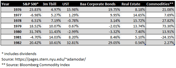
The table below provides the total return for each of the selected asset classes during the last major interest rate hiking cycle in the late 1970-early 1980s. Rates peaked in this cycle in 1981. It is interesting to note that 1) neither of these asset classes did that bad; 2) interest rates (especially T-Bills) did pretty good considering.

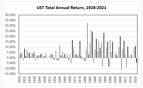
It is even more interesting to observe that USTs did not have that many more negative annual total returns when the yield on the 10yr moved from about 2.5% in 1951 after the Treasury – Federal Reserve Accord to more than 15% in 1981 than in the ensuing bull market thereafter. Moreover, during the bull market there were also significantly more years when the negative total annual return was higher than the worst negative return in the three decades after 1951. The point is that it is quite reasonable and, in fact, mathematically logical, to expect a positive return in 2023 for many fixed income markets.

The US labour market is slowing down

Tags

, , ,

  • Is US employment data hot, ‘goldilocks’, or ‘cold’?
  • Have you been inundated by calls and messages with the question, “But have you seen the details of the Household Survey?”
  • Is the Fed right to keep aggressively hiking?

Summary: The US labour market is slowing down despite headline grabbing low unemployment rate and high wage growth rate. The recent details underlying this data show the total number of people employed growing below trend, fewer hours worked and lower quits rate. As a result, the growth rate of total earnings is also going down, the effect being a lower share of national income going to labour and total consumption as a share of GDP stagnating. All this should make the Fed further re-evaluate its aggressively hawkish interest rate policy.

The Household Employment Survey makes the headlines

After a couple of weeks of ‘SBF’ trending, I, for one, was happy to take my mind off to something much more prescient and important as far as my investments are concerned – the US employment situation. At first glance, the November NFP report came much hotter than expected but because the market did not really react the way one would have expected from such a strong report, we started looking for reasons why that was the case.

Which bought us to the US Household Employment Survey. ‘Us’ here does not mean us literally (for those of you who had followed my writings at 1859, there was plenty of discussion on this topic as soon as I spotted the divergence between the two employment reports in September). And this note is not on why the Household Survey is showing different things from the Establishment Survey.

If you want to, you can read zerohedge on this topic here (I know, think what you want but the folks there were one of the first to spot the issue way back in the summer). If you can’t bear some of the conspiracy language at zerohedge, you can read an inferior version (but still good!) of the same at the more balanced Macro Compass. Finally, there are quite a few respected people on Twitter who have talked about it (see here, here, here).

To give you the full  disclosure, there are some legitimate reasons why the Household Survey produces different results to the Establishment Survey – and they have to do with a methodology issue, see here. BLS is actually well aware of that issue and calculates a time series which reconciles the two surveys and which can be found here (also with a very, very extensive comparison analysis between the methodology of the two). This adjusted data does not look that bad as the stand-alone Household Survey data (the November data was actually very good). But over the last 6 months it still points to a weakening employment market, not a stable or even hot one as per the Establishment Survey.

OK, that’s more than I wanted to write regarding the Household Survey. The rest of the note will show why the US employment situation is actually weakening even taking the Establishment Survey as a base.

The three variables of employment

There are three aspects of employment in general as far as assuaging how hot the economy is doing: wages, people employed, and hours worked, i.e., we need to follow this sequence, purchasing power->consumption->GDP) Basically, one needs to know the full product of Wages X Total Employment X Hours Worked (assuming, of course, that wages are per hour worked; not all jobs pay per hour, but those that do have actually increased at the expense of the others – see some of the links above which discuss the prevalence of part-time jobs and multiple job holders).

The economy can be hot even when wages are flat, or even declining, but there are more people entering the workforce or there are more hours worked – there are multiple combinations among the three variables producing various results. The point is to consider all three variables.

Total number of employed is growing below trend

Let’s take the period in the last three years or so after the Covid crisis. Yes, wage growth has picked up, but more people have exited the labour force and there are fewer hours work.  

The labour force participation rate is still below the pre-Covid levels, and close to a 50-year low:

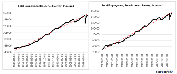
The total number of people employed has risen but, depending on whether one uses the Establishment Survey or the Household Survey, the number is either just above the pre-Covid levels or indeed below. In any case, regardless of which survey one uses, the number is still below trend (and has not been above trend since the 2008 financial crisis).

Higher wages but lower hours worked

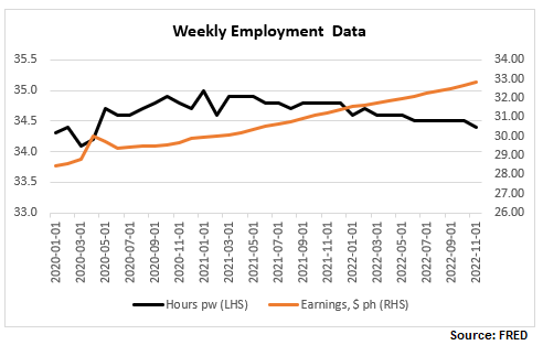
Finally, here are wages and hours worked. I have included below a time series chart for only the last 3 years to be able to see better the divergence between the two: while wages continue to rise, hours worked peaked in January 2021 and have now reversed the spike in 2020.

Let’s focus more on the latest NFP report. Here are the relevant tables below.

  • Generally higher-wage industries, like goods producing, tend to exhibit a smaller increase in hourly wages than lower-wage ones, like services.
  • In some cases, like the Utilities sector, which has the second highest wage per hour but also the highest average weekly earnings (courtesy of more hours worked, more on this later), wages have actually declined.
  • Transportation and warehousing sector has an unusual jump in wages, about 5x the average rise in wages – is there something specific going on there?

The growth rate of total earnings is declining

It is important to look at the last columns in Table B-3 above, ‘Average weekly earnings’, which gives a much better picture of take-home pay as it combines wages with hours worked. So, while indeed the trend of declining 12m-growth rate of weekly wages was reversed with this latest report (back above 5%), which some commentators have warned the Fed should be worried about, the trend of declining total weekly earnings continues to be intact.

Note, average hourly earnings are still elevated, hovering at previous peaks but this is hardly a reason for the Fed to get more worried about, especially after already delivering the fastest interest rate hiking cycle in recent memory.

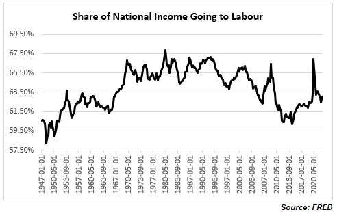
In fact, quite on the contrary. Despite all the excitement about the rise in wages, the share of national income going to workers has been on a decline, with the post-Covid spike now quickly reversed. We are back to the familiar territory of the low range post the 2008 financial crisis which is also the lows since the mid-1960s. If you were worried about a wage-price spiral issue, ala the late-1970s (I actually do not think there was one even back then as real wage growth even then was negative), you really shouldn’t be. It is a very different dynamic, at least for the moment.

Consumer demand as a share of GDP has been stagnant for more than a decade

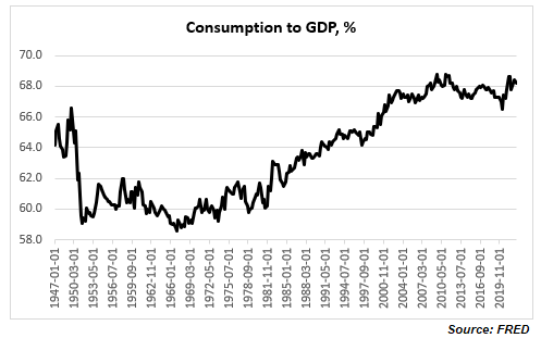
And if you are really worried that consumer demand will push inflation higher, again, you shouldn’t be, necessarily: consumption as a share of GDP is elevated relative to historical records but it is not even above the highs reached more than a decade ago. In fact, it seems that consumption has not been an issue for inflation for at least the last two decades.

The quits rate is declining

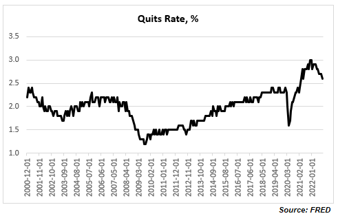
One final observation, there is another labour data series which has been often cited as an example of a tight labour market: the quits rate.  I would though argue two things: 1) labour tightness explains only part of the elevated quits rate, and 2) the quits rate has already started declining.

A higher quits rate is quite consistent with an increasing share of lower paid jobs and with multiple job holders both of which have been trends seen post the 2008 financial crisis, and especially during and after the Covid crisis. It is possible to decompose the quits rates by industry and sector. For example, retail trade, accommodation, and food services, all of which are lower paid/temp jobs by multiple job holders, have much higher quits rates than the average across all industries. This is corroborated by a Pew Research report according to which most workers who quit their jobs cited low pay.

Finally, the quits rate actually peaked at the end of last year (notice the Household/ Establishment Employment Survey discrepancy started shortly after) at about 3%. This is the highest in the series, but the data officially goes back to only 2000. BLS has actually related quits rate data (but only for the manufacturing sector) prior to 2000 which shows that the quits rate has been above 3% in the past, and yes at above 3%, the quits rate is associated with the peak in economic expansion. You can see the full data set and BLS perspective on it here.

Bottom line: you do not need to believe in conspiracy theories about Household Survey vs Establishment Survey labour data inconsistency to conclude that the US labour market is far from tight. If anything, it has already started to slow down. Do not be confused by headline numbers of high wage growth rate and low unemployment rate, look at the overall employment picture taking into account trends in overall total compensation.  

Fed Funds peaks and UST yield curve inversions

Tags

,

  • Either the peak in the Fed Funds rate is much higher, or the UST yield curve, 2×10, is too inverted. Whatever the case is, it’s extremely unlikely that the Fed eventually ends up cutting just the 150bps priced in at the moment.
  • Or to be more precise, unless there is a modern debt jubilee (a central bank/Treasury debt moratorium) or a drastic capital destruction caused by a total collapse in the global supply chains, continuation of war in Europe/Asia or a natural disaster (climate change, etc.), the Fed is more likely to pause the hikes next year, wait, and eventually cut by more than the 150bps priced in the market but less than in the past.
  • In other words, the shape of the current Eurodollar curve is totally ‘wrong’, just like it had been wrong in the previous three interest rate cycles but for different reasons.    

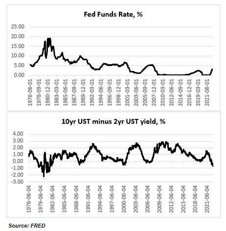
The current UST 2×10 curve inversion is pretty extreme for the absolute level of the Fed Funds rate. At -70bps, it is the largest inversion since October 1981 but back then the Fed Funds rate was around 15%. The maximum inversion of the UST 2×10 curve was -200bps in March 1980 when the Fed Funds rate was around 17%. The Fed Funds rate reached an absolute high of almost 20% in early 1981.

Back then the Fed was targeting the money supply, not interest rates, so you can see the curve was all over the place and thus comparisons are not exactly applicable. But still there were plenty of instances thereafter when the Fed moved to targeting the Fed Funds, and the Fed Funds rate was much higher than now, but the curve was much less inverted before the cycle turned.

Take 1989 when the 2×10 UST curve was around -45bps but the Fed Funds rate at the peak was around 10% (almost double the projected peak for the current cycle). The Fed ended up cutting rates to almost 3% in the following 3 years. Or take the peak in Fed Funds rate in 2000 at 6.5% and a UST 2×10 yield curve inversion of also around 45bps. The Fed proceeded to cut rates to 1% in the following 4 years.

Finally, take the peak in Fed Funds rate at 5.25% in 2006-7 and a UST 2×10 yield curve inversion of around -15bps. The Fed ended cutting rates to pretty much 0% in the following 2 years. In the 2016-18 rate hiking cycle, when the Fed Funds rate peaked at 2.5%, the UST 2×10 yield curve never inverted.

So, today we have a peak in the Fed Funds rate of around 5%, so comparable to the 2007 and 2000 cycles, but a much deeper curve inversion, more comparable to the 1980s. If we go by the 2000 and 2007 scenarios, the Fed cut rates by around 500bps; in the 1980s the Fed cut much more, obviously, from a higher base. In this cycle, if the peak is indeed around 5%, 500bps is the maximum anyway the Fed can cut. That is also the minimum which is “priced in” by the current curve inversion. But the actual market currently and literally prices only 150bps of cuts.

Again, neither of the past interest rate cycles are exactly the same as the current, so straight comparisons are misleading, but somehow, it seems that the peak Fed Funds rate today plus the current pricing of cuts in the forward curve do not quite match the current UST 2×10 curve inversion – either the peak is too low, or the curve is too inverted.

What I think is more likely to happen is the Fed hikes to more or less the peak which is priced in currently around 5% but it does not end up cutting rates immediately. The market is currently pricing peak in May-June next year and cuts to start pretty much immediately after; by the end of 2023 there are 50bps of cuts priced in.

In the last three rate cycles (2000, 2008, 2019) there was quite a bit of time after rates peaked and before the Fed started cutting. The longest was in 2007 – 13 months, then in 2019 it was 8 months and in 2000 it was 6 months. Before 2000 the Fed started cutting rates pretty much immediately after the end of each rate hiking cycle, so very different dynamics.

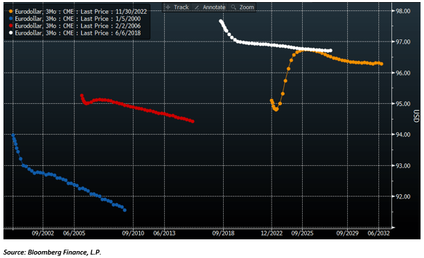
Here are how the Eurodollar curves looked about six months before the peak in rates in each of these cycles. The curve today somewhat resembles the curve in 2006, in a sense that the market correctly priced the peak in rates in 2007 followed by a cut and then a resumption of hikes. But unlike today, the market priced pretty much only one cut and then a resumption of hikes thereafter.  In the interest rate cycles in either 2000 or 2018 the market continued to price hikes, no cuts at all, and a peak in the Fed Funds rate not determined.

Source: Bloomberg Finance, L.P.

And here are how the curves looked after the first cut in each of these cycles (the colours do not correspond – please refer to the legend in the top left corner, but the sequence is the same – sorry about that). The market didn’t expect at all the size of cuts that happened in either of these cycles. Notice that the curve in the current cycle still does not look at all like any of the curves in the previous cycles (noted that in six months’ time, the current Eurodollar curve is also likely to look different from now, but nevertheless, there are much more cuts priced now than in any of the other three cycles).

Source: Bloomberg Finance, L.P.

The point is that the market has been pretty lousy in the past in predicting the trajectory of the Fed Funds rate.

  1. It is strange that the market never priced the pause in any of the actual past three interest rate cycles, and it is even stranger that it is not pricing it now either, given that there has been consistently a pause in the past.
  2. In none of the past three cycles did the market price any substantial cuts; in fact, we had to wait for the first actual cut for any subsequent cuts to be priced – that is also weird given that the Fed ended up cutting a lot.
  3. This time around, the market is pricing more cuts and well in advance but not even as close to that many as in the previous cycles.

However, I do not think we go back to the zero low bound as in the past three cycles. To summarize, the current UST 2×10 yield curve is too much inverted and the Fed would eventually cut rates more than what is currently priced in, but much less than in other interest rate cycles and after taking a more prolonged pause.   

The positive spin on China

It is not surprising that the comments and analysis on the recent protests in China have been overwhelmingly negative. Even Goldman Sachs which said China may end zero-Covid earlier than expected in Q1’23 put a negative spin (“disorderly exit”) and projected a lower-than-expected GDP in Q4’22.

There is no question that Chinese authorities are almost literally pressed to the wall with no easy options here. But what if there is a positive way out? It is no secret to anyone, including Chinese leaders, that there is a need to re-balance the economy towards domestic consumption and the best way to do that is to shift sectoral incomes towards Chinese households. For whatever reasons though Chinese authorities have not done that over the years, with the bulk of any extra income still going to the corporate (both private but mostly state) sector and local governments.

  • The Covid pandemic has however accelerated their work on DCEP, their version of CBDC, which allows for targeted transfers directly into people’s accounts. I believe, this is an avenue which will be much more explored as China gradually eases off from its zero-Covid policy.
  • Over the years Chinese authorities have been particularly slow in building the institutional infrastructure of pension and insurance vehicles and social security as a whole. But there has been substantial progress on that front this year.
  • Chinese assets, and in particular equities, have had two consecutive years of underperformance and under an extreme case scenario a third one is a distant possibility. However, the current set-up favours the establishment of a small exposure.

The Chinese household balance sheet

Chinese households’ balance sheet looks very different to US households’ balance sheet. In the US more than 2/3 of household assets are in the financial sector, the rest is in real estate (this is on average; it varies a lot depending on the income percentile though). In China, the split is more 50/50.

Within financial assets, Chinese households hold almost twice more Cash and its equivalents than US households (in % terms of the total household assets). But, on the other hand, they hold six times less Bonds and other Fixed Income equivalents and ten times less pension and insurance assets (all vehicles which come under social security). Equity allocations are very similar for both Chinese and US households, at around 1/3 of all household assets (this is direct ownership of equities; US households’ overall equity exposure is much larger as they own financial assets through their pension schemes, for example). A snapshot of Chinese household balance sheet can be seen here and of US household balance sheet here.

Basically, Chinese households have too much real estate and cash, too little exposure to bonds, and pretty much zero ‘social security’ cover. The protest against zero-Covid come at an opportune moment when the authorities have also been trying to contain the implosion in the real estate market. With Chinese households using real estate as the main source for pension coverage, creating a genuine viable alternative has become the top priority for Chinese leadership (the topic got extended coverage in China’s 14th Five-Year Plan).

The Chinese social security system

China’s pension industry framework consists of tree pillars. The first one is the basic state pension comprising of the Public Pension Fund and the National Social Security Fund. The second one is the voluntary employee pension plan in which the employer and employee make monthly contributions. And the third one is the private pension.

In April this year, China’ State Council released a document which stated that building the private pension system infrastructure is where their priorities now stand. This was followed by an announcement at a State Council meeting in September of new tax incentives to spur the development of private pensions.

The point is that a combination of an aging population, inadequate tax base and very early retirement age (60 for men and 55 for women) would eventually put the state pension system into deficit. At the same time, the employee-sponsored pension scheme is extremely inadequate covering only a tiny proportion of the population. So, the development of the private pension system has indeed taken centre stage.

DCEP can be used to top up household income

Part and parcel of that is ensuring the growth in household incomes. The authorities have been extremely slow in shifting national income more towards the private household sector. It is not clear to me why, especially given their goal of inclusive growth and the recent heavy regulations on the corporate sector in that direction. But these protests could speed up that process. For example, PBOC has been at the forefront globally in developing their CBDC (the Chinese equivalent is called DCEP – Digital Currency Electronic Payment). They have already successfully employed that in several cities on experimental basis.

In the present environment the authorities can use DCEP to help them ease out of their zero-Covid policy by directing payments to households in specific cities, neighbourhoods, even apartment buildings, which are affected by lockdowns. This kind of real-time, targeted fiscal policy can be extremely beneficial – much more so than the blanket free-for-all fiscal policy the US did during the Covid pandemic.   

Chinese assets offer an opportunity

Where does this leave your exposure to Chinese assets? If you are an institutional Fixed Income investor, you should consider the possibility of large flows into Chinese government bonds by both domestic retail as well as private pension providers, based on the analysis above (to a smaller extent, the same holds true for Chinese equities). Otherwise, it is easy to find reasons (see below) to not have any exposure to Chinese equities, but selling now here on the back of (zero) Covid does not make sense to me. In fact, the opposite is a better option.

Case in point, there was a lot of positive signalling at the latest weekly Covid briefing yesterday. For example, the authorities plan to increase vaccinations among the elderly, a move which could mean intentions to start reopening earlier. Some local governments were criticised for implementing severe lockdowns and were urged to adhere to ‘reasonable’ requests from residents. It is even possible, though I doubt it, that Beijing even decides to fully open up.

But there are two main risks to Chinese equities. The first one is regulatory and it is well known. The developments there are still in progress but if you are long CQQQ or KWEB (these are/were the popular China ETFs among foreign retail investors) and still worried US ADR delisting risk, you should know that only a small percentage of these ETFs holdings is still in ADRs. For example, CQQQ has 131 holdings worth about $767m. Of those only 8% (of the holdings and 15% of the market value) are still US ADRs.

Basically, the ETF providers have converted most of their US ADRs to equivalent HK/China listings, so the risk of substantial loss from US delisting for the whole portfolio has substantially diminished. There are though still regulatory risks. For example, the Chinese authorities can ban foreign entities from owning any China/HK listed stocks. I think the probability of this is small.

It could be also the case that US regulators ban US entities from investing in China/HK listed companies. I think the probability of that is also small but bigger than the former above. But, anyway, both of these are possible in a full-on US-China confrontation ala US-Russia now, which is the second risk to Chinese investments, and which is of truly existential nature. If this is your view, either you should not be touching any China-related investments, or, if you are a probability investor, you should appropriately scale your China exposure.

Mistakes were made

Mistakes become mistakes only in hindsight. The mistake I made, for example, in believing in the transitory aspect of inflation stems largely from not anticipating the extended nature of the global supply issue, sure, not helped by the war in Ukraine. I also made a mistake not investing in crypto.

Did Fed forecasters really make the same mistake on inflation? I am not sure. Regardless of what they said in public, a big driver in their decision-making process must have been the recency bias: after more than a decade of unsuccessfully grappling with disinflation, the right risk-return strategy was ‘to give inflation a chance’. And now the Fed is onto a different ‘recency bias’: having gone through the painful experience of the 1970s, the right strategy for them is to kill inflation at all costs.

That’s how decisions are made in the policy world: not based on actual forecasting outcomes but on protecting awful tail events from ever happening again. To a certain extent that’s how we also make decisions about things which concern us personally, even though we employ more of a barbel strategy: long both tails of the distribution tree.

Take crypto and the recent developments as an example. See this story. I would say, no, the majority of the people who invested in crypto were not stupid. Most were actually quite rational but lazy. Others, though, were irresponsible.

Private investors who invested a small single digit % of their wealth in crypto were logically simply playing the lottery ticket odds. VCs, which also invested a small % of their assets in crypto entities, were also, but they were lazy to do the proper due diligence.

In both cases, the decision-making process was mostly driven by aiming to hit the right-hand side (positive) tail-risk outcome. The risk-return was skewed to do that. Strictly speaking for the former that was the right decision; the latter should have done the work though. Either way, there was no risk in this case of ever landing on the left side of the distribution tree.

And then there is the third group, the pension funds, and the likes, who were simply irresponsible – they had no business investing in crypto. I think that is where one should search for accountability.

But, sure, there were perhaps some people and entities who invested the majority of their net wealth/assets in crypto. I may be wrong, but I think that is a small % of the overall money pool in crypto. And yes, they were perhaps stupid because the left side of the distribution tree was wide exposed.

I never invested in crypto. For that matter I do not remember ever buying lottery tickets in real life (though I have been the proud owner of many deep out-of-the money options which expired worthless…and a few which hit the jackpot). But to go back to inflation, I did manage to lose money being long bonds in this late cycle. I was too ‘lazy’ to do the proper ‘due diligence’ on the fundamental drivers of inflation. But once the war hit in late February, and sanctions followed soon thereafter, it all became clearer.

It was largely because I had done extensive work on the nature of low rates that I knew their gig was over. To quote from the link above: “[We] must be cognizant that a switch to higher rates will most likely only happen after the economy has first gone through one or a combination of: social unrest, debt jubilee, large increase in the money supply or natural disaster.” It turns out that we kind of almost went through all of them: war in Ukraine, student debt forgiveness initiative, yes, massive increase of the money supply, and climate change worries.

What is the right decision to make when it comes to investing now? Well, if the above framework is right, one has to acknowledge the effect of a higher rate environment not just on asset valuations but also on the incentive structure which retail and professional investors are facing in this environment. At this point, it is the second and third order effect of higher interest rates which matter, i.e., staying short bonds is now a decently negative carry trade with low risk-return profile.

Oh, yes, also, always keep small change to buy lottery tickets: in Bulgaria, where I originally come from, the slogan of the National Lottery under communism was “evert week, with a small amount”.

USTs are expensive to foreigners

Tags

,

Foreigners have bought record amount of USTs this year: if we look at the nine-month cumulative flow in USTs (YTD as per TIC data), it is at a record high, marginally beating 2009. This is actually in stark contrast to what they have done with US equities: the nine-month cumulative flow in stocks is at a record low, easily beating the previous low in 2018.

While it is more difficult to compare stocks across countries, as there are a lot more idiosyncratic factors at play, with bonds it is a little bit more straightforward, once we take hedging costs into consideration. And by that measure, USTs are the most expensive they have been at least in the last 10 years.


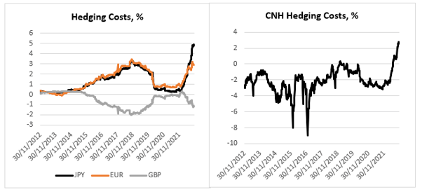
Here at the USD hedging costs for foreign based investors based in these jurisdictions (the calculation is done using 3m FX forward points and – so, an investor buys USD and immediately sells it 3m forward – converted into a ‘yield’/carry, annualized). I have chosen here the largest foreign buyers of USTs: Japan, China, the United Kingdom, and Europe (I have excluded the Cayman Islands which is another large buyer of US assets because even though classified as a foreigner in the TIC data, the hedge funds there are almost all USD-based).

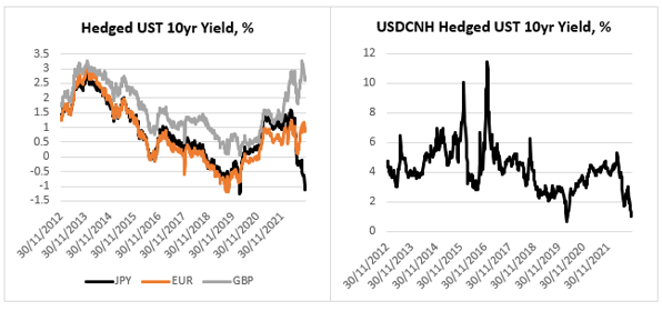
Hedging costs in Japan and China are the highest in the last 10 years; hedging costs for EUR-based investors are close to the highs; hedging costs for GBP-based investors are substantially off their highs. This is what a foreign investor is getting in yield if he or she invests in UST 10yr.

This is in nominal terms – do not be confused by the fact that a JPY-based investor will receive a negative 1.2% yield if he or she invests in UST10yr hedged into JPY for one year. A European would do slightly better, and a Brit would do even better than a European; in fact, until recently a Brit buying USTs hedged in GBP could have picked the highest yield in the last 10 years!


But USTs are really not that attractive anymore to a CNH-based investor – even though he or she still picks up a decent 1% hedged, which is more than a European would gain, this is the second lowest yield in the last 10 years. In fact, this is the same for a Japanese investor – the only other time UST10yr fully hedged yield has been lower was during the height of the Covid crisis in 2020.


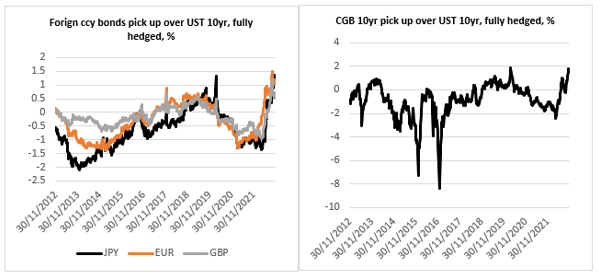
Foreigners are much better off buying their own government bonds than UST10yr, if they do indeed hedge the currency risk. In almost all these four cases (GBP is the exception but only recently) foreign bonds offer a record pick up to fully hedged USTs.

So, how do we reconcile the record buying of USTs YTD by foreigners with these findings? First, the hedge funds in the Cayman Islands have been large buyers of USTs but, as mentioned above, they are USD-based. Once we exclude them (and they have bought 40% of the USTs from ‘abroad’ YTD), foreign buying of USTs is not that high. UK-based accounts have actually been the largest buyers of USTs from abroad (pretty much bought the other 60% of the USTs). I think some of those accounts in the UK are actually USD-based. There is also the peculiarity of the UK Gilts market this year – about 40% of the total YTD buying of USTs by UK-based accounts happened in the two months before the LDI crisis.


As to the two behemoths in the UST market, Japan, and China, yes, they have been net sellers of USTs this year, in line with what the relative valuation above would have predicted. Where does that leave USTs? Looking at the sectoral balances in the US, the private sector still has a sizable $1.4Tn of surplus (as of Q2 this year), and as we have seen above, USD-based investors have not been shy to pick up these relatively high yields in the UST market.

A look at shadow banking globally

Tags

The spill-over from the crypto debacle recently was pretty much non-existent in public markets, largely because risk-on positions were relatively low (see my previous note), but also because crypto itself, even at its peak ‘capitalization’, is rather small relative to the other monetary aggregates, and is rather low in the overall hierarchy of money. I have written extensively on crypto before, how it (doesn’t) fit in the monetary transmission mechanism because it resembles shadow money, and why it is therefore not the future of money.

Rather timely in that sense, the Financial Stability Board (FSB) released last week a new report on the state of the non-bank, aka shadow bank, financial intermediation. The report itself is not particularly interesting but I took it as an opportunity to have an update on how financial assets are distributed intra as well as inter-country.

Bottom line is that despite being at the epicentre of the 2008 financial crisis and all the subsequent regulations introduced after that to ‘curtail’ it, shadow banking is still growing, especially in Europe, and in general outside of the US. If one were looking for a systematic risk to the system, it is not crypto per se, and it is still shadow banking.

How is this going to play out? Very general, shadow banking comprises all financial institutions without access to the central bank, i.e., without the cover of a lender of last resort. So, yes, crypto falls under that umbrella. And yes, it is crypto, or rather the tech behind crypto, which would eventually usher the solution – central bank digital currency (CBDC) which would allow direct access to a central bank balance sheet for pretty much everyone.

But that is unlikely to happen immediately now (too much wokeness about ‘privacy and liberty’ which completely misses the point about CBDC): we might have to go through another crisis to force our hands.    

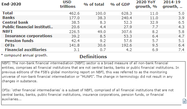
As of the end of 2020, there were $462.6Tn of financial assets globally. And this is how they were distributed:

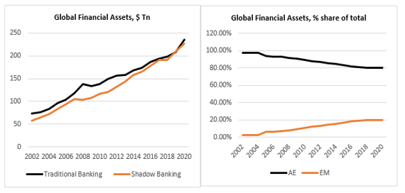
Roughly speaking, we can break column one into two subsections: traditional banking (Banks, Central bank, Public Financial Institutions) and shadow banking (Non-bank financial institutions=NBFI: Insurance corporations, Pension funds, OFIs=other financial institutions, Financial auxiliaries). As of 2020, the two comprised roughly a 50/50 split of the total with shadow banking catching up to traditional banking in the last few years (see the chart below, panel on the left).

Within traditional banking the share of bank financial assets is little changed over time (down marginally since 2002), but the share of central bank assets has grown substantially at the expense of public financial institutions. Within shadow banking, the share of OFI has grown substantially at the expense of pension funds and insurance companies.

How are total financial assets distributed inter-country? The chart above (panel on the right) shows the breakdown between Advanced Economies (AE) and Emerging Markets (EM): while in 2002 EM comprised just 2% of the total, in 2020, they were up to 20%!

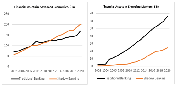
Within AE, shadow banking now dominates, rising from 45% of the total in 2002 to 54% in 2020 (see the chart below, the panel on the left): it seems that QE has favoured a built-up of assets there. On the other hand, traditional banking is still very much dominant in EM even though its share has fallen over the years: shadow banking’s share has risen from 17% of the total to 27% (right-hand panel).

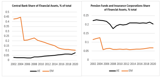
While central bank activity in financial markets has risen in AE, from 3% in 2002 to 8% in 2020, it has declined substantially in EM, from 43% in 2002 to 10% in 2020 (see the chart below, panel on the left). And while the social safety net (pension funds, insurance corporations) share of total financial assets has been fairly stable in AE around 20%, it has declined in EM from 12% in 2002 to 7% in 2020 (panel on the right).

USA comprises a little more than a quarter of all global financial assets but one-third of the total shadow banking assets. The shares of traditional and shadow banking assets to total US financial assets are little changed over the years at 37% and 63% respectively. The share of the central bank financial assets has increased over the years from 2% to 6%.

The Euro-area share of total financial assets is a bit less than a quarter of all global financial assets, but it has seen an explosion of shadow banking – its share of the total assets has risen from 20% to 51% since 2002. The share of the central bank financial assets has increased over the years from 4% to 12%.

Financial assets in Japan are about 10% of total global financial assets. Shadow banking in Japan is about 30% of the total financial assets in the country – and it has been fairly stable over the years. The share of the central bank financial assets has risen from 4% in 2002 to 16% in 2020.

China overtook Japan as the third largest global centre for financial assets in 2013 and currently it comprises about 15% of all global financial assets. Shadow banking in China has risen from 4% in 2005 (that’s when proper data becomes available for China) to 25% in 2020 but it is still below the ones in the other major financial centres. China bucks the trend whereby its central bank assets as a share of total have fallen from 22% in 2005 to 9% in 2020. The social safety net in China is pretty much non-existent – there is no pension funds industry, for all intends and purposes, while the insurance corporations’ share of financial assets has barely moved, risen from 4% to 5% since 2007!

What explains the spectacular bounce in risk?

The prevailing sentiment among the people I speak to (predominantly hedge fund managers) is to sell this rally. The reasons given are (also see below for a complete list): 1) One CPI is unlikely to change the Fed’s interest rate trajectory (basically we are data dependent), 2) China has not changed its zero-Covid strategy in earnest, 3) There is still a risk of a winter energy crisis in Europe, 4) JPY weakness will not reverse before YCC is over.

All these are valid, but I will stick with a risk-on attitude a bit longer. In any case, what caused this drastic change in sentiment?

Positioning was really lopsided. See this article citing research from GS which believes CTAs were forced to buy $150Bn in equities and $75Bn in bonds. Real money is also very light risk after being forced to reduce exposures throughout the year. But what were the main drivers which changed sentiment to begin with?


It was weird to see markets actually not really selling off after Powell’s hawkish FOMC press conference. Perhaps the fact that we had a bunch of FOMC members (see here and here, for example), calling for a slowing down of the pace of Fed Fund Rate (FFR) increases, may explain to some extent the positive reaction at the time. And of course, the catalyst came when the US CPI was released lower than expected.


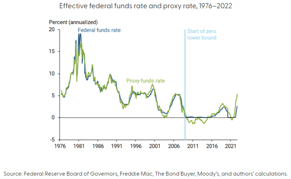
FFR actually does not give anymore a precise indication of the stance of US monetary policy – this is the conclusion of a new paper by FRBSF. If all data such as forward guidance and central bank balances sheet effect are taken into account, the FFR is more likely already above 6% vs the current target of 3.75-4% (the paper puts the FFR at 5.25% for September and I add the 75 bps of hikes since then).

This means monetary policy today is even more restrictive than at the peak before the 2008 financial crisis and approaching levels last seen during the tech bust in 2000. The findings in the paper make intuitive sense. Quoting from the paper:

[W]hen only one tool was being used before the 200s, the stance of monetary policy was directly related to the federal funds rate. However, the use of additional tools and increased policy transparency by FOMC participants has made it more complicated to measure the stance of policy.

The new tools the authors refer to are mainly forward guidance, which started to be actively used after 2003, and central bank balance sheet management, which started after 2008. The proxy FFR (see chart above) actually includes a lot more, a total of 12 market variables, including UST yields, mortgage rates, borrowing spreads, etc. It is perhaps intuitively easier to see that monetary policy was much looser at times when the FFR was at the zero-low bound and QE was in full use than it is a lot tighter today when FFR is firmly in positive territory and QT is in order, but the logic is the same.


So, I think somehow or other, the market now believes that we have seen the peak in FFR (forward) – that provided the foundation of the risk bounce.

China provided the other pillar of support for risk. Ironically, in a similar fashion to how it played out after FOMC, i.e., the consensus was that the 20th CCP Politburo meeting was an overwhelming negative for Chinses assets. And even though they sold off, there was no immediate follow through. In fact, we started hearing that Chinese authorities are looking into taking the first steps to pivot from the Zero-Covid policy, and are very serious about providing a floor for property prices. Finally, there was a genuine improvement on the US-China relations side as US regulators finished their inspection of Chinese companies in HK ahead of schedule and US President Biden and Chinese leader Xi Jinping met at the Group of 20 summit in Bali.

The third pillar of support came from Europe. First, European energy prices (see a chart of TTF) have come a long way down from their peak in the summer (almost full inventories and mild weather helped). Second, the UK pension crisis was short-lived after the change in government and did not have any spill-over effects on other markets. And third, there is genuine hope of a negotiated solution of the war in Ukraine after the Ukrainian army made some sizable advances in reclaiming back lost territory, with both the US and Russia urging now for possible talks. My personal view is that the quick withdrawal of Russia from these territories is a deliberate act to incentivize Ukraine to come to the negotiating table – even though the latter does not seem eager too . Yesterday’s missile incident, and Ukraine’s quick claim that it is Russia’s fault, which is contrary to what preliminary investigation has led to so far, might be a testament to that.

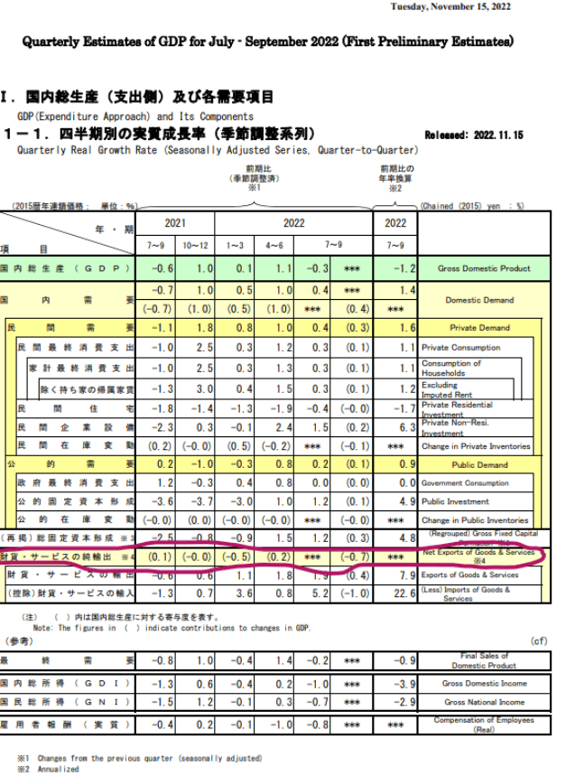
Finally, and that falls under positioning, there is the unwind of USDJPY longs spurred by heavy intervention by Japanese authorities. If there is any proof that policy makers are taking the plunge in the Yen seriously it is in the details of Japan’s Q3 GDP which shrunk unexpectedly by 1.2% (consensus was for a 1.2% increase). The bad news came almost entirely from the negative contribution of net trade. Net trade has been a drag on GDP for the last four quarters primarily from the rise in imports, i.e., the weakness in the Yen. The good news is that the economy otherwise is doing fine: private demand had a big bounce from the previous quarter and has been a net positive overall (all data can be found here): in other words, the problem is the Yen, and YCC makes that worse.

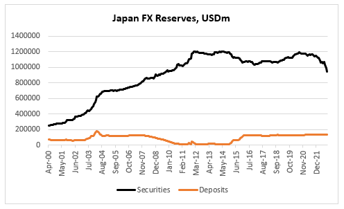
Another piece of data, released last week, which caught our attention, is Japan FX Reserves. The decline from the high in July 2020 is $241Bn, about 18% – that is a substantial amount. The interesting thing, and we kind of know this from the TIC data is that the decline is coming entirely from the sale of foreign securities; deposits actually went up marginally (some of the decline is also valuation). But we know now that when Japan was intervening in USDJPY in September/October, it was selling securities, not depos – most analysts thought Japan would first reduce depos, while intervening, before selling their security portfolio. All data is here.

In summary, CTAs’ sizable wrong way bets long USD and short equities and bonds and real money light risk exposure overall coincided with dovish economic data, reopening China and improving geopolitics (all of these happening on the margin).