Details are slowing coming out of a possible agreement on a new fiscal stimulus. It is a smaller package, but, nevertheless, if it passes, is still substantial as it pertains to direct household (HH) assistance which is what matters to the stock market. The UI benefits + the direct government transfers in the previous package covered more than 200% of the lost income from unemployment during March-September. As a result, total HHs savings rose by about $1.4Tn in that period. A chunk of that money went into financial assets, including stocks, judging from anecdotal evidence and data from retail brokerage accounts.
Most of the extra UI benefits have now stopped and the government transfers are smaller. However, they are still able to cover lost income from unemployment even as of September. Without a new deal, though, that won’t be possible in October, which means that HHs might have to tap into their savings to supplement their income. Which might mean, they have to sell stocks.
Reality, though, is that the majority of that $1.4 of extra savings, up to now, was skewed to the people who do not live pay-check to pay-check and, therefore, going forward, 1) most US HHs would be in big trouble to cover expenses without a new stimulus deal, and 2) there might not be a substantial flow of equities selling pressure from reduced savings even if there were no new deal.
So, that is why a new fiscal stimulus is likely coming, despite, seemingly, no need for it, given elevated HHs savings. In fact, the amount of HH savings is slowly turning into a similarly giant money cemetery as that is what the excess reserves at the Fed are: money which does not enter the ‘real economy’, rather it might remain stuck, ‘forever’, in financial assets.
So, even with the reduced UI payments ($400 vs $600) and reduced direct transfers ($1000 vs $1200), the money should be more than enough to cover the lost income from unemployment. A rough calculation from the article above shows that UI benefits + direct government transfers would amount to $500-600Bn for September – December. The previous package came to a combined $800Bn for April – August (see here).
Which means there will be even more money going into savings and thus financial assets. With monetary policy on autopilot until 2023, all marginal financial liquidity, ironically enough, courtesy of the extremely skewed income distribution in the US, is now solely determined by fiscal. From a pure flow perspective, in the short term, stocks should like this status quo (economy/employment weaker) more than a rebound in economic activity.
Longer term, post the election and into 2021, a Democratic sweep might increase the risk of higher corporate taxes/regulations which will eventually weigh on corporate cash flows. But it might also increase the likelihood of future, and more generous, stimulus packages, and even perhaps, eventually, a UBI.
So, I have been doing a bit more work on trying to quantify US fiscal response to Covid-19 on US household income, consumption, savings and the stock market. Most of the data, I have been using, is from BEA Table 2.6; some is from the BLS employment/compensation report. The complete data set is only updated to July, unfortunately, but I have done projections for August and September where necessary. We will get the new data set on October 1, in a few days.
Bottom line is that without a new fiscal deal, US households will start digging into accumulated substantial savings to cover losses from unemployment which will prop up consumption but, most likely, expose the stock market to the downside.
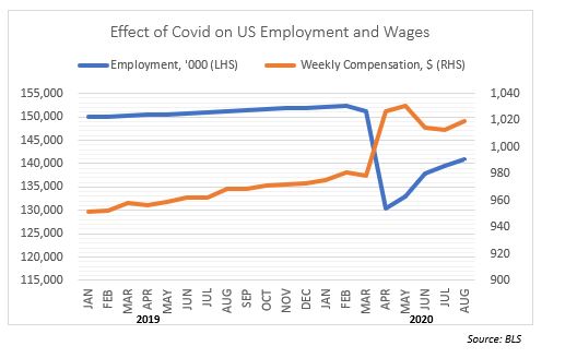
We all know that Covid-19 produced an employment shock comparable only to the Great Depression: there are still some 11.5m fewer people, or so, not employed vs to pre-Covid. The surprise (to me) was the fact that there was a 4.5% jump in weekly compensation, MoM, from February to August this year. This, on its own, cushioned a bit the overall purchasing power of the private sector.
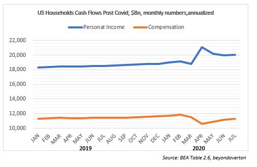
As you can see, actually, personal income did rise immediately after Covid, and is still some 5% higher from February this year. However, for sure it was not due to a rise in employment compensation (# people employed x wage rate,) despite the rise in weekly wages (see previous chart). In fact, overall compensation is still down almost 5% from February.
The reason HH income rose, was active fiscal policy which substantially increased UI Benefit and other government transfers post Covid. The annualized numbers exaggerate a bit this, but, nevertheless, the size of the increase is beyond anything previously done and also more than offsets the decline in employment compensation (see further down).
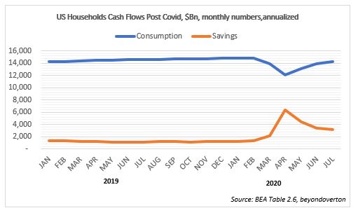
So, what did HHs do with the extra money? Well, they did not spend them: consumption is still down about 5% from February. HHs’ savings, on the other hand, rose substantially in the meantime.
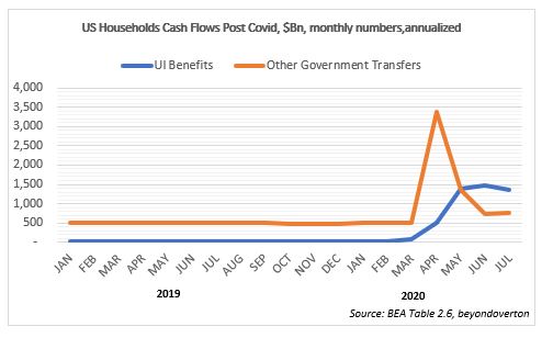
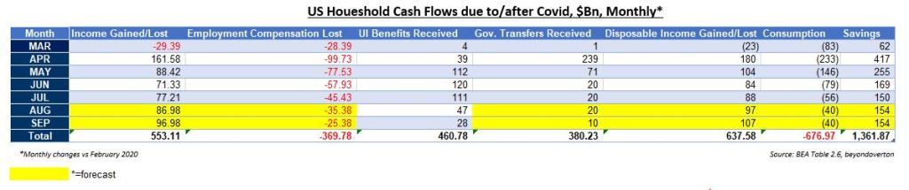
The table below breaks HHs’ cash flows net of their level from before Covid, and it is also on a monthly basis, so it is easier to see how the lost income from unemployment is more than offset by the unemployment insurance benefit payments. Then, on top of that, we’ve had further government transfer payments as part of CARES Act. No wonder the savings rate is so high!
Here is a snapshot of the same table netting off just the employment vs the benefits/transfer flows. US HHs had a negative cashflow only in March. Since then, they have net received income despite the high unemployment rate. Even in August and September, the loss income was more than offset with UI Benefits (not sure how that is possible as the UI payments stopped in July but that is what the data shows).
But both the UI payments and the government transfers are winding down. In October, US HHs might just about break even as employment compensation might not jump up to offset them.
The good news is that HHs have a very large cushion of savings on which to draw on, an extra $1.4Tn (this number also cross-references with Fed H.8 report on bank deposits). So, if anything, the economy would probably be fine. The bad news is that, to an extent that those savings were invested in the stock market, asset prices might find it difficult to rally.
So, there are two conclusions to be made. First, the extent of the fiscal support to the stock market in the past five months is not to be underestimated: if anecdotal evidence and data from retail brokerages are taken together, a big chunk of the households savings was invested in stocks. The fact that government assistance was still bigger than lost gains from unemployment in August (despite the expiry of some UI benefits in July) explains why the stock market remained bid throughout the month.
Second, the pressing need to pass the next phase of the fiscal stimulus is not to save the economy so much, but to save the stock market. Households have amassed about $1.4Tn of extra savings post Covid. As government assistance cannot cover the lost gains from unemployment going forward, without a new fiscal stimulus, some of that savings will most likely be re-directed from stocks to consumption leaving the stock market exposed to the downside.
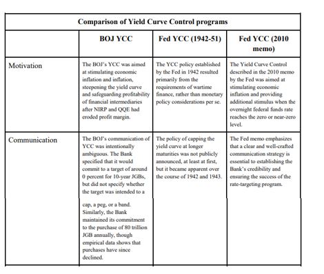
Yield Curve Control (YCC) or Yield Curve Targeting (YCT) – going forward, unless quoted, I will use YCC – is the latest unconventional tool in the modern central bank monetary arsenal. It was first used in 1942 by the Fed, and more recently, by BOJ in 2016, and RBA this year. YCC was first considered in the USA after the 2008 financial crisis, and again after the Covid crisis this year.
There is very little reason for the Fed to adopt YCC in the current environment given no pressure on the yield curve and government finances. On the other hand, there are other, better, tools to stimulate the economy and allow inflation to stay high. If it were eventually to adopt YCC, it is the long-end of the yield curve which will benefit the most from it.
YCC Options
In a 2010 memo, the Fed discussed “strategies for targeting intermediate- and long-term interest rates when short-term interest rates are at the zero bound”. The memo breaks down the choice of YCC into two possibilities:
targeting horizon: which yields along the curve should be capped; and
“hard” vs. “soft” targets: the former would require the Fed to keep yields at a specific level all the time, while under the latter, yields would be adjusted on a periodic basis.
In addition, the memo lists three different implementation methods:
policy signaling approach: keep all short-term yields, in the time frame during which the Fed plans not to raise rates, at the same level as the Fed’s target rate (Fed funds, IOER, etc.);
incremental approach: start with capping the very short-end rate and progressively move forward as needed; and
long-term approach: cap immediately the long-end of the curve.
During the Covid crisis in 2020, there was a very extensive discussion on YCC at the June FOMC meeting, according to the minutes. In fact, there was a whole section on it, going though the other current and past experiences of YCC and listing the pros and cons. While the 2010 memo had zero effect on market sentiment, investors took this most recent development very positively. However, the market was ostensibly disappointed after the release of the July minutes, where the Fed hinted that YCC might not be happening after all, at least for now:
“…many participants judged that yield caps and targets were not warranted in the current environment but should remain an option that the Committee could reassess in the future if circumstances changed markedly.”
Reality, however, is that the July 2020 minutes did not say anything that different from the June 2020 minutes. Here is the relevant quote from the latter:
“…many participants remarked that, as long as the Committee’s forward guidance remained credible on its own, it was not clear that there would be a need for the Committee to reinforce its forward guidance with the adoption of a YCT policy.”
Compare to this quote from the July FOMC minutes:
“Of those participants who discussed this option, most judged that yield caps and targets would likely provide only modest benefits in the current environment, as the Committee’s forward guidance regarding the path of the federal funds rate already appeared highly credible and longer-term interest rates were already low.”
Despite these mentions of YCC by the Fed in its latest FOMC meetings, unlike 2010, we know very little this time about the Fed’s intentions how to structure and implement YCC, if needed. The Jackson Hole meeting revealed some of the main conclusions of the FOMC’s review of monetary policy strategy, tools, and communications practices, especially on average inflation targeting (AIT) but there was no light shed on what the Fed is thinking about YCC.
Taking the example of Japan, YCC is a natural extension of BOJ monetary policy: QE (quantitative easing: start in 1997, but officially only in 2001), QQE (quantitative and qualitative easing: stat 2013), QQE+NIRP (negative interest rate policy: start January, 2016), QQE+YCC (start September, 2016). In effect, BOJ moved from targeting the 0/N rate (QE) to targeting quantity of money (monetary base in QQE), to a mixture of quantity and O/N (QQE+NIRP) to a mixture of quantity and short and medium-term rates (QQE+YYC, in reality, even though the quantity is still there, the focus is more on the rates)
RBA took a short cut, skipped QQE+NIRP and went straight to QQE+YCC, targeting only the 3yr rate. According to the June FOMC minutes, see above, it looks like the Fed might also skip, at least, NIRP:
“…survey respondents attached very little probability to the possibility of negative policy rates.”
In addition, it seems the Fed is more inclined to look at capping short-term yields:
“A couple of participants remarked that an appropriately designed YCT policy that focused on the short-to-medium part of the yield curve could serve as a powerful commitment device for the Committee.”
While capping long-term yields could result in some negative externalities:
“Some of these participants also noted that longer-term yields are importantly influenced by factors such as longer-run inflation expectations and the longer-run neutral real interest rate and that changes in these factors or difficulties in estimating them could result in the central bank inadvertently setting yield caps or targets at inappropriate levels.”
YCC can be implemented in different formats and its goals can also differ.
The original YCC in the 1940s USA was all about helping the Treasury fund its large war budget deficit. Frankly, this ‘should’ be the main reason YCC is implemented. Indeed, it was exactly in this light that Bernanke suggested YCC is an option in our more modern times in his famous speech in 2001, “Deflation: make sure it does not happen here”:
“…a pledge by the Fed to keep the Treasury’s borrowing costs low, as would be the case under my preferred alternative of fixing portions of the Treasury yield curve, might increase the willingness of the fiscal authorities to cut taxes.”
The point is, if the goal was to stimulate the economy, push the inflation rate up and the unemployment rate down, forward guidance (which is what QQE is) and possibly NIRP (not applicable for every country though) are better options (see quotes above from the June/July FOMC minutes).
YCC is the option to use only once the economy has picked up and inflation is on the way up but years of QE has left the government debt stock elevated to the point that even a marginal rise in interest rates would be deflationary and push the economy back to where it started. In other words, YCC is giving the chance for the Treasury to work out its heavy debt load. Most likely, this would be happening at the expense of a short-term rise in inflation over and beyond what is originally considered prudent but on a long-enough time frame, average inflation would still be within those ‘normal’ limits, as long as the central bank remains credible, of course. Again, the post WW2 YCC should be a good reference point for such a scenario.
The Original YCC
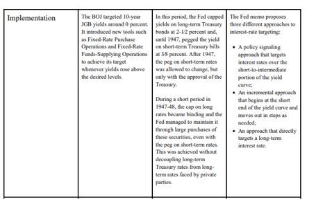
The initial proposal to peg the US Treasury yield curve was first presented at the June 1941 FOMC meeting by Emanuel Goldenweiser, director of the Division of Research and Studies.
“That a definite rate be established for long term Treasury offerings, with the understanding that it is the policy of the Government not to advance this rate during the emergency. The rate suggested is 2 1/2 per cent. When the public is assured that the rate will not rise, prospective investors will realize that there is nothing to gain by waiting, and a flow into Government securities of funds that have been and will become available for investment may be confidently expected.”
The emergency hereby mentioned was, of course, WW2. The war started in September 1939 and by late 1940, Britain was running out of money to pay for equipment. In a speech on October 30, 1940, President Roosevelt first promised Britain every possible assistance even though Britain lacked the financial resources to pay. The Lend-Lease Act, passed by Congress in March 1941, eventually signalled that it would finance whatever Britain required. US direct involvement in WW2 after the bombing of Pearl Harbour ensured the country, itself, would have to spend heavily in the war effort.
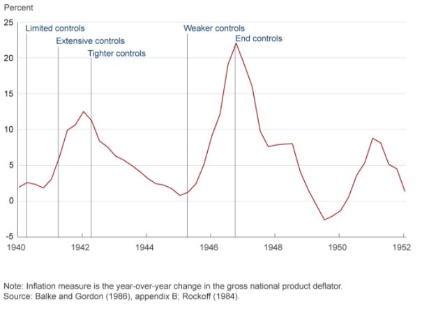
That was the context of the YCC which followed in 1942. In addition, US economic circumstances leading to the decision to peg the US Treasury curve were actually not that different to today. The US banking system was flush with liquidity on the back of large gold inflows, inflation was around 2% and the shape of the yield curve (the very front end) was not that dissimilar: the front end was around 0%, the 5yr around 65bps, and the long bond at 2.5%. With the start of the war, inflation picked up but there were price controls put in place which limited its rise. Government debt to GDP, however, was actually much lower than today and it got to present levels only by the end of the war.
By the time the actual peg went in place, the curve had steepened, especially the 10yr had gone to 2% as inflation really accelerated. Inflation eventually reached a staggering 12.5% in 1942 at which point even more price controls were imposed.
Some FOMC members at that time regarded such a steep yield curve as inconsistent with the policy objectives (keeping inflation under control in the context of the US Treasury issuance program) and insisted on a horizontal structure of managing the curve. And that is in spite of the fact that the decision to peg interest rates was never officially announced. In fact, US Treasury Secretary, Henry Morgenthau’s preference was for a continuation of what today we regard as quantitative easing (QE), i.e. Fed using a quantity rather than rates target.
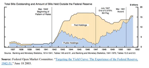
Under the peg, the Fed, instead, had to buy whatever the private sector sells as long as yields were above the stipulated levels. Naturally, investors were riding the positively sloped yield curve, selling the front end and buying the long end. The Fed was forced to accumulate a lot of T-Bills as a result.
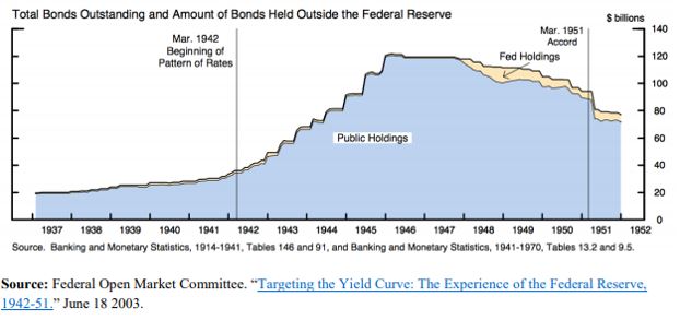
However, its holdings of coupons were never that large.
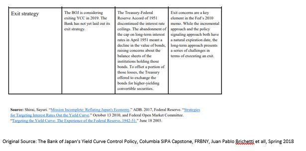
With the end of the war, inflation started picking up again and the Fed eventually took off the yield peg in the front end in July 1947. The peg in the long end stayed until the March 1951 US Treasury Accord. By that time, US public debt to GDP had shrunk back to 73% from more than 100% at the end WW2.
The 1951 Fed-Treasury Accord did not completely end Fed’s management of the yield curve, however. Fed’s new chairman, Willian Martin, wanted to confine market operations in the front end of the curve only, insisting that this will eventually also affect the long end. This ‘bills only’ policy lasted until 1961 and it provided a turn in how the Fed views its involvement in the US Treasury market: from helping the Treasury finance the government’s debt to a more traditional approach to monetary policy focusing on price stability and employment.
Even that was not the end of Fed’s direct involvement. From 1961 till 1975, the Fed engaged in the so called, ‘even keel’ operations. Under these, the Fed supplied reserves and refrained from any policy decisions just before US Treasury auctions and even immediately after (until the time primary dealers were able to sell their inventory to the private sector).
The set-up for YCC in the 1940s has many similarities not only with present day USA but also with Japan, where public debt to GDP at 250% is even higher that US at its peak. However, as discussed below, the rationale for YCC in Japan, is nevertheless different.
YCC in Japan
With QQE starting in April 2013, BOJ indicated it would be buying 60-70Tn Yen of assets per year. On JGBs, the plan was to slowly lengthen the duration to flatten the curve until inflation surpassed 2%. This was an upgrade from the previous inflation target range of 1-2%. BOJ also added an estimated time target of when it expected that to occur (initially 2015). For all intends and purposes, this was QE plus forward guidance, plus average inflation targeting in one.
A substantial reduction in the price of oil and a consumption tax hike in April 2014 exacerbated the dis-inflationary environment and forced BOJ to increase the annual purchases to 80Tn Yen later that year, extend duration (up to 40 years, average duration moved from 3 years to 7 years) and initiate ETFs and J-REITs purchases. In the meantime, the monetary base and the balance sheet were exploding, latter reaching almost 100% GDP. In effect, through QQE, BOJ moved from targeting the uncollateralized O/N rate to targeting the monetary base.
By 2015, these efforts by BOJ seemed to have worked. Inflation rose from -0.6% in 2013 to 1.2%, unemployment went down. However, subsequent decline in inflation to 0.5% in 2016 threw some doubt over the efficacy of these monetary policy efforts. By then, BOJ holdings of JGBs were approaching 50% of the overall market, contributing to declining market liquidity. 10yr JGB had gone from 75bps to almost 0%. They eventually broke the zero-bound after the BOJ initiated QQE+NIRP by lowering the marginal rate on excess reserves to -0.1% from 0.1%.
The practical consequences of QE+NIRP was a push up of the duration and risk curve (into sub-debt, credit card loans, equities, etc.) and out of the country into international assets. As banks’ JGB holdings gradually dwindled, banks had trouble finding assets for collateral purposes, a fact which, together with the flat yield curve interfered with the monetary transmission mechanism. Eventually, BOJ was buying more and more JGBs from pension funds and insurance companies. As these financial entities don’t have an account at the BOJ, it was banks’ deposits which were increasing. MMFs funds decision to stop taking in more deposits after NIRP, moved even more money into the banking system which further lowered their profitability.
Unlike US, where a large majority of financial assets are owned by other entities, Japan has a bank-based financial system. Even though NIRP did trigger the “loss reversal rate” (loss of bank profits below a certain level of interest rates, causes tighter lending conditions), reality was that only a very small portion of the banks’ deposits, about 4%, i.e. the so-called policy rate balance, were charged the negative rate. Majority were still charged at the 0.1%, about 80%, or so-called basic balances at the BOJ. The rest were charged 0%.
But the effect on the banks was highly uneven. Regional banks suffered more as big banks could find higher yields abroad, for example. So, despite best efforts by BOJ to help the banks with the tiering system, overall bank profitability still fell.
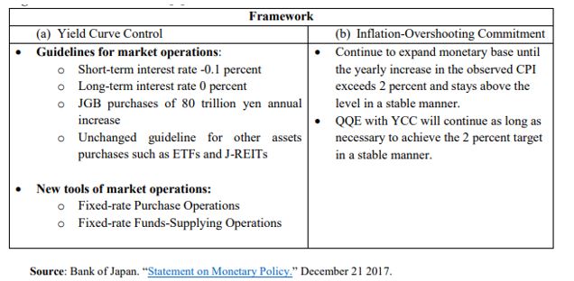
This was the context for YCC which Japan launched in September 2016. The economy was still in need for more stimulus but the way BOJ was providing it, didn’t work, and, if anything, worsened matters as the flat yield curve hindered the monetary transmission mechanism, and the negative interest rate worsened Japanese banks’ profitability. BOJ need to slow down its purchases of JGBs, and thus lower balance sheet growth. The way it was planning to do this was to move away from a quantity target back to an interest rate target with the novelty of adding a long-end one.
In addition to YCC, BOJ provided more clarity to its inflation targeting framework: it added an inflation overshooting commitment. This meant that inflation had to surpass 2% for some time so that average inflation rises to 2%. This brought it even closer to how AIT in the US is supposed to work.
YCC also resulted in a de facto BOJ balance sheet tapering – annual purchases went from 80Tn Yen in 2014 to eventually 16Tn Yen in 2019 – as BOJ didn’t have to interfere as much to keep interest rates within their targets. This was despite the fact that BOJ never actually changed its quantity target, which actually did create a lot of confusion – in March this year, the central bank even scrapped the upper limit on annual purchases. But there was no practical doubt that BOJ had moved on from a quantity to a rates target.
Despite the fact that YCC was initiated to steepen the yield curve, BOJ never really had to do anything in that regard. BOJ interventions were done through two tools: 1) fixed rate purchase operations and 2) fixed rate funds supply operations. The former was used only to bring 10yr JGBs below 10bps.
Benefits and Disadvantages of YCC
Historical analysis shows that a credible central bank can indeed control nominal interest rates. However, by default, it is fully in charge, strictly speaking, only of interest rates ceilings (bond vigilantes are indeed only a gold standard phenomenon; they are redundant in a free floating, irredeemable money monetary system). That is notwithstanding side effects such as higher inflation – which indeed might be one of the goals – or weaker currency.
Interest rate floors are a lot more difficult to control, as to do that, the central bank must be in possession of fixed income assets for sale. Central bank balance sheets may not have a higher bound, but they do have a lower band. When BoJ set on the steepen the yield curve, it indeed opened itself to such a risk, but it did have a very large balance sheet at the time (luckily it never had to go through selling JGBs). In theory a central bank can get around that problem by enlisting the help of the Treasury which can issue more bonds as the yield target breaks that lower bound limit. But then again, there might be negative side effects, such as deflation and a higher debt burden, which this time would be going against said goals.
When it comes to real yields, things get more complicated as inflation is added to the variables that need to be controlled. Historical experience suggests that structural shifts in inflation expectations are more likely to follow rather than lead spot inflation. Very generally speaking, it is a lot easier for a credible central bank to control an inflation ceiling than an inflation floor for somewhat similar reasons (see above). It seems that for a central bank to be able to control the floors of either real or nominal yields, it has to become ‘incredible’ (pun intended)!
Using these conclusions above, it seems to me that there is little upside to resort to YCC, if the goal was just to push inflation up. YCC is very much a complementary tool in that respect. However, YCC can be very effective in allowing inflation to go up alongside helping the Treasury fund. It is very much the main tool here.
One of the challenges of YCC is to keep the central bank balance sheet from expanding too much. Unlike limited QE, there is indeed a risk of it having to purchase large quantities of bonds to keep the interest rate ceilings. There is also the question of exit. Unlike QE which simply smoothed the yield curve, YCC provides a hard ceiling and thus the possibility of a large break higher in yields once the controls are lifted.
What Should the Fed Do?
The fact there was no specific feature on YCC at the Jackson Hole meeting this year (going by the first day of the meeting at this point), makes me think that this is not a monetary policy tool which is high on Fed’s agenda at the moment. Fed is more inclined to first try AIT and more direct forward guidance, as indeed Japan did pre-YCC. However, judging from the June 2020 FOMC minutes, if YCC were to be implemented, it would be on the short-end of the US treasury market, following the Australian model:
“Among the three episodes discussed in the staff presentation, participants generally saw the Australian experience as most relevant for current circumstances in the United States.”
The Australian model though combines YCC with a calendar-based forward guidance. It is not clear how that will work if the Fed adopts an outcome-based forward guidance first, as this is what is favored currently by most FOMC participants.
Also, the Fed must be careful as to exactly what shape yield curve it wants to eventually have. The 1940s YCC flattened the curve, while both Japan and Australia YCC steepened it. The US yield curve is currently flatter than the 1940s US curve but steeper than either Japanese or Australian one at the time YCC was announced. Going for the Australian example of pegging the front end, it will most likely steepen the curve as it did in Australia.
Prior to Jackson Hole, the OIS curve was indicating that there would be no rate hikes in the next 5 years. Post, market is not 100% sure, which means chairman Powel communication was not so clear. The 5y5y forward, which is probably the best proxy of the Fed’s terminal rate is still around 65bps: the curve is well anchored all the way to 10yr which is a great outcome given the massive supply of US Treasuries.
How much benefit would the curve get from pegging any yields up to 10 year? I don’t think a lot. It is the 30 year that the Fed might consider pegging eventually; below 1.5% today, it is still relatively low. The 30-year Treasury is where really proper market demand and supply meet and it thus becomes the focal point for the monetary – fiscal interplay.
If the Fed is planning to do YCC, it should peg the 30-year US Treasury, just like it did in the 1940s. For everything else, the Fed has better tools at its disposal.
Despite the fanfare in the markets, the Federal Reserve’s monetary stimulus, on its own, is rather underwhelming compared to the equivalent during the 2008 financial crisis. What makes a difference this time, is the fiscal stimulus. The 2020 one is bigger than the 2008 one; but more importantly, it actually creates net financial assets for the private sector.
Monetary Stimulus
Fed’s balance sheet has increased by 73% since the beginning of 2020. In comparison, it increased by 109% between August’08, the month before Lehman went bust and most major programs started, and March’09, the month when the stock market bottomed. Actually, by the time QE3 ended, in September 2014, Fed’s balance sheet had increased by 385% compared to since before the crisis.
Commercial bank reserves were at 9% of their total assets before the Covid crisis and are sitting at 15% now, a 94% increase. In the aftermath of the 2008 crisis, on the other hand, bank reserves tripled from August’08 to March’09 and increased 10x by September’14. Relative to banks’ total assets, reserves were just at 3% before the crisis but rose to 20% by the end of QE3.
Bank deposits were at 75% of their total assets in January’20 and are at 76% now, a 17% increase. Deposits were at 63% before the 2008 crisis, had declined to 60% by March’09, and eventually rose to 69% of banks total assets. Overall, for this full period, commercial bank deposits rose by 49%.
In percentage terms, Fed’s balance sheet rose less during the 2020 crisis than during the 2008 crisis and its aftermath.
Commercial bank reserves were a much smaller percentage of banks’ total assets before the 2008 crisis than before the 2020 crisis, but by the end of QE in 2014, they were bigger than today.
Banks started deleveraging post the 2008 financial crisis (deposits went up as a percentage of total assets) and continue to deleverage even now.
On the positive side, however, the Fed has introduced four new programs in 2020 that did not exist in 2008, Moreover, unlike 2008, they are directed at the non-financial corporate sector, i.e. much more targeted lending than during the financial crisis.
Nevertheless, very little overall has been used of the facilities currently, both in absolute terms (the new ones), and compared to 2008.
In fact, looking at the performance of financial assets, the market is not only telling us we are beyond the worst-case scenario, but, as equities and credit have hit all-time highs, it seems we are discounting a back-to-normal outcome already. It took the US equity market about four years after the 2008 crisis to reach its previous peak in 2007. In the 2020 crisis, it took two moths!
Following the 2020 Covid crisis, monetary policy so far is much less potent than following the 2008 financial crisis. Taking into account the full usage of Fed’s facilities announced in 2020, the growth rate in both Fed’s balance sheet and commercial bank reserves by the end of 2020 will likely match those for the period Auguts’08-March’09. But it has a long way to go to resemble the strength of monetary policy during QE1,2.3. Given that US equities only managed to bottom out by March’09, in an environment of much stronger monetary policy on the margin than today, means that their extraordinary recovery during the Covid crisis has probably borrowed a lot from the future.
Fiscal Stimulus
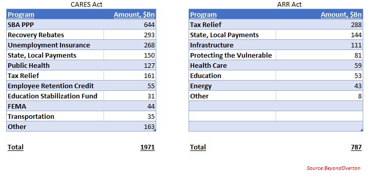
The Coronavirus Aid, Relief, and Economic Security (CARES) Act of 2020 is much bigger than the American Recovery and Reinvestment (ARR) Act of 2008, both in absolute terms and in percentage of GDP.
However, what really makes the difference, is the fact that the CARES Act has the provision to increase the private sector’s net assets. This is done through two of the programs. The SBA PPP allows for about $642Bn of loans to small businesses. If eligibility criteria are met, the loans can be forgiven. The Recovery Rebates Program allows for the disbursement of $1,200pp ($2,400 per joint filers plus $500 per dependent child). Nothing like this existed during the 2008 financial crisis.
Most of the loans through the SBA PPP have already been made, and about $112Bn are forgiven. So, there is another maximum of $532Bn which could still be forgiven (deadline is end of 2020). The Employment Rebate Programs is about $300Bn in size.
Just the size of these two programs can potentially be as big as the ARR Act was, in absolute terms. They create the possibility for the private sector to formally receive ‘income’, even though it is a one-off at the moment, without incurring a liability. Some of the other programs, like Tax Relief, are a version of that, but instead of acquiring an asset, the private sector receives a liability reduction – not exactly the same thing.
This is important. Until now, the private sector could receive income either in exchange for work, or, as it became increasingly more common starting in the late 1990s, with the promise of paying it back (in the form of debt). This now could be changing.
The Fed, for example, can not do that. Its mandate prevents it to ‘spend’ and only to ‘lend’. Until 2020, the Fed’s programs were essentially an exercise of liquidity transformation and a duration switch (the private sector reduced duration – mostly UST, MBS – and increased liquidity – T-Bills and bank reserves). There was no change in net assets on its balance sheet; the change was only in the composition of assets. The more recent programs introduced direct lending to the non-financial sector, still no net creation of financial assets, but a much broader access to the real economy.
In a sense, while the CARES Act comes closer to the concept of Helicopter Money or Universal Basic Income (UBI), the monetary stimulus of 2020 is moving closer to the concept of Modern Monetary Theory (MMT).
In that sense, while the reaction of financial markets to the monetary stimulus may not be deemed warranted, taking into account the innovative structure of the fiscal stimulus, asset prices overreaction becomes easier to understand. Still, I believe the market has discounted way too much into the future.
There is always a dichotomy between financial markets and the economy but, it seems that currently, the gap is quite stark between the two. It could be that the market is comfortable with the idea that, in a worst-case scenario, the authorities have plenty of ammunition to use, in the case of both the existing facilities as well as new stimulus.
As if rates going negative was not enough of a wake-up call that what we are dealing with is something else, something which no one alive has experienced: a build-up of private debt and inequality of extraordinary proportions which completely clogs the monetary transmission as well as the income generation mechanism. And no, classical fiscal policy is not going to be a solution either – as if years of Japan trying and failing was not obvious enough either.
But the most pathetic thing is that we are now going to fight a pandemic virus with the same tools which have so far totally failed to revive our economies. If the latter was indeed a failure, this virus episode is going to be a fiasco. If no growth could be ‘forgiven’, ‘dead bodies’ borders on criminal.
Here is why. The narrative that we are soon going to reach a peak in infections in the West following a similar pattern in China is based on the wrong interpretation of the data, and if we do not change our attitude, the virus will overwhelm us. China managed to contain the infectious spread precisely and exclusively because of the hyper-restrictive measures that were applied there. Not because of the (warm) weather, and not because of any intrinsic features of the virus itself, and not because it provided any extraordinary liquidity (it did not), and not because it cut rates (it actually did, but only by 10bps). In short, the R0 in China was dragged down by force. Only Italy in the West is actually taking such draconian measures to fight the virus.
Any comparisons to any other known viruses, present or past, is futile. We simply don’t know. What if we loosen the measures (watch out China here) and the R0 jumps back up? Until we have a vaccine or at least we get the number of infected people below some kind of threshold, anything is possible. So, don’t be fooled by the complacency of the 0.00whatever number of ‘deaths to infected’. It does not matter because the number you need to be worried about is the hospital beds per population: look at those numbers in US/UK (around 3 per 1,000 people), and compare to Japan/Korea (around 12 per 1,000 people). What happens if the infection rate speeds up and the hospitalization rate jumps up? Our health system will collapse.
UK released its Coronavirus action plan today. It’s a grim reading. Widespread transmission, which is highly likely, could take two or three months to peak. Up to one fifth of the workforce could be off work at the same time. These are not just numbers pulled out of a hat but based on actual math because scientist can monitor these things just as they can monitor the weather (and they have become quite good at the latter). And here, again, China is ahead of us because it already has at its disposal a vast reservoir of all kinds of public data, available for immediate analysis and to people in power who can make decisions and act fast, vert fast. Compare to the situation in the West where data is mostly scattered and in private companies’ hands. US seems to be the most vulnerable country in the West, not just because of its questionable leadership in general and Trump’s chaotic response to the virus so far, but also because of its public health system set-up, limiting testing and treating of patients.
Which really brings me to the issue at hand when it comes to the reaction in the markets.
The Coronavirus only reinforces what is primarily shaping to be a US equity crisis, at its worst, because of the forces (high valuation, passive, ETF, short vol., etc.) which were in place even before. This is unlikely to morph into a credit crisis because of policy support.
Therefore, if you have to place your bet on a short, it would be equities over credit. My point is not that credit will be immune but that if the crisis evolves further, it will be more like dotcom than GFC. Credit and equity crises follow each other: dotcom was preceded by S&L and followed by GFC.
And from an economics standpoint, the corona virus is, equally, only reinforcing the de-globalization trend which, one could say, started with the decision to brexit in 2016. The two decades of globalization, beginning with China’s WTO acceptance in 2001, were beneficial to the USD especially against EM, and US equities overall. Ironically, globalization has not been that kind to commodity prices partially because of the strong dollar post 2008, but also because of the strong disinflationary trend which has persisted throughout.
So, if all this is about to reverse and the Coronavirus was just the feather that finally broke globalization’s back, then it stands to reason to bet on the next cycle being the opposite of what we had so far: weaker USD, higher inflation, higher commodities, US equities underperformance.