• About
  • BeyondOverton Travel
    • Silk Road (1): If Turkey is in crisis, it’s not obvious visiting it
    • Silk Road (2): Could beautiful nature and ancient history create a false sense of entitlement?
    • Silk Road (3): Fast Car
    • Silk Road (4):We took a bus ride to Iran
    • Silk Road (5): Border bothers
    • Silk Road (6): Chevrolet Land
    • Silk Road (7): Free-roaming camels and wild horses
    • Silk Road (8): China West to East
    • Silk Road (9): I have not told half of what I saw
  • BLOG
  • g88kboy Travel
    • On the Silk Road
    • Bulgaria : The Chicken crossed the Road
    • Turkey : The Country, not the Bird
    • Georgia on my Mind
    • Armenian Ayran
    • Iran – The Curious Land
    • An American in Azerbaijan
    • Uzbekistan: Golden Teeth and Neon Signs
    • Kazakhstan: Thirty Sweating Seniors
    • China Part One – Pandas Are Extinct
    • China Part Two: My TED Talk (Deep Analysis)
    • Phillipines – They Relax, I (pretend to😉) Study
    • Singapore: flashing trees and a torrent of tears
    • Malaysia: That ain’t no croc, it’s a log
    • Brunei: The Instinctive Fight for Superior Domination
    • Phillipines: Hello Friend Again
  • Outside the window
    • Bulgaria
    • Turkey
    • Georgia
    • Armenia
    • Iran
    • Azerbaijan
    • Uzbekistan
    • Kazakhstan

BeyondOverton

~ let's move this window

BeyondOverton

Category Archives: Questions

The US labour market is slowing down

06 Tuesday Dec 2022

Posted by beyondoverton in Monetary Policy, Questions

≈ 1 Comment

Tags

Fed, inflation, labour market, Rates

  • Is US employment data hot, ‘goldilocks’, or ‘cold’?
  • Have you been inundated by calls and messages with the question, “But have you seen the details of the Household Survey?”
  • Is the Fed right to keep aggressively hiking?

Summary: The US labour market is slowing down despite headline grabbing low unemployment rate and high wage growth rate. The recent details underlying this data show the total number of people employed growing below trend, fewer hours worked and lower quits rate. As a result, the growth rate of total earnings is also going down, the effect being a lower share of national income going to labour and total consumption as a share of GDP stagnating. All this should make the Fed further re-evaluate its aggressively hawkish interest rate policy.

The Household Employment Survey makes the headlines

After a couple of weeks of ‘SBF’ trending, I, for one, was happy to take my mind off to something much more prescient and important as far as my investments are concerned – the US employment situation. At first glance, the November NFP report came much hotter than expected but because the market did not really react the way one would have expected from such a strong report, we started looking for reasons why that was the case.

Which bought us to the US Household Employment Survey. ‘Us’ here does not mean us literally (for those of you who had followed my writings at 1859, there was plenty of discussion on this topic as soon as I spotted the divergence between the two employment reports in September). And this note is not on why the Household Survey is showing different things from the Establishment Survey.

If you want to, you can read zerohedge on this topic here (I know, think what you want but the folks there were one of the first to spot the issue way back in the summer). If you can’t bear some of the conspiracy language at zerohedge, you can read an inferior version (but still good!) of the same at the more balanced Macro Compass. Finally, there are quite a few respected people on Twitter who have talked about it (see here, here, here).

To give you the full  disclosure, there are some legitimate reasons why the Household Survey produces different results to the Establishment Survey – and they have to do with a methodology issue, see here. BLS is actually well aware of that issue and calculates a time series which reconciles the two surveys and which can be found here (also with a very, very extensive comparison analysis between the methodology of the two). This adjusted data does not look that bad as the stand-alone Household Survey data (the November data was actually very good). But over the last 6 months it still points to a weakening employment market, not a stable or even hot one as per the Establishment Survey.

OK, that’s more than I wanted to write regarding the Household Survey. The rest of the note will show why the US employment situation is actually weakening even taking the Establishment Survey as a base.

The three variables of employment

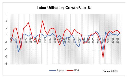
There are three aspects of employment in general as far as assuaging how hot the economy is doing: wages, people employed, and hours worked, i.e., we need to follow this sequence, purchasing power->consumption->GDP) Basically, one needs to know the full product of Wages X Total Employment X Hours Worked (assuming, of course, that wages are per hour worked; not all jobs pay per hour, but those that do have actually increased at the expense of the others – see some of the links above which discuss the prevalence of part-time jobs and multiple job holders).

The economy can be hot even when wages are flat, or even declining, but there are more people entering the workforce or there are more hours worked – there are multiple combinations among the three variables producing various results. The point is to consider all three variables.

Total number of employed is growing below trend

Let’s take the period in the last three years or so after the Covid crisis. Yes, wage growth has picked up, but more people have exited the labour force and there are fewer hours work.  

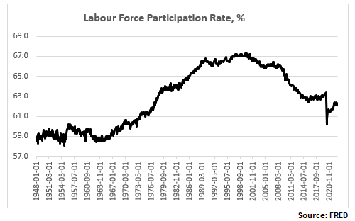
The labour force participation rate is still below the pre-Covid levels, and close to a 50-year low:

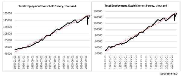
The total number of people employed has risen but, depending on whether one uses the Establishment Survey or the Household Survey, the number is either just above the pre-Covid levels or indeed below. In any case, regardless of which survey one uses, the number is still below trend (and has not been above trend since the 2008 financial crisis).

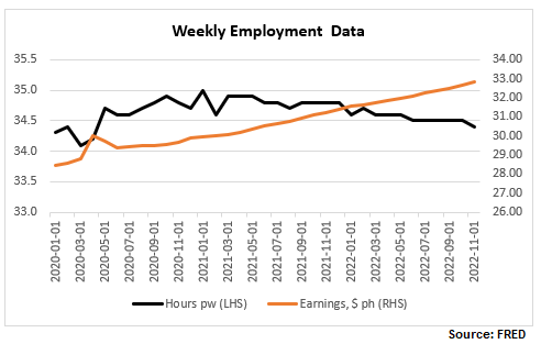
Higher wages but lower hours worked

Finally, here are wages and hours worked. I have included below a time series chart for only the last 3 years to be able to see better the divergence between the two: while wages continue to rise, hours worked peaked in January 2021 and have now reversed the spike in 2020.

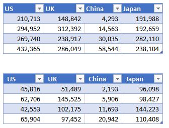
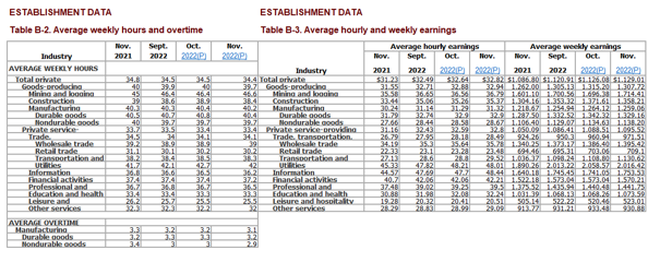
Let’s focus more on the latest NFP report. Here are the relevant tables below.

  • Generally higher-wage industries, like goods producing, tend to exhibit a smaller increase in hourly wages than lower-wage ones, like services.
  • In some cases, like the Utilities sector, which has the second highest wage per hour but also the highest average weekly earnings (courtesy of more hours worked, more on this later), wages have actually declined.
  • Transportation and warehousing sector has an unusual jump in wages, about 5x the average rise in wages – is there something specific going on there?

The growth rate of total earnings is declining

It is important to look at the last columns in Table B-3 above, ‘Average weekly earnings’, which gives a much better picture of take-home pay as it combines wages with hours worked. So, while indeed the trend of declining 12m-growth rate of weekly wages was reversed with this latest report (back above 5%), which some commentators have warned the Fed should be worried about, the trend of declining total weekly earnings continues to be intact.

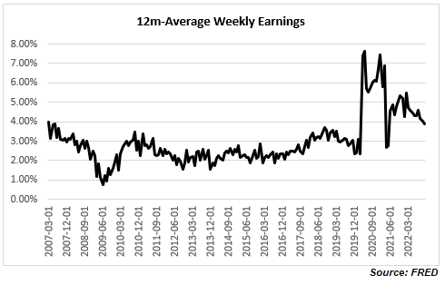
Note, average hourly earnings are still elevated, hovering at previous peaks but this is hardly a reason for the Fed to get more worried about, especially after already delivering the fastest interest rate hiking cycle in recent memory.

In fact, quite on the contrary. Despite all the excitement about the rise in wages, the share of national income going to workers has been on a decline, with the post-Covid spike now quickly reversed. We are back to the familiar territory of the low range post the 2008 financial crisis which is also the lows since the mid-1960s. If you were worried about a wage-price spiral issue, ala the late-1970s (I actually do not think there was one even back then as real wage growth even then was negative), you really shouldn’t be. It is a very different dynamic, at least for the moment.

Consumer demand as a share of GDP has been stagnant for more than a decade

And if you are really worried that consumer demand will push inflation higher, again, you shouldn’t be, necessarily: consumption as a share of GDP is elevated relative to historical records but it is not even above the highs reached more than a decade ago. In fact, it seems that consumption has not been an issue for inflation for at least the last two decades.

The quits rate is declining

One final observation, there is another labour data series which has been often cited as an example of a tight labour market: the quits rate.  I would though argue two things: 1) labour tightness explains only part of the elevated quits rate, and 2) the quits rate has already started declining.

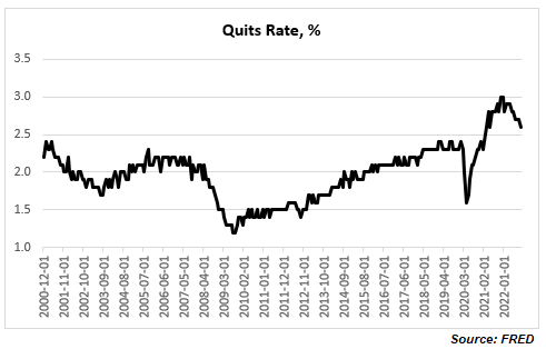
A higher quits rate is quite consistent with an increasing share of lower paid jobs and with multiple job holders both of which have been trends seen post the 2008 financial crisis, and especially during and after the Covid crisis. It is possible to decompose the quits rates by industry and sector. For example, retail trade, accommodation, and food services, all of which are lower paid/temp jobs by multiple job holders, have much higher quits rates than the average across all industries. This is corroborated by a Pew Research report according to which most workers who quit their jobs cited low pay.

Finally, the quits rate actually peaked at the end of last year (notice the Household/ Establishment Employment Survey discrepancy started shortly after) at about 3%. This is the highest in the series, but the data officially goes back to only 2000. BLS has actually related quits rate data (but only for the manufacturing sector) prior to 2000 which shows that the quits rate has been above 3% in the past, and yes at above 3%, the quits rate is associated with the peak in economic expansion. You can see the full data set and BLS perspective on it here.

Bottom line: you do not need to believe in conspiracy theories about Household Survey vs Establishment Survey labour data inconsistency to conclude that the US labour market is far from tight. If anything, it has already started to slow down. Do not be confused by headline numbers of high wage growth rate and low unemployment rate, look at the overall employment picture taking into account trends in overall total compensation.  

Mirror, mirror on the wall, who is the wealthiest of them all?

18 Monday May 2020

Posted by beyondoverton in Politics, Questions

≈ Leave a comment

When we talk about the European Union, we often lament that there are no fiscal transfers from the ‘rich countries of the North’ to the ‘poor countries of the South’, assuming that indeed this is so. But is this really so, and how have things changed since the inception of the EUR?

To measure wealth across countries, economists normally use GDP per capita. This is how some of the major EU countries rank according to this measure.


AT=Austria, BL=Belgium, FN=Finland, FR=France, GE=Germany, GR=Greece, IR=Ireland, IT=Italy, NL=Netherlands, PO=Portugal, SP=Spain

More or less, as expected, the bottom is taken by the four Mediterranean countries, while the north and core are at the top. However, GDP is a flow variable, measuring how much economic activity was created during a specific year. It tells us nothing about pre-existing wealth or, in fact, current debts.

A much better measure to use for that purpose, would be CSFB data for net wealth per adult. CSFB publishes two sets of data: mean and median net wealth per adult. Here is the data for the same set of countries as above.

The two data sets give a slightly different view. Looking at the mean net wealth, the bottom three countries in 2000, Finland, Greece and Portugal, are still the bottom three countries in 2019, though in slightly different order. The Netherlands was the wealthiest country in both 2000 and 2019. However, the top three in 2000 was also comprised by Italy and Belgium, while in 2019, they were replaced by France and Austria.

According to median net wealth, however, two things stand out. First, the Netherlands was top three in 2000 but last in 2019 (the data for the Netherlands does look strange; the median net wealth collapses after 2011; I wonder if it is a question of CSFB changing something in their model). Second, Italy was top in 2000 but right in the middle of the rankings in 2019.

The other striking takeaway is that whether we look at mean or median net wealth, Germany is not that rich at all: it is much closer to the bottom of both sets of data. What about the North vs South divide? Portugal and Greece do seem poor but Span and Italy are more often seen in the top half of the rankings than in the bottom.

Part of the confusion when it comes to classification between the ‘rich’ North and the ‘poor’ South comes from looking only at the asset side of household balance sheets. Using BIS data for household debt and World Bank population statistics we can also calculate household debt per capita for each of these countries. This is the ranking according to this measure (the lower debt per capita the better).

The Mediterranean countries are better off than the core and the north as they have much less household debt per capita. This might be almost counterintuitive: the more assets one has, the more liabilities, they might also have.

We can also cross check the CSFB data above by combining the GDP per capita and the household debt per capita data to arrive at an approximation of a net wealth per capita. As discussed, we have to bear in mind that GDP is a flow variable, while debt is a stock variable, so we are not comparing exactly apples to apples. Here is the ranking according to the difference between GDP and Debt per capita.

The Netherlands is bottom just like in the median net wealth data from CSFB. Portugal and Greece bring up the rear which is also consistent with previous findings. The top three are slightly different. Ireland is top here and was second in the median net wealth data from CSFB. But here Germany is third while it was more towards the bottom in the previous case.

And here is the ranking according to ratio of household debt to GDP to capita ratio.

The Netherlands is bottom again, with Portugal and Finland bringing up the rear, so, similar to the CSFB data. The top is a bit more mixed but Ireland still figures in both sets of data.

Bottom line is that there is a much less clear differentiation between the North and the South when it comes to net wealth per adult/capita than what we tend to assume.

How have some of the other major countries fared?

Mean wealth (top table below) in the US is almost twice as big as the average mean wealth of these European countries, but median US wealth (bottom table) is less than that respective average. Japan’s median wealth has barely risen from 2000 (at least compared to any of the other countries shown here) but it is almost twice as big as US’. The median Brit is richer than the average median European but only marginally so compared to the Spanish or Italian. Finally, despite its phenomenal growth since 2000, China is still twice less rich that Greece, which is the ‘poorest’ of the European countries above.

Fed’s greatest liquidity boost ever?

12 Sunday Jan 2020

Posted by beyondoverton in Monetary Policy, Politics, Questions

≈ 1 Comment

Tags

Fed, repos

According to John Authers at Bloomberg, data from CrossBorder Capital, going back to January 1969, shows that we have been recently experiencing Fed’s greatest liquidity boost ever. I have no reason to doubt CrossBorder Capital or their proprietary model of measuring liquidity. But there are many ways of defining, as well as measuring, liquidity. So, I decided to simply look at what exactly the Fed has done since it started expanding its balance sheet in September last year.

Source: FRB H41, beyondoverton

Fed has indeed been doing more than $100Bn worth of repo operations on a daily basis recently, but those operations are only temporary, i.e. they can not be taken cumulatively in ascertaining the effect on liquidity. In fact, the Fed’s balance sheet has increased by $380Bn, and only 55% of which came from O/N and term repo operations ($211Bn). The other 45% came from asset purchases. On the asset purchases, the Fed bought mostly T-Bills ($182Bn), some coupons ($55Bn) while letting its MBS portfolio slowly mature (-$81Bn).

However, not all of that increase went towards interbank liquidity. In fact, only about 50% of that increase ($198Bn) went towards bank deposits. The TGA account increased by $167Bn; that drained liquidity. Reverse repos decreased by $20Bn (FRP by $17Bn and others by $3Bn), which added liquidity. Finally, $37Bn went towards the natural increase in currency in circulation.

Source: FRB H41, beyondoverton

Fed actually started increasing its T-Bill and UST portfolio already in mid-August, three weeks before the repo spike. Part of that increase went towards MBS maturities. But by the end of August, Fed’s balance sheet had already started growing. By the third week of September, also the combined assets portfolio (T-Bills, USTs, MBS) started growing as well, even though MBS continued to decrease on a net basis.  

Source: FRB H41, beyondoverton

Fed’s repo operations started the second week of September. They reached a high of $256Bn in the last week of December. At the moment they are at the same level where they were in the first week of December ($211Bn).

Source: FRB H41, beyondoverton

On the liability side, the TGA account actually bottomed out two weeks before the Fed started buying USTs and T-Bills, while the FRP account topped the week the Fed started the repo operations. Could it be a coincidence? I don’t think so. My guess is that the Fed knew exactly what was going on and took precautions on time (we might find eventually if it did indeed nudge foreigners to start moving funds away from FRP).

Source: FRB H41, beyondoverton

Finally, while currency in circulation naturally increases with time, bank deposits also bottomed out the week the Fed started the repo operations in September, but strangely enough, they topped the first week of December (for the time being).

Source: FRB H41, beyondoverton

So, while the Fed’s liquidity injection since last September was substantial relative to both the decrease in liquidity before that (starting in 2018 when the decrease in the Fed’s balance sheet became consistent) and, to a certain extent, since the end of the 2008 financial crisis, it is difficult to make a claim that this is the greatest liquidity boost ever. The charts below show the 4-week and 3-month moving average percentage change in the Fed’s balance sheet. The 4-week change in September was indeed the largest boost in liquidity since the immediate aftermath of the 2008 financial crisis. The 3-month change though isn’t.

Source: FRB H41, beyondoverton

The Fed pumped more liquidity in the system during the European debt crisis. In the first four months of 2013, not only the growth rate of the Fed’s balance sheet was higher than in the last four months now since September 2019, but also the absolute increase in Fed’s assets and US bank deposits. Moreover, there were no equivalent increases in either the TGA or the FRP accounts.

Final note, if the first week of January is any guide, it might be that a big chunk of the Fed’s balance sheet increase might be behind us, if only for the time being. Fed’s balance sheet decreased by $24Bn, which is the largest absolute decrease since the last week of July 2019, i.e. before the start of the most recent boost in liquidity. I actually do expect the Fed’s balance sheet to keep growing but at a much smaller scale and mostly through asset purchases rather than repos.

Source: FRB H41, beyondoverton

Do stock markets always go up?

08 Friday Nov 2019

Posted by beyondoverton in Asset Allocation, Equity, Questions

≈ 1 Comment

Tags

returns

In the long run – yes (assuming no failed states).

Do you, guys, remember the Betteridge’s law of headlines?

How do we define a long run?

How about the whole history of the S&P 500 Index.

Since 1871 S&P 500 index has gone up 3,049% (2.4% annual return) or 1,855,212% (6.9% annual return) in real terms*.

However, it took 57 years for the S&P 500 to break firmly above its 1929 high in real terms! That’s more or less, one generation of flat returns.

And let’s look at those 148 years of returns. How were they distributed?

For 115 of those, between 1871 and 1986, the S&P 500 had a total return of about 460% (without dividends – just price change). That’s 1.5% return per year.

Then for the next 33 years, the S&P 500 returned the same 460% in total but this time, the annual return was more than 3x higher at 5.3%.

115 years of return happened in just 33 years!

What exactly happened in the early 1980s?

Let’s just say, there was no miracle.

However, the power of shareholders’ primacy lead to an explosion of US share buybacks; the economy’s financialization lead to massive M&A activity and the reform of executive compensation incentives. All this contributed to the strong returns for US stocks.  

There was, of course a positive correlation to US GDP growth and US productivity growth and US population growth, but a negative correlation to the changes in them (meaning, the lower growth rates of the US economy, productivity and population in the latter period coincided with higher stock market returns).

Were the strong returns post 1986 a payback of the decent returns prior or a pay-forward from the future earnings ahead?

My bet is on the latter given the possibility of simple mean reversion of returns probability coupled with lower real GDP growth rates and declining productivity growth rates. If negative returns on sovereign debt are any guidance, I would not be surprised if what follows is several decades of flat returns overall.

*Source for all data is Robert J. Shiller website: http://www.econ.yale.edu/~shiller/data.htm

Pension fund crisis?*

24 Thursday Oct 2019

Posted by beyondoverton in Debt, Politics, Questions

≈ Leave a comment

Tags

pensions

At presentations you will see the blue line below.

How many times have you seen the red line?

Pension funds unfunded liabilities have indeed been on the rise, especially after 1999. But so have pension funds assets. So much, that the ratio between the two has been declining (which is the natural, long-term trend) since 2008.

In fact, for the whole period between WW2 and 1984, unfunded liabilities were always bigger than funded liabilities. In 1999, unfunded liabilities hit an all time low of 25% of funded liabilities and even though that ratio has risen since then to 75%, it is still much closer to the bottom of the whole period since 1945.

So, is there a pension fund crisis?

Maybe, but it is not obvious to me that it is anything bigger than at any other point in history before the 1990s.

Could there be a pension fund crisis?

Of course. But you know what is going to happen (as long as the US is fully sovereign), the Treasury will bail out the pension fund industry just as it bailed out the fund management industry in 1988 following the Asian/Russia crisis, and the banking, insurance and auto industry following the 2008 financial crisis.

This, sadly, does not prevent that future pensioners might be exposed to some misguided government attempts to respond to this supposed pension fund crisis by extending the retirement age.

Bottom line is that 1) pension funds unfunded liabilities are not even close to being in a crisis and 2) any fully sovereign government is in a position to provide all the necessary resources to secure comfortable retirement to its people.

We have advanced as a society to such an extent that the only hurdle to a normal life to all at the moment is our antiquated rules of accounting, not our lack of resources.

*Betteridge’s law of headlines: “Any headline that ends with a question mark can be answered by the word no.”

What do Myanmar driving and our monetary system have in common?

21 Thursday Mar 2019

Posted by beyondoverton in Monetary Policy, Questions, Travel

≈ Leave a comment

Both make people’s lives unintentionally difficult and complicated by having changed the system in the 1970s but continuing to insist on following the same old rules.

In 1970, Myanmar General Me Win changed the direction of traffic in the country (literally overnight) from left to right. Such a sudden decision would have been a precarious change even in the best of circumstances, but in the case of Myanmar which, having been a British colony, traffic had been on the left with a right-hand drive steering wheel, it was truly extraordinary given that all the cars continued to be with a right-hand steering wheel!

In 1971, US President Richard Nixon ended the gold standard which had been at the core of most of the world’s monetary systems for centuries. The world truly went on fiat money. That would have been a difficult task in the best of circumstances given the previous history of fiat money. In the case of US, and most other countries, it became an impossible one given that no attempt was made to upgrade the monetary system to the new reality of fiat money.

Every country we have visited so far on our journey is unique on its own, but no country in the world is so truly unique as Myanmar when it comes to driving on the road. We spent almost a month in Myanmar and honestly it took me some time to realize that we were driving on the right side of the road but also the driver is sitting on the right side of the car! Can you imagine how hard and crazy this is? I actually can, having lived in London for two decades and frequently driven to Europe. But even that is not a good comparison as I would generally drive on well-kept highways in Europe, while in Myanmar there are no real highways, all roads are single lane and quite bad by European standards. Try overtaking under these conditions in Myanmar: when the steering wheels of cars didn’t change, people were left with relying on honks and passenger guidance when merging into a lane.

Something similar happened with our monetary system: in 1971 we finally, and for good, threw off the gold shackles but we did not change the gold standard accounting (CB reserves vs. government bonds) and continued to impose imaginary limits on government finances and money supply in general. This is as backward, inconvenient and dangerous as a right-hand drive on the right side of the road.

I started paying attention to this monetary inconsistency only after GFC’08 when it became obvious that there is something ‘not right’ with our money supply: the way the Fed was conducting QE, the way inflation did not budge, and the way no one batted an eyelid when the $700bn financial rescue plan was announced. Then I discovered Mosler, Wray and the rest of the original MMT crew. Finally, I brushed up on financial history going well beyond the Great Depression, when ‘MMT’ was last popular, to Knapp and even beyond (“Debt: the first 5,000 years”). But what convinced me most that our monetary transmission mechanism is far from optimal (just like in Myanmar, I had to spend some time on its roads to even notice the peculiarity) was that I was intimately involved in the plumbing of the financial system by trading and having exposure in the short end of the money markets, especially in the years following GFC’08.

What is extraordinary for me in both cases is that people don’t seem to be bothered and despite the obvious difficulties prefer to just get on with the existing status quo. Speaking to locals in Myanmar, there is neither appetite to change back to the previous driving system, nor to start importing left-hand driving wheel cars (even though some people have mentioned a draft law that would have a cut-off point after which only left-hand drive wheel cars would be allowed to be imported). In the case of gold-standard-monetary-system-not-fitted-to-a-fiat-world, the people in power (central bankers, prominent economists) have ridiculed any attempts to think of possible improvements.

Is Boeing giving too much money back to shareholders?

18 Monday Mar 2019

Posted by beyondoverton in Equity, Questions

≈ Leave a comment

Tags

share buybacks

Has Boeing invested enough in R&D? Could investing more instead of returning money to shareholders in the form of share buybacks and dividends have prevented the faulty automated system which supposedly was the cause of the two most recent fatal crashes?

  • Boeing’s share price has risen more than 250% over the last 5 years. The DJI, of which Boeing is a part of, has risen about 60%; the S&P Index has risen about 50% during that period.
  • Boeing has bought back a total of $39Bn of shares over the last 5 years which is actually just about half of the authorized amount. The 2018 share buyback payout ratio was about 76%. The share buyback has increased by 50% over this period, and at the moment it is one of the largest among US companies.
  • As a result of the share buybacks, Boeing’s share count has been reduced from 767m in 2013 to 586m in 2018, or by about 24%.
  • Over the same period Boeing has spent about $17Bn on R&D, about half the amount spent on buybacks; R&D spending has been flat in the last 5 years.
  • Top-line revenue growth over the last 5 years is about 3% per annum which fades in comparison to share price growth, or EPS growth (see below).
  • Bottom-line EPS annual growth rate, on the other hand, is about 24%. There is no doubt that this is a consequence of decreased share count (see above) simply by logical deduction. However, it could also be as a result of reduced costs (of which employment still is the largest, see below). Either way, both causes can be seen as a temporary phenomenon and not good for the company’s long-term prospects.
  • Boeing has reduced payroll by about 10% over the last 5 years, despite total US full-time employment rising by 10% over the same period.
  • Boeing has increased its dividend by 325% over the last six years. For 2018, its dividend payout ratio was 39%, which makes the total payout ratio stand at 115%, i.e. Boeing is spending more than 100% of its earnings on shareholders payouts. This is financed pretty much all by rising FCF rather than new debt.
  • Nothing wrong with giving some FCF back to investors IF: 1) that does not jeopardize the company’s future profitability, which would be determined more by top-line rather than bottom-line growth – there is a limit how much costs can be cut; 2) that means, unintentionally, producing a defective product which not only cuts company’s profitability or causes, in extreme cases, actual physical damage to consumers. In both cases, the verdict on Boeing is still out.

To all the people who think share buybacks are the best way to utilize company’s resources, that they do not affect the company’s share price, that they do not reduce the share count and have no bearing on employment, Boeing is not your best example.

Is Japan doing that bad?

16 Wednesday May 2018

Posted by beyondoverton in Questions

≈ Leave a comment

Latest GDP numbers out of Japan came out overnight and though the decline in GDP was expected, it was worse (-0.1% vs -0.6% actual). But is this really a surprise given the continuous decline in the Japanese population – deaths outnumber births now by more than 1,000 per day?

  • The growth rate of Japan’s population started declining in earnest in the mid-1970s, but it turned negative only in 2009. Absent massive rises in productivity, it is natural for GDP growth rate to decline as well in line with the decline in population growth.
  • Still, Japan’s GDP growth rate has been consistently above the growth rate of its population (another way of saying GDP per capita rises) except for a brief period post the 2008 financial crisis. Nevertheless, the average GDP growth rate since 2009 is still above the average growth rate of the population (0.6% vs -0.1%, respectively).

What does this mean? Positive labor productivity growth rate.

  • Since the 2008 financial crisis, Japan’s annual GDP per capita growth rate averaged the same as US’. Even since the 1990s, when Japan’s supposed stagnation started, its GDP per capita was on average just 35bps lower than that in the US.

  • GDP per capita growth can be broken by growth in labor productivity (GDP per hour worked) and changes in labor utilisation. Measured by GDP per hour worked, Japan surpassed USA in 1989. But measured by labor productivity growth, it has outperformed the US since the 1970s at least.

  • High labor productivity can come from many things (greater use of capital, low labor utilisation, innovation). In general, Japan tends to have a lower labor utilisation rate than US. That could mean more automation/ less employment of low productivity workers.

  • Perhaps that is why, Japan also tends to have a lower labor compensation (per hour worked) growth rate than US. However, in 2016, for the first time, that changed.

Bottom line is as long as population continues to decline, GDP should also be expected to decline given also lackluster productivity growth. However, as long as productivity growth is positive, GDP rate of decline should stay above population rate of decline. It could be better, but there is nothing bad about that either.

Is the effect of demography on inflation fading?

10 Thursday May 2018

Posted by beyondoverton in Questions

≈ Leave a comment

Good paper by M. Juselius and E. Takats on “The enduring link between demography and inflation” pointing to the fact that:

  • an increase in the share of the dependent population is generally associated with higher inflation; and
  • aging is set to increase the share of dependents, reversing a previous trend.

Is inflation then set to burst higher? It depends.

First, even though the global dependency ratio is rising, its level is not the same for each country. For example, China’s current dependency ratio at 40 is 58% of Japan’s at 68. US dependency ratio is forecast to rise the least; in fact, in the mid-2030s, it is forecast to start declining again.

Second, a lower dependency ratio, even though a rising one, should in theory cause less upward pressure on inflation. By that measure, US inflation may rise but would probably rise less than UK’s and EU’s; in fact, by 2050, with US dependency ratio the lowest among these major countries, one would expect US inflation to be the most subdued.

Third, Japan’s dependency ratio has been rising pretty much since the great crash in 1990, and, in 2007, it surpassed these other countries’ dependency ratios, while this whole time has coincided with a period of consistent deflation there: obviously there are other, presumably, much stronger determinants of inflation.

Fourth, and to the latter point, with the advance of technology, labor’s role in the production function is becoming less important. Does that mean that demography’s role in influencing inflation is also fading?

What does investment-led growth even mean?

27 Monday Nov 2017

Posted by beyondoverton in Questions

≈ 2 Comments

It does not matter how we spin it and define it, economic growth is about production and consumption chasing each’s other tail in a circle. We can argue what comes first but reality is that we need both.

A few years ago, Noah Smith wrote a blog post with a similar sounding title but focusing on consumption.

Nowadays, it seems fashionable to talk about innovation in technology and increasing productivity so the latest epiphany when it comes to ways to boost economic growth is to focus on investment (with the buzz words of driverless cars, AI, blockchain, etc.).

In other words, we have given up on trying to do anything about the demand side of the economy (purchasing power down because wages pressured by automation and globalization) so let’s go back to trying to increase the supply (and hope that it will create its own demand?). Sadly, Say’s Law does not work in the modern fiat-based economy (maybe it did work in a barter economy).

So, increasing investments, will it push up GDP growth?

Yes, of course. GDP(Y) = investment(I) + consumption(C) + government spending(G) + net exports(NX). If we increase I, Y will go up.

But aren’t we already operating way below capacity in the developed world? What’s the point of creating even more capacity. The point is that at t(0), if I goes up, Y goes up (and inflation probably goes down, but who cares, right?).

But let’s say we weren’t operating below capacity. Doesn’t this investment at some point need to be ‘consumed’? How is it going to be consumed if there is no purchasing power?

Or maybe the plan is to ‘export our investment’ so that some other country can consume it. Well, I guess it is possible, but the stuff we are good at (financial services, defense, education) we are already exporting. There are a lot more things we are good at but they are either in the digital sphere where the marginal cost of production and, especially distribution, is zero and there is not much value-added, or we do not want to export it (really high-tech stuff).

I think the sad reality is:

We have exhausted all other options in the above equation.

C: Not that consumption-led growth does not work per se, but that it does not work with borrowed money. It does work, however, if people have the income to consume.

G: No one has the appetite for more government spending (even though some people, when they talk about investment-led growth, do include the government there)

NX: It’s not like there are many other countries out there that are eager/have the means to consume.

So, yes, increasing I is the next logical step. And it could work as long as that is accompanied by a rise in purchasing power which eventually gets transformed to a rise in aggregate demand which leads to increased consumption. Or something like this: I rises in t(0) -> Y rises in t(0) which leads to a rise in C(t+1) and a corresponding rise in Y(t+1). A virtuous cycle we could create indeed.

But if I does not result in a rise in purchasing power, i.e. if we invest in increasing production through automation, then it is a dead end. Which is why all these corporates are sitting on their cash and buying back their share and not investing.

In an environment when inflation is close to zero and we are operating way below capacity, it sounds strange to me that we are going to focus on investment which will only increase capacity, instead of figuring out how to prop up consumption without incurring more personal debt.

It is a totally different argument whether we need consumption at all, or rather whether even if we give people money to consume they will (I bet the millennials are much less likely to consume regardless of their income). Which raises the issue of whether we really need additional GDP, whether that should be our focus etc.

My answer is as long as we have a debt-based economy, we are hooked on GDP. All this talk about fancy other stuff to measure our wellbeing is great but it does not cut it that somebody has to service that debt. Of course, there are alternatives but they must be accompanied by some sort of a debt jubilee.

← Older posts

Subscribe

  • Entries (RSS)
  • Comments (RSS)

Archives

  • January 2023
  • December 2022
  • November 2022
  • August 2022
  • February 2022
  • April 2021
  • November 2020
  • October 2020
  • September 2020
  • August 2020
  • July 2020
  • June 2020
  • May 2020
  • April 2020
  • March 2020
  • February 2020
  • January 2020
  • December 2019
  • November 2019
  • October 2019
  • May 2019
  • March 2019
  • February 2019
  • January 2019
  • December 2018
  • November 2018
  • October 2018
  • September 2018
  • August 2018
  • June 2018
  • May 2018
  • March 2018
  • February 2018
  • January 2018
  • November 2017
  • October 2017
  • September 2017
  • August 2017
  • July 2017
  • June 2017

Categories

  • AI
  • Asset Allocation
  • blockchain
  • China
  • De-urbanization
  • Debt
  • Decentralization
  • EM
  • Energy
  • Equity
  • FX
  • g88kboy
  • Monetary Policy
  • Politics
  • Questions
  • Quotes
  • The last man standing will laugh
  • Travel
  • UBI
  • Uncategorized
  • VR

Meta

  • Register
  • Log in

Blog at WordPress.com.

  • Follow Following
    • BeyondOverton
    • Join 73 other followers
    • Already have a WordPress.com account? Log in now.
    • BeyondOverton
    • Customize
    • Follow Following
    • Sign up
    • Log in
    • Report this content
    • View site in Reader
    • Manage subscriptions
    • Collapse this bar
 

Loading Comments...