Apple is up more than 70% this year; Microsoft – 50%. Together they have contributed almost 40% to the more than 30% rise in the Nasdaq.
Facebook, Google and Amazon, the other heavy weights in the index, have together contributed about 19% to this year’s performance.
Just five companies have contributed almost 60% to this year’s Nasdaq returns!
Apple and Microsoft together have bought back almost $85Bn of their own shares this year. Amazon does not buy back its shares (yet). Google started in 2015 and has bought back $8Bn this year. Facebook started buying back its shares last year and has bought back about $13Bn this year.
Intel, Comcast, Nvidia, Costco, Charter Communications bring up the top 10 with a combined share buyback of around $20bn. Costco, Charter Communications and, to a certain extent, Nvidia, are actually, good examples of Yardeni’s claim that companies mostly buy back shares to avoid dilution. Sadly, that is not the case for the heavy hitters in the list, the ones doing most of the buybacks, and thus the ones with a disproportionate influence on index performance. For example, just among those five, Intel and Comcast have done 3/4 of the combined buybacks.
There is a big difference when it comes to Apple and Microsoft, however.
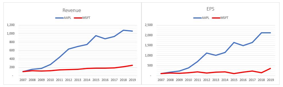
Since 2007 Apple has outperformed Microsoft in both Revenue growth (former’s increased 10x, latter’s – about 2.5x) and EPS growth (20x increase vs. 3.5x). In 2007 Apple’s revenue was about half of Microsoft’s. In 2010 they were the same. Today Apple’s revenue is more than 2.5x bigger than Microsoft’s, however it topped in Q3’2018, while Microsoft’s is still growing.
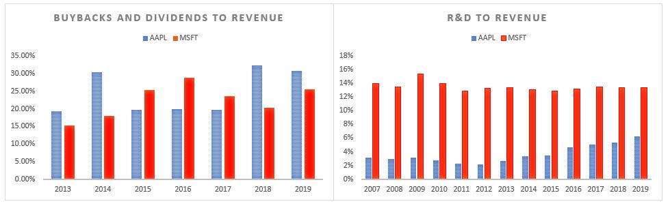
Apple only started paying dividend in 2010 and buying back its stock in 2011. Since then, both have spent about 25% of their top-line revenues, on average, on shareholders payouts. However, Microsoft spends considerably more on R&D as a % of revenue than Apple.
Apple managed to reduce its share count by almost 30% since 2012. Microsoft reduced its share count by a ‘mere’ 22% since 2007. And it shows. Apple’s share price has massively outperformed Microsoft’s since 2007. Of course, there are other factors in place (the IPhone came in 2007) and maybe it is just a coincidence that the out-performance started in 2010, when Apple began giving cash back to shareholders!
Bottom line: Make sure you have at least AAPL and MSFT share price on your screens all the time into year end.
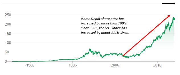
Home Depot cuts its 2019 forecast after sales miss; shares drop the most since 2008.
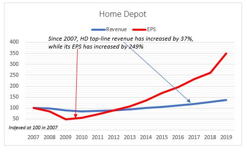
Since 2007, Home Depot’s top-line revenue has increased by 37%, while its EPS has increased by 249%, almost 7x more.
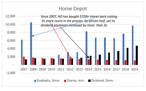
Since 2007, Home Depot has bought $72Bn shares back, one of the largest share buyback programs out there, cutting its share count in the process by almost half; yet its dividend payments increased by more than 3x.
Emphasis on the fact that Home Depot topped analysts’ expectations for earnings but sales fell short. Which is exactly the story of our times: Easier to push up EPS through the share count (buybacks) than through top-line revenue growth. Management also gets paid on EPS, not revenue.
And the cherry on the cake: Home Depot’s share price has increased by more than 700% since the end of 2007; the S&P Index has increased by about 111% since then.
One would have thought that after so many years of Home Depot using the same technique to ‘score a home run’, investors would have understood the tactic and re-priced its valuation.
The idea about this post came after listening to Ben Hunt’s and Ed Yardeni’s recent Ritholz Wealth Management podcasts. While, in general, I do agree with the conclusion Ben reaches, I thought looking at just two individual companies’ share buyback programs, as he did in two separate posts, is perhaps a bit too narrow. At the same time, I was doubtful whether Yardeni’s approach of going to the opposite extreme of looking at all S&P 500 companies and taking the average is equally that ‘practical’.
Ed Yardeni is a top strategist but his claim in “Exposing the big lie about stock buybacks” that the majority (2/3) of US stock buybacks go to cover employee stock issuance, even if true on an aggregate level, does not change the fact that buybacks are possibly the main driver of US stock out-performance.
“The current source for equity issuance data in the Financial Accounts of the United States does not fully incorporate issuance to employees by public corporations. Staff is exploring how best to reflect such issuance activity in future releases.”
Emphasis on fully. What does this mean? Look at p.68, table F.223 of the latest Flow of Funds data. So, line 2 (‘Nonfinancial corporate business’) does not include ESOPs (and other equity compensation plans)? I don’t think that changes the demand-supply dynamics. Share grants are different from IPOs and buybacks as they are a non-cash flow item, as in the former there is no exchange of cash at issuance and the effect on the supply of shares happens only when those are sold by the employees in the secondary market. They are a balance sheet item. So mot likely, they will be registered either in line 16 (‘Household sector’) or in line 31 (‘Broker and dealers’) at the point of sale.
In any case, in the Flow of Funds data, ‘Net Issue‘ and ‘Net Purchases‘ have to balance, if we start tinkering with the net issuance (line 2), as in, assume that actually US corporates net bought back fewer shares to account for the ESOP (and other equity compensation programs), then we have to also change something on the net purchases side (line 15 and below). My guess is that ESOPs are incorporated in the Flow of Funds data but not in the net issuance section (with a positive sign), rather in the net purchases section (negative sign). I think this is the more likely scenario in what the Fed official meant as “not fully incorporating ESOP” in that data.
I could be wrong on this, so looking forward to some clarity from the Fed in the future publications of the Flow of Funds data.
I have no reason to doubt indeed that on average for all the companies in the S&P 500, 2/3 of share buyback activity goes towards avoiding dilution from share issuance on the back of employee compensation plans. However, this is not true for the largest corporate share buybacks programs in terms of dollar amounts conversion. And because of their market weight, this is where the big impact from buybacks on the S&P 500 comes from (on average, the price change of these companies’ share price is double that of the S&P 500 in the last 8 years).
If we take the 20 largest share buybacks programs and look at the same period 2011-2018 which also Yardeni data covers, employee stock compensation is only about 14% of the value of the corporate share buybacks. The ratios vary from company to company but just to give you an example, for Apple, which has, by far, the largest share repurchase program of all companies in the US, employee stock compensation is on average about 11% of total buybacks. The banks have the largest ratio, at around 35%, while Boeing and Visa have the lowest, around 4%.
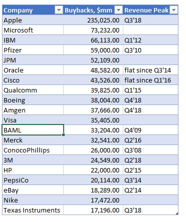
Selected US Share Buybacks
Those large share buyback programs have reduced the companies share count by about 18% on average between 2011 – 2018. In some of the larger buybacks, like Apple, Pfizer etc., the share count is reduced by almost 25%. So, even if indeed some of the share buyback activity is on the back of employee compensation, there is still substantial reduction in the share count which should have an effect on share prices and on performance indicators per share.
ESOPs are actually not that prevalent in US businesses. In fact, only about 10% of the private workforce is involved in such programs and only about 10% of the publicly traded companies have them. Public companies, however, have other equity compensation programs but they are mostly geared to senior management. There are three kinds of equity awards that public companies give: restricted shares, share options and performance shares.
Share options had been the original and the most popular form of executive compensation until the mid-2000s or so. Their use was limited in the 1960-1970s, however, as the stock market languished and went nowhere (which is when companies started giving out restricted shares, which, even though they vest, they do not require either any upward movement of the share prices to ‘make money’ – as options do, or beating any performance targets – as performance shares do).
However, by the late 1990s, with the stock market rising substantially on the back of the financialization of the US economy which started in the 1980s with the doctrine of shareholder primacy and the accompanying surge of corporate share buybacks (SEC Rule 10B-18), the popularity of stock options surged to 75% of all executive compensation. By the mid-2000s, though, three things happened which affected adversely the use of stock options in executive compensation programs: 1) in 2006 the accounting rules changed, resulting in charge against earnings for the grant of options; 2) during the crisis of 2008, stock markets fell substantially; 3) The Dodd-Frank Act of 2010 now requires a say-on-pay vote. As a result, organizations such as Institutional Shareholder Services, now have a much greater influence over executive pay. Therefore, performance shares have become the dominant source of executive compensation.
There are two points I want to make here. First, the concern over exuberant executive pay is not something new – regulators have been looking into it since at least the 2000s. Second, because the performance targets are tied to companies’ EPS, the changes made to the executive compensation plans, unfortunately, fall short of their target: senior management can legally find a loophole to still continue to disproportionately increase their compensation. What do I mean ‘disproportionately’? I mean relative to other employees’ compensation and to companies’ top line growth.
Which brings me to a second claim made by Yardeni, namely that S&P 500 companies’ EPS growth is only about 1% lower than their total earnings growth. Again, I have no reason to doubt that, as a whole, this is correct: on average across all the S&P500 companies, there may not be much ‘smoothing out’ of EPS through share buybacks . But looking at the largest share buybacks programs, that’s not the case.
Of those, on average over the 2011-2018 period, top line net operational income growth is about half of EPS’s growth. What I found is that while top line income growth is somewhat similar to the average of the whole S&P 500 index (11.1% vs 8.1%), EPS growth in the largest share buyback companies was much higher.
Again, the numbers vary. For some (Microsoft, Nike), actually, average top-line growth is slightly higher than EPS growth. On the other spectrum, companies like Pfizer and Merck have had much smaller top line growth rates than EPS ones. Apple, having the largest share buyback program, has a more respectable 23% average annual top line operational income growth rate vs 27% EPS growth rate. But still very far from the average for the S&P 500 index company.
In fact, for majority of the companies in that sample, their revenues had peaked already some time ago. That did not stop companies continuing with their share buyback programs. In fact, some like Apple, Cisco, Amgen, BAML, Merck, Pfizer have substantially increased their spend on share buybacks thereafter.
Selected US Share Buybacks
Given the above, it is not unreasonable to assume that indeed senior management in these companies is ‘wrongly’ incentivized to authorize more buybacks despite lackluster top-line operational performance in order to benefit from the obviously better EPS performance.
But it is not all doom and gloom when it comes to share buybacks. Employment
has risen on average by 26% over that period for those companies. However, that
is really concentrated in a few big companies like Apple, Microsoft and Nike
(for example, Apple has doubled its employment between 2001-2018). A lot of
companies, the industrials (Pepsico, Merck, Pfizer, Texas Instruments) and the
banks (JPM, BAML) have actually marginally reduced employment.
Finally, while it is reasonable to suppose that a lot of the increased activity
in buybacks is linked to senior executives’ compensation packages, it is a lot
more difficult to make the claim that they happen at the expense of R&D. For
example, comparing Apple to Microsoft – massive difference when it comes to
R&D spending vs buybacks. While Apple has spent a lot less on R&D vs
buybacks in the last 8 years (in fact $175Bn less!), Microsoft has spent a lot
more ($19Bn). And while Apple spends just about 3% of its revenue on R&D, Microsoft
spends about 13%.
There is a divergence among the industrialists as well, with Texas
Instruments, Boeing and Amgen spending substantially more on buybacks relative
to R&D, while Pfizer, Merck and Cisco have spent substantially more on R&D
than on buybacks.
What’s the right way to analyse US share buybacks? I don’t think there is one right way. Ben Hunt has done great investigative work looking at a couple of the large corporate share buybacks. Ed Yardeni has done the same looking at the whole S&P 500 index. I have taken the middle road by looking at the 20 or so largest share buybacks. Probably each one of these three approaches is prone to some selection bias geared to the conclusions one may want to reach!?
From being a niche discussion and research topic when I first started looking at it in 2015 to being now in the popular media on a daily basis, share buybacks do deserve this attention because they could be potentially affecting things like income and wealth inequality, corporate investment, employment, productivity, economic growth, etc. So, it is only good if more and more people look at the the numbers to try to figure what exactly is going on.
In the long run – yes (assuming no failed states).
Do you, guys, remember the Betteridge’s law of headlines?
How do we define a long run?
How about the whole history of the S&P 500 Index.
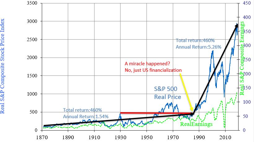
Since 1871 S&P 500 index has gone up 3,049% (2.4% annual return) or 1,855,212% (6.9% annual return) in real terms*.
However, it took 57 years for the S&P 500 to break firmly above its 1929 high in real terms! That’s more or less, one generation of flat returns.
And let’s look at those 148 years of returns. How were they distributed?
For 115 of those, between 1871 and 1986, the S&P 500 had a total return
of about 460% (without dividends – just price change). That’s 1.5% return per
year.
Then for the next 33 years, the S&P 500 returned the same 460% in total but this time, the annual return was more than 3x higher at 5.3%.
115 years of return happened in just 33 years!
What exactly happened in the early 1980s?
Let’s just say, there was no miracle.
However, the power of shareholders’ primacy lead to an explosion of US share buybacks; the economy’s financialization lead to massive M&A activity and the reform of executive compensation incentives. All this contributed to the strong returns for US stocks.
There was, of course a positive correlation to US GDP growth and US
productivity growth and US population growth, but a negative correlation to the
changes in them (meaning, the lower growth rates of the US economy, productivity
and population in the latter period coincided with higher stock market
returns).
Were the strong returns post 1986 a payback of the decent returns prior or a pay-forward from the future earnings ahead?
My bet is on the latter given the possibility of simple mean reversion of returns probability coupled with lower real GDP growth rates and declining productivity growth rates. If negative returns on sovereign debt are any guidance, I would not be surprised if what follows is several decades of flat returns overall.
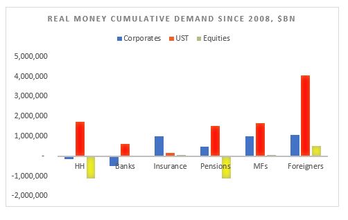
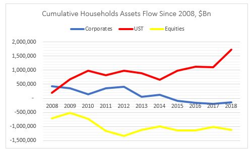
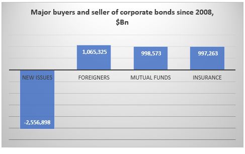
Households have massively deleveraged: sold about $1Tn of US equities and bought about $2Tn of USTs. The have also marginally divested from corporate bonds.
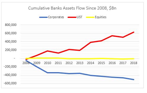
Banks have deleveraged as well: bought about $0.5Tn of UST while
selling about the same amount of equities. The have also marginally divested
from corporate bonds.
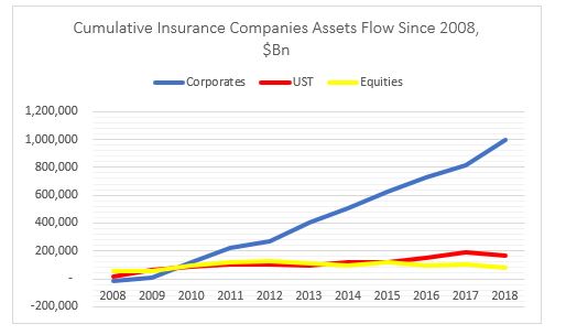
Insurance companies have put on risk: bought about $1Tn of
corporate bonds and small amounts of both equities and USTs.
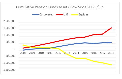
Mix bag for pension funds with a slight deleveraging: bought $0.5Tn
of corporate bonds but sold about $1Tn of equities. But also bought $1.5Tn of
USTs.
Mutual funds have put on risk: bought about $1Tn of corporate
bonds and small amount of equities. Also bought more than $1.5Tn USTs.
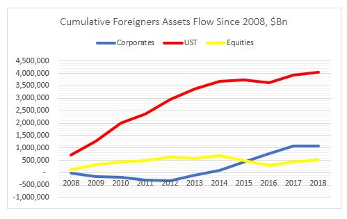
Finally, foreigners have also put on risk: bought $1Tn of
corporate bonds, $0.5Tn of equities and $4Tn of USTs.
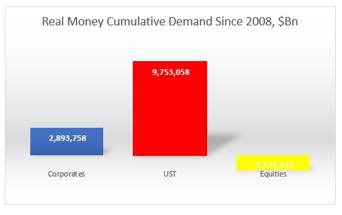
Overall, the most (disproportionate) flows went into USTs, followed by US
corporates. Demand for equities was actually negative from real money.
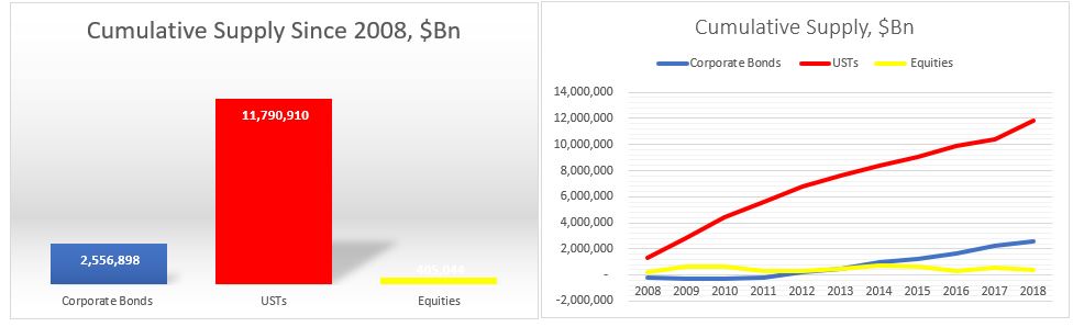
What about supply?
Issuance of USTs was naturally the dominant flow followed by US corporates and US equities.
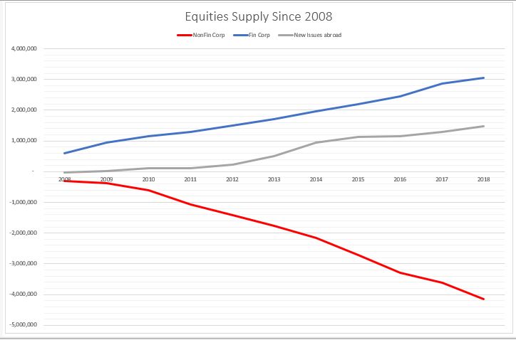
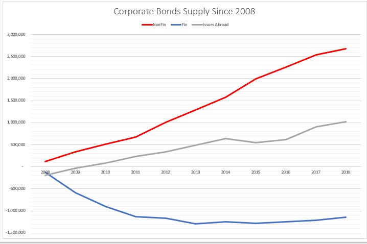
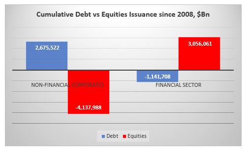
On the US equities side, however, there is a very clear distinction between US non-financial corporate issuance, which is net negative (i.e. corporates bought back shares) and US financial and US corporate issuance abroad, which is net positive. In other words, the non-corporate buybacks (more than $4Tn) were offset by the financial sector (ETF) and ‘ADRs’ issuance.
The opposite is happening on the corporate supply side. Non-financial corporates have done the majority of the issuance while the financial sector has deleveraged (reduced debt liabilities).
In other words, non-financial corporates have bought back their shares at the expense of issuing debt, while the financial sector (ETFs) has issued equities and reduced their overall indebtedness.
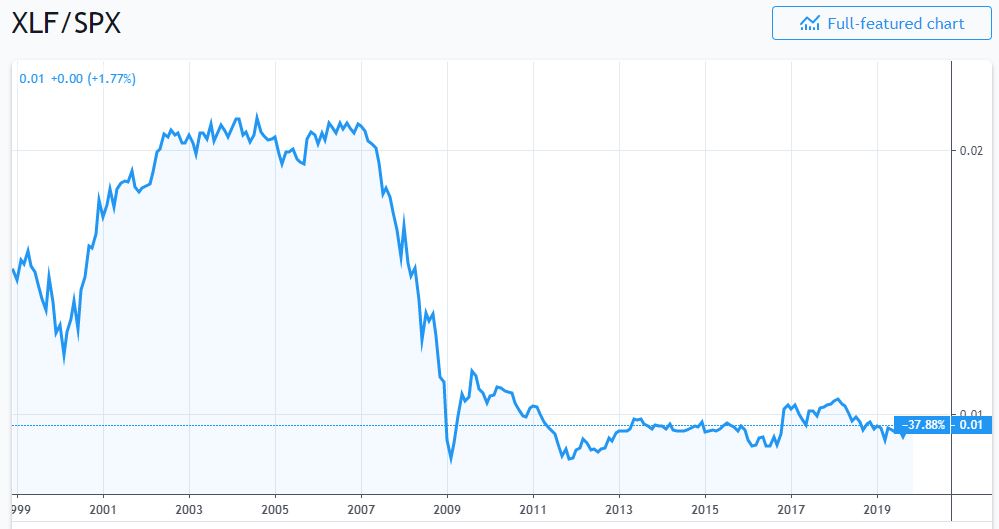
No wonder, then that financial sector shares have underperformed the overall
market since 2009.
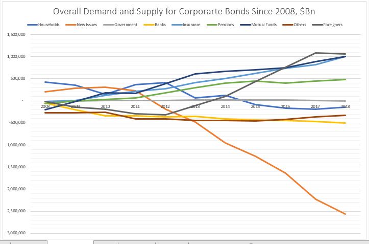
Putting the demand and supply side together this is how the charts look.
On the equities side, the buying comes mostly from ETFs (in ‘Others’ – that is basically a ‘wash’ from the issuance) and foreigners. The biggest sellers of equities are households and pension funds. The rest of the players, more or less cancel each other out.
So, households and pension funds, ‘sold’ to ETFs and foreigners.
On the corporate bonds side, the main buyers were foreigners, mutual funds
and insurance companies. Pension funds also bought. The main seller were the
banks. ‘Others’ (close end funds etc.) and households also sold a small amount.
So, here it looks like foreigners, mutual funds and insurance companies ‘bought’
mostly at new issue or from the banks.
Finally, on the USTs side, everybody was a buyer. But the biggest
buyer by large were foreigners. Mutual funds, pension funds, the Fed and
households came, more or less, in equal amount, second. And then banks, ‘Others’
and insurance companies.
Kind of in a similar way, everyone here ‘bought’ at new issue.
Conclusion
It’s all about demand and supply.
In equities, real money has been a net seller in general, while the biggest buyer has been non-financial corporates themselves in the process of share buybacks. The financial sector has been a net issuer of equity thus its under-performance to the non-financial corporate sector. Equity real money flow is skewed mostly on the sell side.
Real money flow in corporate bonds is more balanced, but with a net
buying bias.
USTs real money flow is skewed completely on the buy side.
Overall, since 2008 real money has sold equities, bought a bit of corporate
bonds and bought a lot of UST: it does not seem at all that real money
embraced the bullish stance which has prevailed in the markets since March 2009.
*Data is from end of Q4’08 till Q4’18, Source for all data is Fed Z1 Flow of Funds
Why do smart people do obviously ‘irrational’ things? It must be the
incentive structure, so for them they do not seem irrational. So, I am wrecking
my brain over China’s decision to issue EUR-denominated bonds (and a few weeks
ago USD-denominated ones), in light of its goal of CNY and CGBs
internationalization, 40-50bps over the CGB curve (swapped in EUR).
The rationale China is putting forward is that enables it to diversify its investor
base on the back of the trade tensions! Seriously? Do they really mean that or
are they getting a really bad advice? Wasn’t the intention to actually go the
other way as a result of the trade war? Didn’t China want to be become more
self-reliant? In any case, China does not need foreign currency funding given
its large, positive NIIP. China has the opposite problem. It has too much idle
domestic savings and not enough domestic financial assets. This, among other
things, creates a huge incentive for capital flight which, despite its closed
capital account, China is desperately trying to prevent.
In that sense, China does need foreign investor but to
invest in CGBs (and other local, CNY-denominated bonds) to act as a buffer to
the potential domestic capital outflow as the capital accounts gates slowly
open up. It is for this reason that BBGAI and JPM have started including CGBs
into their indices this year.
It is for this reason SAFE decided to scrap the quota restrictions on both QFII and RQFII in
September. It is for this reason that Euroclear signed a memorandum of understanding
with the China Central Depository & Clearing to provide cross-border
services to further support the evolution of CIBM. That opens up the path for
Chinese bonds to be used as collateral in international markets (eventually to
become euro-clearable), even as part of banks’ HQLA.
All these efforts
are done to make access to the local fixed income market easier for foreign
investors. And now, what does China do after? Ahh, you don’t need to go through
all this, here is a China government bond in EUR, 50bps cheaper (than if you go
through the hassle of opening a Bond Connect account and hedging your CNY back
in EUR).
This not
only goes against China’s own goals regarding financial market liberalization but
also against the recent trend of other (EM) markets preferring to issue in domestic
currency than in hard currency. And while other EMs may not have had the choice
to issue in hard currency from time to time, China does. And while the investor
base for other EMs between the domestic and the hard currency market is indeed
different, and the markets are very distinctive, China does not have much of an
international investor base. Issuing in the hard currency market may indeed ‘crowd
out’ the domestic market. Especially when you come offering gifts of 50bps in a
negative interest rate environment.
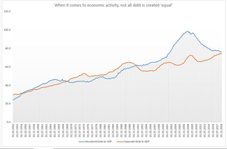
Credit impacts the real economy in a different way depending
on whether it is to households or to corporates (see Atif Mian’s work, also his
interview here).
Very generally speaking, credit to households affects the economy directly
through the demand-side channel, while credit to corporates – through the
supply-side channel directly, and only then, potentially, indirectly through
the demand-side channel.
Household debt to GDP was flat for two decades between mid-1960s and mid-1980s; and then it doubled; corporate debt for GDP, on the hand, was flat also for two decades after the S&L crisis, and even now it is only a few per cents higher. But the demand-side reduction from the household debt channel post 2008 is rather unique.
Given that the US was running a negative output gap for most of the period post 2008 (and it might still do, even though official estimate is for a small positive), it was the demand-side that needed some catching up to. Instead, the opposite was essentially happening: credit to households was decreasing relative to credit to corporates. As far as credit was concerned, it was primarily the supply side that was getting stimulated (of course, the question is how much stimulus was really created given that a lot of the corporate debt went to share buybacks).
The other theory, one to which I subscribe, is that the modern economy is essentially always experiencing a demand gap. When real wages stopped growing in the 1990s, post the the financial liberalization of the 1980s, household credit experienced a massive run-up. The demand gap left from the stagnation in real incomes was filled with household debt. Until the sudden stop in 2008.
Household debt to GDP did not grow between 1960s-1980s but real household income did, so there was no demand gap either. Post 2008, though, neither of these two options were available which left the US economy in a demand insufficiency. The ‘stimulus’ provided was mostly through the supply side with very little follow through into the demand side which meant lackluster economic growth.
The bottom line is that the type of credit creation matters.
The central bank affects directly only the supply of credit (and in some cases,
even less so) thus, it has limited ability (none?) to decide on whether credit
goes to firms or households. We may get a lot more from lower interest rates if
policy makers start thinking more holistically about the whole process of
credit creation. Banks do not care where credit goes
(why should they?) as long as they get their money back.
But with overall debt in the economy climbing higher and higher, it is essential to think how we can get the most out of it. And if the market can’t do that (it can’t), someone else should step in.
All this does not mean that US households should get even more indebted! On the contrary, the decline in household debt to GDP is good news only if it were also followed by a similar rise in real household income. And it the private market can’t do that either (it seems, it can’t), then we need to rely on the official sector to take on that burden.
Really interesting the divergence of monetary policy in Norway and Canada, and now possibly, Sweden with the rest of the DM/EM world in the last 12 months*. While pretty much every other central bank in the world has turned dovish, Norges hiked four times since September last year, while Bank of Canada has hiked 5 times since mid 2017. And last week, against all odds and expectations, Riskbank also surprised by pretty much guaranteeing a hike at its December meeting. It’s questionable whether hikes in either country was/is warranted looking strictly at economic activity.
Despite a spike in core inflation in early 2019, something which Norges had actually expected to be temporary, inflation is back below 2%. Both Canada’s and Sweden’s inflation spiked up in mid 2018 and have recently retreated back below 2%. Growth in all three counties has actually been more elevated than in neighboring Europe or US but growth was never the reason their respective central banks cut rates before, so it does not seem to be the reason they are now hiking. In fact, looking at weakening domestic demand and rising unemployment rates in Sweden, there are probably more reasons to cut than hike now.
So why are they hawkish? One theory is that the central banks are worried about rising household leverage with private debt to GDP in each close to the highest in the world. The thing is, other countries in a similar situation have chosen to go the opposite way. Australia, New Zealand, Korea, which also have high household debt ratios, tried to be ‘hawkish’ but have been aggressively cutting over the last 12 months on the back of slowing global demand.
The problem with hiking rates when over-indebtedness is high is that you are ‘inviting’ financial instability and when that is one of your mandates, it is probably not such a wise choice. Is that why the Riskbank has said it would hike only once and stop at 0%?
Another theory is that the Riskbank is
preparing to introduce the e-krona and does not want to be dealing with the arb
of negative rates. I find that a poor excuse to hike as well.
And finally, some people are looking for a symbolic meaning of Sweden going back to 0% after being the first modern central bank to go below, 10 years ago. I don’t know. My guess is that it is more likely to be part of the experimentation process, but that ultimately it would turn out to be too early not to be a policy mistake.
*In Israel, the UK and the Czech Republic the last interest rate moves were a hike. However, Israel hiked only once, in November last year (from 0%) and with inflation at 0.5% and below the target range of 1-3%, the central banks has removed any prospect for a further rate increase and confirmed inflation is in a downward trend. UK is a special case of Brexit and deserves a post on its own. The Czech Republic, I have to admit, is a proper outlier here with both growth and inflation bucking all trends in Europe and, therefore, also deserves its own blog post.
When speaking to investors, the two most common questions I get asked, given rather extreme levels and valuations of (most) asset classes, are:
1.Should my
asset allocation change dramatically going forward? and
2.What is
the best risk diversifier for my portfolio?
I have previously
opined on this here.
Very broadly speaking, on the equity portion, one should reduce exposure to US
equities and increase allocation to EM equities (unhedged). On the fixed income
side, one should move completely out of the long end of UST and put everything into
T-Bills to 2yr UST; exposure to EU-denominated sovereigns should also be reduced
to zero at the expense of EM local (unhedged) and hard currency bonds. In the
normally ‘Others’ section of the portfolio, one should include soft commodities
(or alternatively, scale everything down to make space for them). Finally, in
terms of FX exposure, apart from EM currencies through the unhedged portions of
the bonds and equities allocations, one should hedge the USD exposure with EUR.
Here I am
adding some more general thoughts on what I consider to be the best portfolio
diversifier for the next 5 years, possibly even longer. To my knowledge, ‘noone’
is invested in any meaningful way in Chinese bonds (I am excluding the special
situations credit funds, some of which I know to be very active in the Chinese credit
space – but even they are not looking at Chinese government or bank policy
bonds).
The big
fixed income funds, the pension/mutual funds, the insurance companies have zero
allocation to Chinese bonds. Some of the index followers started dipping their
foot in the space but most of them are either ignoring China’s weight or are massively
underweight the respective index. Finally, a sign of how unloved this market
is, on the passive/ETF side, the biggest fund is just a bit more than $100mm.
Let me just
say here that we are talking about the third (possibly even the second, by the end
of this year) largest fixed income market in the world. And no one is in it?
Chinese bonds merit a rather significant place in
investors’ portfolios. They offer diversification thanks to their low
correlation and superior volatility-adjusted return relative to other developed
and emerging markets. In addition, Chinese bonds are likely to benefit significantly from
both the passive and active flows going forward: I expect up $3 trillion of foreign inflows
over the next decade on the back of indexation.
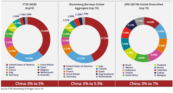
Bloomberg Barclays Global Aggregate Index (BBGAI) and JP Morgan Global
Diversified have already confirmed Chinese bonds inclusion in their respective
indices. FTSE Russell WGBI is likely to do that next March. This inclusion is a big deal! It
will have huge repercussions on the global bond industry. It is a much more
important and far-reaching development than a similar inclusion of Chinese
equities in global indices last year. And the market is not only not ready for
this, but it is also underestimating its impact overall.
China is a
highly rated sovereign with a much better risk/return profile than other
high-quality alternatives. Chinese bonds
offer a significant scope for portfolio diversification because they have very low correlation to global interest
rates which means lower return volatility.
Therefore, China sovereign bonds offer a much
better volatility-adjusted return than Global Bonds, EM Hard Currency and Corporate Bonds, US HY and
Equities, Global Equities and Real Estate.
Among the plethora of negatively yielding sovereign bonds, China sovereigns offer a good pick-up over other DM bonds while yielding not too much lower than EM bonds. In addition, they offer much more opportunity for alpha generation than both DM or EM sovereign bonds. This alpha partially comes from the fact that Chinese fixed income market is still not so well developed and partially from the fact that there are not many sophisticated foreign players in it, as access to it is still not that straightforward.
However,
things are rapidly improving on the access side. Bond Connect has already
started to revolutionize the onshore market. Before the setting-up of CIBM, and
especially Bond Connect in 2017, access to the China bond market was extremely
cumbersome through a lengthy process requiring approvals from high authority (QFII
and RQFII). Bond Connect, on the other hand, does not require domestic account
and custody while following international trading practices. In addition, not
long ago, it started real-time settlement and block trading. As a result, Bond
Connect volumes doubled.
Moreover,
in September this year, SAFE decided to scrap the quota restrictions on both QFII
and RQFII, while Euroclear signed a memorandum of understanding with the China
Central Depository & Clearing to provide cross-border services to further support
the evolution of CIBM. That opens up the path for Chinese bonds to be used as
collateral in international markets (eventually to become euro-clearable), even
as part of banks’ HQLA. Such developments are bound to make access to the
Chinese bond market much easier for overseas investors.
September proved
to be a very important month for the China bond market also because the authorities
finally delivered on the interest rate reform agenda. The central bank eliminated the benchmark policy loan and deposit
rates in favor of a more flexible reference rate. This should be positive
for yield curve formation and the continued expansion of interbank liquidity.
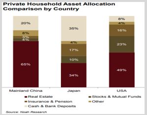
China does not have some of the weaknesses typical of emerging markets. On the opposite, it has very little sovereign FX debt, has large FX reserves, and it is a net creditor to the world. Moreover, some of the foreign debt is most likely offset by foreign assets.
Corporate-sector leverage, however, is still high, though default rates, despite lots of recent media focus, are still relatively low. On the other hand, the recovery rates are high, while the official, banking and household sectors are in relatively strong position which, reflects degrees of freedom to deal with these challenges. China has large amounts of debt with implicit state backing and a culture averse to defaults. In effect, the government controls both the asset and the liability side of the domestic debt issue thus a debt crisis is much less likely than in a fully free-market economy. The fact that China has the ‘fiscal’ space to deal with the private debt issue is one big advantage it has over DM countries with similarly high private debt burdens but which have also already used the option of shifting that debt to the government balance sheet.
The high debt issue and the authorities’ attitude to it, the structure of the economy (export-driven) as well as the potential transition from an extremely high growth rate to a more ‘normal’ one, makes China’s situation very similar to Japan’s in the late 1980s. Yet, there are also major differences. China’s urbanization rate is much below Japan’s before the 1990 crisis, the real estate bubble is only in the top tier cities as opposed to country-wide as in Japan, the Renminbi is more likely to depreciate going forward than massively appreciate which is what happened to the Yen after the Plaza accord.
The high debt issue is a problem China shares not only with Japan but also with most advanced countries in the world. Similar to them, China is fully sovereign (the government has full control of the overall economy balance sheet; the currency peg is a “question mark”, not a real issue given China’s large positive NIIP). Of all these advanced economies with similarly high non-financial debt to GDP, only China has not reached the zero-bound*. It is, therefore, likely for the Chinese policy rate to continue to move lower until it eventually hits 0%.
Similar to Japan, it has a high household savings rate and a rapidly ageing population. Yet, Chinese households have relatively low exposure to financial assets and especially to bonds. Given the policy agenda of financial market reform and the life-cycle savings behavior (i.e. risk-aversion increases with age), Chinese households’ allocation to bonds is bound to increase manifold. Moreover, with the looming of the property tax law (sometime next year), I expect the flow into bonds to start fairly soon.
This
flow aspect makes the case for investing into China bonds much stronger. Given the size of the Chinese fixed income market, its
rapid growth rate and the reforms undertaken most recently, global bond indices had ignored
Chinese bonds for too long. However, last year BBGAI announced that it would
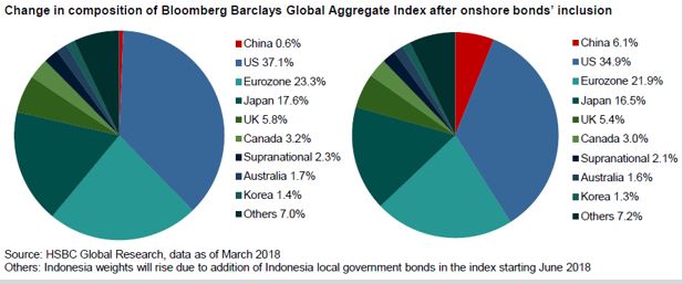
include China in its index as of April 1, 2019. Purely as a result of this, China bond inflow is expected to reach
$500Bn by 2021 as the weights gradually increase from 0.6% to 6%. By then
China will be the 4th largest component in the index (after US,
Japan and France – and bigger than Germany!)
Before
BBGAI’s inclusion, there had never been a bond market that large, that was not
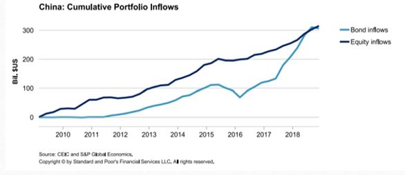
included in an index, as the Chinese bond market. In fact, China already represents the third largest bond market in the world,
growing from $1.6 trillion in 2008 to over $11 trillion now.
And even after these
inflows, China bonds are still likely to remain relatively under-owned by
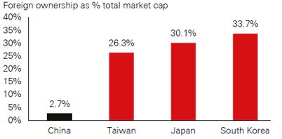
foreigners as they would represent just 5% of China’s total bond market (currently foreign ownership of the overall bond market is around 3%,
PBOC expects it to reach 15%). Foreign ownership of China sovereign bonds (CGBs)
is slightly higher, but even at around 6%, it is materially lower than in other
major sovereign bond markets. This under-ownership is even more pronounced relative
to the emerging market (EM) universe (the ranges there are between 10% and 50%).
Finally,
foreign investors are expected to continue to get very favorable treatment from
the Chinese authorities. The government has an incentive to make things easier as they need
the foreign inflows to balance the potential domestic outflows once the current
account is liberalized. For example, the tax changes implemented last year allowed
foreigners to waive the withholding tax and VAT on bond interest income for a
period of three years.
I am still
frankly shocked how little time investors have to discuss these developments
above but, at the same time, how eager they are to discuss the Chinese economy
and the trade tensions. From one hand, they acknowledge the importance of China
for their investment portfolio, but on the other, they continue to ignore the
elephant in the room being the Chinese bond market. I understand that this choice
is perhaps driven by investors’ inherent negative bias towards any Chinese
asset, but the situation between asset and asset is much more nuanced.
In the
fixed income space, one can be bearish select corporate credit and bullish CGBs
or bank policy bonds (in fact, the more bearish one is on corporate credit, the
more bullish sovereign bonds one should be). Finally, I do acknowledge that the
big unknown here is the currency. But even there, the market has become much
more sophisticated: one can now use a much longer CNY/CNH forward curve to hedge.
Bottom line is that if you are still looking for a fixed income alternative to diversify your portfolio and you are not looking at Chinese sovereign bonds as an alternative, you are not being fiduciary responsible.
*For more details, see JP Morgan’s economics research note, “China’s debt: How will it evolve?”