• About
  • BeyondOverton Travel
    • Silk Road (1): If Turkey is in crisis, it’s not obvious visiting it
    • Silk Road (2): Could beautiful nature and ancient history create a false sense of entitlement?
    • Silk Road (3): Fast Car
    • Silk Road (4):We took a bus ride to Iran
    • Silk Road (5): Border bothers
    • Silk Road (6): Chevrolet Land
    • Silk Road (7): Free-roaming camels and wild horses
    • Silk Road (8): China West to East
    • Silk Road (9): I have not told half of what I saw
  • BLOG
  • g88kboy Travel
    • On the Silk Road
    • Bulgaria : The Chicken crossed the Road
    • Turkey : The Country, not the Bird
    • Georgia on my Mind
    • Armenian Ayran
    • Iran – The Curious Land
    • An American in Azerbaijan
    • Uzbekistan: Golden Teeth and Neon Signs
    • Kazakhstan: Thirty Sweating Seniors
    • China Part One – Pandas Are Extinct
    • China Part Two: My TED Talk (Deep Analysis)
    • Phillipines – They Relax, I (pretend to😉) Study
    • Singapore: flashing trees and a torrent of tears
    • Malaysia: That ain’t no croc, it’s a log
    • Brunei: The Instinctive Fight for Superior Domination
    • Phillipines: Hello Friend Again
  • Outside the window
    • Bulgaria
    • Turkey
    • Georgia
    • Armenia
    • Iran
    • Azerbaijan
    • Uzbekistan
    • Kazakhstan

BeyondOverton

~ let's move this window

BeyondOverton

Monthly Archives: December 2022

Don’t fight Powell

15 Thursday Dec 2022

Posted by beyondoverton in Monetary Policy

≈ Leave a comment

Tags

Fed, Rates

After reading John Authers’ piece this morning, I was not really planning to write a note on yesterday’s FOMC meeting. I think he summed up the Fed’s actions very well and correctly analysed the market’s reactions. And I would say that indeed the mantra “Don’t fight the Fed” should be valid in general. But that holds true only if we understand what the Fed is trying to achieve. Here is a more nuanced view on the matter.

If the Fed had only raised the dot plot in the face of slowing down inflation since the last SEP (and obviously reiterated that there would be no cuts next year, etc.), I would have concluded that the Fed intends to keep hiking, regardless, bound not to repeat the ‘mistakes’ of the late 1970s. Don’t fight the Fed in this case would have been the right strategy.

However, raising the dot plot in the face of slowing inflation but also alluding to a smaller hike than priced in the next FOMC meeting (see Authers’ note above) introduces a decent amount of confusion as to exactly what the Fed’s intentions are. It could be that most Fed members had made up their mind about the dot plot before the surprise slowdown in inflation this week and didn’t bother/didn’t have the time to adjust their view thereafter. The intention for a smaller hike next allows Fed officials to change their mind. So, in this case the market’s reaction (nothing really changed post the meeting[i]) might be justified.

It could also be that Fed officials took the lower-than-expected CPI in stride and concluded that it alone does not warrant a change in view. That also signifies that during the previous SEP, the Fed made a mistake in its projections of the terminal Fed rate (it should have been ‘much’ higher). Does that mean “Don’t fight the Fed” holds in this instance? It appears so, but then again, if the Fed made a mistake in the past and was quick to acknowledge it, then it is also possible that the Fed is again making a mistake. The market’s reaction is thus dubious, neither ‘wrong’, nor ‘right’.

The final possibility is that the Fed has literally and figuratively lost the plot (pun intended) and is planning to stay hawkish (not necessarily continue to hike, but certainly not cut) until the inflation rate crosses back below 2%, regardless of what happens to the economy. It must be clear that in this case “Don’t fight the Fed” firmly holds.

I have no idea what most of the other FOMC members’ intentions are but listening to Fed Chairman Powell’s press conference, I am pretty sure what his are: I think he is firmly in the last camp above. Here is why.

In his opening statement, Powell made several references to the fact that the “labor market remains extremely tight with the unemployment rate near a 50-year low, job vacancies still very high, and wage growth elevated”. In the Q&A session, similar, “I’ve made it clear that right now, the labor market is very, very strong. You’re near a 50 year low: you’re at or above maximum unemployment in 50 years.” I’ve written on this before, i.e., why not only I disagree that the labour market is so tight but that it is actually slowing down.

However here is some additional color, which shows that it is not that straightforward, and we have to give at least some credit to Chairman Powell. So, when it comes to the US labor market statistics the table below provides the basics. Bear these in mind as we go along.
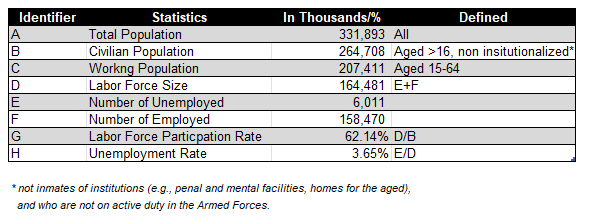
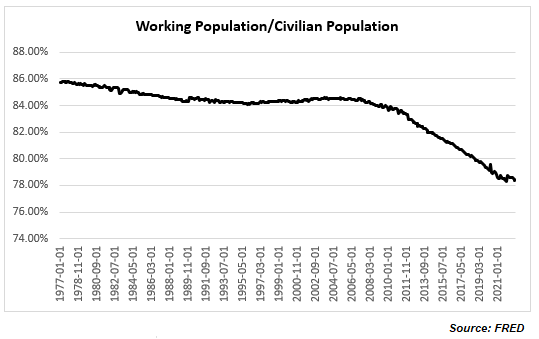
Strictly speaking, Chairman Powell is right that “the labor market continues to be out of balance, with demand substantially exceeding the supply of available workers” (in his opening statement; he goes in more detail on this in the Q&A session particularly in a question from Market Watch). Look at the ratio of Working Population to Civilian Population which is at nearly 50yr low
And within the Working Population the actual Labor Force Size only managed to get just above its pre-Covid level this August and has started to decline again since then, so that the ratio between the two is still below the pre-Covid level (and as a matter of fact still below the high reached at the onset of the 2000 recession).

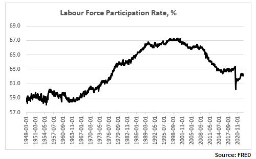
And here is the now more familiar labor force participation rate (LFPR), still way below the pre-Covid high and substantially below the pre-2000 recession high.
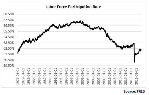
So, when Powell refers to the “labor market is 3.5m people smaller than it should have been based on pre-pandemic levels” this is what he has in mind: strictly speaking, if we adjust the LFPR to its pre-Covid high, the labor force would have been about 3.021m people more. But that is on the supply side, and we are going to go through this more later on.

But let’s look at the demand side as well. As per Powell, again in the answer to the journalist from Market Watch, “you can look at vacancies”. Here they are.
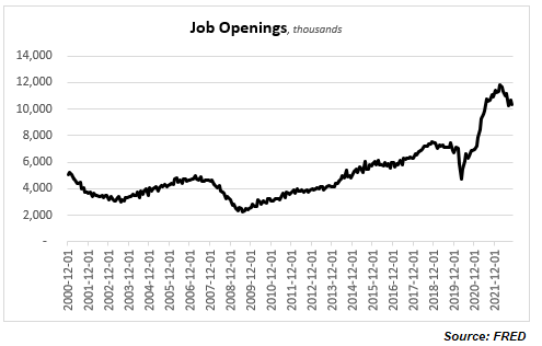
Powell is right to an extent: there are still more that 10m job openings. This is down from nearly 12m from the highs in March, and job openings are never zero, but even the current number puts job openings at about 5.8m additional vacancies over the pre-Covid average.

So, the question really is to square the demand and the supply side of labor. Obviously, it is not that straightforward. It is normal to have people unemployed at the same time as vacancies unfilled, but the state of the labor market post Covid is more unusual, also because the unfilled vacancies are not pushing real wages up. Which is why some people have suggested that rather than a wage issue it is really a skill mismatch issue (plenty of studies done on this post the 2008 recession), or indeed Covid-related issue (even Powell referred to this as a cause in his Q&A).

Chairman Powell lamented yesterday that the LFPR is not going up, “contrary to what we thought”. But if it does go up, does it mean the headline statistics will indicate the labor market is tightening or loosening? I ran some hypothetical numbers regarding this below.

The second column in the table above indicates a hypothetical LFPR per the time period in column one. The third column is the actual labor force as a result (in thousands). The fourth column indicates the additional people coming into the labor market. The fifth column indicates the number of unemployed if all these additional people entered the labor force; the sixth column is the resulting unemployment rate. The seventh column shows the number of unemployed if 50% of the additional labor force actually found jobs; the eight column is the resulting unemployment rate. Finally, the ninth column shows the number of unemployed if all the additional labor force fills the job openings (see Chart above) over and above the average pre-Covid; the tenth column shows the resulting unemployment rate.

There are myriad such scenarios. In the example above, using averages and simple assumptions about additional employment vs unemployment, the unemployment rate is higher than the current one in all but the last three examples (column 10 – the last three entries). Bottom line is that the drop in the labor force participation rate makes relative comparisons about how tight the labor market is (i.e., looking only at the unemployment rate) pretty irrelevant.

It also makes all of the above analysis almost useless (or at best very theoretical) as far as investing is concerned. It really does not matter at the end what the ‘real’ employment situation is. Powell was very clear yesterday. “The largest amount of pain” would not come from people losing their jobs. “The worst pain would come from a failure to raise rates high enough and from us allowing inflation to become entrenched in the economy; the ultimate cost of getting it out of the economy would be very high in terms of  unemployment, meaning very high unemployment for extended periods of time.”

That’s it. Inflation is all that matters. And if there was any hint at all that the Fed might increase its 2% inflation target, Powell was very adamant that it is not happening: “…changing our inflation goal is just something we’re not, we’re not thinking about. It’s not something we’re not going to think about it. We have a 2% inflation goal and we’ll use our tools to get inflation back to 2%. I think this isn’t the time to be thinking about that. I mean there may be a longer run project at some point. But that is not where we are at all at  the committee, we’re not considering that. We’re not going to consider that under any circumstances we’re gonna we’re gonna keep our inflation target at 2%.”

This turned out to be a long note just to conclude that indeed, it is pointless to fight the Fed, assuming that Powell’s view is shared by the majority of Fed voters, or if not, that the majority would still fall under the guidance of the Chairman. However, leaving the possibility of only 25bps hike at the next FOMC meeting is perhaps a sign that there may be some disagreement at the Fed.


[i] During New York hours; the market has subsequently weakened during the European morning session.

This is not a 2023 investment outlook

10 Saturday Dec 2022

Posted by beyondoverton in Asset Allocation

≈ Leave a comment

“It says in the brochure,” said Arthur, pulling it out of his pocket and looking at it again, “that I can have a special prayer, individually tailored to me and my special needs.”
– “Oh, all right,” said the old man. “Here’s a prayer for you. Got a pencil?”
– “Yes,” said Arthur.
– “It goes like this. Let’s see now: “Protect me from knowing what I don’t need to know. Protect me from even knowing that there are things to know that I don’t know. Protect me from knowing that I decided not to know about the things that I decided not to know about. Amen.” That’s it. It’s what you pray silently inside yourself anyway, so you may as well have it out in the open.”
– “Hmmm,” said Arthur. “Well, thank you”
– “There’s another prayer that goes with it that’s very Important,” continued the old man, “so you’d better jot this down, too, just in case. You can never be too sure. “Lord, lord, lord. Protect me from the consequences of the above prayer. Amen.” And that’s it. Most of the trouble people get into in life comes from missing out that last part.”

~ Douglas Adams, The Hitchhikers Guide to the Galaxy

It’s the time of the year when next year investment outlooks are released. If you are a newbie in this business, it is very important to devour as many as possible of those so that you can make as many as possible mistakes early on in your career when it is not only less painful to do so, but also when your ego is more flexible, hopefully, to allow you to learn from those mistakes.

If you are more experienced, you may be able to sift through the myriad of new investment outlooks and find that rare and original gem which may help you make money in the future. Either way, at best reading new year investment outlooks will make you look smart in the short-run when you attend those non-finance-related-but-people-want-to-know-about-investment Xmas drinks. At worst though, they will cloud your judgement as a professional investor and make you lose money in the long run.

This year has been brutal for investors, and it is very tempting to conclude that next year will be much better, which is essentially what most investment outlooks are saying. Note, 2023 is not necessarily projected to be a stellar year but still a year of small double digits returns (so slightly above the average).  It would be interesting to read therefore those people who forecast returns in the two tail distributions, especially the one on the left (another brutal year). I would say there would a be a lot of informational value if an experienced name has such a view for next year.

Looking at some of the major trends this year though, all of them have recently been at least partially unwound. Going from less to more: higher US yields have unwound about 1/4 of their move, weak US equities about 1/3, strong USD about half, strong commodities about 2/3, and last but not least, strong crude has unwound all of its move this year! We have another two weeks of trading until year end and those unwinds may be reversed (i.e., confirming the trends of the year), but that already tells us something about what to expect going forward.

These major trends will not explain everything but a good chunk of everything that is happening in the investment world. Many other trades are just a derivative of those major trends. For example, receiving Emerging Markets (EM) rates is almost a consensus trade for next year but it is heavily dependent on what happens to US rates. Long EM and European stocks are favourites for next year, but these cannot be considered in isolation to what happens in US equities. And people who trade FX for a living do not need a reminder that there are always two sides to the ‘coin’ (and one side is almost always the USD).

Commodities are slightly trickier, though. This year the correlation between individual commodities was higher than normal, but that is not always the case. Basically, the role of the USD in FX, USD rates in Fixed Income and US equities in Equities, is played by the price of oil in Commodities as energy takes such an outsized role in the cost structure of any commodity. But sanctions, tariffs, the weather etc., can also affect the way some commodities trade in markets.

This year commodities were the only asset class as a whole (looking at the five major ones, Rates, Credit, FX, Equities and Commodities) which posted positive returns. And this comes after a decade of pretty poor returns otherwise. Does it mean that is it for commodities?

There are also the odd idiosyncratic trades which offer enormous value to those who can discover them. This year some of those idiosyncratic trades were Brazil (rates, equities, FX), Turkey (both rates and equities), FTSE, India (equities), almost all Latam FX, etc. (obviously there were a lot of idiosyncratic trades in individual equities and credit). Can China provide double digit idiosyncratic equity returns next year, after two absolutely horrible years and almost a decade of flat returns? Can Japanese rates experience the opposite?

Then there are the relative value trades and those ‘technical’ trades (mostly in Fixed Income) which could provide an extra source of gains almost regardless of the direction of the major trends in the market. For example, after more than a decade of rates stuck at zero, a sufficient number of interest rates have gone up to provide now a decent cushion even if rates continue to trend upwards next year.

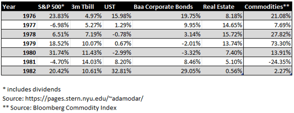
The table below provides the total return for each of the selected asset classes during the last major interest rate hiking cycle in the late 1970-early 1980s. Rates peaked in this cycle in 1981. It is interesting to note that 1) neither of these asset classes did that bad; 2) interest rates (especially T-Bills) did pretty good considering.

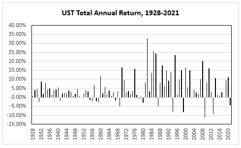
It is even more interesting to observe that USTs did not have that many more negative annual total returns when the yield on the 10yr moved from about 2.5% in 1951 after the Treasury – Federal Reserve Accord to more than 15% in 1981 than in the ensuing bull market thereafter. Moreover, during the bull market there were also significantly more years when the negative total annual return was higher than the worst negative return in the three decades after 1951. The point is that it is quite reasonable and, in fact, mathematically logical, to expect a positive return in 2023 for many fixed income markets.

The US labour market is slowing down

06 Tuesday Dec 2022

Posted by beyondoverton in Monetary Policy, Questions

≈ 1 Comment

Tags

Fed, inflation, labour market, Rates

  • Is US employment data hot, ‘goldilocks’, or ‘cold’?
  • Have you been inundated by calls and messages with the question, “But have you seen the details of the Household Survey?”
  • Is the Fed right to keep aggressively hiking?

Summary: The US labour market is slowing down despite headline grabbing low unemployment rate and high wage growth rate. The recent details underlying this data show the total number of people employed growing below trend, fewer hours worked and lower quits rate. As a result, the growth rate of total earnings is also going down, the effect being a lower share of national income going to labour and total consumption as a share of GDP stagnating. All this should make the Fed further re-evaluate its aggressively hawkish interest rate policy.

The Household Employment Survey makes the headlines

After a couple of weeks of ‘SBF’ trending, I, for one, was happy to take my mind off to something much more prescient and important as far as my investments are concerned – the US employment situation. At first glance, the November NFP report came much hotter than expected but because the market did not really react the way one would have expected from such a strong report, we started looking for reasons why that was the case.

Which bought us to the US Household Employment Survey. ‘Us’ here does not mean us literally (for those of you who had followed my writings at 1859, there was plenty of discussion on this topic as soon as I spotted the divergence between the two employment reports in September). And this note is not on why the Household Survey is showing different things from the Establishment Survey.

If you want to, you can read zerohedge on this topic here (I know, think what you want but the folks there were one of the first to spot the issue way back in the summer). If you can’t bear some of the conspiracy language at zerohedge, you can read an inferior version (but still good!) of the same at the more balanced Macro Compass. Finally, there are quite a few respected people on Twitter who have talked about it (see here, here, here).

To give you the full  disclosure, there are some legitimate reasons why the Household Survey produces different results to the Establishment Survey – and they have to do with a methodology issue, see here. BLS is actually well aware of that issue and calculates a time series which reconciles the two surveys and which can be found here (also with a very, very extensive comparison analysis between the methodology of the two). This adjusted data does not look that bad as the stand-alone Household Survey data (the November data was actually very good). But over the last 6 months it still points to a weakening employment market, not a stable or even hot one as per the Establishment Survey.

OK, that’s more than I wanted to write regarding the Household Survey. The rest of the note will show why the US employment situation is actually weakening even taking the Establishment Survey as a base.

The three variables of employment

There are three aspects of employment in general as far as assuaging how hot the economy is doing: wages, people employed, and hours worked, i.e., we need to follow this sequence, purchasing power->consumption->GDP) Basically, one needs to know the full product of Wages X Total Employment X Hours Worked (assuming, of course, that wages are per hour worked; not all jobs pay per hour, but those that do have actually increased at the expense of the others – see some of the links above which discuss the prevalence of part-time jobs and multiple job holders).

The economy can be hot even when wages are flat, or even declining, but there are more people entering the workforce or there are more hours worked – there are multiple combinations among the three variables producing various results. The point is to consider all three variables.

Total number of employed is growing below trend

Let’s take the period in the last three years or so after the Covid crisis. Yes, wage growth has picked up, but more people have exited the labour force and there are fewer hours work.  

The labour force participation rate is still below the pre-Covid levels, and close to a 50-year low:

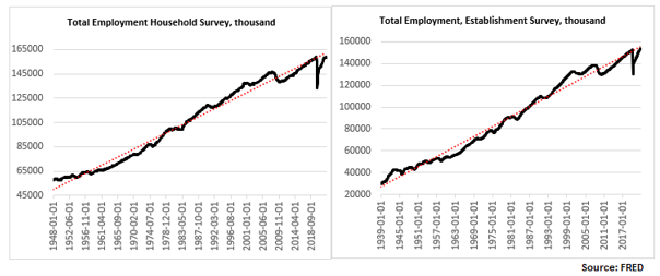
The total number of people employed has risen but, depending on whether one uses the Establishment Survey or the Household Survey, the number is either just above the pre-Covid levels or indeed below. In any case, regardless of which survey one uses, the number is still below trend (and has not been above trend since the 2008 financial crisis).

Higher wages but lower hours worked

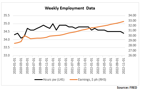
Finally, here are wages and hours worked. I have included below a time series chart for only the last 3 years to be able to see better the divergence between the two: while wages continue to rise, hours worked peaked in January 2021 and have now reversed the spike in 2020.

Let’s focus more on the latest NFP report. Here are the relevant tables below.

  • Generally higher-wage industries, like goods producing, tend to exhibit a smaller increase in hourly wages than lower-wage ones, like services.
  • In some cases, like the Utilities sector, which has the second highest wage per hour but also the highest average weekly earnings (courtesy of more hours worked, more on this later), wages have actually declined.
  • Transportation and warehousing sector has an unusual jump in wages, about 5x the average rise in wages – is there something specific going on there?

The growth rate of total earnings is declining

It is important to look at the last columns in Table B-3 above, ‘Average weekly earnings’, which gives a much better picture of take-home pay as it combines wages with hours worked. So, while indeed the trend of declining 12m-growth rate of weekly wages was reversed with this latest report (back above 5%), which some commentators have warned the Fed should be worried about, the trend of declining total weekly earnings continues to be intact.

Note, average hourly earnings are still elevated, hovering at previous peaks but this is hardly a reason for the Fed to get more worried about, especially after already delivering the fastest interest rate hiking cycle in recent memory.

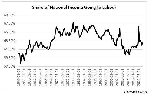
In fact, quite on the contrary. Despite all the excitement about the rise in wages, the share of national income going to workers has been on a decline, with the post-Covid spike now quickly reversed. We are back to the familiar territory of the low range post the 2008 financial crisis which is also the lows since the mid-1960s. If you were worried about a wage-price spiral issue, ala the late-1970s (I actually do not think there was one even back then as real wage growth even then was negative), you really shouldn’t be. It is a very different dynamic, at least for the moment.

Consumer demand as a share of GDP has been stagnant for more than a decade

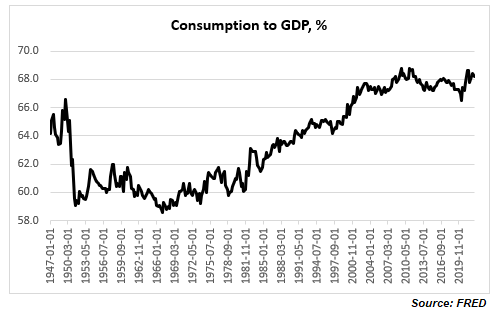
And if you are really worried that consumer demand will push inflation higher, again, you shouldn’t be, necessarily: consumption as a share of GDP is elevated relative to historical records but it is not even above the highs reached more than a decade ago. In fact, it seems that consumption has not been an issue for inflation for at least the last two decades.

The quits rate is declining

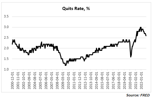
One final observation, there is another labour data series which has been often cited as an example of a tight labour market: the quits rate.  I would though argue two things: 1) labour tightness explains only part of the elevated quits rate, and 2) the quits rate has already started declining.

A higher quits rate is quite consistent with an increasing share of lower paid jobs and with multiple job holders both of which have been trends seen post the 2008 financial crisis, and especially during and after the Covid crisis. It is possible to decompose the quits rates by industry and sector. For example, retail trade, accommodation, and food services, all of which are lower paid/temp jobs by multiple job holders, have much higher quits rates than the average across all industries. This is corroborated by a Pew Research report according to which most workers who quit their jobs cited low pay.

Finally, the quits rate actually peaked at the end of last year (notice the Household/ Establishment Employment Survey discrepancy started shortly after) at about 3%. This is the highest in the series, but the data officially goes back to only 2000. BLS has actually related quits rate data (but only for the manufacturing sector) prior to 2000 which shows that the quits rate has been above 3% in the past, and yes at above 3%, the quits rate is associated with the peak in economic expansion. You can see the full data set and BLS perspective on it here.

Bottom line: you do not need to believe in conspiracy theories about Household Survey vs Establishment Survey labour data inconsistency to conclude that the US labour market is far from tight. If anything, it has already started to slow down. Do not be confused by headline numbers of high wage growth rate and low unemployment rate, look at the overall employment picture taking into account trends in overall total compensation.  

Fed Funds peaks and UST yield curve inversions

02 Friday Dec 2022

Posted by beyondoverton in Debt, Monetary Policy

≈ Leave a comment

Tags

Fed, Rates

  • Either the peak in the Fed Funds rate is much higher, or the UST yield curve, 2×10, is too inverted. Whatever the case is, it’s extremely unlikely that the Fed eventually ends up cutting just the 150bps priced in at the moment.
  • Or to be more precise, unless there is a modern debt jubilee (a central bank/Treasury debt moratorium) or a drastic capital destruction caused by a total collapse in the global supply chains, continuation of war in Europe/Asia or a natural disaster (climate change, etc.), the Fed is more likely to pause the hikes next year, wait, and eventually cut by more than the 150bps priced in the market but less than in the past.
  • In other words, the shape of the current Eurodollar curve is totally ‘wrong’, just like it had been wrong in the previous three interest rate cycles but for different reasons.    

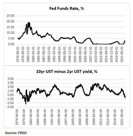
The current UST 2×10 curve inversion is pretty extreme for the absolute level of the Fed Funds rate. At -70bps, it is the largest inversion since October 1981 but back then the Fed Funds rate was around 15%. The maximum inversion of the UST 2×10 curve was -200bps in March 1980 when the Fed Funds rate was around 17%. The Fed Funds rate reached an absolute high of almost 20% in early 1981.

Back then the Fed was targeting the money supply, not interest rates, so you can see the curve was all over the place and thus comparisons are not exactly applicable. But still there were plenty of instances thereafter when the Fed moved to targeting the Fed Funds, and the Fed Funds rate was much higher than now, but the curve was much less inverted before the cycle turned.

Take 1989 when the 2×10 UST curve was around -45bps but the Fed Funds rate at the peak was around 10% (almost double the projected peak for the current cycle). The Fed ended up cutting rates to almost 3% in the following 3 years. Or take the peak in Fed Funds rate in 2000 at 6.5% and a UST 2×10 yield curve inversion of also around 45bps. The Fed proceeded to cut rates to 1% in the following 4 years.

Finally, take the peak in Fed Funds rate at 5.25% in 2006-7 and a UST 2×10 yield curve inversion of around -15bps. The Fed ended cutting rates to pretty much 0% in the following 2 years. In the 2016-18 rate hiking cycle, when the Fed Funds rate peaked at 2.5%, the UST 2×10 yield curve never inverted.

So, today we have a peak in the Fed Funds rate of around 5%, so comparable to the 2007 and 2000 cycles, but a much deeper curve inversion, more comparable to the 1980s. If we go by the 2000 and 2007 scenarios, the Fed cut rates by around 500bps; in the 1980s the Fed cut much more, obviously, from a higher base. In this cycle, if the peak is indeed around 5%, 500bps is the maximum anyway the Fed can cut. That is also the minimum which is “priced in” by the current curve inversion. But the actual market currently and literally prices only 150bps of cuts.

Again, neither of the past interest rate cycles are exactly the same as the current, so straight comparisons are misleading, but somehow, it seems that the peak Fed Funds rate today plus the current pricing of cuts in the forward curve do not quite match the current UST 2×10 curve inversion – either the peak is too low, or the curve is too inverted.

What I think is more likely to happen is the Fed hikes to more or less the peak which is priced in currently around 5% but it does not end up cutting rates immediately. The market is currently pricing peak in May-June next year and cuts to start pretty much immediately after; by the end of 2023 there are 50bps of cuts priced in.

In the last three rate cycles (2000, 2008, 2019) there was quite a bit of time after rates peaked and before the Fed started cutting. The longest was in 2007 – 13 months, then in 2019 it was 8 months and in 2000 it was 6 months. Before 2000 the Fed started cutting rates pretty much immediately after the end of each rate hiking cycle, so very different dynamics.

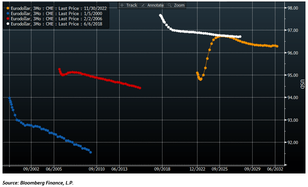
Here are how the Eurodollar curves looked about six months before the peak in rates in each of these cycles. The curve today somewhat resembles the curve in 2006, in a sense that the market correctly priced the peak in rates in 2007 followed by a cut and then a resumption of hikes. But unlike today, the market priced pretty much only one cut and then a resumption of hikes thereafter.  In the interest rate cycles in either 2000 or 2018 the market continued to price hikes, no cuts at all, and a peak in the Fed Funds rate not determined.

Source: Bloomberg Finance, L.P.

And here are how the curves looked after the first cut in each of these cycles (the colours do not correspond – please refer to the legend in the top left corner, but the sequence is the same – sorry about that). The market didn’t expect at all the size of cuts that happened in either of these cycles. Notice that the curve in the current cycle still does not look at all like any of the curves in the previous cycles (noted that in six months’ time, the current Eurodollar curve is also likely to look different from now, but nevertheless, there are much more cuts priced now than in any of the other three cycles).

Source: Bloomberg Finance, L.P.

The point is that the market has been pretty lousy in the past in predicting the trajectory of the Fed Funds rate.

  1. It is strange that the market never priced the pause in any of the actual past three interest rate cycles, and it is even stranger that it is not pricing it now either, given that there has been consistently a pause in the past.
  2. In none of the past three cycles did the market price any substantial cuts; in fact, we had to wait for the first actual cut for any subsequent cuts to be priced – that is also weird given that the Fed ended up cutting a lot.
  3. This time around, the market is pricing more cuts and well in advance but not even as close to that many as in the previous cycles.

However, I do not think we go back to the zero low bound as in the past three cycles. To summarize, the current UST 2×10 yield curve is too much inverted and the Fed would eventually cut rates more than what is currently priced in, but much less than in other interest rate cycles and after taking a more prolonged pause.   

Subscribe

  • Entries (RSS)
  • Comments (RSS)

Archives

  • January 2023
  • December 2022
  • November 2022
  • August 2022
  • February 2022
  • April 2021
  • November 2020
  • October 2020
  • September 2020
  • August 2020
  • July 2020
  • June 2020
  • May 2020
  • April 2020
  • March 2020
  • February 2020
  • January 2020
  • December 2019
  • November 2019
  • October 2019
  • May 2019
  • March 2019
  • February 2019
  • January 2019
  • December 2018
  • November 2018
  • October 2018
  • September 2018
  • August 2018
  • June 2018
  • May 2018
  • March 2018
  • February 2018
  • January 2018
  • November 2017
  • October 2017
  • September 2017
  • August 2017
  • July 2017
  • June 2017

Categories

  • AI
  • Asset Allocation
  • blockchain
  • China
  • De-urbanization
  • Debt
  • Decentralization
  • EM
  • Energy
  • Equity
  • FX
  • g88kboy
  • Monetary Policy
  • Politics
  • Questions
  • Quotes
  • The last man standing will laugh
  • Travel
  • UBI
  • Uncategorized
  • VR

Meta

  • Register
  • Log in

Blog at WordPress.com.

  • Follow Following
    • BeyondOverton
    • Join 73 other followers
    • Already have a WordPress.com account? Log in now.
    • BeyondOverton
    • Customize
    • Follow Following
    • Sign up
    • Log in
    • Report this content
    • View site in Reader
    • Manage subscriptions
    • Collapse this bar
 

Loading Comments...