• About
  • BeyondOverton Travel
    • Silk Road (1): If Turkey is in crisis, it’s not obvious visiting it
    • Silk Road (2): Could beautiful nature and ancient history create a false sense of entitlement?
    • Silk Road (3): Fast Car
    • Silk Road (4):We took a bus ride to Iran
    • Silk Road (5): Border bothers
    • Silk Road (6): Chevrolet Land
    • Silk Road (7): Free-roaming camels and wild horses
    • Silk Road (8): China West to East
    • Silk Road (9): I have not told half of what I saw
  • BLOG
  • g88kboy Travel
    • On the Silk Road
    • Bulgaria : The Chicken crossed the Road
    • Turkey : The Country, not the Bird
    • Georgia on my Mind
    • Armenian Ayran
    • Iran – The Curious Land
    • An American in Azerbaijan
    • Uzbekistan: Golden Teeth and Neon Signs
    • Kazakhstan: Thirty Sweating Seniors
    • China Part One – Pandas Are Extinct
    • China Part Two: My TED Talk (Deep Analysis)
    • Phillipines – They Relax, I (pretend to😉) Study
    • Singapore: flashing trees and a torrent of tears
    • Malaysia: That ain’t no croc, it’s a log
    • Brunei: The Instinctive Fight for Superior Domination
    • Phillipines: Hello Friend Again
  • Outside the window
    • Bulgaria
    • Turkey
    • Georgia
    • Armenia
    • Iran
    • Azerbaijan
    • Uzbekistan
    • Kazakhstan

BeyondOverton

~ let's move this window

BeyondOverton

Tag Archives: Fed

Don’t fight Powell

15 Thursday Dec 2022

Posted by beyondoverton in Monetary Policy

≈ Leave a comment

Tags

Fed, Rates

After reading John Authers’ piece this morning, I was not really planning to write a note on yesterday’s FOMC meeting. I think he summed up the Fed’s actions very well and correctly analysed the market’s reactions. And I would say that indeed the mantra “Don’t fight the Fed” should be valid in general. But that holds true only if we understand what the Fed is trying to achieve. Here is a more nuanced view on the matter.

If the Fed had only raised the dot plot in the face of slowing down inflation since the last SEP (and obviously reiterated that there would be no cuts next year, etc.), I would have concluded that the Fed intends to keep hiking, regardless, bound not to repeat the ‘mistakes’ of the late 1970s. Don’t fight the Fed in this case would have been the right strategy.

However, raising the dot plot in the face of slowing inflation but also alluding to a smaller hike than priced in the next FOMC meeting (see Authers’ note above) introduces a decent amount of confusion as to exactly what the Fed’s intentions are. It could be that most Fed members had made up their mind about the dot plot before the surprise slowdown in inflation this week and didn’t bother/didn’t have the time to adjust their view thereafter. The intention for a smaller hike next allows Fed officials to change their mind. So, in this case the market’s reaction (nothing really changed post the meeting[i]) might be justified.

It could also be that Fed officials took the lower-than-expected CPI in stride and concluded that it alone does not warrant a change in view. That also signifies that during the previous SEP, the Fed made a mistake in its projections of the terminal Fed rate (it should have been ‘much’ higher). Does that mean “Don’t fight the Fed” holds in this instance? It appears so, but then again, if the Fed made a mistake in the past and was quick to acknowledge it, then it is also possible that the Fed is again making a mistake. The market’s reaction is thus dubious, neither ‘wrong’, nor ‘right’.

The final possibility is that the Fed has literally and figuratively lost the plot (pun intended) and is planning to stay hawkish (not necessarily continue to hike, but certainly not cut) until the inflation rate crosses back below 2%, regardless of what happens to the economy. It must be clear that in this case “Don’t fight the Fed” firmly holds.

I have no idea what most of the other FOMC members’ intentions are but listening to Fed Chairman Powell’s press conference, I am pretty sure what his are: I think he is firmly in the last camp above. Here is why.

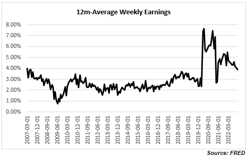
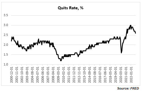
In his opening statement, Powell made several references to the fact that the “labor market remains extremely tight with the unemployment rate near a 50-year low, job vacancies still very high, and wage growth elevated”. In the Q&A session, similar, “I’ve made it clear that right now, the labor market is very, very strong. You’re near a 50 year low: you’re at or above maximum unemployment in 50 years.” I’ve written on this before, i.e., why not only I disagree that the labour market is so tight but that it is actually slowing down.

However here is some additional color, which shows that it is not that straightforward, and we have to give at least some credit to Chairman Powell. So, when it comes to the US labor market statistics the table below provides the basics. Bear these in mind as we go along.

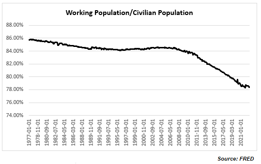
Strictly speaking, Chairman Powell is right that “the labor market continues to be out of balance, with demand substantially exceeding the supply of available workers” (in his opening statement; he goes in more detail on this in the Q&A session particularly in a question from Market Watch). Look at the ratio of Working Population to Civilian Population which is at nearly 50yr low

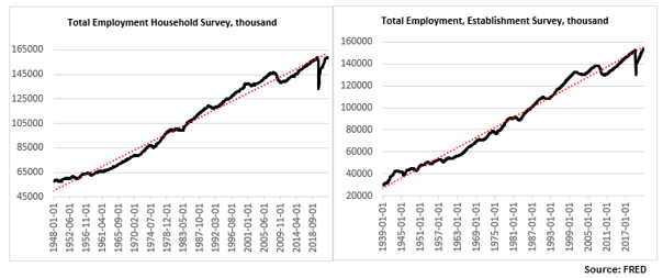
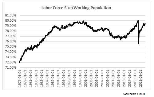
And within the Working Population the actual Labor Force Size only managed to get just above its pre-Covid level this August and has started to decline again since then, so that the ratio between the two is still below the pre-Covid level (and as a matter of fact still below the high reached at the onset of the 2000 recession).

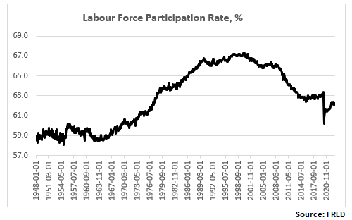
And here is the now more familiar labor force participation rate (LFPR), still way below the pre-Covid high and substantially below the pre-2000 recession high.

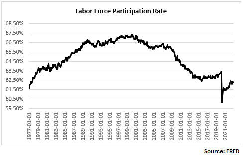
So, when Powell refers to the “labor market is 3.5m people smaller than it should have been based on pre-pandemic levels” this is what he has in mind: strictly speaking, if we adjust the LFPR to its pre-Covid high, the labor force would have been about 3.021m people more. But that is on the supply side, and we are going to go through this more later on.

But let’s look at the demand side as well. As per Powell, again in the answer to the journalist from Market Watch, “you can look at vacancies”. Here they are.

Powell is right to an extent: there are still more that 10m job openings. This is down from nearly 12m from the highs in March, and job openings are never zero, but even the current number puts job openings at about 5.8m additional vacancies over the pre-Covid average.

So, the question really is to square the demand and the supply side of labor. Obviously, it is not that straightforward. It is normal to have people unemployed at the same time as vacancies unfilled, but the state of the labor market post Covid is more unusual, also because the unfilled vacancies are not pushing real wages up. Which is why some people have suggested that rather than a wage issue it is really a skill mismatch issue (plenty of studies done on this post the 2008 recession), or indeed Covid-related issue (even Powell referred to this as a cause in his Q&A).

Chairman Powell lamented yesterday that the LFPR is not going up, “contrary to what we thought”. But if it does go up, does it mean the headline statistics will indicate the labor market is tightening or loosening? I ran some hypothetical numbers regarding this below.

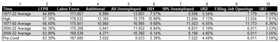
The second column in the table above indicates a hypothetical LFPR per the time period in column one. The third column is the actual labor force as a result (in thousands). The fourth column indicates the additional people coming into the labor market. The fifth column indicates the number of unemployed if all these additional people entered the labor force; the sixth column is the resulting unemployment rate. The seventh column shows the number of unemployed if 50% of the additional labor force actually found jobs; the eight column is the resulting unemployment rate. Finally, the ninth column shows the number of unemployed if all the additional labor force fills the job openings (see Chart above) over and above the average pre-Covid; the tenth column shows the resulting unemployment rate.

There are myriad such scenarios. In the example above, using averages and simple assumptions about additional employment vs unemployment, the unemployment rate is higher than the current one in all but the last three examples (column 10 – the last three entries). Bottom line is that the drop in the labor force participation rate makes relative comparisons about how tight the labor market is (i.e., looking only at the unemployment rate) pretty irrelevant.

It also makes all of the above analysis almost useless (or at best very theoretical) as far as investing is concerned. It really does not matter at the end what the ‘real’ employment situation is. Powell was very clear yesterday. “The largest amount of pain” would not come from people losing their jobs. “The worst pain would come from a failure to raise rates high enough and from us allowing inflation to become entrenched in the economy; the ultimate cost of getting it out of the economy would be very high in terms of  unemployment, meaning very high unemployment for extended periods of time.”

That’s it. Inflation is all that matters. And if there was any hint at all that the Fed might increase its 2% inflation target, Powell was very adamant that it is not happening: “…changing our inflation goal is just something we’re not, we’re not thinking about. It’s not something we’re not going to think about it. We have a 2% inflation goal and we’ll use our tools to get inflation back to 2%. I think this isn’t the time to be thinking about that. I mean there may be a longer run project at some point. But that is not where we are at all at  the committee, we’re not considering that. We’re not going to consider that under any circumstances we’re gonna we’re gonna keep our inflation target at 2%.”

This turned out to be a long note just to conclude that indeed, it is pointless to fight the Fed, assuming that Powell’s view is shared by the majority of Fed voters, or if not, that the majority would still fall under the guidance of the Chairman. However, leaving the possibility of only 25bps hike at the next FOMC meeting is perhaps a sign that there may be some disagreement at the Fed.


[i] During New York hours; the market has subsequently weakened during the European morning session.

The US labour market is slowing down

06 Tuesday Dec 2022

Posted by beyondoverton in Monetary Policy, Questions

≈ 1 Comment

Tags

Fed, inflation, labour market, Rates

  • Is US employment data hot, ‘goldilocks’, or ‘cold’?
  • Have you been inundated by calls and messages with the question, “But have you seen the details of the Household Survey?”
  • Is the Fed right to keep aggressively hiking?

Summary: The US labour market is slowing down despite headline grabbing low unemployment rate and high wage growth rate. The recent details underlying this data show the total number of people employed growing below trend, fewer hours worked and lower quits rate. As a result, the growth rate of total earnings is also going down, the effect being a lower share of national income going to labour and total consumption as a share of GDP stagnating. All this should make the Fed further re-evaluate its aggressively hawkish interest rate policy.

The Household Employment Survey makes the headlines

After a couple of weeks of ‘SBF’ trending, I, for one, was happy to take my mind off to something much more prescient and important as far as my investments are concerned – the US employment situation. At first glance, the November NFP report came much hotter than expected but because the market did not really react the way one would have expected from such a strong report, we started looking for reasons why that was the case.

Which bought us to the US Household Employment Survey. ‘Us’ here does not mean us literally (for those of you who had followed my writings at 1859, there was plenty of discussion on this topic as soon as I spotted the divergence between the two employment reports in September). And this note is not on why the Household Survey is showing different things from the Establishment Survey.

If you want to, you can read zerohedge on this topic here (I know, think what you want but the folks there were one of the first to spot the issue way back in the summer). If you can’t bear some of the conspiracy language at zerohedge, you can read an inferior version (but still good!) of the same at the more balanced Macro Compass. Finally, there are quite a few respected people on Twitter who have talked about it (see here, here, here).

To give you the full  disclosure, there are some legitimate reasons why the Household Survey produces different results to the Establishment Survey – and they have to do with a methodology issue, see here. BLS is actually well aware of that issue and calculates a time series which reconciles the two surveys and which can be found here (also with a very, very extensive comparison analysis between the methodology of the two). This adjusted data does not look that bad as the stand-alone Household Survey data (the November data was actually very good). But over the last 6 months it still points to a weakening employment market, not a stable or even hot one as per the Establishment Survey.

OK, that’s more than I wanted to write regarding the Household Survey. The rest of the note will show why the US employment situation is actually weakening even taking the Establishment Survey as a base.

The three variables of employment

There are three aspects of employment in general as far as assuaging how hot the economy is doing: wages, people employed, and hours worked, i.e., we need to follow this sequence, purchasing power->consumption->GDP) Basically, one needs to know the full product of Wages X Total Employment X Hours Worked (assuming, of course, that wages are per hour worked; not all jobs pay per hour, but those that do have actually increased at the expense of the others – see some of the links above which discuss the prevalence of part-time jobs and multiple job holders).

The economy can be hot even when wages are flat, or even declining, but there are more people entering the workforce or there are more hours worked – there are multiple combinations among the three variables producing various results. The point is to consider all three variables.

Total number of employed is growing below trend

Let’s take the period in the last three years or so after the Covid crisis. Yes, wage growth has picked up, but more people have exited the labour force and there are fewer hours work.  

The labour force participation rate is still below the pre-Covid levels, and close to a 50-year low:

The total number of people employed has risen but, depending on whether one uses the Establishment Survey or the Household Survey, the number is either just above the pre-Covid levels or indeed below. In any case, regardless of which survey one uses, the number is still below trend (and has not been above trend since the 2008 financial crisis).

Higher wages but lower hours worked

Finally, here are wages and hours worked. I have included below a time series chart for only the last 3 years to be able to see better the divergence between the two: while wages continue to rise, hours worked peaked in January 2021 and have now reversed the spike in 2020.

Let’s focus more on the latest NFP report. Here are the relevant tables below.

  • Generally higher-wage industries, like goods producing, tend to exhibit a smaller increase in hourly wages than lower-wage ones, like services.
  • In some cases, like the Utilities sector, which has the second highest wage per hour but also the highest average weekly earnings (courtesy of more hours worked, more on this later), wages have actually declined.
  • Transportation and warehousing sector has an unusual jump in wages, about 5x the average rise in wages – is there something specific going on there?

The growth rate of total earnings is declining

It is important to look at the last columns in Table B-3 above, ‘Average weekly earnings’, which gives a much better picture of take-home pay as it combines wages with hours worked. So, while indeed the trend of declining 12m-growth rate of weekly wages was reversed with this latest report (back above 5%), which some commentators have warned the Fed should be worried about, the trend of declining total weekly earnings continues to be intact.

Note, average hourly earnings are still elevated, hovering at previous peaks but this is hardly a reason for the Fed to get more worried about, especially after already delivering the fastest interest rate hiking cycle in recent memory.

In fact, quite on the contrary. Despite all the excitement about the rise in wages, the share of national income going to workers has been on a decline, with the post-Covid spike now quickly reversed. We are back to the familiar territory of the low range post the 2008 financial crisis which is also the lows since the mid-1960s. If you were worried about a wage-price spiral issue, ala the late-1970s (I actually do not think there was one even back then as real wage growth even then was negative), you really shouldn’t be. It is a very different dynamic, at least for the moment.

Consumer demand as a share of GDP has been stagnant for more than a decade

And if you are really worried that consumer demand will push inflation higher, again, you shouldn’t be, necessarily: consumption as a share of GDP is elevated relative to historical records but it is not even above the highs reached more than a decade ago. In fact, it seems that consumption has not been an issue for inflation for at least the last two decades.

The quits rate is declining

One final observation, there is another labour data series which has been often cited as an example of a tight labour market: the quits rate.  I would though argue two things: 1) labour tightness explains only part of the elevated quits rate, and 2) the quits rate has already started declining.

A higher quits rate is quite consistent with an increasing share of lower paid jobs and with multiple job holders both of which have been trends seen post the 2008 financial crisis, and especially during and after the Covid crisis. It is possible to decompose the quits rates by industry and sector. For example, retail trade, accommodation, and food services, all of which are lower paid/temp jobs by multiple job holders, have much higher quits rates than the average across all industries. This is corroborated by a Pew Research report according to which most workers who quit their jobs cited low pay.

Finally, the quits rate actually peaked at the end of last year (notice the Household/ Establishment Employment Survey discrepancy started shortly after) at about 3%. This is the highest in the series, but the data officially goes back to only 2000. BLS has actually related quits rate data (but only for the manufacturing sector) prior to 2000 which shows that the quits rate has been above 3% in the past, and yes at above 3%, the quits rate is associated with the peak in economic expansion. You can see the full data set and BLS perspective on it here.

Bottom line: you do not need to believe in conspiracy theories about Household Survey vs Establishment Survey labour data inconsistency to conclude that the US labour market is far from tight. If anything, it has already started to slow down. Do not be confused by headline numbers of high wage growth rate and low unemployment rate, look at the overall employment picture taking into account trends in overall total compensation.  

Fed Funds peaks and UST yield curve inversions

02 Friday Dec 2022

Posted by beyondoverton in Debt, Monetary Policy

≈ Leave a comment

Tags

Fed, Rates

  • Either the peak in the Fed Funds rate is much higher, or the UST yield curve, 2×10, is too inverted. Whatever the case is, it’s extremely unlikely that the Fed eventually ends up cutting just the 150bps priced in at the moment.
  • Or to be more precise, unless there is a modern debt jubilee (a central bank/Treasury debt moratorium) or a drastic capital destruction caused by a total collapse in the global supply chains, continuation of war in Europe/Asia or a natural disaster (climate change, etc.), the Fed is more likely to pause the hikes next year, wait, and eventually cut by more than the 150bps priced in the market but less than in the past.
  • In other words, the shape of the current Eurodollar curve is totally ‘wrong’, just like it had been wrong in the previous three interest rate cycles but for different reasons.    

The current UST 2×10 curve inversion is pretty extreme for the absolute level of the Fed Funds rate. At -70bps, it is the largest inversion since October 1981 but back then the Fed Funds rate was around 15%. The maximum inversion of the UST 2×10 curve was -200bps in March 1980 when the Fed Funds rate was around 17%. The Fed Funds rate reached an absolute high of almost 20% in early 1981.

Back then the Fed was targeting the money supply, not interest rates, so you can see the curve was all over the place and thus comparisons are not exactly applicable. But still there were plenty of instances thereafter when the Fed moved to targeting the Fed Funds, and the Fed Funds rate was much higher than now, but the curve was much less inverted before the cycle turned.

Take 1989 when the 2×10 UST curve was around -45bps but the Fed Funds rate at the peak was around 10% (almost double the projected peak for the current cycle). The Fed ended up cutting rates to almost 3% in the following 3 years. Or take the peak in Fed Funds rate in 2000 at 6.5% and a UST 2×10 yield curve inversion of also around 45bps. The Fed proceeded to cut rates to 1% in the following 4 years.

Finally, take the peak in Fed Funds rate at 5.25% in 2006-7 and a UST 2×10 yield curve inversion of around -15bps. The Fed ended cutting rates to pretty much 0% in the following 2 years. In the 2016-18 rate hiking cycle, when the Fed Funds rate peaked at 2.5%, the UST 2×10 yield curve never inverted.

So, today we have a peak in the Fed Funds rate of around 5%, so comparable to the 2007 and 2000 cycles, but a much deeper curve inversion, more comparable to the 1980s. If we go by the 2000 and 2007 scenarios, the Fed cut rates by around 500bps; in the 1980s the Fed cut much more, obviously, from a higher base. In this cycle, if the peak is indeed around 5%, 500bps is the maximum anyway the Fed can cut. That is also the minimum which is “priced in” by the current curve inversion. But the actual market currently and literally prices only 150bps of cuts.

Again, neither of the past interest rate cycles are exactly the same as the current, so straight comparisons are misleading, but somehow, it seems that the peak Fed Funds rate today plus the current pricing of cuts in the forward curve do not quite match the current UST 2×10 curve inversion – either the peak is too low, or the curve is too inverted.

What I think is more likely to happen is the Fed hikes to more or less the peak which is priced in currently around 5% but it does not end up cutting rates immediately. The market is currently pricing peak in May-June next year and cuts to start pretty much immediately after; by the end of 2023 there are 50bps of cuts priced in.

In the last three rate cycles (2000, 2008, 2019) there was quite a bit of time after rates peaked and before the Fed started cutting. The longest was in 2007 – 13 months, then in 2019 it was 8 months and in 2000 it was 6 months. Before 2000 the Fed started cutting rates pretty much immediately after the end of each rate hiking cycle, so very different dynamics.

Here are how the Eurodollar curves looked about six months before the peak in rates in each of these cycles. The curve today somewhat resembles the curve in 2006, in a sense that the market correctly priced the peak in rates in 2007 followed by a cut and then a resumption of hikes. But unlike today, the market priced pretty much only one cut and then a resumption of hikes thereafter.  In the interest rate cycles in either 2000 or 2018 the market continued to price hikes, no cuts at all, and a peak in the Fed Funds rate not determined.

Source: Bloomberg Finance, L.P.

And here are how the curves looked after the first cut in each of these cycles (the colours do not correspond – please refer to the legend in the top left corner, but the sequence is the same – sorry about that). The market didn’t expect at all the size of cuts that happened in either of these cycles. Notice that the curve in the current cycle still does not look at all like any of the curves in the previous cycles (noted that in six months’ time, the current Eurodollar curve is also likely to look different from now, but nevertheless, there are much more cuts priced now than in any of the other three cycles).

Source: Bloomberg Finance, L.P.

The point is that the market has been pretty lousy in the past in predicting the trajectory of the Fed Funds rate.

  1. It is strange that the market never priced the pause in any of the actual past three interest rate cycles, and it is even stranger that it is not pricing it now either, given that there has been consistently a pause in the past.
  2. In none of the past three cycles did the market price any substantial cuts; in fact, we had to wait for the first actual cut for any subsequent cuts to be priced – that is also weird given that the Fed ended up cutting a lot.
  3. This time around, the market is pricing more cuts and well in advance but not even as close to that many as in the previous cycles.

However, I do not think we go back to the zero low bound as in the past three cycles. To summarize, the current UST 2×10 yield curve is too much inverted and the Fed would eventually cut rates more than what is currently priced in, but much less than in other interest rate cycles and after taking a more prolonged pause.   

Fed’s taper

19 Friday Jun 2020

Posted by beyondoverton in Monetary Policy

≈ Leave a comment

Tags

Fed, liquidity, repos

Has the Fed really started tapering?

Liquidity is getting tighter. The decline in Fed repos is simply a reflection of their increased cost. Therefore, we will know when things are really getting bad if repo volumes start to pick up. Finally, if the market expected to get a flush of liquidity towards month end from TGA, this is now less likely to happen.

  • First drop in overall Fed’s balance sheet since 02/26. And it is a rather large drop, $74Bn.
  • Third week in a row of declines in bank deposits. Level now is the same as 04/15. The 4-week rolling growth rate is now the lowest since the Fed’s U-turn last September.
  • TGA continues to climb to record highs despite some disbursements towards Fed’s SPVs as new programs get triggered. It is likely that the level of TGA depends on the amount of SBA loans drawn/forgiven and such TGA can stay above $800Bn, Treasury’s target, for some time.
  • CB swap lines decline by $92Bn – first large decline as some of them have matured and no additional USD funding required.
  • Net repos outstanding continue to decline – this has been a feature all of this week as both O/N and term repos have been 0 for USTs. Reason for that is Fed raised the minimum bid on O/N to IOER +5bps and on term to IOER +10bps. This was a surprise, not that it happened (Fed probably made that decision at its April FOMC already), but that it happened ahead of tax receipts day. Commercial banks now must step in to fill in the gap but with their deposits on decline, their flexibility is diminished.
  • Fed bought $83Bn of mortgages – that’s perhaps to compensate for net selling in the previous 3 weeks.

Extra liquidity is getting withdrawn. That’s it. Market is not in distress yet. For that, we will know it when Fed repo volumes start picking up again and O/N rates shoot up. But for sure, on the margin, there is less liquidity to go around. Markets are not reflecting this yet. Perhaps, waiting for a sign, that all this surplus liquidity has been withdrawn, to react.

Liquidity down, equities up, Fed around the corner

08 Monday Jun 2020

Posted by beyondoverton in Equity, Uncategorized

≈ 1 Comment

Tags

Fed

Repo volumes are rising in a similar fashion to the beginning of the crisis in February. Liquidity is leaving the system. Last two days, repos (O/N and term) rose above $100Bn. S&P500 topped on February 19 while repo volumes were about half of what we are seeing today. By the time we hit $100Bn in repos (March 3), the index had dropped 10%.

We had about two weeks (March 3-March 22) of repos printing about $128Bn on average per day. S&P 500 bottomed on March 23 as the Fed started stepping in with its various programs. Repos went down below $50Bn on average a day. More importantly liquidity started flooding the system. Reverse repos skyrocketed from $5bn on average per day to $143Bn a day by mid-April! Equities rallied in due course.

April/May, things went back to normal: repo volumes between $0Bn and $50Bn a day and reverse repos averaging about $2-3Bn a day->Goldilocks: liquidity was just about fine. Equities were doing well. Then in the first week of June, repos jumped above $50Bn, and last Friday and today they went above $100Bn. Reverse repos are firmly at $0Bn: they have literally been $0Bn for the last 4 days.

Again, just like in February, liquidity is starting to get drained from the system. By that level of repo volumes in March, equities were already 10% lower from peak. S&P500 is just a couple % below that previous peak, but Nasdaq is above!

I am not sure why the market is here. It could be that, in a perfect Pavlovian way, investors are giving the benefit of the doubt to the Fed that it will announce an increase of its asset purchasing program at this week’s FOMC meeting. If it doesn’t, US equities are a sell.

And don’t be fooled by no YCC or any forward guidance. The Fed needs to step in the UST market big way. YCC on 2-3 year will do nothing. Fed needs to do YCC on at least up to 10yr. As to really address the liquidity leaving the system, Fed needs to at least double its weekly UST purchases.

Fed’s crisis response may endanger the dollar

13 Friday Mar 2020

Posted by beyondoverton in Equity, FX

≈ 1 Comment

Tags

ECB, Fed

The response from the two most powerful central banks could not have been more different. ECB is innovative, using fine tuning and precision in tiered rates and targeted lending; Fed is still throwing the kitchen sink at the market by flooding the banking system with liquidity.

ECB is also going more direct partially because the banking system there is in shatters, but also because it makes sense regardless. Plus, the ECB is already taking credit risk by buying corporate bonds. Surely, the next step is literally direct credit lending and massively expanding the ECB counterparty list.

Fed is still stuck in the old model of credit transmission, entirely relying on the banking system. That model died in 2008, in fact, even before that, in the early 2000s, as the first Basel rules came into effect and the shadow banking system flourished.

Post 2008 it became much more common for financial institutions, like PE etc. to get in the credit loan business. Needless to say, this carries a big risk given that they don’t have access to Fed’s balance sheet like the banks.

The US banking system is now flooded with liquidity. If the new repo auctions are fully subscribed, this will double banks’ reserve balances and will bring them to the peak post the 2008 crisis. But do banks need that liquidity?  It does not seem so: the first $500Bn repo auction yesterday had just $78Bn of demand. But that liquidity from the Fed is there on demand, plus the central banks swaps lines are open, and as of March 12, none has been drawn. And finally, the foreign reverse repos pool balance at the Fed has not shown any unusual activity (no drawdowns). All this is indicating that USD liquidity is at the moment sufficient, if not superfluous, so, it should have a negative effect on USD, given long USD has been a popular position post 2008.

All this liquidity, however, may still do nothing to stocks, as seen by their performance into the close yesterday, because balance sheet constraints prevent banks from channelling that liquidity further into the US economy where it is surely needed. From one hand, the Fed is really pushing on a string when it comes to domestic dollar liquidity, but, on the other, it is providing more than plenty abroad. 

Risky assets are still a sell on any bounce, and the USD is probably a sell as well, as the Fed will be forced to keep cutting but it is now running a risk of foreign money exiting long established overweight positions in US assets. 

Fed’s weekly balance sheet update

23 Thursday Jan 2020

Posted by beyondoverton in Monetary Policy

≈ Leave a comment

Tags

Fed

Total assets down $30Bn: the biggest weekly decline since May 1, 2019, and down $27Bn from peak on Jan. 1, 2020. All of the decline is on the back of repos, down $43Bn on the week, and 70Bn from peak. At $186Bn, repos were last time here in mid October 2019.

On the liability side, bank reserves declined by $64Bn. But the liquidity dropped more because both the TGA and domestic reverse repos rose by $31Bn and $15Bn respectively. At $412, TGA is at its highest level over the last 12 months. On the other hand, and as expected, FRP continues to decline and at $250Bn is close to the low end of the 12m period. Currency in circulation also dropped for third week in a row, posting the biggest cumulative decline from its peak over the last 12m. The decline in FRP and currency in circulation cushioned the otherwise drop in overall liquidity.

Going forward, there is no doubt that the bulk of the central bank’s increase in balance sheet is behind us for the moment, ceteris paribus. The Fed will continue shifting from repos to T-Bills and probably coupons (especially if it hikes the IOER/repo rate next week). The effect on liquidity will depend on the liabilities mixture, though. Expect TGA to slowly start decreasing ($400Bn has kind of been its upper limit, rarely going above it by much).

FRP has a bit more to go on the downside but I think it will struggle to break $200Bn, probably settle around $215Bn.

That should help liquidity. If the Fed buys more securities than the decline in repos, under that scenario, bank reserves/liquidity go up. If not, it really depends on the net effect of the change in autonomous factors. 

If you are trading Fixed Income, expect a bit more pressure on the curve to continue flattening. If you are trading equities, none of this matters to you. At the moment, the only thing the equity market cares about is the size of the gamma cushion.

QE or not QE? Not QE, and not much liquidity either

16 Thursday Jan 2020

Posted by beyondoverton in Equity, Monetary Policy

≈ Leave a comment

Tags

Fed, liquidity

I am late in this debate, at least in writing, because at first, I thought it did not matter; it is all semantics. Last week I read John Authers’ article in Bloomberg in which he referenced a chart from CrossBorder Capital that showed that the Fed had recently injected the greatest liquidity boost ever. That got me really curious, so I did some digging in the Fed’s balance sheet and I concluded, notwithstanding that I am not privy of how CrossBorder Capital defines and measures liquidity, it is unlikely that the Fed’s actions led to the ‘greatest liquidity boost ever’. And then yesterday Dallas Fed President Kaplan said he was worried about the Fed creating asset bubbles. This pushed the ‘old’ narrative that CBs’ liquidity/NIRP/ZIRP is creating a mad search for yield and a rush in risky assets out of the woodwork again on social media. So, that got me thinking that whatever the Fed did since last September, whether it is QE or not, actually matters.

So, just to refresh, since September 2019, the Fed’s balance sheet increased by about $400bn, of which more than half came from repos, the other from mostly T-Bills, with the increase in coupons more than offset by the decline in MBS. On the liability side, there was a similar breakdown: about 50% came from an increase in bank deposits, the other 50% came from an increase in currency in circulation and the TGA account. This 50/50 in both assets and liabilities is important to keep in mind.

Source FRB H.4.1, BeyondOverton

During QE1, the increase in securities held was more than 3x the increase in Fed’s total assets. That was mostly because loans and CBs swaps declined to make up the difference. On the securities side, the Fed bought both coupons and MBS. T-Bills remained the same, while agencies declined. However, 75% of the increase in assets came from a rise in MBS (from $0 to almost $1.2Bn). The Fed had begun to extend loans to some market players even before September 2008, but immediately after Lehman Brothers failed, the Fed extended loans to primary dealers (PD) as well as asset-backed/commercial paper/money market/mutual fund entities to the tune of about $400Bn. These were very temporary loans, pretty much making sure that no other PD or any other significantly important player failed. By the time QE1 finished the loans had gone back to almost pre-Lehman-time sizes. In a similar fashion, the Fed had already put in place CBs swaps even before September 2008, but immediately thereafter, the CB swap line jumped to more than $500Bn, and by the time QE1 finished it had gone to $0. Finally, repos actually decreased during QE1. Bottom line is, as far as Fed’s assets are concerned, September 2019 had absolutely no resemblances at all to September 2008.

Source: FRB H.4.1, BeyondOverton

On the liability side, the differences were also stark. Unlike 2019, during QE1 bank reserves contributed to 95% of the increase. The FRRP account remained pretty much flat for the full duration of QE1, while the TGA account was unchanged but it did exhibit the usual volatility during seasonal funding periods.

QE2 was much more straightforward than QE1. The Fed’s assets increased only on the back of coupon purchases (around $600Bn), while the Fed continued to decrease its MBS and loans portfolio. On the liability side, bank reserves continued to contribute about 95% of the increase. The rest was currency in circulation. Bottom line here again, really no resemblance to 2019.

QE3 was similar in the sense that Fed’s reserves increased 100% on the back of securities purchases (around $1.6Tn), but this time split equally between coupons and MBS. On the liability side, at 80% of total, bank reserves contributed slightly less towards the overall increase. The rest was split between currency in circulation and reverse repos. During QE3, unlike QE1 and QE2, less of the Fed’s balance sheet increase went towards higher liquidity (bank reserves), but still nothing like in 2019. For one reason or another, the market was willing to give some of the liquidity back to the Fed in the form of reverse repos even before the Fed started tapering (reverse repos were prominent after QE3 when the Fed stopped growing its balance sheet but before it actually started tapering it).

No, you can’t call whatever the Fed has been doing so far, starting in September 2019, QE. There are simply no comparisons with any of the previous QEs: The largest increases on the Fed’s balance sheet in 2019 was T-Bills and repos; the Fed never bought T-Bills or engaged in repos in any of the previous QEs – the asset mix was totally different. On the liability side, while in the QEs almost all of the increase went directly into bank liquidity, in 2019 only 50% did. FRRP was more or less unchanged, at around $100Bn between QE1 start and the end of QE3 – by September 2019 it had tripled! TGA averaged around $60Bn before the end of QE3; thereafter the average increased 4x!

As to the second issue of how much of the Fed’s liquidity injection since the crisis has boost asset prices? Not much.

According to the Fed’s own flow of funds data, real money has been a net seller of equities and buyer of risk-free assets since the 2008 financial crisis. If there is a rush into risky assets, it is not obvious from the data. There is also this argument that the Fed’s consistent boost of liquidity, combined with low interest rates, provides the proverbial put for prices and, therefore, the search for yield can be implemented by selling vol/gamma. This could indeed be the case. The problem is that I have not seen any data which shows exactly what the $ notional (in cash equities) equivalent of that vol selling flow is.

Moreover, given that both ECB and BOJ have engaged in even bigger balance sheet expansions, plus their interest rates are negative, the case could be made for a similar exercise in Europe and Japan. However, both European and Japanese equity markets have been languishing for years, underperforming US equity markets. Finally, even if this indeed were the case, the more likely explanation for the reasons people would be selling vol is the relentless bid from corporates engaging in share buybacks. This would also explain the underperformance of equity markets abroad relative to US ones despite higher CBs’ liquidity boosts there.

But how much liquidity did the Fed provide since the 2008 financial crisis?

Source: FRB H.4.1, BeyondOverton

Equities bottomed in March 2009. Fed’s assets increased by about $2Tn thereafter. But only 37% of that increase went to bank reserves. 40% went towards the natural increase of currency in circulation, 14% went to TGA and 9% went to the FRRP (drawing liquidity out). It is slightly better if one does the comparison since QE1, but even there, at most, 50% went directly to bank reserves.

Finally, one has to take into account that banks’ reserves needs have also substantially increased since the 2008 financial crisis on the back of Basel III requirements. According to the Fed itself, the aggregate lowest comfortable level of reserve balances in the banking system ranges from $600Bn to just under $900Bn. At $1.6Tn currently, there is not much excess liquidity left in the system. In fact, banks Fed deposits were already at around $800bn in March 2009. Given that most of the regulations were implemented thereafter, one could claim that no additional liquidity was really added to the banking system since.

Fed’s greatest liquidity boost ever?

12 Sunday Jan 2020

Posted by beyondoverton in Monetary Policy, Politics, Questions

≈ 1 Comment

Tags

Fed, repos

According to John Authers at Bloomberg, data from CrossBorder Capital, going back to January 1969, shows that we have been recently experiencing Fed’s greatest liquidity boost ever. I have no reason to doubt CrossBorder Capital or their proprietary model of measuring liquidity. But there are many ways of defining, as well as measuring, liquidity. So, I decided to simply look at what exactly the Fed has done since it started expanding its balance sheet in September last year.

Source: FRB H41, beyondoverton

Fed has indeed been doing more than $100Bn worth of repo operations on a daily basis recently, but those operations are only temporary, i.e. they can not be taken cumulatively in ascertaining the effect on liquidity. In fact, the Fed’s balance sheet has increased by $380Bn, and only 55% of which came from O/N and term repo operations ($211Bn). The other 45% came from asset purchases. On the asset purchases, the Fed bought mostly T-Bills ($182Bn), some coupons ($55Bn) while letting its MBS portfolio slowly mature (-$81Bn).

However, not all of that increase went towards interbank liquidity. In fact, only about 50% of that increase ($198Bn) went towards bank deposits. The TGA account increased by $167Bn; that drained liquidity. Reverse repos decreased by $20Bn (FRP by $17Bn and others by $3Bn), which added liquidity. Finally, $37Bn went towards the natural increase in currency in circulation.

Source: FRB H41, beyondoverton

Fed actually started increasing its T-Bill and UST portfolio already in mid-August, three weeks before the repo spike. Part of that increase went towards MBS maturities. But by the end of August, Fed’s balance sheet had already started growing. By the third week of September, also the combined assets portfolio (T-Bills, USTs, MBS) started growing as well, even though MBS continued to decrease on a net basis.  

Source: FRB H41, beyondoverton

Fed’s repo operations started the second week of September. They reached a high of $256Bn in the last week of December. At the moment they are at the same level where they were in the first week of December ($211Bn).

Source: FRB H41, beyondoverton

On the liability side, the TGA account actually bottomed out two weeks before the Fed started buying USTs and T-Bills, while the FRP account topped the week the Fed started the repo operations. Could it be a coincidence? I don’t think so. My guess is that the Fed knew exactly what was going on and took precautions on time (we might find eventually if it did indeed nudge foreigners to start moving funds away from FRP).

Source: FRB H41, beyondoverton

Finally, while currency in circulation naturally increases with time, bank deposits also bottomed out the week the Fed started the repo operations in September, but strangely enough, they topped the first week of December (for the time being).

Source: FRB H41, beyondoverton

So, while the Fed’s liquidity injection since last September was substantial relative to both the decrease in liquidity before that (starting in 2018 when the decrease in the Fed’s balance sheet became consistent) and, to a certain extent, since the end of the 2008 financial crisis, it is difficult to make a claim that this is the greatest liquidity boost ever. The charts below show the 4-week and 3-month moving average percentage change in the Fed’s balance sheet. The 4-week change in September was indeed the largest boost in liquidity since the immediate aftermath of the 2008 financial crisis. The 3-month change though isn’t.

Source: FRB H41, beyondoverton

The Fed pumped more liquidity in the system during the European debt crisis. In the first four months of 2013, not only the growth rate of the Fed’s balance sheet was higher than in the last four months now since September 2019, but also the absolute increase in Fed’s assets and US bank deposits. Moreover, there were no equivalent increases in either the TGA or the FRP accounts.

Final note, if the first week of January is any guide, it might be that a big chunk of the Fed’s balance sheet increase might be behind us, if only for the time being. Fed’s balance sheet decreased by $24Bn, which is the largest absolute decrease since the last week of July 2019, i.e. before the start of the most recent boost in liquidity. I actually do expect the Fed’s balance sheet to keep growing but at a much smaller scale and mostly through asset purchases rather than repos.

Source: FRB H41, beyondoverton

Repo squeeze and the Fed: two additional solutions

04 Friday Oct 2019

Posted by beyondoverton in Monetary Policy, Politics

≈ Leave a comment

Tags

Fed

Things the Fed can do to alleviate the potential repo squeeze (apart from the usual suspects already discussed in great detail by both saleside/buyside research and in Twittersphere):

1) hike the interest banks pay on TT&L ‘notes’ accounts from EFF-25bps to EFF, or to make it even simpler, equal to IOER. That could encourage funds to move from the TGA account back to TT&L accounts and ‘release’ reserves.

When the Fed started paying IOER, the opportunity cost for the Treasury to keep money on deposit in the banking system (TT&L accounts) rose. The Treasury thus started using the TGA at the Fed.

2) cut the fee on daily uncollateralized overdrafts from the current 50bps, adjust the net debt caps, decrease the penalty daily overdraft fee of 150bps. That could encourage better use of the existing Fed intraday liquidity option.

The Fed made major changes to its daily overdraft operations in 2011 spurred by some inexplicable desire to limit its credit exposure. This was probably on the back of political pressure from the legacy of the 2008 crisis during which the Fed indeed took massive credit risk.

Before 2011, the majority of the Fed’s daily overdrafts were uncollateralized. The new rules discouraged uncollateralized ‘repos’ by raising their fees and introducing collateralized overdrafts for free. After those changes, majority of the overdrafts became collateralized. The problem arose when during the most recent repo squeeze, the mechanics of obtaining collateral became complicated.

In any case, Fed’s action was strange given the fact that only a few months before that, in 2011, it had changed the accounting rules which pretty much ensured that the central bank can not go bankrupt (no negative equity) even in theory.

Should the Fed, actually, be providing free intraday liquidity with no collateral to eligible institutions? I think so. Because:

-that liquidity is needed for transaction (retail 24/7), not consumption or production purposes (Pfister 2018)

-the central bank can create money at zero cost, while the opportunity cost of holding money should be equal to the social cost of creating it (Friedman 1969)

-the central bank would be simply accommodating Basell III regulations

These two solutions are not groundbreaking: the Fed would be either going back to the way things were before 2007 (uncollateralized Fed daily overdrafts), or taking into account new developments (the emergence of IOER).

Subscribe

  • Entries (RSS)
  • Comments (RSS)

Archives

  • January 2023
  • December 2022
  • November 2022
  • August 2022
  • February 2022
  • April 2021
  • November 2020
  • October 2020
  • September 2020
  • August 2020
  • July 2020
  • June 2020
  • May 2020
  • April 2020
  • March 2020
  • February 2020
  • January 2020
  • December 2019
  • November 2019
  • October 2019
  • May 2019
  • March 2019
  • February 2019
  • January 2019
  • December 2018
  • November 2018
  • October 2018
  • September 2018
  • August 2018
  • June 2018
  • May 2018
  • March 2018
  • February 2018
  • January 2018
  • November 2017
  • October 2017
  • September 2017
  • August 2017
  • July 2017
  • June 2017

Categories

  • AI
  • Asset Allocation
  • blockchain
  • China
  • De-urbanization
  • Debt
  • Decentralization
  • EM
  • Energy
  • Equity
  • FX
  • g88kboy
  • Monetary Policy
  • Politics
  • Questions
  • Quotes
  • The last man standing will laugh
  • Travel
  • UBI
  • Uncategorized
  • VR

Meta

  • Create account
  • Log in

Blog at WordPress.com.

  • Subscribe Subscribed
    • BeyondOverton
    • Join 74 other subscribers
    • Already have a WordPress.com account? Log in now.
    • BeyondOverton
    • Subscribe Subscribed
    • Sign up
    • Log in
    • Report this content
    • View site in Reader
    • Manage subscriptions
    • Collapse this bar
 

Loading Comments...