
I am late in this debate, at least in writing, because at first, I thought it did not matter; it is all semantics. Last week I read John Authers’ article in Bloomberg in which he referenced a chart from CrossBorder Capital that showed that the Fed had recently injected the greatest liquidity boost ever. That got me really curious, so I did some digging in the Fed’s balance sheet and I concluded, notwithstanding that I am not privy of how CrossBorder Capital defines and measures liquidity, it is unlikely that the Fed’s actions led to the ‘greatest liquidity boost ever’. And then yesterday Dallas Fed President Kaplan said he was worried about the Fed creating asset bubbles. This pushed the ‘old’ narrative that CBs’ liquidity/NIRP/ZIRP is creating a mad search for yield and a rush in risky assets out of the woodwork again on social media. So, that got me thinking that whatever the Fed did since last September, whether it is QE or not, actually matters.
So, just to refresh, since September 2019, the Fed’s balance sheet increased by about $400bn, of which more than half came from repos, the other from mostly T-Bills, with the increase in coupons more than offset by the decline in MBS. On the liability side, there was a similar breakdown: about 50% came from an increase in bank deposits, the other 50% came from an increase in currency in circulation and the TGA account. This 50/50 in both assets and liabilities is important to keep in mind.
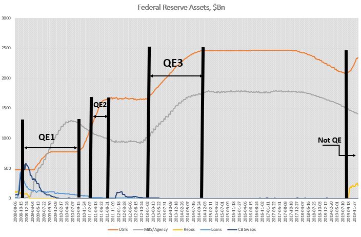
During QE1, the increase in securities held was more than 3x the increase in Fed’s total assets. That was mostly because loans and CBs swaps declined to make up the difference. On the securities side, the Fed bought both coupons and MBS. T-Bills remained the same, while agencies declined. However, 75% of the increase in assets came from a rise in MBS (from $0 to almost $1.2Bn). The Fed had begun to extend loans to some market players even before September 2008, but immediately after Lehman Brothers failed, the Fed extended loans to primary dealers (PD) as well as asset-backed/commercial paper/money market/mutual fund entities to the tune of about $400Bn. These were very temporary loans, pretty much making sure that no other PD or any other significantly important player failed. By the time QE1 finished the loans had gone back to almost pre-Lehman-time sizes. In a similar fashion, the Fed had already put in place CBs swaps even before September 2008, but immediately thereafter, the CB swap line jumped to more than $500Bn, and by the time QE1 finished it had gone to $0. Finally, repos actually decreased during QE1. Bottom line is, as far as Fed’s assets are concerned, September 2019 had absolutely no resemblances at all to September 2008.
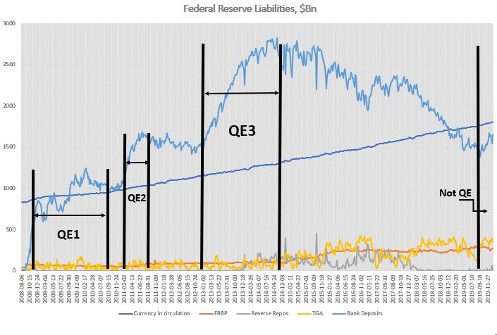
On the liability side, the differences were also stark. Unlike 2019, during QE1 bank reserves contributed to 95% of the increase. The FRRP account remained pretty much flat for the full duration of QE1, while the TGA account was unchanged but it did exhibit the usual volatility during seasonal funding periods.
QE2 was much more straightforward than QE1. The Fed’s assets increased only on the back of coupon purchases (around $600Bn), while the Fed continued to decrease its MBS and loans portfolio. On the liability side, bank reserves continued to contribute about 95% of the increase. The rest was currency in circulation. Bottom line here again, really no resemblance to 2019.
QE3 was similar in the sense that Fed’s reserves increased 100% on the back of securities purchases (around $1.6Tn), but this time split equally between coupons and MBS. On the liability side, at 80% of total, bank reserves contributed slightly less towards the overall increase. The rest was split between currency in circulation and reverse repos. During QE3, unlike QE1 and QE2, less of the Fed’s balance sheet increase went towards higher liquidity (bank reserves), but still nothing like in 2019. For one reason or another, the market was willing to give some of the liquidity back to the Fed in the form of reverse repos even before the Fed started tapering (reverse repos were prominent after QE3 when the Fed stopped growing its balance sheet but before it actually started tapering it).
No, you can’t call whatever the Fed has been doing so far, starting in September 2019, QE. There are simply no comparisons with any of the previous QEs: The largest increases on the Fed’s balance sheet in 2019 was T-Bills and repos; the Fed never bought T-Bills or engaged in repos in any of the previous QEs – the asset mix was totally different. On the liability side, while in the QEs almost all of the increase went directly into bank liquidity, in 2019 only 50% did. FRRP was more or less unchanged, at around $100Bn between QE1 start and the end of QE3 – by September 2019 it had tripled! TGA averaged around $60Bn before the end of QE3; thereafter the average increased 4x!
As to the second issue of how much of the Fed’s liquidity injection since the crisis has boost asset prices? Not much.
According to the Fed’s own flow of funds data, real money has been a net seller of equities and buyer of risk-free assets since the 2008 financial crisis. If there is a rush into risky assets, it is not obvious from the data. There is also this argument that the Fed’s consistent boost of liquidity, combined with low interest rates, provides the proverbial put for prices and, therefore, the search for yield can be implemented by selling vol/gamma. This could indeed be the case. The problem is that I have not seen any data which shows exactly what the $ notional (in cash equities) equivalent of that vol selling flow is.
Moreover, given that both ECB and BOJ have engaged in even bigger balance sheet expansions, plus their interest rates are negative, the case could be made for a similar exercise in Europe and Japan. However, both European and Japanese equity markets have been languishing for years, underperforming US equity markets. Finally, even if this indeed were the case, the more likely explanation for the reasons people would be selling vol is the relentless bid from corporates engaging in share buybacks. This would also explain the underperformance of equity markets abroad relative to US ones despite higher CBs’ liquidity boosts there.
But how much liquidity did the Fed provide since the 2008 financial crisis?
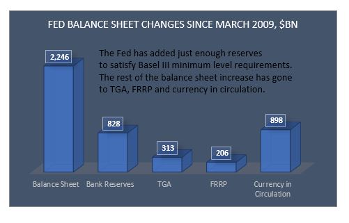
Equities bottomed in March 2009. Fed’s assets increased by about $2Tn thereafter. But only 37% of that increase went to bank reserves. 40% went towards the natural increase of currency in circulation, 14% went to TGA and 9% went to the FRRP (drawing liquidity out). It is slightly better if one does the comparison since QE1, but even there, at most, 50% went directly to bank reserves.
Finally, one has to take into account that banks’ reserves needs have also substantially increased since the 2008 financial crisis on the back of Basel III requirements. According to the Fed itself, the aggregate lowest comfortable level of reserve balances in the banking system ranges from $600Bn to just under $900Bn. At $1.6Tn currently, there is not much excess liquidity left in the system. In fact, banks Fed deposits were already at around $800bn in March 2009. Given that most of the regulations were implemented thereafter, one could claim that no additional liquidity was really added to the banking system since.
