Tags
- Is US employment data hot, ‘goldilocks’, or ‘cold’?
- Have you been inundated by calls and messages with the question, “But have you seen the details of the Household Survey?”
- Is the Fed right to keep aggressively hiking?
Summary: The US labour market is slowing down despite headline grabbing low unemployment rate and high wage growth rate. The recent details underlying this data show the total number of people employed growing below trend, fewer hours worked and lower quits rate. As a result, the growth rate of total earnings is also going down, the effect being a lower share of national income going to labour and total consumption as a share of GDP stagnating. All this should make the Fed further re-evaluate its aggressively hawkish interest rate policy.
The Household Employment Survey makes the headlines
After a couple of weeks of ‘SBF’ trending, I, for one, was happy to take my mind off to something much more prescient and important as far as my investments are concerned – the US employment situation. At first glance, the November NFP report came much hotter than expected but because the market did not really react the way one would have expected from such a strong report, we started looking for reasons why that was the case.
Which bought us to the US Household Employment Survey. ‘Us’ here does not mean us literally (for those of you who had followed my writings at 1859, there was plenty of discussion on this topic as soon as I spotted the divergence between the two employment reports in September). And this note is not on why the Household Survey is showing different things from the Establishment Survey.
If you want to, you can read zerohedge on this topic here (I know, think what you want but the folks there were one of the first to spot the issue way back in the summer). If you can’t bear some of the conspiracy language at zerohedge, you can read an inferior version (but still good!) of the same at the more balanced Macro Compass. Finally, there are quite a few respected people on Twitter who have talked about it (see here, here, here).
To give you the full disclosure, there are some legitimate reasons why the Household Survey produces different results to the Establishment Survey – and they have to do with a methodology issue, see here. BLS is actually well aware of that issue and calculates a time series which reconciles the two surveys and which can be found here (also with a very, very extensive comparison analysis between the methodology of the two). This adjusted data does not look that bad as the stand-alone Household Survey data (the November data was actually very good). But over the last 6 months it still points to a weakening employment market, not a stable or even hot one as per the Establishment Survey.
OK, that’s more than I wanted to write regarding the Household Survey. The rest of the note will show why the US employment situation is actually weakening even taking the Establishment Survey as a base.
The three variables of employment
There are three aspects of employment in general as far as assuaging how hot the economy is doing: wages, people employed, and hours worked, i.e., we need to follow this sequence, purchasing power->consumption->GDP) Basically, one needs to know the full product of Wages X Total Employment X Hours Worked (assuming, of course, that wages are per hour worked; not all jobs pay per hour, but those that do have actually increased at the expense of the others – see some of the links above which discuss the prevalence of part-time jobs and multiple job holders).
The economy can be hot even when wages are flat, or even declining, but there are more people entering the workforce or there are more hours worked – there are multiple combinations among the three variables producing various results. The point is to consider all three variables.
Total number of employed is growing below trend
Let’s take the period in the last three years or so after the Covid crisis. Yes, wage growth has picked up, but more people have exited the labour force and there are fewer hours work.
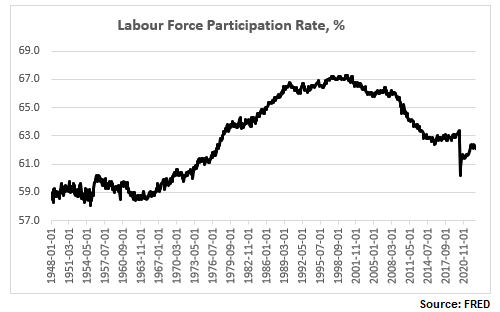
The labour force participation rate is still below the pre-Covid levels, and close to a 50-year low:
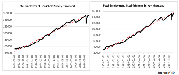
The total number of people employed has risen but, depending on whether one uses the Establishment Survey or the Household Survey, the number is either just above the pre-Covid levels or indeed below. In any case, regardless of which survey one uses, the number is still below trend (and has not been above trend since the 2008 financial crisis).
Higher wages but lower hours worked
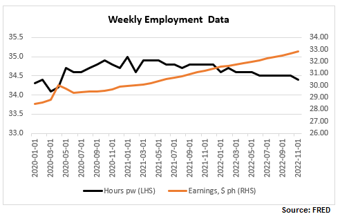
Finally, here are wages and hours worked. I have included below a time series chart for only the last 3 years to be able to see better the divergence between the two: while wages continue to rise, hours worked peaked in January 2021 and have now reversed the spike in 2020.
Let’s focus more on the latest NFP report. Here are the relevant tables below.
- Generally higher-wage industries, like goods producing, tend to exhibit a smaller increase in hourly wages than lower-wage ones, like services.
- In some cases, like the Utilities sector, which has the second highest wage per hour but also the highest average weekly earnings (courtesy of more hours worked, more on this later), wages have actually declined.
- Transportation and warehousing sector has an unusual jump in wages, about 5x the average rise in wages – is there something specific going on there?

The growth rate of total earnings is declining
It is important to look at the last columns in Table B-3 above, ‘Average weekly earnings’, which gives a much better picture of take-home pay as it combines wages with hours worked. So, while indeed the trend of declining 12m-growth rate of weekly wages was reversed with this latest report (back above 5%), which some commentators have warned the Fed should be worried about, the trend of declining total weekly earnings continues to be intact.

Note, average hourly earnings are still elevated, hovering at previous peaks but this is hardly a reason for the Fed to get more worried about, especially after already delivering the fastest interest rate hiking cycle in recent memory.
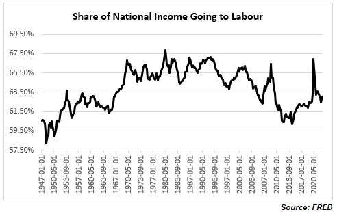
In fact, quite on the contrary. Despite all the excitement about the rise in wages, the share of national income going to workers has been on a decline, with the post-Covid spike now quickly reversed. We are back to the familiar territory of the low range post the 2008 financial crisis which is also the lows since the mid-1960s. If you were worried about a wage-price spiral issue, ala the late-1970s (I actually do not think there was one even back then as real wage growth even then was negative), you really shouldn’t be. It is a very different dynamic, at least for the moment.
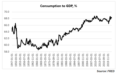
Consumer demand as a share of GDP has been stagnant for more than a decade
And if you are really worried that consumer demand will push inflation higher, again, you shouldn’t be, necessarily: consumption as a share of GDP is elevated relative to historical records but it is not even above the highs reached more than a decade ago. In fact, it seems that consumption has not been an issue for inflation for at least the last two decades.
The quits rate is declining
One final observation, there is another labour data series which has been often cited as an example of a tight labour market: the quits rate. I would though argue two things: 1) labour tightness explains only part of the elevated quits rate, and 2) the quits rate has already started declining.
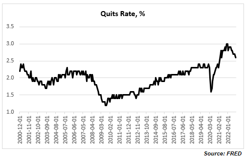
A higher quits rate is quite consistent with an increasing share of lower paid jobs and with multiple job holders both of which have been trends seen post the 2008 financial crisis, and especially during and after the Covid crisis. It is possible to decompose the quits rates by industry and sector. For example, retail trade, accommodation, and food services, all of which are lower paid/temp jobs by multiple job holders, have much higher quits rates than the average across all industries. This is corroborated by a Pew Research report according to which most workers who quit their jobs cited low pay.
Finally, the quits rate actually peaked at the end of last year (notice the Household/ Establishment Employment Survey discrepancy started shortly after) at about 3%. This is the highest in the series, but the data officially goes back to only 2000. BLS has actually related quits rate data (but only for the manufacturing sector) prior to 2000 which shows that the quits rate has been above 3% in the past, and yes at above 3%, the quits rate is associated with the peak in economic expansion. You can see the full data set and BLS perspective on it here.
Bottom line: you do not need to believe in conspiracy theories about Household Survey vs Establishment Survey labour data inconsistency to conclude that the US labour market is far from tight. If anything, it has already started to slow down. Do not be confused by headline numbers of high wage growth rate and low unemployment rate, look at the overall employment picture taking into account trends in overall total compensation.

Pingback: Don’t fight Powell | BeyondOverton