Liquidity is getting tighter. The decline in Fed repos is simply a reflection of their increased cost. Therefore, we will know when things are really getting bad if repo volumes start to pick up. Finally, if the market expected to get a flush of liquidity towards month end from TGA, this is now less likely to happen.
First drop in overall Fed’s balance sheet since 02/26. And it is a rather large drop, $74Bn.
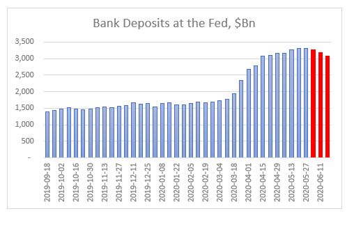
Third week in a row of declines in bank deposits. Level now is the same as 04/15. The 4-week rolling growth rate is now the lowest since the Fed’s U-turn last September.
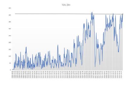
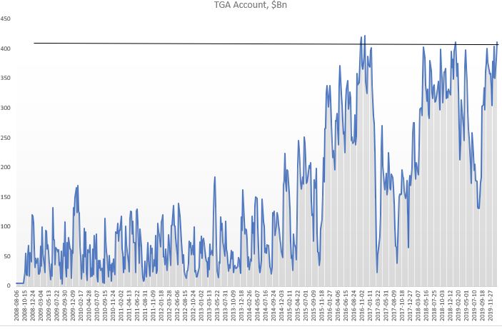
TGA continues to climb to record highs despite some disbursements towards Fed’s SPVs as new programs get triggered. It is likely that the level of TGA depends on the amount of SBA loans drawn/forgiven and such TGA can stay above $800Bn, Treasury’s target, for some time.
CB swap lines decline by $92Bn – first large decline as some of them have matured and no additional USD funding required.
Net repos outstanding continue to decline – this has been a feature all of this week as both O/N and term repos have been 0 for USTs. Reason for that is Fed raised the minimum bid on O/N to IOER +5bps and on term to IOER +10bps. This was a surprise, not that it happened (Fed probably made that decision at its April FOMC already), but that it happened ahead of tax receipts day. Commercial banks now must step in to fill in the gap but with their deposits on decline, their flexibility is diminished.
Fed bought $83Bn of mortgages – that’s perhaps to compensate for net selling in the previous 3 weeks.
Extra liquidity is getting withdrawn. That’s it. Market is not in distress yet. For that, we will know it when Fed repo volumes start picking up again and O/N rates shoot up. But for sure, on the margin, there is less liquidity to go around. Markets are not reflecting this yet. Perhaps, waiting for a sign, that all this surplus liquidity has been withdrawn, to react.
Fed is now probably considering which is worse: a UST flash crash or a risky asset flash crash. Or both if they play their hand wrong.
Looking at the dynamics of the changes in the weekly Fed balance sheet, latest one released last night, a few things spring up which are concerning.
1.The rise in repos for a second week in a row – a very similar development to the March rise in repos (when UST10yr flashed crashed). The Fed’s buying of Treasuries is not enough to cope with the supply hitting the market, which means the private sector needs to pitch in more and more in the buying of USTs (which leads to repos up).
This also ties up with the extraordinarily rise in TGA (US Treasury stock-piling cash). But the build-up there to $1.4Tn is massive: US Treasury has almost double the cash it had planned to have as end of June! Bottom line is that the Fed/UST are ‘worried’ about the proper functioning of the UST market. Next week’s FOMC meeting is super important to gauge Fed’s sensitivity to this development
2.Net-net liquidity has been drained out of the system in the last two weeks despite the massive rise in the Fed balance sheet (because of the bigger rise in TGA). It is strange the Fed did not add to the CP facility this week and bought only $1Bn of corporate bonds ($33Bn the week before, the bulk of the purchases) – why?
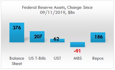
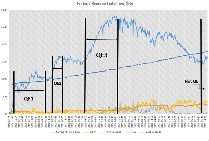
Fed’s balance sheet has gone up by $3tn since the beginning of the Covid crisis, but only about half of that has gone in the banking system to improve liquidity. The other half has gone straight to the US Treasury, in its TGA account. That 50% liquidity drain was very similar throughout the Fed’s liquidity injection between Sept’19-Dec’19. And it was very much unlike QE 1,2,3, in which almost 90% of Fed liquidity went into the banking system. See here. Very different dynamics.
Bottom line is that the market is ‘mis-pricing’ equity risk, just like it did at the end of 2019, because it assumes the Fed is creating more liquidity than in practice, and in fact, financial conditions may already be tightening. This is independent of developments affecting equities on the back of the Covid crisis. But on top of that, the market is also mis-pricing UST risk because the internals of the UST market are deteriorating. This is on the back of all the supply hitting the market as a result of the Treasury programs for Covid assistance.
The US private sector is too busy buying risky assets at the expense of UST. Fed might think about addressing that ‘imbalance’ unless it wants to see another flash crash in UST. So, are we facing a flash crash in either risky assets or UST?
Ironically, but logically, the precariousness of the UST market should have a higher weight in the decision-making progress of the Fed/US Treasury than risky markets, especially as the latter are trading at ATH. The Fed can ‘afford’ a stumble/tumble in risky assets just to get through the supply in UST that is about to hit the market and before the US elections to please the Treasury. Simple game theory suggest they should actually ‘encourage’ an equity market correction, here and now. Perhaps that is why they did not buy any CP/credit this week?
The Fed is on a treadmill and the speed button has been ratcheted higher and higher, so the Fed cannot keep up. It’s a dilemma (UST supply vs risky assets) which they cannot easily resolve because now they are buying both. They could YCC but then they are risking the USD if foreigners decide to bail out of US assets. So, it becomes a trilemma. But that is another story.
As if rates going negative was not enough of a wake-up call that what we are dealing with is something else, something which no one alive has experienced: a build-up of private debt and inequality of extraordinary proportions which completely clogs the monetary transmission as well as the income generation mechanism. And no, classical fiscal policy is not going to be a solution either – as if years of Japan trying and failing was not obvious enough either.
But the most pathetic thing is that we are now going to fight a pandemic virus with the same tools which have so far totally failed to revive our economies. If the latter was indeed a failure, this virus episode is going to be a fiasco. If no growth could be ‘forgiven’, ‘dead bodies’ borders on criminal.
Here is why. The narrative that we are soon going to reach a peak in infections in the West following a similar pattern in China is based on the wrong interpretation of the data, and if we do not change our attitude, the virus will overwhelm us. China managed to contain the infectious spread precisely and exclusively because of the hyper-restrictive measures that were applied there. Not because of the (warm) weather, and not because of any intrinsic features of the virus itself, and not because it provided any extraordinary liquidity (it did not), and not because it cut rates (it actually did, but only by 10bps). In short, the R0 in China was dragged down by force. Only Italy in the West is actually taking such draconian measures to fight the virus.
Any comparisons to any other known viruses, present or past, is futile. We simply don’t know. What if we loosen the measures (watch out China here) and the R0 jumps back up? Until we have a vaccine or at least we get the number of infected people below some kind of threshold, anything is possible. So, don’t be fooled by the complacency of the 0.00whatever number of ‘deaths to infected’. It does not matter because the number you need to be worried about is the hospital beds per population: look at those numbers in US/UK (around 3 per 1,000 people), and compare to Japan/Korea (around 12 per 1,000 people). What happens if the infection rate speeds up and the hospitalization rate jumps up? Our health system will collapse.
UK released its Coronavirus action plan today. It’s a grim reading. Widespread transmission, which is highly likely, could take two or three months to peak. Up to one fifth of the workforce could be off work at the same time. These are not just numbers pulled out of a hat but based on actual math because scientist can monitor these things just as they can monitor the weather (and they have become quite good at the latter). And here, again, China is ahead of us because it already has at its disposal a vast reservoir of all kinds of public data, available for immediate analysis and to people in power who can make decisions and act fast, vert fast. Compare to the situation in the West where data is mostly scattered and in private companies’ hands. US seems to be the most vulnerable country in the West, not just because of its questionable leadership in general and Trump’s chaotic response to the virus so far, but also because of its public health system set-up, limiting testing and treating of patients.
Which really brings me to the issue at hand when it comes to the reaction in the markets.
The Coronavirus only reinforces what is primarily shaping to be a US equity crisis, at its worst, because of the forces (high valuation, passive, ETF, short vol., etc.) which were in place even before. This is unlikely to morph into a credit crisis because of policy support.
Therefore, if you have to place your bet on a short, it would be equities over credit. My point is not that credit will be immune but that if the crisis evolves further, it will be more like dotcom than GFC. Credit and equity crises follow each other: dotcom was preceded by S&L and followed by GFC.
And from an economics standpoint, the corona virus is, equally, only reinforcing the de-globalization trend which, one could say, started with the decision to brexit in 2016. The two decades of globalization, beginning with China’s WTO acceptance in 2001, were beneficial to the USD especially against EM, and US equities overall. Ironically, globalization has not been that kind to commodity prices partially because of the strong dollar post 2008, but also because of the strong disinflationary trend which has persisted throughout.
So, if all this is about to reverse and the Coronavirus was just the feather that finally broke globalization’s back, then it stands to reason to bet on the next cycle being the opposite of what we had so far: weaker USD, higher inflation, higher commodities, US equities underperformance.
“I am here for one reason and one reason alone. I’m here to guess what the music might do a week, a month, a year from now. That’s it. Nothing more. And standing here tonight, I’m afraid that I don’t hear a thing. Just…silence”
~Margin Call
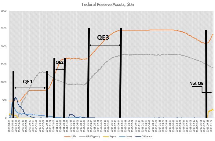
At the moment, the popular narrative in the market is that the Fed has created the greatest liquidity boost ever. On the back of it, US stock prices, in particular, have risen in an almost vertical fashion since September 2019. The irony is that this boost of liquidity was not big enough to justify such a reaction. In fact, if we compare Fed’s recent balance sheet increase to QE 1,2,3, it becomes obvious that they have little in common, which is why central bank officials have continuously stated that this is not QE. Whether that is the case or not is not a question of trivial semantics. It actually carries important market implications: once this overestimation of Fed liquidity becomes common knowledge, the stock market would have to correct accordingly.
The large increase of autonomous factors on the liability side of the Fed’s balance sheet is at the core of this misunderstanding.
Although the Fed has indeed been doing around $100Bn worth of repo operations on a daily basis since September 2019 (less so recently), these operations are only temporary (overnight and 14-days), i.e. they cannot be taken cumulatively in ascertaining the effect on liquidity. In fact, during that period, the Fed’s balance sheet increased by only about $400bn, of which about half came from repos, the other from securities purchases, mostly T-Bills, with the increase in UST (coupons) more than offset by the decline in MBS.
Source: FRB H.4.1, BeyondOverton
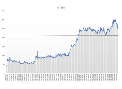
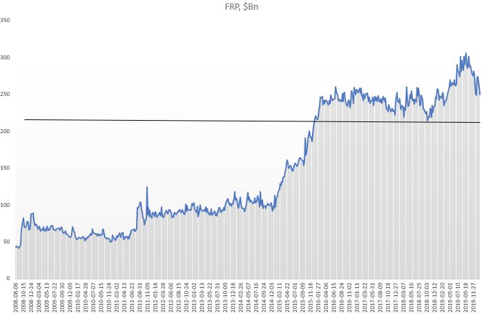
However, not all of the increase in Fed’s balance sheet went towards interbank liquidity: bank reserves rose by only about $150Bn (as of 22/01/2020), less than half of the total! Almost two-thirds went towards an increase in the Treasury General Account (TGA), which takes liquidity out. The growth of currency in circulation (which also decreases liquidity) was exactly offset by a net decline in reverse repos: a drop in the Foreign Reverse Repos (FRP), but a rise in domestic reverse repo.
Source: FRB H.4.1, BeyondOverton
Fed actually started increasing its T-Bills and coupons portfolio already in mid-August, three weeks before the repo spike. Part of that increase went towards MBS maturities. But by the end of August, Fed’s balance sheet had already started growing. By the third week of September, also the combined assets portfolio (T-Bills, coupons, MBS) bottomed out, even though MBS continued to decrease on a net basis.
Source: FRB H.4.1, BeyondOverton
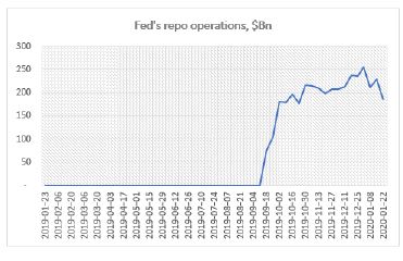
Fed’s repo operations began the second week of September. They reached a high of $256Bn during the last week of December. At $186Bn, down $70Bn from the highs, they are at the same level where they were in mid-October.
Source: FRB H.4.1, BeyondOverton
On the liability side, TGA actually bottomed out two weeks before the Fed started buying coupons and T-Bills, while the FRP topped the week the Fed started the repo operations. Could it be a coincidence? I don’t think so. My guess is that the Fed knew exactly what was going on and took precautions on time. Just as we found out that the Fed had lowered the rate paid on FRP to that of the domestic repo rate, we might also one day find out if it did indeed nudge foreigners to start moving funds away.
Source: FRB H.4.1, BeyondOverton
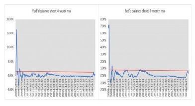
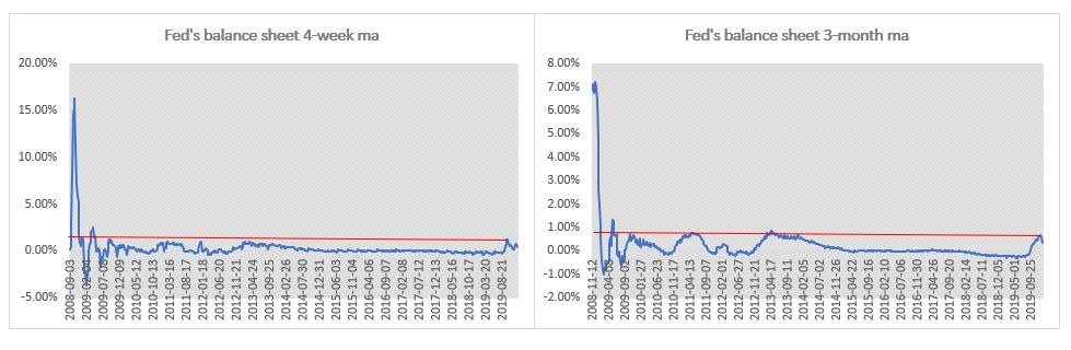
So, while the Fed’s liquidity injection since last September was substantial relative to the period when the Fed was tapering (2018) or when the balance sheet was not growing (2015-17), it is a stretch to make a claim that this is the greatest liquidity boost ever. The charts below show the 4-week and 3-month moving average percentage change in the Fed’s balance sheet. The 4-week change in September was indeed the largest boost in liquidity since the immediate aftermath of the 2008 financial crisis. The 3-month change, though, isn’t.
Source: FRB H.4.1, BeyondOverton
The Fed pumped more liquidity in the system during the European debt crisis. In the first four months of 2013, both the growth rate of the Fed’s balance sheet and the absolute increase of assets and bank reserves were higher than in the last four months of 2019. Moreover, there were no equivalent increases in either the TGA or the FRP.
Source FRB H.4.1, BeyondOverton
In fact, the reason Fed’s balance sheet changes this time around did not provide any substantial boost to liquidity, is precisely because they are very different from the three QE episodes immediately after the 2008 financial crisis.
For example, during QE1, the increase in securities held was more than three times the increase in Fed’s total assets. That was mostly because loans and central banks (CBs) swaps declined, to make up the difference. The Fed bought both coupons and MBS. However, 75% of the increase in assets came from a rise in MBS (from $0 to almost $1.2Tn), while T-Bills remained unchanged and agencies declined.
The Fed had begun to extend loans to primary dealers (PDs) even before September 2008, but immediately after Lehman Brothers failed, it included asset-backed/commercial paper/money market/mutual fund entities to this list of loan recipients as well. At around $400Bn, these were short-term loans, designed to pretty much make sure that no other PD or any significantly important player failed.
By the time QE1 finished most of these loans were repaid. In a similar fashion, the Fed had already put in place CBs swap lines even before September 2008, but they got really filled up, to the tune of more than $500Bn, after the Lehman Brothers event. Finally, repos actually decreased during QE1. Bottom line is, as far as Fed’s assets are concerned, September 2019 had no resemblances at all to September 2008.
On the liability side, the differences were also stark. Unlike 2019, during QE1 bank reserves contributed to 95% of the overall increase of balance sheet. The FRP remained pretty much flat for the full duration of QE1, while the TGA was unchanged but it did exhibit the usual volatility during seasonal funding periods.
Source: FRB H.4.1, BeyondOverton
QE2 was much more straightforward than QE1. Fed’s assets increased only on the back of coupon purchases (around $600Bn), while the Fed continued to decrease its MBS and loans portfolio. On the liability side, bank reserves continued to contribute about 95% of the increase. The rest was currency in circulation. Bottom line here again is that there is really no resemblance to 2019.
QE3 was similar to QE2 in the sense that Fed’s reserves increased 100% on the back of securities purchases (around $1.6Tn), but this time split equally between coupons and MBS. On the liability side, however, at 80% of total, bank reserves contributed slightly less towards the overall increase than during QE1 or QE2. The rest was split between currency in circulation and reverse repos. So, during QE3 less of the Fed’s balance sheet increase, than during the previous QEs, contributed to liquidity overall, but still much more than in 2019.
Reverse repos were especially prominent after QE3, when the Fed stopped growing its balance sheet but before it actually started tapering it. Probably, that was the sign that the banking system was actually running enough surplus reserves that it was willing to give some of the liquidity back to the Fed.
To recap, whatever the Fed has been doing so far, starting in September 2019, has simply no comparisons with any of the previous QEs. The largest increases on the Fed’s balance sheet in 2019 were T-Bills and repos; the Fed never bought T-Bills or engaged in repos in any of the previous QEs – the asset mix was totally different. On the liability side, while in the QEs almost all of the increase went directly into bank liquidity, in 2019 less than 50% did. FRP was more or less unchanged, at around $100Bn, between the beginning of QE1 and the end of QE3, but by September 2019 it had tripled. TGA averaged around $60Bn before the end of QE3; thereafter the average increased four times!
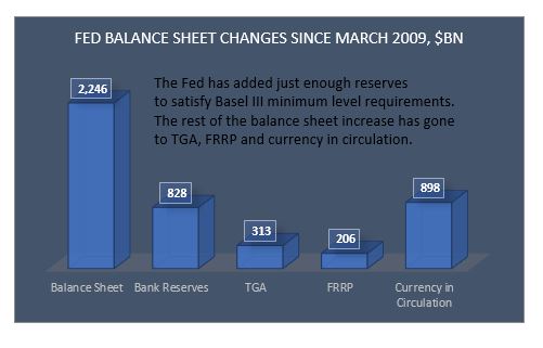
As a matter of fact, when we put the whole picture together, the case could be made that the Fed did not really create any additional liquidity at all since equities bottomed in March 2009.
Fed’s assets have increased by about $2Tn since then. But only 37% of that increase went to bank reserves. 40% went towards the natural increase of currency in circulation, 14% went to the TGA and 9% went to the FRP (last three drawing liquidity out).
Source: FRB H.4.1, BeyondOverton
Yes, bank reserves have increased by about $800Bn since then but also have bank reserves needs on the back of Basel III liquidity requirements. According to the Fed itself, the aggregate lowest comfortable level of reserve balances in the banking system ranges from $600Bn to just under $900Bn. Thus, at $1.6Tn currently, there is not much excess liquidity left in the system: on a net basis, whatever extra liquidity was created, it happened between September 2008 and March 2009.
More precisely, actually, the Fed did create surplus liquidity up to about the end of 2014. Between 2015 and the end of 2017, the liquidity in the system stayed flat. After that, the Fed started taking liquidity out, and by the middle of 2019 it left just about enough surplus liquidity (over and above the March 2009 level) to satisfy Basel III liquidity requirements.
Going forward, it is very likely that the bulk of the increase of the central bank’s balance sheet is behind us for the moment, ceteris paribus. The Fed will continue shifting from repos to T-Bills and probably coupons (especially if it hikes the IOER/repo rate, as expected). The effect on liquidity will depend on the mixture of liabilities, though. I expect the TGA to start drifting lower with seasonality as well as because it is at level associated with reversals in the past.
Source: FRB H.4.1, BeyondOverton
FRP has a bit more to go on the downside but I think it will struggle to break $200Bn, and it might settle around $215Bn. TGA and FRP declining should help liquidity even if Fed’s balance sheet does not increase. If the decline in the demand for repos is less than Fed’s securities purchases, bank reserves are likely to go up: this should help liquidity overall. Otherwise, it depends on the net effect of the change in all autonomous factors.
Source: FRB H.4.1, BeyondOverton
So, while the Fed has just about created enough liquidity to take bank reserves to the level of March 2009 (plus the reserves required to meet Basel III liquidity requirements), S&P 500 is up 10% since the Fed started this latest liquidity injections, and almost 400% since the bottom in 2009: an outstanding performance given all of the above. While the rise in the market pre 2019 can be fully attributed to massive corporate share buybacks, with active managers and real money (households, pension funds, mutual funds and insurance companies) net sellers of equities, thereafter, it is more of a mixed bag.
In 2019 retail money picked up the baton from corporates and bought the most equities since the 2008 financial crisis[1]. In addition, there has been relentless selling of volatility in the form of exotic structured retail products (mostly out of Asia[2]), betting on a continued stability and a rising trend on the back of the ongoing US corporate share buyback program, combined with the Fed’s about face on rates last year. Together with an all-time record speculative selling of VIX futures, this has left the street, generally speaking, quite long gamma, thus further helping the market’s bullish stance (to monetize their gamma exposure, dealers sell on rallies and buy on dips, thus cushioning the market on the way down, while the buying from other sources ensures the market keeps grinding higher).
Having mostly missed the extraordinary rally in US stocks during 2009-2018 (i.e. during the Fed’s previous balance sheet expansions and before the tapering), real money did not want to be left out on this one as well. However, not only the premises for this bullishness are unfounded, as discussed above, but also the internals of the previous stock market rally might be changing.
Corporate share buybacks, while still strong, are fading. This is happening for two main reasons. First, the Boeing scandal (prior to last year, Boeing was one of the largest share buyback companies in the US), I believe, is really accelerating bipartisan support to allow regulators more leeway into scrutinizing how companies choose to spend their cash. Second, with corporate earnings growth slowing down, US companies have been substantially scaling down their plans for share buybacks in 2020, anyway.
Neither the fact that the central bank liquidity is much smaller than envisioned, nor that the breadth of the rally is narrowing, seems to be on people’s radar at the moment. On the contrary, investors might be even embracing a completely new paradigm, this-time-is-different attitude, which sometimes comes at moments preceding a market correction. For example, at Davos 2020, Bob Prince, the Co-CIO of the largest hedge fund in the world, Bridgewater, said in an interview with Bloomberg TV, that he believed the boom-bust cycle was over. In fact, he went further in elaborating on this view:
“Stability could be an opportunity…You’ll hear the tremors before the earthquake. It won’t just come upon you all of a sudden. Volatility is out there, but it is not imminent.” This reminded me of the build-up to the 2008 financial crisis[3]. It’s not that people did not see the risks in subprime mortgage CDOs back then. They did, and that was why it took them some time to get in on the
[1] See Brace Your Horses, This Carriage is Broken”, BeyondOverton, January 14, 2020
[2] “How an exotic investment product sold in Korea could create havoc in the US options market”, Bloomberg, January 20, 2020
[3] “When the music stops, in terms of liquidity, things will be complicated. But as long as the music is playing, you’ve got to get up and dance.”, Chuck Prince, CEO of Citibank, the largest US bank in 2007.
Following up on the ‘easy’ question of what to expect the effect of the Corona Virus will be in the long term, here is trying to answer the more difficult question what will happen to the markets in the short-to-medium term.
Coming up from the fact that this was the steepest 6-day stock market decline of this magnitude ever (and notwithstanding that this was preceded by a quite unprecedented market rise), there are two options for what is likely to happen next week:
During the weekend, the number of Corona Virus (CV) cases in the West shoots up (situation starts to deteriorate rapidly) which causes central banks (CB) to react (as per ECB, Fed comments on Friday) -> markets bounce.
CV news over the weekend is calm, which further reinforces the narrative of ‘this too shall pass’: It took China a month or so, but now it is recovering -> markets rally.
While it is probably obvious that one should sell into the bounce under Option 1, I would argue that one should sell also under Option 2 because the policy response, we have seen so far from authorities in the West, and especially in the US, is largely inferior to that in China in terms of testing, quarantining and treating CV patients. So, either the situation in the US will take much longer than China to improve with obviously bigger economic and, probably more importantly, political consequences, or to get out of hand with devastating consequences.
It will take longer for investors to see how hollow the narrative under Option 2 is than how desperately inadequate the CB action under Option 1 is. Therefore, markets will stay bid for longer under Option 2.
The first caveat is that if under Option 1 CBs do nothing, markets may continue to sell off next week but I don’t think the price action will be anything that bad as this week as the narrative under Option 2 is developing independently.
The second caveat is that I will start to believe the Option 2 narrative as well but only if the US starts testing, quarantining, treating people in earnest. However, the window of opportunity for that is narrowing rapidly.
What’s the medium-term game plan?
I am coming from the point of view that economically we are about to experience primarily a ‘permanent-ish’ supply shock, and, only secondary, a temporary demand shock. From a market point of view, I believe this is largely an equity worry first, and, perhaps, a credit worry second.
Even if we Option 2 above plays out and the whole world recovers from CV within the next month, this virus scare would only reinforce the ongoing trend of deglobalization which started probably with Brexit and then Trump. The US-China trade war already got the ball rolling on companies starting to rethink their China operations. The shifting of global supply chains now will accelerate. But that takes time, there isn’t simply an ON/OFF switch which can be simply flicked. What this means is that global supply chains will stay clogged for a lot longer while that shift is being executed.
It’s been quite some since the global economy experienced a supply shock of such magnitude. Perhaps the 1970s oil crises, but they were temporary: the 1973 oil embargo also lasted about 6 months but the world was much less global back then. If it wasn’t for the reckless Fed response to the second oil crisis in 1979 on the back of the Iranian revolution (Volcker’s disastrous monetary experiment), there would have been perhaps less damage to economic growth. Indeed, while CBs can claim to know how to unclog monetary transmission lines, they do not have the tools to deal with supply shocks: all the Fed did in the early 1980s, when it allowed rates to rise to almost 20%, was kill demand.
CBs have learnt those lessons and are unlikely to repeat them. In fact, as discussed above, their reaction function is now the polar opposite. This is good news as it assures that demand does not crater, however, it sadly does not mean that it allows it to grow. That is why I think we could get the temporary demand pullback. But that holds mostly for the US, and perhaps UK, where more orthodox economic thinking and rigid political structures still prevail.
In Asia, and to a certain extent in Europe, I suspect the CV crisis to finally usher in some unorthodox fiscal policy in supporting directly households’ purchasing power in the form of government monetary handouts. We have already seen that in Hong Kong and Singapore. Though temporary at the moment, not really qualifying as helicopter money, I would not be surprised if they become more permanent if the situation requires (and to eventually morph into UBI). I fully expect China to follow that same path.
In Europe, such direct fiscal policy action is less likely but I would not be surprised if the ECB comes up with an equivalent plan under its own monetary policy rules using tiered negative rates and the banking system as the transmission mechanism – a kind of stealth fiscal transfer to EU households similar in spirit to Target2 which is the equivalent for EU governments (Eric Lonergan has done some excellent work on this idea).
That is where my belief that, at worst, we experience only a temporary demand drop globally, comes from, although a much more ‘permanent’ in US than anywhere else. If that indeed plays out like that, one is supposed to stay underweight US equities against RoW equities – but especially against China – basically a reversal of the decades long trend we have had until now. Also, a general equity underweight vs commodities. Within the commodities sector, I would focus on longs in WTI (shale and Middle East disruptions) and softs (food essentials, looming crop failures across Central Asia, Middle East and Africa on the back of the looming locust invasion).
Finally, on the FX side, stay underweight the USD against the EUR on narrowing rate differentials and against commodity currencies as per above.
The more medium outlook really has to do with whether the specialness of US equities will persist and whether the passive investing trend will continue. Despite, in fact, perhaps because of the selloff last week, market commentators have continued to reinforce the idea of the futility of trying to time market gyrations and the superiority of staying always invested (there are too many examples, but see here, here, and here). This all makes sense and we have the data historically, on a long enough time frame, to prove it. However, this holds mostly for US stocks which have outperformed all other major stocks markets around the world. And that is despite lower (and negative) rates in Europe and Japan where, in addition, CBs have also been buying corporate assets direct (bonds by ECB, bonds and equities by BOJ).
Which begs the question what makes US stocks so special? Is it the preeminent position the US holds in the world as a whole? The largest economy in the world? The most innovative companies? The shareholders’ primacy doctrine and the share buybacks which it enshrines? One of the lowest corporate tax rates for the largest market cap companies, net of tax havens?…
I don’t know what is the exact reason for this occurrence but in the spirit of ‘past performance is not guarantee for future success’s it is prudent when we invest to keep in mind that there are a lot of shifting sands at the moment which may invalidate any of the reasons cited above: from China’s advance in both economic size, geopolitical (and military) importance, and technological prowess (5G, digitalization) to potential regulatory changes (started with banking – Basel, possibly moving to technology – monopoly, data ownership, privacy, market access – share buybacks, and taxation – larger US government budgets bring corporate tax havens into the focus).
The same holds true for the passive investing trend. History (again, in the US mostly) is on its side in terms of superiority of returns. Low volatility and low rates, have been an essential part of reinforcing this trend. Will the CV and US probably inadequate response to it change that? For the moment, the market still believes in V-shaped recoveries because even the dotcom bust and the 2008 financial crisis, to a certain extent, have been such. But markets don’t always go up. In the past it had taken decades for even the US stock market to better its previous peaks. In other countries, like Japan, for example, the stock market is still below its previous set in 1990.
While the Fed has indeed said it stands ready to lower rates if the situation with the CV deteriorates, it is not certain how central bankers will respond if an unexpected burst of inflation comes about on the back of the supply shock (and if the 1980s is any sign, not too well indeed). Even without a spike in US interest rates, a 20-30 VIX investing environment, instead of the prevailing 10-20 for most of the post 2009 period, brought about by pulling some of the foundational reasons for the specialness of US equities out, may cause a rethink of the passive trend.
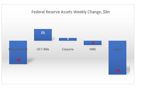
Total assets down $30Bn: the biggest weekly decline since May 1, 2019, and down $27Bn from peak on Jan. 1, 2020. All of the decline is on the back of repos, down $43Bn on the week, and 70Bn from peak. At $186Bn, repos were last time here in mid October 2019.
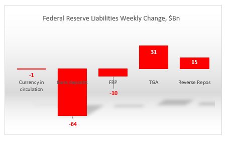
On the liability side, bank reserves declined by $64Bn. But the liquidity dropped more because both the TGA and domestic reverse repos rose by $31Bn and $15Bn respectively. At $412, TGA is at its highest level over the last 12 months. On the other hand, and as expected, FRP continues to decline and at $250Bn is close to the low end of the 12m period. Currency in circulation also dropped for third week in a row, posting the biggest cumulative decline from its peak over the last 12m. The decline in FRP and currency in circulation cushioned the otherwise drop in overall liquidity.
Going forward, there is no doubt that the bulk of the central bank’s increase in balance sheet is behind us for the moment, ceteris paribus. The Fed will continue shifting from repos to T-Bills and probably coupons (especially if it hikes the IOER/repo rate next week). The effect on liquidity will depend on the liabilities mixture, though. Expect TGA to slowly start decreasing ($400Bn has kind of been its upper limit, rarely going above it by much).
FRP has a bit more to go on the downside but I think it will struggle to break $200Bn, probably settle around $215Bn.
That should help liquidity. If the Fed buys more securities than the decline in repos, under that scenario, bank reserves/liquidity go up. If not, it really depends on the net effect of the change in autonomous factors.
If you are trading Fixed Income, expect a bit more pressure on the curve to continue flattening. If you are trading equities, none of this matters to you. At the moment, the only thing the equity market cares about is the size of the gamma cushion.
I am late in this debate, at least in writing, because at first, I thought it did not matter; it is all semantics. Last week I read John Authers’ article in Bloomberg in which he referenced a chart from CrossBorder Capital that showed that the Fed had recently injected the greatest liquidity boost ever. That got me really curious, so I did some digging in the Fed’s balance sheet and I concluded, notwithstanding that I am not privy of how CrossBorder Capital defines and measures liquidity, it is unlikely that the Fed’s actions led to the ‘greatest liquidity boost ever’. And then yesterday Dallas Fed President Kaplan said he was worried about the Fed creating asset bubbles. This pushed the ‘old’ narrative that CBs’ liquidity/NIRP/ZIRP is creating a mad search for yield and a rush in risky assets out of the woodwork again on social media. So, that got me thinking that whatever the Fed did since last September, whether it is QE or not, actually matters.
So, just to refresh, since September 2019, the Fed’s balance sheet increased by about $400bn, of which more than half came from repos, the other from mostly T-Bills, with the increase in coupons more than offset by the decline in MBS. On the liability side, there was a similar breakdown: about 50% came from an increase in bank deposits, the other 50% came from an increase in currency in circulation and the TGA account. This 50/50 in both assets and liabilities is important to keep in mind.
Source FRB H.4.1, BeyondOverton
During QE1, the increase in securities held was more than 3x the increase in Fed’s total assets. That was mostly because loans and CBs swaps declined to make up the difference. On the securities side, the Fed bought both coupons and MBS. T-Bills remained the same, while agencies declined. However, 75% of the increase in assets came from a rise in MBS (from $0 to almost $1.2Bn). The Fed had begun to extend loans to some market players even before September 2008, but immediately after Lehman Brothers failed, the Fed extended loans to primary dealers (PD) as well as asset-backed/commercial paper/money market/mutual fund entities to the tune of about $400Bn. These were very temporary loans, pretty much making sure that no other PD or any other significantly important player failed. By the time QE1 finished the loans had gone back to almost pre-Lehman-time sizes. In a similar fashion, the Fed had already put in place CBs swaps even before September 2008, but immediately thereafter, the CB swap line jumped to more than $500Bn, and by the time QE1 finished it had gone to $0. Finally, repos actually decreased during QE1. Bottom line is, as far as Fed’s assets are concerned, September 2019 had absolutely no resemblances at all to September 2008.
Source: FRB H.4.1, BeyondOverton
On the liability side, the differences were also stark. Unlike 2019, during QE1 bank reserves contributed to 95% of the increase. The FRRP account remained pretty much flat for the full duration of QE1, while the TGA account was unchanged but it did exhibit the usual volatility during seasonal funding periods.
QE2 was much more straightforward than QE1. The Fed’s assets increased only on the back of coupon purchases (around $600Bn), while the Fed continued to decrease its MBS and loans portfolio. On the liability side, bank reserves continued to contribute about 95% of the increase. The rest was currency in circulation. Bottom line here again, really no resemblance to 2019.
QE3 was similar in the sense that Fed’s reserves increased 100% on the back of securities purchases (around $1.6Tn), but this time split equally between coupons and MBS. On the liability side, at 80% of total, bank reserves contributed slightly less towards the overall increase. The rest was split between currency in circulation and reverse repos. During QE3, unlike QE1 and QE2, less of the Fed’s balance sheet increase went towards higher liquidity (bank reserves), but still nothing like in 2019. For one reason or another, the market was willing to give some of the liquidity back to the Fed in the form of reverse repos even before the Fed started tapering (reverse repos were prominent after QE3 when the Fed stopped growing its balance sheet but before it actually started tapering it).
No, you can’t call whatever the Fed has been doing so far, starting in September 2019, QE. There are simply no comparisons with any of the previous QEs: The largest increases on the Fed’s balance sheet in 2019 was T-Bills and repos; the Fed never bought T-Bills or engaged in repos in any of the previous QEs – the asset mix was totally different. On the liability side, while in the QEs almost all of the increase went directly into bank liquidity, in 2019 only 50% did. FRRP was more or less unchanged, at around $100Bn between QE1 start and the end of QE3 – by September 2019 it had tripled! TGA averaged around $60Bn before the end of QE3; thereafter the average increased 4x!
As to the second issue of how much of the Fed’s liquidity injection since the crisis has boost asset prices? Not much.
According to the Fed’s own flow of funds data, real money has been a net seller of equities and buyer of risk-free assets since the 2008 financial crisis. If there is a rush into risky assets, it is not obvious from the data. There is also this argument that the Fed’s consistent boost of liquidity, combined with low interest rates, provides the proverbial put for prices and, therefore, the search for yield can be implemented by selling vol/gamma. This could indeed be the case. The problem is that I have not seen any data which shows exactly what the $ notional (in cash equities) equivalent of that vol selling flow is.
Moreover, given that both ECB and BOJ have engaged in even bigger balance sheet expansions, plus their interest rates are negative, the case could be made for a similar exercise in Europe and Japan. However, both European and Japanese equity markets have been languishing for years, underperforming US equity markets. Finally, even if this indeed were the case, the more likely explanation for the reasons people would be selling vol is the relentless bid from corporates engaging in share buybacks. This would also explain the underperformance of equity markets abroad relative to US ones despite higher CBs’ liquidity boosts there.
But how much liquidity did the Fed provide since the 2008 financial crisis?
Source: FRB H.4.1, BeyondOverton
Equities bottomed in March 2009. Fed’s assets increased by about $2Tn thereafter. But only 37% of that increase went to bank reserves. 40% went towards the natural increase of currency in circulation, 14% went to TGA and 9% went to the FRRP (drawing liquidity out). It is slightly better if one does the comparison since QE1, but even there, at most, 50% went directly to bank reserves.
Finally, one has to take into account that banks’ reserves needs have also substantially increased since the 2008 financial crisis on the back of Basel III requirements. According to the Fed itself, the aggregate lowest comfortable level of reserve balances in the banking system ranges from $600Bn to just under $900Bn. At $1.6Tn currently, there is not much excess liquidity left in the system. In fact, banks Fed deposits were already at around $800bn in March 2009. Given that most of the regulations were implemented thereafter, one could claim that no additional liquidity was really added to the banking system since.
According to John Authers at Bloomberg, data from CrossBorder Capital, going back to January 1969, shows that we have been recently experiencing Fed’s greatest liquidity boost ever. I have no reason to doubt CrossBorder Capital or their proprietary model of measuring liquidity. But there are many ways of defining, as well as measuring, liquidity. So, I decided to simply look at what exactly the Fed has done since it started expanding its balance sheet in September last year.
Source: FRB H41, beyondoverton
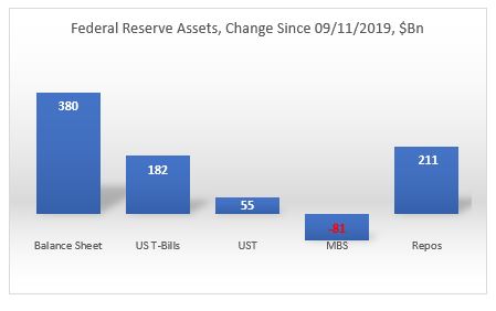
Fed has indeed been doing more than $100Bn worth of repo operations on a daily basis recently, but those operations are only temporary, i.e. they can not be taken cumulatively in ascertaining the effect on liquidity. In fact, the Fed’s balance sheet has increased by $380Bn, and only 55% of which came from O/N and term repo operations ($211Bn). The other 45% came from asset purchases. On the asset purchases, the Fed bought mostly T-Bills ($182Bn), some coupons ($55Bn) while letting its MBS portfolio slowly mature (-$81Bn).
However, not all of that increase went towards interbank liquidity. In fact, only about 50% of that increase ($198Bn) went towards bank deposits. The TGA account increased by $167Bn; that drained liquidity. Reverse repos decreased by $20Bn (FRP by $17Bn and others by $3Bn), which added liquidity. Finally, $37Bn went towards the natural increase in currency in circulation.
Source: FRB H41, beyondoverton
Fed actually started increasing its T-Bill and UST portfolio already in mid-August, three weeks before the repo spike. Part of that increase went towards MBS maturities. But by the end of August, Fed’s balance sheet had already started growing. By the third week of September, also the combined assets portfolio (T-Bills, USTs, MBS) started growing as well, even though MBS continued to decrease on a net basis.
Source: FRB H41, beyondoverton
Fed’s repo operations started the second week of September. They reached a high of $256Bn in the last week of December. At the moment they are at the same level where they were in the first week of December ($211Bn).
Source: FRB H41, beyondoverton
On the liability side, the TGA account actually bottomed out two weeks before the Fed started buying USTs and T-Bills, while the FRP account topped the week the Fed started the repo operations. Could it be a coincidence? I don’t think so. My guess is that the Fed knew exactly what was going on and took precautions on time (we might find eventually if it did indeed nudge foreigners to start moving funds away from FRP).
Source: FRB H41, beyondoverton
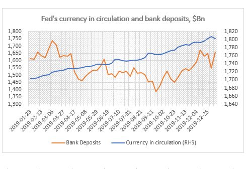
Finally, while currency in circulation naturally increases with time, bank deposits also bottomed out the week the Fed started the repo operations in September, but strangely enough, they topped the first week of December (for the time being).
Source: FRB H41, beyondoverton
So, while the Fed’s liquidity injection since last September was substantial relative to both the decrease in liquidity before that (starting in 2018 when the decrease in the Fed’s balance sheet became consistent) and, to a certain extent, since the end of the 2008 financial crisis, it is difficult to make a claim that this is the greatest liquidity boost ever. The charts below show the 4-week and 3-month moving average percentage change in the Fed’s balance sheet. The 4-week change in September was indeed the largest boost in liquidity since the immediate aftermath of the 2008 financial crisis. The 3-month change though isn’t.
Source: FRB H41, beyondoverton
The Fed pumped more liquidity in the system during the European debt crisis. In the first four months of 2013, not only the growth rate of the Fed’s balance sheet was higher than in the last four months now since September 2019, but also the absolute increase in Fed’s assets and US bank deposits. Moreover, there were no equivalent increases in either the TGA or the FRP accounts.
Final note, if the first week of January is any guide, it might be that a big chunk of the Fed’s balance sheet increase might be behind us, if only for the time being. Fed’s balance sheet decreased by $24Bn, which is the largest absolute decrease since the last week of July 2019, i.e. before the start of the most recent boost in liquidity. I actually do expect the Fed’s balance sheet to keep growing but at a much smaller scale and mostly through asset purchases rather than repos.
“For a little reflection will show what enormous social changes would result from a gradual disappearance of a rate of return on accumulated wealth.”
~ John Maynard Keynes
Lately, not a day passes by without someone commenting on the pernicious effect of negative rates and how they are an aberration which cannot and should not be ‘allowed’ to continue. Reality is slightly more nuanced.
To start with, low interest rates are the norm, not the exception throughout history. Second, while indeed a rarity, negative rates have existed in the past, and, depending on circumstances, have lasted longer than initially expected. Third, to ascertain their effect, we must first understand their cause and purpose. All these will eventually allow us to forecast how long they would be around. Still, even then, we must be cognizant that a switch to higher rates will most likely only happen after the economy has first gone through one or a combination of: social unrest, debt jubilee, large increase in the money supply or natural disaster.
Negative interest rates are a result of past accumulation of surplus capital (and its mirror image, large stock of debt) combined with previous persistently high interest rates on that debt relative to the growth rate of the money supply (new money).
The forces that could push rates structurally higher, therefore, would logically be either a reduction of the surplus capital/debt, or a massive increase in the money supply. As neither of this has happened yet, negative interest rates are effectively the market’s response to this status quo: on a long enough timeframe, they reduce the debt stock and they allow the money supply stock to outpace interest payments on the debt and have some left for economic growth.
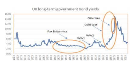
Considering that interest rates measure the cost of capital, when capital is abundant, ceteris paribus, interest rates should be low. For example, normally, periods of peace bring about an accumulation of surplus capital, either directly because money is not spent on wars, but more importantly, indirectly, as people innovate and bring about technological advancements which increase efficiency and reduce the need for more capital in general. As a result, interest rates trend lower. That’s exactly what happened, indeed, during the almost century of peace in the time of Pax Britannica in the 19th century.
Source: BeyondOverton, BOE Three Centuries of Data
At the same time, wars, conflicts, or even big natural disasters, deplete the capital stock and force interest rates to rise. Sometimes, when these negative supply shocks turn out to be ‘one-off’ occurrences (the 1970s oil crises), we could get just a spike in interest rates; sometimes, if the conflict persists, the increase in interest rates can last much longer (the Cold War).
On a long enough timescale, one would then expect to see periods of low interest rates inevitably followed by periods of high interest rates in a kind-of mean reversion pattern. Actually, that is not the case. In fact, according to Paul Schmeizing[1], real rates have been falling for over 500 years on a variety of regression measures:
“…over the entire timeframe 1313-2018, I find 19.7% of advanced economy GDP experience negative long-term real rates on an annual basis…the general trend of an even higher frequency of negative rates is independent of the establishment of central banks and active monetary policy.”
Mean reversion of interest rates is not a given from a historical point of view largely because certain events, the so-called paradigm shifts, have such a profound effect on the production function that no war or natural disaster can easily reverse. For example, the Agricultural Revolution ushered the first large (and ‘permanent’) resource surplus which lasted humanity indeed a long time. We came close to depleting it during the centuries of the Dark Ages in Europe but, with the help from the Renaissance, the Industrial Revolution couldn’t come soon enough to change the paradigm shift once again. After that, Aggregate Supply (AS) had been consistently running above Aggregate Demand (AD).
While on the face of it, an imbalance of this sort, AS > AD, is much better than the reverse, managing it, has proven quite difficult over the years. Especially in the more modern times when the changes affect both the production function and the mode and nature of consumption (from a physical to a digital medium – more on this later).
Feudalism, socialism, capitalism, etc., are all examples of how society is designing an institutional framework to help distribute these surpluses in the most optimal way. However, because of the inertia of the past and the numerous vested interests, such institutional changes may take much longer than the production breakthroughs to feed through. Therefore, as the capital surpluses keep adding up while their distribution mode remains the same, the economy becomes even more imbalanced.
If capital does not flow naturally through the income channel to raise the purchasing power of the majority, aggregate demand starts to lag. Debt becomes then the lever which transfers purchasing power, in a way substituting for rising wages. However, as debt comes with the additional burden of positive interest rates, it pushes up inequality to an unsustainable level thus closing even that avenue of balancing the economy. Therefore, AS continues to increase at the expense of AD, and a deflationary spiral ensues. A temporary solution to this problem in the past has indeed been a form of negative rates, called demurrage money.
Demurrage money is not unusual in history. Early forms of commodity money, like grain and cattle, were indeed subject to decay. Even metallic money, later on, was subject to inherent ‘negative’ interest rates. In the Middle Ages in Europe coins were periodically recoiled and then re-minted at a discount rate (in England, for example, this was done every 6 years, and for every four coins, only three were issued back). Money supply though, did not shrink, as the authorities (the king) would replenish the difference.
In 1906, Silvio Gesell proposed a system of demurrage money which he called Freigeld (free money), effectively placing a stamp on each paper note costing a fraction of the note’s value over a specific time period. During the Great Depression, Gesell’s idea was used in some parts of Europe (the wara and the Worgl) with the demurrage rate of 1% per month.
The idea behind demurrage money is to decouple two of the three attributes of money: store of value vs medium of exchange. These two cannot possibly co-exist and are in constant ‘conflict’ with each other: a medium of exchange needs to circulate to have any value, but a store of value, by default, ‘requires’ money to be kept out of circulation.
Negative interest rates solve this issue by splitting these two functions. The problem though is that negative rates are not a very efficient tool for reducing the capital surplus because the whole process takes a really long time. Absent any other changes in the institutional framework, the general pattern of the past has therefore been for a military conflict, either a revolution or a war, to literally obliterates the capital surplus.
As mentioned before, indeed, the Industrial Revolution was followed by the century of peace of Pax Britannica during which neither low rates nor the gold standard managed to close down the inter-country economic imbalances, thus we got two very violent world wars. The period between the end of WW2 and now is considered one of general world peace. And indeed, relative to the horrors of the war which preceded it, it was.
But despite the fact that there were no major traditional global wars after 1945, the Cold War was a major global war of ideologies, in which few shots were fired, but one which caused a large capital outlay (military build-up, but also huge government investments in space exploration, and in general, technology). In addition, there were a lot of proxy wars (Afghanistan, Korea, Vietnam) and conflicts (for example, the 1970s oil crises were a result of such a proxy conflict). It is not surprising then, that during that time interest rates tended to stay high.
(Incidentally, it is with sadness that I heard of the passing of Paul Volcker the other day, but reality is that he presided over a Fed which orchestrated the largest aberration in the history of interest rates since Babylonian times. In my opinion this was totally unnecessary and a complete overkill.)
Source: Business Insider; original data from ‘History of Interest Rates’ by Homer and Sylla
By the end of the Cold War, when it was clear that capitalism had gained the upper hand as the main institutional framework of the time, interest rates started to subside. It also became obvious that the USA was to become the undisputedly dominant global power. In addition, all these (mostly government) investments of the Cold-War time started to pay off, eventually ushering the Digital Revolution which is still ongoing. To a certain extent, one could think of this period as Pax Americana, in reference to the global dominance of Britain during most of the 19th century.
The Digital Revolution has heralded a similar paradigm shift to the Agriculture and Industrial Revolutions in the past. Indeed, the resulting capital surplus has not only completely reversed the previous spike in interest rates but has brought about a strong disinflationary environment pushing real interest rates in negative territory.
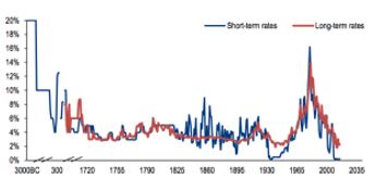
This period is called by some the biggest and longest bond bull market in history. It is probably the biggest because interest rates have gone down from double digits in the 1980s to almost 0% now. But it is certainly not the longest. As seen in the chart on page 1, interest rates in Britain trended down from 6% to 2% for almost 100 years in the 19th century. And it doesn’t yet look like there is an end to this bull market as there are no signs that anything is being done on the institutional side to take into account the changing modes of production and consumption caused by the paradigm shift of the Digital Revolution.
Moreover, low/negative interest rates are only really applicable to the government sovereign market. In the current debt-backed system, the majority of money is still loaned into circulation at a positive interest rate. Even in Europe and Japan, where base interest rates and sovereign bond yields are negative, the majority of private debt still carries a positive interest rate. This structure inherently requires a constantly growing portion of the existing stock of money to be devoted to paying solely interest. Thus, the rate of growth of the money supply has to be equal to or greater to the rate of interest; otherwise more and more money would be devoted to paying interest rather than to economic activity.
Source: BeyondOverton, US Federal Reserve
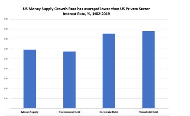
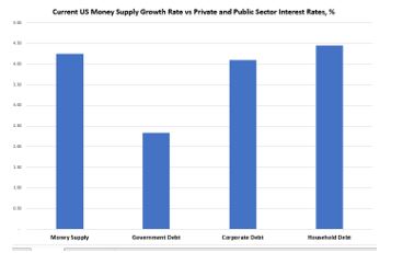
This is indeed problematic if one considers that the long-term average growth rate of US money supply in modern times is around 6% (chart above), which is only slightly higher than the average interest rate on US government debt but it is below the average interest rate on both US household and corporate debt. To reach this conclusion, I used the US Treasury 10-year yield as the average yield on US government debt (the average maturity of US debt is slightly less than that), and allowed very generous estimates for both US corporate debt and household debt[2].
In addition, I have not included the much higher yield on US corporate junk bonds which comprise a growing proportion of overall corporate debt now. I have not used either credit card/consumer debt, which has a much higher interest rate, or student loan debt, which carries approximately similar interest rate to auto loans rates used in the calculation. Just like for BBB and lower rated US corporates, credit card and student loan debt are a much higher proportion of total US household indebtedness now compared to before the 2008 crisis.
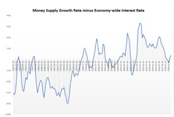
Finally, I estimated the long-term average economy-wide interest rate as a weighted average of government, corporate and household debt – with the weights being their portions of the total stock of debt. With the caveats mentioned above, that average rate since the early 1980s is about 7% – higher than the average money supply growth rate.
Source: BeyondOverton
Over the last four decades, US money supply has not only not grown enough, on average, to stimulate US economic growth, but has been, in fact, even below the overall interest rate of the economy. Needless to say, this is not an environment that can last for a long time. It is surprising it did go on for so long.
Indeed, if one calculates the above equivalent rates for the period 1980-2007 only, the situation would be even more extreme (see chart above). In fact, until the late 1990s, money supply growth had been pretty much consistently below the economy-wide interest rate. Only after the dotcom crisis, but really after the 2008 crisis, money supply growth rate picked up and stayed on average above the economy-wide interest rate.
What is the situation now? The current money supply growth rate is just above the average economy-wide interest rate: above the government and corporate interest rates but below the household interest rate (data is as of Q1’2019, chart below). It is also still below the combined average private sector interest rate.
Source: BeyondOverton
So, even at these low interest rate, US money supply is just about ‘enough’ to cover interest payments on previously created money. And that is assuming equal distribution of money. Reality is that new money creation is only just ‘enough’ to cover interest payment on public debt. Moreover, money distribution is very skewed in the private sector: corporates have record amount of cash but that cash normally sits only in the treasuries of few corporates. The private sector, overall, can barely cover its interest payment, let alone invest in CAPEX, etc.
Seen from this angle, negative interest rates may not be a temporary phenomenon designed just to spur lending. On the opposite. It is almost counter-intuitive from what we learn in economics where we are accustomed to think that a rising GDP is associated with higher interest rates because of the need to suppress potentially inflationary pressures. Reality is that a rising GDP also produces more excess capital which tends to naturally put pressure on interest rates lower. If this increase in AS is not fully offset by a rise in AD, inflationary pressures may not develop and interest rates may not rise. In fact, they may start falling if the debt build-up becomes excessive. In that regard, the purpose of negative interest rates may be to help reduce the overall debt stock in the economy and to escape the deflationary liquidity trap caused by the declining marginal efficiency of capital.
Could they work? Sure, they could, but unless they are deeply negative, it will take a really long time and, most likely, the fabric of society would come apart either way. So, what could cause this massive bull market in rates then to reverse?
Well, it is unlikely to see those signs of reversal in any economic variable on the demand side, like lower unemployment or even higher wages, as the surpluses are just too large. At least not from a structural point of view: for example, a pop in real wages could see a pop in real rates but that will quickly reverse as the supply side will adjust almost ‘instantaneously’. Instead, we should look for signs of any pressure on AS which would come about from institutional changes. Anything that suddenly reduces the capital/debt surplus, such as a debt jubilee, or permanent increases of the money supply, such as ‘helicopter money’.
In the absence of such changes, we could either see a prolonged period of negative interest rates to address the above imbalances or, in the worst-case scenario, for example in the US where there is strong institutional pushback against them, social unrest. The process of de-globalization, which started already with Brexit and Trump’s US tariffs, is another supply side force which would take its time but could eventually erode the global resource surplus.
In the end, if all else fails, nature would have the final say as climate change could cause a massive natural disaster, leading to such a destruction of capital, that interest rates would be bound to go much higher from there!
[1] Eight Centuries of Global Real Interest Rates, R-G, and the ‘Suprasecular’ Decline, 1311-2018, 24 Nov. 2019
[2] For corporate debt I used the average yield on Aaa and Baa bonds and for household debt I used mortgage debt and auto loans
Credit impacts the real economy in a different way depending
on whether it is to households or to corporates (see Atif Mian’s work, also his
interview here).
Very generally speaking, credit to households affects the economy directly
through the demand-side channel, while credit to corporates – through the
supply-side channel directly, and only then, potentially, indirectly through
the demand-side channel.
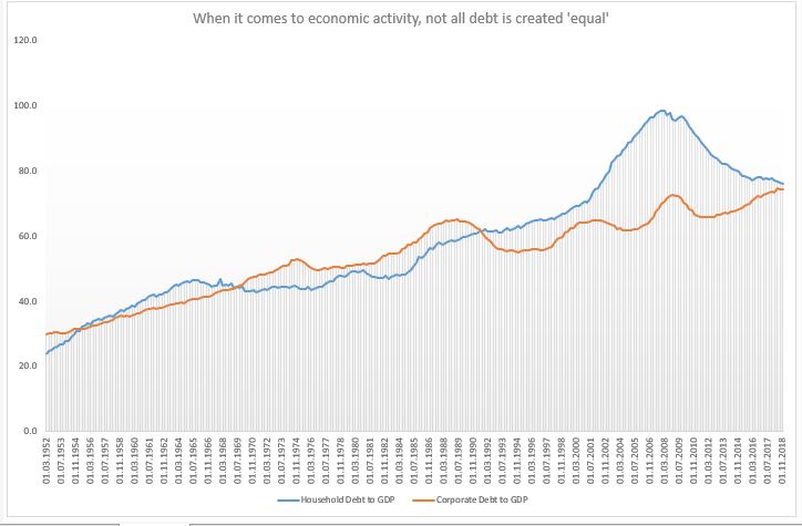
Household debt to GDP was flat for two decades between mid-1960s and mid-1980s; and then it doubled; corporate debt for GDP, on the hand, was flat also for two decades after the S&L crisis, and even now it is only a few per cents higher. But the demand-side reduction from the household debt channel post 2008 is rather unique.
Given that the US was running a negative output gap for most of the period post 2008 (and it might still do, even though official estimate is for a small positive), it was the demand-side that needed some catching up to. Instead, the opposite was essentially happening: credit to households was decreasing relative to credit to corporates. As far as credit was concerned, it was primarily the supply side that was getting stimulated (of course, the question is how much stimulus was really created given that a lot of the corporate debt went to share buybacks).
The other theory, one to which I subscribe, is that the modern economy is essentially always experiencing a demand gap. When real wages stopped growing in the 1990s, post the the financial liberalization of the 1980s, household credit experienced a massive run-up. The demand gap left from the stagnation in real incomes was filled with household debt. Until the sudden stop in 2008.
Household debt to GDP did not grow between 1960s-1980s but real household income did, so there was no demand gap either. Post 2008, though, neither of these two options were available which left the US economy in a demand insufficiency. The ‘stimulus’ provided was mostly through the supply side with very little follow through into the demand side which meant lackluster economic growth.
The bottom line is that the type of credit creation matters.
The central bank affects directly only the supply of credit (and in some cases,
even less so) thus, it has limited ability (none?) to decide on whether credit
goes to firms or households. We may get a lot more from lower interest rates if
policy makers start thinking more holistically about the whole process of
credit creation. Banks do not care where credit goes
(why should they?) as long as they get their money back.
But with overall debt in the economy climbing higher and higher, it is essential to think how we can get the most out of it. And if the market can’t do that (it can’t), someone else should step in.
All this does not mean that US households should get even more indebted! On the contrary, the decline in household debt to GDP is good news only if it were also followed by a similar rise in real household income. And it the private market can’t do that either (it seems, it can’t), then we need to rely on the official sector to take on that burden.