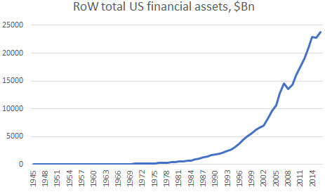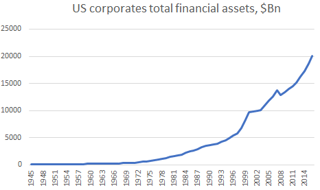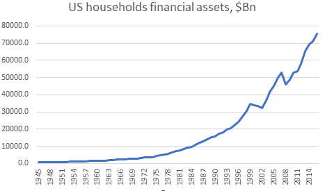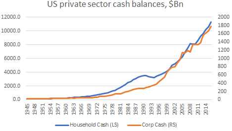
Source: Z1 Flow of Funds*
The queen asked the wrong question
In November 2008, the Queen of England asked why no one saw the credit crunch coming. That was kind of unfair. The thing is quite a lot of people saw it coming. Some of them even publicly warned about it (even though that went on for many years in advance, so people ignored them). However, very few people did something about it (those that did are now ‘legendary’ and there are books written and movies made about them, to say nothing that they are also very rich as a result).
The right question to have asked is why nobody in authority did anything about it. I suspect that is the case because very few people actually understood what was going on and why it was happening. The data was not there. It goes back to the fact that it is pointless to guess what people think because that would not help you ascertain what they will do. Our mind freezes when we are facing options and we do not have the data or the ability to analyze the data in order to help us make a decision. In most situations that matter, therefore, people act only when they do not have a choice.
Smart ideas implemented too early could be a job killer
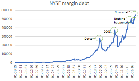
Most people in my circle of risk takers in 2006 and 2007 knew very well that something was afoot with all this subprime mortgage origination going around. Even if you were not a mortgage specialist, there was plenty of anecdotical evidence of how extreme the situation had gotten. The thing is most of us had been through the emerging market crises of the previous decade and, having survived that, had the temerity of selling risk way too early ahead of the Dotcom crash. There was no way we would have made make that same mistake so soon again in 2006, or 2007.
However, even in early 2008, when the pressure was mounting with funds and banks going out of business, there was still a general feeling of calm and belief in the status quo. The markets had been easy for the last 5 years before that and very few people were crunching the numbers and doing their homework. Everyone was just riding the trend. In fairness, it was not obvious how and where the macro problem was. Traditional liquidity was plentiful despite the Fed raising rates, traditional bank leverage was also not that high. You either had to go micro and do the really had work (aka Michael Burry) or be lucky (some people were, as always).
The case of missing money 2008 edition (flying blind in an ocean of data)
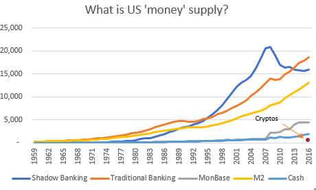
How should we measure monetary liquidity in our modern economy? We know that the physical notes and coins which the Fed and the Office of the Mint in the US, for example, produce is only a small % of the actual money supply (‘Cash’ in the chart at the top of the post). Moreover, we know that this cash is circulated only when the public demands to exchange its digital money for physical ones. The 2008 financial crisis has also finally taught us that majority of the money created is done by the ‘private’ banks in the process of loan origination (‘Traditional Banking’). Some people, however, are still confused with the base money creation by the central banks (‘MonBase’), calling it ‘printing money’. These excess reserves at the Fed, for example, are nothing but a monetary ‘cemetery’. They are stuck there, unable to enter the real economy unless new debt is created.
However, there is also the shadow bank money. The Fed defines shadow banks as “financial intermediaries that conduct maturity, credit, and liquidity transformation without explicit access to central bank liquidity or public sector credit guarantees.” Shadow banking had existed for many years but in the mid-1990s it took over the dominant position in liquidity transformation ahead of traditional money supply (chart at the top of the post).
The first problem of shadow banking, apart from the two obvious ones in the definition above, namely no access to central bank balance sheet and no public guarantees, is that it is done off the brokers’ balance sheets.
The second one was that the brokers, which were the dominant shadow banks, relied completely on the interbank market. Lacking deposits and access to the central bank, their funding was at risk every single time interest rates in the wholesale market went haywire or the value of the collateral (see below) declined.
And the third problem was that in the period between the Dotcom crash and 2008 the ‘safe’ collateral that forms the base of shadow banking liquidity transformation was mostly repackaged private debt in the form of (sub-prime) mortgage back securities.
It was a combination of all of the above which made the 2008 financial crisis so unique: 1) it was difficult to measure either the total liquidity in the system for macro-economic reasons, or the banks/brokers’ financial health; 2) the monetary system was much more dependent on the level of interest rates: one, it affected them directly in the interbank market, and, two, indirectly, as high interest rates eroded the ability to stay current on the mortgages which were at the core of the system -> mortgage assets plunged and -> the shadow banking funding was cut further.
Because most of the money before the crisis was created outside of the remit of the central bank, cutting rates, as was the traditional way of getting liquidity back in the system, did not work without also supplying enough safe assets at Par.
Be careful what you wish for because it can have unintended consequence
The rise of the shadow banking system coincided with the process of the financialisation of the economy in the 1980s and 1990s. As corporate profits increased at the expense of labor, capital was created but never circulated in the real economy. Instead it was hoarded at the top. The economy needed an alternative source of liquidity and the market provided it in the form of shadow banking. However, the Clinton administration’s plan to eliminate the government budget deficit towards the end of the 1990s also meant a substantial decline in US government bonds issuance.
That was a problem for the shadow banking liquidity as safe assets were essential in the liquidity transformation process. But again, the market responded by creating a plethora of seemingly ‘safe’ private assets by combining risky subprime mortgages with prime (GSE-backed) mortgages. In the beginning this suited everybody: the people who, while their real income had been declining, could now get credit to buy houses (and other durable goods), the government, glad to see the economy booming again, shortly after the shock of the Dotcom crash, the central bankers, quick to raise rates to give themselves some room for cutting them later on, the rating agencies not turning away the extra commissions and eager not to spoil the party by giving ‘everyone a high grade’, and, finally, the banks, opening another avenue of revenue generation.
But the more the Fed raised rates the more difficult it was for those homeowners to stay current on their mortgage payments. We had three forces working together in that regard. First, as seen above, the whole system incentivized the creation of as many mortgages as possible. So, it was a question of volume. Second, there was little regard in terms of how that volume was generated. So, it was a question of very questionable mortgage origination practices (NINJAs, a lot of ARMs, etc.) And third, the price of real estate was rising rapidly. So, it was a question of even more debt in order to be able to buy that more expensive house (many loan-to-value mortgages above 100%). While at the same time real wages were still declining.
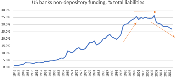
This was not rocket science. But it was the perfect storm that no one wanted to see coming because everyone was enjoying the party. And even though it was not straightforward to see it in the data, there were signs. For example, the chart below shows the non-depository funding (i.e. any other funding but checking and time-deposits which are the most secure ones) of US banks as a % of total assets. In the 1990s there was a spike in banks’ wholesale funding: repos, debt, open market paper, etc. The line flattened thereafter before hitting an all-time high in 2008. After 2008, the banks have continued to move away from wholesale funding in line with the decline of the shadow banking as well as with the new banking regulations.
Source: Z1 Flow of Funds
Bottom line is that despite the rise of math and science PhDs taking over the mortgage structured departments at the banks and broker dealers creating more and more complicated mortgage products, it was simple math that at some point eventually, as long as the Fed kept raising interest rates, the music will stop. No one knew when that would happen though and no one wanted to be the first to leave.
However, when it eventually happened, it was not clear why it happened. Lehman Brothers (one of the main cogs in the shadow banking system) was let go even though just a few months before Bear Stearns was ‘saved’. Letting a broker-dealer go under maybe was to teach a lesson at no such great cost to the system as it was not a depository institution, I do not know, but whatever the reasoning behind it was, it spectacularly backfired as the whole shadow banking system collapsed. The Fed had no choice but to take Morgan Stanley and Goldman Sachs under its wing shortly after Lehman’s bankruptcy (they officially became depository taking institutions).
The case of missing money, current edition
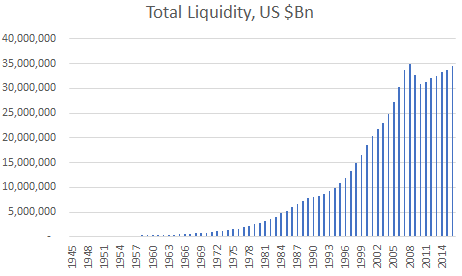
We still have no idea what our money supply is. Shadow banking liquidity continues to decrease and even though traditional money supply has continued to rise, total liquidity now is still just about at the same level as the peak of the 2008 financial crisis (chart below).
Source: Z1 Flow of Funds**
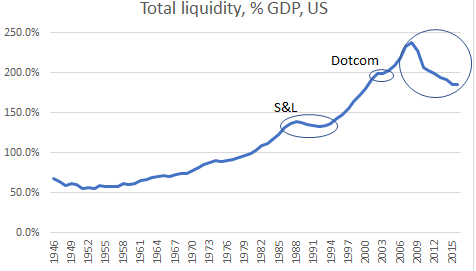
Relative to GDP, the situation looks even worse (chart below). Total liquidity as a % of GDP continues to decrease 8 years after the financial crisis. During the Dotcom crash, it only flattened out, but during the previous debt crisis, the 1990s Savings and Loans Crisis, total liquidity as a % of GDP decreased for about 5 years.
Source: Z1 Flow of Funds
It is no surprise then that we see the emergence of cryptocurrencies. They are the new fake safe private assets in a system starved of money and with real incomes still barely rising. With a total market capitalization of all cryptocurrencies of around $150bn, they are just about 10% of the US physical notes and coins in circulation, and only above 1% of US M2, so not an immediate and systematic danger to the monetary system. But unlike subprime mortgages, their digital and decentralized nature would allow them to spread very fast if the circumstances allow. And just like shadow banking liquidity, they are difficult to follow, let alone measure. Therefore, it is imperative for central banks and regulators not to get too complacent yet again.
*Shadow Banking Liquidity is defined as the sum of all sectors open market paper, holding companies’ debt and loans, GSE total liabilities, Agencies total liabilities, Issuers of asset-backed total liabilities, money market mutual funds total liabilities, broker-dealers repos; Traditional Banking Liquidity is defined as private depository institutions total liabilities; Cryptos is cryptocurrencies which is not to scale; All numbers in $Bn
** Total Liquidity is the sum of Shadow and Traditional banking liquidity