
In this post I am looking at debt sustainability, or the horizontal axis of the debt matrix presented here, using data from 36 countries of which 20 are developed markets (DM) and 16 are emerging markets (EM). Source: BIS
Total non-financial debt is composed of Private Debt and Government Debt. Private Debt can be further broken down between Households and Corporates.
Summary
- In terms of total debt as a % of GDP, the most vulnerable 14 countries are all DM with Ireland (379%), Japan (371%) and Portugal (324%) taking the lead; on the other hand, the least vulnerable 13 are all EM with Indonesia (68%), Argentina (74%), and Mexico (82%) bringing in the rear. However, in terms of debt flow dynamics, EM has generally put on more debt after the 2008 financial crisis than DM.
- We cannot see the latter development in the government debt picture. The 9 countries with the highest government debt to GDP are all DM, while the bottom 5 are all EM. In addition, the gap between DM and EM government debt since the 2008 debt crisis has widened (i.e. DM put on more government debt than EM).
- But we can see that in the private debt picture. Yes, in terms of debt stock, the worst 7 countries are still all DM and the best 11 countries are all EM, but in terms of flows, the gap between DM and EM since the 2008 financial crisis has substantially narrowed – i.e., EM countries have accumulated substantially more private debt than DM countries.
- The reason for that is EM private corporate debt, which has surpassed that of DM.
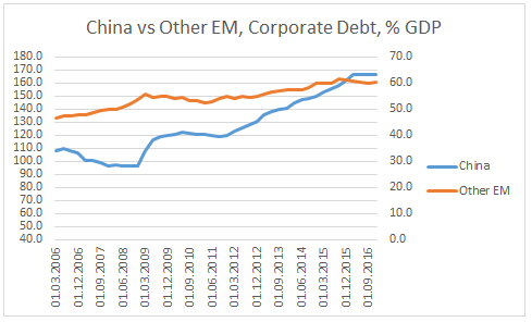
- Nevertheless, if we strip the effect of China, the increase in EM corporate debt is not that dramatic.
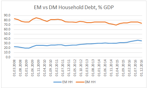
- There is one area in which EM private debt is still in much better shape than DM. That is household debt, where, in terms of stock, EM’s indebtedness is still half that of DM’s.

(Please click to enlarge for all chats in this post)
Details and charts
Total Debt
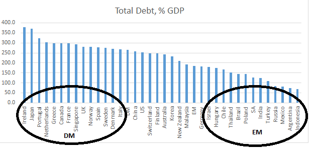
The worst indebted country is Ireland with its total debt as a % GDP doubling between 2008 (250%) and 2015 (500%), before settling in at 379%. There was a similar spike in indebtedness with most European countries in the top echelon of the above chart. Japan’s debt, on the other hand has been steadily increasing throughout the period.
The debt stock of the best EM countries is still several magnitudes less than that of the worst DM countries above. However, while DM’s overall debt levels have been more or less unchanged in the years after the crisis, EM has been putting on debt.

EM debt as a % GDP has increased from 140% (2009) to 185% (2016), while DM debt has been relatively stable at 265% of GDP.
Government Debt

Overall, EM debt stock as a % of GDP (46%) is more than half that of DM’s equivalent (98%).
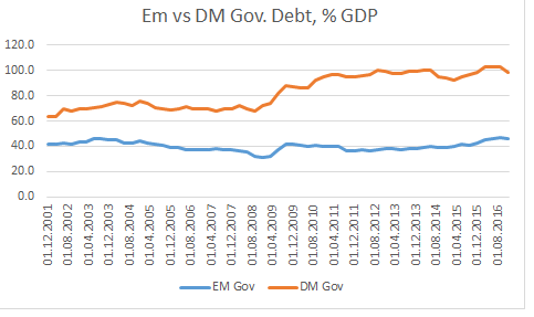
And the gap has widened after the 2008 financial crisis, with DM government debt increasing while EM’s generally stable.
Private Debt
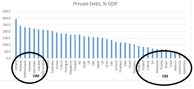
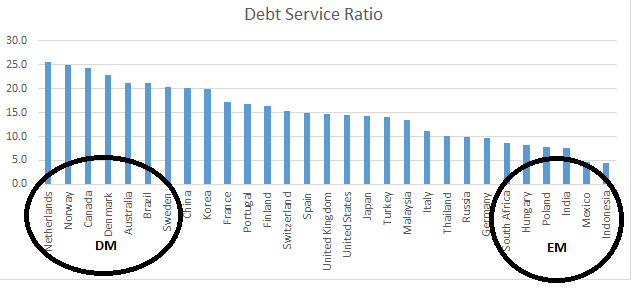
The latest private debt stock figures do not give us any additional information other than what we have already seen in total and government debt above: the most indebted countries being DM and the least EM. The private non-financial debt service ratios confirm that as well (chart below).
However, the flow picture looks very different.
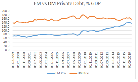
The gap between DM and EM private debt to GDP has substantially narrowed. If before the crisis, EM debt was less than half of DM debt (84% vs 176%), now they are almost on top of each other (138% vs 158%): EM has leveraged while DM has deleveraged.

(As per BIS, Credit-to-GDP gap is defined as the difference between the credit-to-GDP ratio and its long-term trend.)
After 2008, while DM has generally de-levered private debt at the expense of public debt, EM has levered private debt while public debt has remained the same. As a result, EM has levered while DM has de-levered. But where exactly has EM put on debt?
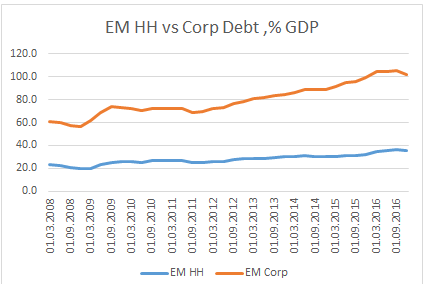
Both EM household and corporate debt have increased since the 2008 crisis but the bigger change is in the latter.
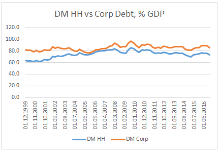
DM, on the other hand, has de-levered both household as well as corporate debt.
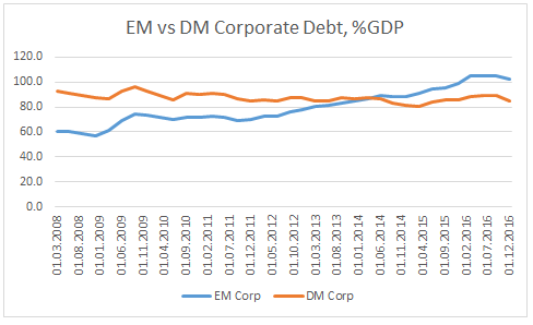
EM corporate debt surpassed DM corporate debt in 2014. However, if we strip the effect of China, the rest of EM’s corporate debt does not seem to have risen that much since 2008 (chart below).
In addition, EM households’ balance sheet still seems relatively much cleaner compared to DM’s (chart below).
The bottom line is that while DM’s debt stock is hitting extreme levels, EM’s still has room to grow. In addition, while all public and private debt levels are very high in DM, EM can in theory de-lever its corporate debt at the expense of either household debt or government debt and still keep its total debt level in check.
Conclusion: EM debt picture still looks generally healthier than DM’s equivalent. In fact, EM government debt dynamics have improved relative to DM’s after the 2008 financial crisis. The opposite has, however, happened in private debt dynamics. Nevertheless, despite worries of an increase in EM private debt indebtedness after 2008, this is mostly constrained to China’s corporate debt. EM household debt dynamics are also in much better shape than DM’s.
