Negative interest rates may not be a temporary measure

Tags

,

In the current debt-backed system, the majority of money is still loaned into circulation at a positive interest rate. Even in Europe and Japan, where base interest rates and sovereign bond yields are negative, the majority of private debt still carries a positive interest rate. This structure inherently requires a constantly growing portion of the existing stock of money to be devoted to paying solely interest. Thus, the rate of growth of the money supply has to be equal to or greater than the rate of interest, otherwise more and more money would be devoted to paying interest than to economic activity.

The long-term average growth rate of US money supply is around 6%, which is only slightly higher than the average interest rate on US government debt but it is below both the average US corporate interest rate and US household debt. While I have used the UST 10yr yield as the average yield on US government debt (the average maturity of US debt is slightly less than that), the estimates for both US corporate debt and US household debt are very generous. For the former, I used the average yield on Aaa and Baa corporate bonds, and for the latter I used a weighted average interest rate between mortgage debt and auto loans (I have used 2/3 and 1/3 weights). I have not included the much higher yield on US corporate junk bonds which comprise a growing proportion of overall corporate debt. I have also not used credit card/consumer debt, which has a much higher interest rate than auto loans, and also student loan debt which carries approximately similar interest rate to auto loans. Just like for BBB and lower rated US corporates, credit card and student loan debt are a much higher proportion of total US household indebtedness compared to before the 2008 crisis.

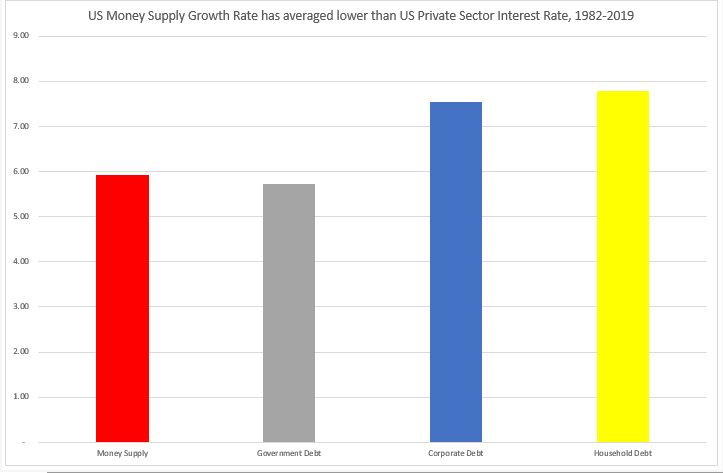
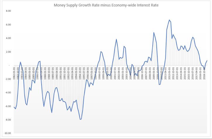
I estimate the long-term average economy-wide interest rate as a weighted average of government, corporate and household debt – with the weights being their portions of the total stock of debt. That rate currently is about 7%, still higher than the average money supply growth rate since the early 1980s. Over the last four decades, US money supply has not only not grown enough, on average, to stimulate US economic growth, but has been, in fact even, below the overall interest rate in the economy. Needless to say, this is not an environment that could have persisted for a long time.

Indeed, if one calculates the above equivalent rates for the period 1980-2007, the situation would be even more extreme (see Chart below). In fact, until the late 1990s, money supply growth had been pretty much consistently below the economy-wide interest rate. Only after the dotcom crisis, but really after the 2008 crisis, money supply growth rate picked up and stayed on average above the economy-wide interest rate.

What is the situation now? The current money supply growth rate is just above the average economy-wide interest rate; respectively above the government and corporate interest rates but below the household interest rate (data is as of Q1’2019).

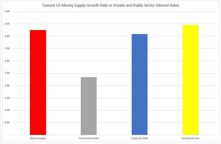
It is also still below the combined average private sector interest rate.

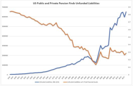
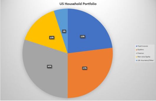
So, even at these low interest rate, US money supply is just about enough to cover interest payments on previously created money. And that is assuming equal distribution of money. Reality is that it is only enough to cover interest payment on public debt. And even in the private sector, money distribution is very skewed: corporates have record amount of cash but it is only in the treasuries of few corporates. The private sector, overall, can barely cover its interest payment, let alone invest in CAPEX, etc.

The deeper question is whether money creation should indeed be linked to debt at positive interest rate. In fact, we have already answered that question, and gone beyond, with some portion of money creation in Europe and Japan actually happening at negative interest rate. In effect, the market is trying to correct for all those decades when money creation substantially lagged interest payments: money there is starting to decay.

Demurrage money is not unusual in history. Early forms of commodity money, like grain and cattle, was indeed subject to decay. Even metallic money, later, on was subject to inherent ‘negative interest rates’. In the Middle Ages, in Europe, coins were periodically recoiled and then re-minted at a discount rate (in England, for example, this was done every 6 years, and for every four coins, only three were issued back). Money supply though, did not shrink, as the authorities (the king) would replenish the difference to find his own expenses. In 1906, Silvio Gesell proposed a system of demurrage money which he called Freigeld (free money), effectively placing a stamp on each paper note costing a fraction of the note’s value over a specific time period. During the Great Depression, Gesell’s idea was used in some parts of Europe (the wara and the Worgl) with the demurrage rate of 1% per month.

The idea behind demurrage money is to decouple two of the three attributes of money: store of value vs medium of exchange. These two cannot possibly co-exist and are in constant ‘conflict’ with each other: a medium of exchange needs to circulate to have any value, but a store of value, by default, ‘requires’ money to be kept out of circulation. Negative interest rates in effect split these two functions.

Seen from this point of view, negative interest rates may not be a temporary phenomenon just to spur lending. On the opposite, negative interest rates may be here to help reduce the overall debt stock in the economy and to escape the deflationary liquidity trap caused by the declining marginal efficiency of capital.

Pension fund crisis?*

Tags

At presentations you will see the blue line below.

How many times have you seen the red line?

Pension funds unfunded liabilities have indeed been on the rise, especially after 1999. But so have pension funds assets. So much, that the ratio between the two has been declining (which is the natural, long-term trend) since 2008.

In fact, for the whole period between WW2 and 1984, unfunded liabilities were always bigger than funded liabilities. In 1999, unfunded liabilities hit an all time low of 25% of funded liabilities and even though that ratio has risen since then to 75%, it is still much closer to the bottom of the whole period since 1945.

So, is there a pension fund crisis?

Maybe, but it is not obvious to me that it is anything bigger than at any other point in history before the 1990s.

Could there be a pension fund crisis?

Of course. But you know what is going to happen (as long as the US is fully sovereign), the Treasury will bail out the pension fund industry just as it bailed out the fund management industry in 1988 following the Asian/Russia crisis, and the banking, insurance and auto industry following the 2008 financial crisis.

This, sadly, does not prevent that future pensioners might be exposed to some misguided government attempts to respond to this supposed pension fund crisis by extending the retirement age.

Bottom line is that 1) pension funds unfunded liabilities are not even close to being in a crisis and 2) any fully sovereign government is in a position to provide all the necessary resources to secure comfortable retirement to its people.

We have advanced as a society to such an extent that the only hurdle to a normal life to all at the moment is our antiquated rules of accounting, not our lack of resources.

*Betteridge’s law of headlines:Any headline that ends with a question mark can be answered by the word no.”

The best portfolio diversifier

Given low, and in some countries negative sovereign rates, are sovereign bonds still the best portfolio diversifier in the long run? 

Yes

Because the portfolio optimization function has also changed. We are moving away from a world of profit maximization to a world of loss minimization.

Given persistent and large output gaps and surplus capital in the developed world, the expected return on future capital investment should be negative.

If Japan, Switzerland, Sweden and Denmark are any guide, their respective stock markets are down or flat since rates hit 0%. US is still a massive outlier (buybacks) but that is also fading (SPX buyback index is down YTD).

From a long-term point of view, I would still own sovereign debt as it has superior risk-adjusted returns even at these low yields. For example, in the last bear market for bonds, 10yr UST went from 1.95% in 1941 to 14.6% in 1982. Annual real total return for the period was 0.4% (annual nominal return was 5% with Sharpe ratio of 0.54). There were 10 years of negative returns (24% of the time) with the largest drawdown of 5% in 1969. In the bull market that followed, annual real returns were much higher but that was only because of disinflation (nominal returns were only marginally higher – around 6%). We still had 6 years of negative returns, but the largest drawdown was 11%.

‘Bond bubble’ is an oxymoron. The best value on the curve now: T-Bills. If you could be bothered to roll them, they would have a similar return to the long end but much lower volatility. The Fed just announced it is in the market buying T-Bills (as it ‘should’: the Fed is massively underweight T-Bills vs both history and the market). Despite heavy Treasury issuance net supply of T-Bills is expected to be negative next year.

US retail is massively underweight USTs: about 3-5% of all financial assets and about 2% of their overall assets.

Is gold a better portfolio diversifier when sovereigns yields are negative? Perhaps, in the short term and only for retail. Long-term, expected return on gold should also be negative (as long as sovereign yields are negative). For institutional investor gold is an inferior option from a liquidity and regulations point of view.

Is there a better portfolio diversifier at the moment, short-term? Perhaps soft commodities which trade below production costs (for some, like cotton, wheat – substantially below) – compare to precious metals which trade 50% above marginal cost of production. 

Soft commodities might be the exception among the major asset classes, whereby expected return is actually positive in a negative sovereign yield world, given that they already experienced negative returns in the past 10 years and their zero (negative?) weights in institutional or retail portfolios (mean reversion).

One can go even fancier here, up the risk curve, and allocate to hard currency emerging market debt, which has had even better risk-adjusted returns than USTs over the last 3 years. And, depending on currency views, go even further into local currency (unhedged) emerging market debt. USTs do not need to be negative, just to hover around 0%, for emerging market debt to really outperform, assuming no major market dislocation.

Finally, on the equity side, some allocation to emerging markets equity is also probably warranted given their massive under-performance specifically to US equities and my projected negative returns of the latter going forward. Unlike their developed market counterparts, emerging markets are not running negative output gaps and therefore, capital is still expected to earn a premium there.

Bottom line: if we are indeed in a loss-minimization type of world when it comes to investment returns (note, this does not assume any kind of market crash) one is still better off staying in sovereign debt, even when it yields negative as every other liquid asset is bound to return even more negative on any reasonable time scenario.

The 60/40 portfolio is a myth

Tags

,

-US households balance sheet is comprised roughly of 70% financial assets and 30% real assets. That mixture has actually been relatively stable throughout the post WW2 period.

-The non financial side of the balance sheet is comprised of 80% real estate and 20% ‘goods’ (car, furniture, etc.). Since WW2 there has been a gradual increase in the real estate portion from 70% of total to about 85% in 2007.

-The biggest item on the financial side of the portfolio is the pension fund (PF) allocation at around 30% of total. This was not always the case. In fact, it has gradually grown from 9% in 1945.

-The second biggest allocation is to equities (EQ) direct at around 18%, which turns out to be the average for the whole period post WW2. The highest allocation was in 1999 and 1965 at 28%, the lowest in 1984 at 10%.  Households own equities also indirect through their pension and mutual funds.

-The third biggest allocation is cash at 15%, 17% being the average in the post WW2 period, 25% the highest in 1984, and 12% the smallest in 1999.

-The fourth largest allocation is to mutual funds (MF) at 9%. Just like with PF, this allocation has increased gradually from pretty much 0% before the financial liberalization of the early 1980s.

-Fixed Income (FI) direct only comes fifth here at 6%, average 7%, highest 11% in 2008, smallest 5% in 1972. Households also own fixed income indirectly through their pension funds.

-The FI portfolio is comprised of USTs, agencies, munis and corporate debt. Munis have the largest allocation at around 39% followed by USTs at 33% corporates at 19% and agencies.

-the FI portfolio looked very different in the early days with the bulk of the exposure in USTs (84%), corporates (11%) and munis (5%). Agencies exposure kicked in only in the late 1960s.

-US households also own their own businesses (non-corporate equity – NCEQ) which used to be their largest exposure immediately in the early days post WW2 at 31% but has gradually halved by now.

-If we add cash and loans (very small exposure) to FI, the FI allocation overall goes to 23%. If we add the MF exposure to the Equities exposure, the latter goes to 27%. Life insurance (LI) and ‘Other’ comprise the remaining 5%.

-If we extract the PF exposure to its respective allocation to the different asset classes, the overall ‘concise’ US household portfolio has these weights at the moment: FI-30%, EQ-40%, NCEQ – 15%, LI/Other – 15%.

These are the trends in equities from the Fed’s Flow of Funds

1.Net cumulative real money equity flow (households, mutual funds, pension funds, insurers and ETFs) is down almost $400Bn since 2008.

2.There is a clear trend obvious above of switching from active equity management (households, mutual funds, pension funds, insurers) to passive (ETFs).

3.The only real buyer of equities since 2008 are non financial corporates themselves. Although, to be fair, the domestic financial sector has been a large issuer of equities, especially immediately post 2008, offsetting some of the demand from corporates. Bottom line is that since 2008, very generally speaking, real money has been selling equities into a corporate bid.

4.Share buybacks started in earnest only after SEC Rule 10B-18 was introduced in 1981. Until then corporates were net issuers of shares (supply increased). After 1983, on a cumulative basis, corporates became net buyers of equities (supply shrank). From 2008 onwards, corporates bought back more shares than for the whole period before.

5.Households have been reducing their direct holdings of equities. From 1946 till the early 1990s they moved from owning direct to owning equities through their pension fund. From 1990 till 2000 they expanded also in mutual funds and as a result, the growth of pension funds’ exposure to equities slowed down at the expense of mutual funds growth. And from 2000 till now they have been switching further into owning equities through ETFs at the expense of all of the above.

6.Since 2008, cumulative equity inflow from insurance companies and mutual funds is more or less flat. Pension funds divested from equities at the expense largely of ETFs.

7.Equities inflow from foreigners really picked up after 2000s but peaked in 2014.

Repo squeeze and the Fed: two additional solutions

Tags

Things the Fed can do to alleviate the potential repo squeeze (apart from the usual suspects already discussed in great detail by both saleside/buyside research and in Twittersphere):

1) hike the interest banks pay on TT&L ‘notes’ accounts from EFF-25bps to EFF, or to make it even simpler, equal to IOER. That could encourage funds to move from the TGA account back to TT&L accounts and ‘release’ reserves.

When the Fed started paying IOER, the opportunity cost for the Treasury to keep money on deposit in the banking system (TT&L accounts) rose. The Treasury thus started using the TGA at the Fed.

2) cut the fee on daily uncollateralized overdrafts from the current 50bps, adjust the net debt caps, decrease the penalty daily overdraft fee of 150bps. That could encourage better use of the existing Fed intraday liquidity option.

The Fed made major changes to its daily overdraft operations in 2011 spurred by some inexplicable desire to limit its credit exposure. This was probably on the back of political pressure from the legacy of the 2008 crisis during which the Fed indeed took massive credit risk.

Before 2011, the majority of the Fed’s daily overdrafts were uncollateralized. The new rules discouraged uncollateralized ‘repos’ by raising their fees and introducing collateralized overdrafts for free. After those changes, majority of the overdrafts became collateralized. The problem arose when during the most recent repo squeeze, the mechanics of obtaining collateral became complicated.

In any case, Fed’s action was strange given the fact that only a few months before that, in 2011, it had changed the accounting rules which pretty much ensured that the central bank can not go bankrupt (no negative equity) even in theory.

Should the Fed, actually, be providing free intraday liquidity with no collateral to eligible institutions? I think so. Because:

-that liquidity is needed for transaction (retail 24/7), not consumption or production purposes (Pfister 2018)

-the central bank can create money at zero cost, while the opportunity cost of holding money should be equal to the social cost of creating it (Friedman 1969)

-the central bank would be simply accommodating Basell III regulations

These two solutions are not groundbreaking: the Fed would be either going back to the way things were before 2007 (uncollateralized Fed daily overdrafts), or taking into account new developments (the emergence of IOER).

Trade may drive the economy, but share buybacks drive the stock market

Tags

,

Trade and tariffs, important as they are indeed for economic activity globally, are a sideshow when it comes to the big picture in the stock market. Yes, commodity markets may ebb and flow on trade but this is not the mercantile 19th or early 20th century. Look at the divergence between the oil majors and the price of oil this year, for example.

The big secular trends in stocks are determined by technological innovation and regulations. Their momentum is determined by net share buybacks (IPO minus share buybacks). Valuations play such a minor role that the cynic in me would probably say that they are used by clever stock analysts to give us reasons to buy their research.

We may be approaching such a turning point in US markets where the confluence of technology and regulations start to hurt stocks: 1) US is falling behind China in 5G, which is possibly the most important technological development at the moment; 2) US regulators are intent on drastically changing the business model of US tech company behemoths.

And stock market momentum may eventually be turning as well, if current trends of increased IPO supply and policy towards curbing share buybacks continue.

I am not talking about a one-off stock market correction, the way we’ve had so far since the 1980s. I am not even talking about a bear market. If these trends play out the way I described, the result will be much more structural: I expect at best the US stock market to deliver half of the total average annual return it has had so far since the 1980s, and at worst, to have a prolonged multi-decade sideways trajectory, similar to what it went through in the three decades prior.

Supply pressure likely to hit US stocks

Tags

I don’t think the stock market bulls appreciate the wave of supply that may hit the market in 2019. I know we got used to billions of dollars of share buybacks on the demand side while not paying that much attention to the supply side. Yet, IPOs in the last few years have been quietly building up. In fact, if the experts are right, 2019 could beat the IPO record issuance reached before the dotcom bust.

According to Renaissance Capital, the total value of private companies that are planning to go public in 2019 is $697Bn. They estimate that if just 15% of that value exits at IPO, that would amount to over $100Bn which would be more than the record for IPOs set in 2000.

If companies manage to get their valuations just from tech names, there is a minimum of $200bn of value in the pipeline (Lyft, Uber, AirBnb, Pinterest, Slack, Postmates). Using the 15% benchmark, see above, that would make tech IPO size in 2019 somewhat similar to 2018 when the tech sector raised $32Bn in IPOs. But the $200Bn amount is on the conservative side. That would still make the tech sector the largest one in terms of IPO issuance.

How will that play out? Will there be enough demand to offset this supply? With fewer individual retail accounts and fewer active managers than in 2000, how would passive investors react to this?

On top of that, we have the threat of more regulation, especially on the tech sector, but also on the general market with the spectre of a ban on share buybacks looming on the horizon.

Just looking at the supply – demand dynamics, it feels like we do not even need to bother with the ‘subjective fact’ of excessively high valuations and recent earnings downgrades to make a good bear case for US stocks. But I can already foresee what the bulls would say, “If you discount the data by market cap, the extreme IPO number does not look that bad”. I guess, the jury on this is still out.

What do Myanmar driving and our monetary system have in common?

Both make people’s lives unintentionally difficult and complicated by having changed the system in the 1970s but continuing to insist on following the same old rules.

In 1970, Myanmar General Me Win changed the direction of traffic in the country (literally overnight) from left to right. Such a sudden decision would have been a precarious change even in the best of circumstances, but in the case of Myanmar which, having been a British colony, traffic had been on the left with a right-hand drive steering wheel, it was truly extraordinary given that all the cars continued to be with a right-hand steering wheel!

In 1971, US President Richard Nixon ended the gold standard which had been at the core of most of the world’s monetary systems for centuries. The world truly went on fiat money. That would have been a difficult task in the best of circumstances given the previous history of fiat money. In the case of US, and most other countries, it became an impossible one given that no attempt was made to upgrade the monetary system to the new reality of fiat money.

Every country we have visited so far on our journey is unique on its own, but no country in the world is so truly unique as Myanmar when it comes to driving on the road. We spent almost a month in Myanmar and honestly it took me some time to realize that we were driving on the right side of the road but also the driver is sitting on the right side of the car! Can you imagine how hard and crazy this is? I actually can, having lived in London for two decades and frequently driven to Europe. But even that is not a good comparison as I would generally drive on well-kept highways in Europe, while in Myanmar there are no real highways, all roads are single lane and quite bad by European standards. Try overtaking under these conditions in Myanmar: when the steering wheels of cars didn’t change, people were left with relying on honks and passenger guidance when merging into a lane.

Something similar happened with our monetary system: in 1971 we finally, and for good, threw off the gold shackles but we did not change the gold standard accounting (CB reserves vs. government bonds) and continued to impose imaginary limits on government finances and money supply in general. This is as backward, inconvenient and dangerous as a right-hand drive on the right side of the road.

I started paying attention to this monetary inconsistency only after GFC’08 when it became obvious that there is something ‘not right’ with our money supply: the way the Fed was conducting QE, the way inflation did not budge, and the way no one batted an eyelid when the $700bn financial rescue plan was announced. Then I discovered Mosler, Wray and the rest of the original MMT crew. Finally, I brushed up on financial history going well beyond the Great Depression, when ‘MMT’ was last popular, to Knapp and even beyond (“Debt: the first 5,000 years”). But what convinced me most that our monetary transmission mechanism is far from optimal (just like in Myanmar, I had to spend some time on its roads to even notice the peculiarity) was that I was intimately involved in the plumbing of the financial system by trading and having exposure in the short end of the money markets, especially in the years following GFC’08.

What is extraordinary for me in both cases is that people don’t seem to be bothered and despite the obvious difficulties prefer to just get on with the existing status quo. Speaking to locals in Myanmar, there is neither appetite to change back to the previous driving system, nor to start importing left-hand driving wheel cars (even though some people have mentioned a draft law that would have a cut-off point after which only left-hand drive wheel cars would be allowed to be imported). In the case of gold-standard-monetary-system-not-fitted-to-a-fiat-world, the people in power (central bankers, prominent economists) have ridiculed any attempts to think of possible improvements.

Spin it either way you like, but equity buybacks make all the difference

Tags

There are two things we can say for sure about share buybacks:

1) based purely on equity flows, they have dominated equity markets since at least 2000

2) based purely on the reduction of share count, and assuming no increase in leverage, as is indeed the case for most of the largest share buybacks, they push up the price of shares

The verdict is out on whether they contribute to lower capital spending, and indirectly cause stagnant employment and wages. Given the supremacy of the shareholder primacy doctrine, I would be surprised if the latter does not hold (that is the whole point, in fact, even though, if every company targets lower employment costs, the cumulative effect on the economy would be lower aggregate demand, thus indirectly lower long-term company profitability), while it would be irresponsible if the former does, given that this ultimately cuts long-term profitability prospects.

Given the record amount of investor equity outflows, the record amount of company share buybacks and the near vertical rally in US equities since the beginning of the year, we can finally put to rest the hypothesis that it is share buybacks that drive primarily equity performance. This is indeed the conclusion that sell-side analysts have come to recently (see Citi, JPM, GS), based on equity flows, notwithstanding that when I was at HSBC, we came to the same conclusion three years ago. It stands to reason then that as S&P companies enter their blackout period en-masse starting next week and going into the middle of April, we should expect equities to lose some ground.

Things are a bit more nuanced though. The biggest mistake people make when analysing buybacks is that they look at the whole market and use averages. You want to understand the effect of buybacks, look at the companies doing the buybacks.

  • Only 13% of publicly listed companies engage in share buybacks.
  • Of those, the largest 20 companies constitute more than 50% of all buybacks.
  • Of those Apple alone constitutes about Âź of the total amount bought back.

The high concentration of buybacks among very few of the largest US companies guarantees their outsize effect on US equity indices performance while at the same time plays down their effect on equity fundamentals when looking at indices averages.

One unifying feature of the companies doing share buybacks is that their share count ends up substantially reduced. This is in stark contrast to the general market where share count is more or less flat to slightly down over the last 20 years or so. Over the last 5 years, the combined share count of the 20 largest share-buyback companies decreased by 11%. But there are wide variances amongst them. The biggest buybacks naturally reduce the most the share count. For example, Apple’s share count decreased by 23% and Boeing’s (5th largest) decreased by 24%.

There are two exceptions. Broadcom authorized $12Bn in buybacks in 2018 but over the last 5 years its share count has actually risen by 71%. And Micron Technology had a $10Bn buyback programme in 2018 but its share count has increased by 16% over the last 5 years.

Another unifying feature of the companies doing share buybacks is that their share prices tend to rise over time. The causation is a lot more difficult to prove given that over the last 5 years the general stock market is also up. But still, the average share rise of those 20 companies is almost double the rise in the S&P Index over that period.

And again, there are two exceptions. Qualcomm share price has decreased by 28% over the last 5 years despite its share count down by 17%. And ConocoPhillips lost 4% of its value while its share count went down by 5% over the period.

Do share buybacks ‘cook’ the books. Difficult to say using averages even on those 20 companies. Indeed, of those 20, on average top line growth is smaller than bottom line growth but is this from reduced share count or as a result of expanding profit margins due to cost cutting, for example? One has to dig deeper into the numbers on individual basis. Apple’s and Cisco’s Revenue growth is about half its EPS growth; Intel’s, Texas Instruments’, Amgen’s equivalent is between 3x and 5x smaller; yet Qualcomm’s, United Health’s and Wells Fargo’s Revenue is about 1.5x bigger than its EPS growth rate. And still others, like PepsiCo, Pfizer and Nike, have a negative Revenue growth rate but a positive EPS one. Finally, both ConocoPhillips and Merck have negative growth rate for both top-and bottom-line numbers.

Do share buybacks happen at the expense of capital investment? Again, difficult to judge even from these 20 companies without digging into debt, FCF etc. or other specifics. On average, capital spending growth over the last 5 years is in line with Revenue growth and below EPS. But there are, of course, outliers. Qualcomm, 3M, Adobe and Cisco have a negative capital spending growth rate despite positive Revenue and ESP growth rates. Oracle and Texas Instruments have double digit capital spending growth rates despite small single digit Revenue growth rates.

A few prominent people in the markets have written in support of buybacks and playing down their role in analysing US equity performance, but having looked at the numbers again from the bottom up, I cannot help but disagree with their conclusion.