‘State’ money creation – this ghost from the past is badly needed for the future

At present, majority of money (medium of exchange=inside money) creation in the developed world gets done by private banks. The state (government and/or the central bank =outside money) does create money but it is either as a medium of exchange within the banking system only, or on the back of demand for physical cash in exchange for inside money.

I have written about this before here (‘A simplified hierarchy of money’). The problem with the current monetary transmission mechanism (‘A simplified version of the monetary transmission mechanism’) is that it is set up almost by default to produce a scarcity of money. One alternative could be that the central bank distributes money directly using all the available data management techniques and recent advances of technology (central bank digital cash).

Given the state of our economy, and in order to properly address the level of technological advances we are experiencing, i.e. to minimize the risk of disruptions which could lead to social upheavals and loss of our prosperity, it could be a good idea to look at history to see how money was created and distributed in similar periods of development.

(Click to enlarge)

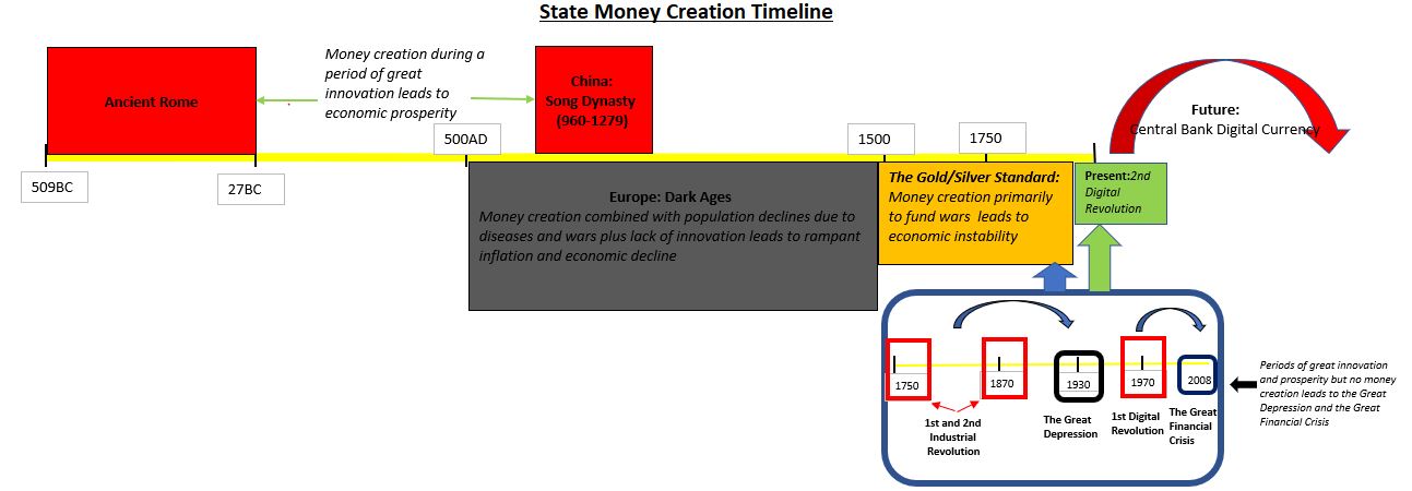
Indeed, inside vs. outside money creation is only a recent phenomenon (late 20th century) while state money creation had been the norm for the majority of human existence. And that’s the thing. Unfortunately, our current views of state money creation are really shaped by the most recent examples which had been disasters. For example, the Gold Standard came into existence to curb the rampant money creation to fund wars during the European Dark Age. In addition, that was a period without any major commercial innovations and characterized by population stagnation across Europe.

The late 18th and the 19th century, on the other hand, saw the 1st and 2nd Industrial Revolution which introduced new modes of production. The second half of the 19th century up to early 20th century was also characterized by a period of general peace (Pax Britannica). By then the great innovations of the previous two centuries were also commercialized. As a result of all this, Europe, in particular, became very prosperous.

Unfortunately, the existence of the Gold Standard, prohibited the state to issue enough money to correspond to the increased potential of economic activity. The Great Depression in the 1930s was thus characterized by a positive supply shock, on the back of these innovations, and a negative demand shock on the back of insufficient supply of the medium of exchange.

Early 20th century was probably the first time humanity was experiencing the fruits of progress on a basis similar in scale to the period of the Song Dynasty (960-1279) in China and the Roman Republic (509BC-27BC). Yet, policy makers failed to take full advantage of this by unnecessarily restricting the flow of money. It took a global war which destroyed/redirected a large part of Europe’s industrial capacity to re-address the imbalance between supply and demand.

Even then, policy makers, still did not take note that there was a paradigm shift in the late 1800s after the 1st Industrial Revolution, when a period of innovations massively shifted our economic potential much higher. While the developed world was slowly moving away from ‘scarcity’ and closer to ‘abundance’, they continued to operate from the basis that supply of resources is the bigger issue. The period from the end of the WW2 to the early 1970s continued to be characterized by a restrictive flow of money, the quasi gold standard. Luckily, it did take some time for capacity to come back on line after the war, so there were no major financial disasters.

In fact, it was quite ironical, that as soon as President Nixon decided to finally fully abandon the gold standard and introduce the age of fiat money, the world experienced a supply side crisis: due to problems in the Middle East, the supply of oil became restricted leading to a rise in inflation. This actually emboldened policy makers even further to focus on issues emanating from insufficient supply of resources and thus manage the demand side of the economy more closely to reflect that. The problem on the supply side, however, was short-lived, and as soon as the Middle East crisis subsided, oil started flowing back and ‘equilibrium’ ensued.

Nevertheless, even to the present day, our economic policy is still dictated by the mantra of supply side economics and inflation targeting.

Alongside these developments, the second half of the 20th century was also characterized by the start of the 1st Digital Revolution with the invention of the computer in the 1950s and its commercialization in the 1980s. Starting in the 1990s, globalization also took off. These developments boosted even further potential supply, while at the same time, money flow, despite no restrictions on actual money supply due to its fiat nature (but actual restrictions due to the separation of outside and inside money) continued to be restrictive.

These were the developments which led to the Great Financial Crisis in 2008, which, just like the Great Depression before, was characterized by a positive supply shock due to a burst of the commercialization of previous innovations and a negative demand shock due to insufficient money supply. The present time seems also to be the beginning of what could be called the 2nd Digital Revolution of AI and VR, which has the potential to even further increase our economic potential. Yet, when it comes to money creation, we are still operating with the mentality the Gold Standard: money is kept excessively restricted for fear of rising inflation.

In light of this, it could be worthwhile to point out that there were actually periods of successful state money creation in the past: Rome in the last five centuries BC and China between 10th and 13th century. Why did state money creation work back then? Three main reasons:

  • massive prosperity on the back of the commercialization of previous innovations,
  • a period of relative peace, and
  • a properly working institutional framework

It is important also to note that both in the beginning of the 20th century and now, all these three reasons above are present. If history is any guide, failure to supply the necessary amount of medium of exchange to ‘record’ this existing prosperity could lead to war, followed by disappearance of the economic prosperity, and in the worst possible scenario (did not happen during the Great Depression) the dismantling of the institutional framework. Or, if more recent political developments are any guide, could this time be different and the decline starts with the dismantling of the institutional framework, followed by war and the natural disappearance of prosperity?

To sum up:

  • state money creation is good when it is done within a solid institutional framework, and it follows (or is accompanied) by a positive supply shock brought about by previous innovations leading to economic prosperity (past examples: the Roman Republic, China during the Song Dynasty; no current examples);
  • state money creation leads to negative outcomes when it follows a negative supply shock brought about by war, natural population declines, or inadequate institutional framework (Europe during the Dark Age, the Gold Standard; more recent examples: Zimbabwe, Turkey, Argentina, etc.)

Is Japan doing that bad?

Latest GDP numbers out of Japan came out overnight and though the decline in GDP was expected, it was worse (-0.1% vs -0.6% actual). But is this really a surprise given the continuous decline in the Japanese population – deaths outnumber births now by more than 1,000 per day?

  • The growth rate of Japan’s population started declining in earnest in the mid-1970s, but it turned negative only in 2009. Absent massive rises in productivity, it is natural for GDP growth rate to decline as well in line with the decline in population growth.
  • Still, Japan’s GDP growth rate has been consistently above the growth rate of its population (another way of saying GDP per capita rises) except for a brief period post the 2008 financial crisis. Nevertheless, the average GDP growth rate since 2009 is still above the average growth rate of the population (0.6% vs -0.1%, respectively).

What does this mean? Positive labor productivity growth rate.

  • Since the 2008 financial crisis, Japan’s annual GDP per capita growth rate averaged the same as US’. Even since the 1990s, when Japan’s supposed stagnation started, its GDP per capita was on average just 35bps lower than that in the US.

  • GDP per capita growth can be broken by growth in labor productivity (GDP per hour worked) and changes in labor utilisation. Measured by GDP per hour worked, Japan surpassed USA in 1989. But measured by labor productivity growth, it has outperformed the US since the 1970s at least.

  • High labor productivity can come from many things (greater use of capital, low labor utilisation, innovation). In general, Japan tends to have a lower labor utilisation rate than US. That could mean more automation/ less employment of low productivity workers.

  • Perhaps that is why, Japan also tends to have a lower labor compensation (per hour worked) growth rate than US. However, in 2016, for the first time, that changed.

Bottom line is as long as population continues to decline, GDP should also be expected to decline given also lackluster productivity growth. However, as long as productivity growth is positive, GDP rate of decline should stay above population rate of decline. It could be better, but there is nothing bad about that either.

Is the effect of demography on inflation fading?

Good paper by M. Juselius and E. Takats on “The enduring link between demography and inflation” pointing to the fact that:

  • an increase in the share of the dependent population is generally associated with higher inflation; and
  • aging is set to increase the share of dependents, reversing a previous trend.

Is inflation then set to burst higher? It depends.

First, even though the global dependency ratio is rising, its level is not the same for each country. For example, China’s current dependency ratio at 40 is 58% of Japan’s at 68. US dependency ratio is forecast to rise the least; in fact, in the mid-2030s, it is forecast to start declining again.

Second, a lower dependency ratio, even though a rising one, should in theory cause less upward pressure on inflation. By that measure, US inflation may rise but would probably rise less than UK’s and EU’s; in fact, by 2050, with US dependency ratio the lowest among these major countries, one would expect US inflation to be the most subdued.

Third, Japan’s dependency ratio has been rising pretty much since the great crash in 1990, and, in 2007, it surpassed these other countries’ dependency ratios, while this whole time has coincided with a period of consistent deflation there: obviously there are other, presumably, much stronger determinants of inflation.

Fourth, and to the latter point, with the advance of technology, labor’s role in the production function is becoming less important. Does that mean that demography’s role in influencing inflation is also fading?

We can’t ignore SOFR (continued)

Tags

  • People have been proposing a variety of reasons for the LIBOR-OIS spread continued widening. And majority of them make sense. My view is that we cannot discard the fact that the gradual replacement of Libor with the Secured Overnight Financing Rate (SOFR) is also playing a major role.
  • Unless you are actually directly involved in the Libor market, and there are only a ‘handful’ people left in it now, the larger investment community is not paying enough attention to these changes.
  • At the moment there are four eligible benchmark interest rates which can be used for hedge accounting purposes, as per FASB: UST, LIBOR, OIS (based on FFER), SIFMA Municipal Swap Rate. The Fed has requested that the OIS based on SFOR to be added to the list.
  • This is a big deal. There are $350Tn of worth of loan/bonds, etc. tied to Libor. And by 2021 Libor will be gone. From April 3, 2018, the Fed will start publishing Libor’s replacement, SOFR. Anyone involved in the Fixed Income markets better start to get ready.

Of course, LIBOR may remain viable well past 2021, but we do not think that market participants can safely assume that it will.  Users of LIBOR must now take in to account the risk that it may not always be published.

Jerome H. Powell, Roundtable of the Alternative Reference Rates Committee, November 2, 2017

  • The meaning of Libor may still be the same, but the significance of the way it is derived, has massively changed since the scandals of 2012, and now its relevance is about to fade: Libor is no longer reliable.

In our view, it would not be feasible to produce a robust, transaction-based rate constructed from the activity in wholesale unsecured funding markets.  A transactions-based rate from this market would be fairly easy to manipulate given such a thin level of activity, and the rate itself would likely be quite volatile.  Thus, LIBOR seems consigned to rely primarily on some form of expert judgment rather than direct transactions.  

Jerome H. Powell, Roundtable of the Alternative Reference Rates Committee, November 2, 2017

  • Today, there are 17 banks that submit quotes in support of Libor. Look at the distribution of daily aggregate wholesale dollar funding volumes for the 30 global systemically important banks: the median is less than $1 billion per day. On some days, there are less than $100 million.

  • SOFR is very different. To begin with, it is secured (UST collateral), it is only O/N and it is only transactional but volumes are massive (see below). Libor is unsecured, term and it is both transactional and ‘estimated’ (increasingly more the latter). SOFR is kind of a ‘pure’ GC rate.

  • SOFR is a good proxy for a risk-free rate. It could offer the broadest measure of dealers’ cost of financing Treasury securities O/N and, therefore, it could provide useful information regarding O/N demand and supply for funding in the UST repo market.
  • So, the market has three years or so to start converting $trillions worth of contracts which point now to Libor, to SOFR (some of them will just expire before that date). The problem is, because Libor is much higher than SFOR, the receiver of Libor on a legacy contract will require compensation in order to agree to the conversion.

  • There are just too many issues with this conversion. For example, how do you deal with current Libor contract which requires payments based on 3m Libor after the introduction of SFOR which is only O/N (CME will start trading future on SOFR in May)?


Now, however, market participants have realized that they may need to more seriously consider transitioning other products away from LIBOR, and the ARRC has expanded its work to help ensure that this can be done in a coordinated way that avoids unnecessary disruptions.

Jerome H. Powell, Roundtable of the Alternative Reference Rates Committee, November 2, 2017

  • When you need to settle floating rate coupons then you need to use OIS (based on SOFR), but there may not be that much (term) liquidity there at the beginning. You don’t want to be relying on this then if you are going to be converting trillion of $ of Libor.
  • Darrell Duffie proposes instead an auction and protocol based approach. Bottom line is that the LIBOR->SFOR conversion is a big thing in the markets and unless you dig in regulatory/compliance documents, very few people are discussing it.

The story of the year is not soaring Libor but emerging SOFR

Tags

  • So, apparently Morgan Stanley thinks “soaring Libor is the story of the year…”  I believe the story of the year is Secured Overnight Financing Rate (SOFR) which the Fed will start publishing April 3; LIBOR is going into the history books. I am not saying the widening of the Libor-OIS spread is related to this, however, I suspect so.
  • The widening of the Libor-OIS curiously coincided with the Fed’s initial announcement on SOFR in June’18, then again in towards the end of 2017 when it said it plans to start publishing SOFR in Q1’2018. It blew up finally, when it became clear that that date will be April 3.

  • Libor setting was always partially subjective even in the good old days pre-2008, especially longer-dated tenors; after 2008, with many banks withdrawing, it has become increasing less transaction-based.
  • According to the Fed, SOFR will be entirely transaction-based and it will be purely spot (O/N). This is a big divergence with the Libor-based structure. Has the market started to transition already?
  • For example, custodians need to move to new systems for calculating compound term coupons from spot because even though market makers will start to build systems to trade futures and forwards, that will take time as it also needs regulatory approval.
  • New debt products will reference SOFR, but existing ones must also have some reference to SOFR, especially longer-dated ones when Libor really becomes extinct in 2021. All this takes time as well, and, I suspect, it is not going to be that straightforward given the large legacy of Libor products out there.

Not all oil is ‘created equal’

  • Not all oil is ‘created equal’: US WTI and European Brent are light and sweet, most of OPEC is heavy and sour, Russia’s is kind of in the middle. These distinction matter not only because of the different qualities, but more importantly, because of whether the oil is refinery-ready.

Diagram 1

  • Therefore, direct comparisons between OPEC and US Shale Oil, for example, is like comparing apples and oranges -> same category but very different at the same time. Instead, US Shale Oil’s direct competitors are the ones in the circle above (see also Chart 4, see below).
  • If we grossly oversimplify and break world oil production into two categories: Light/Sweet are all US competitors (circled above), with API>35, and Heavy/Sour are mostly OPEC/Russia/Canada with API<35, as per above diagram, this is how it would look over time.

Chart 1

  • US’ main oil competition started reducing production at about the same time the US shale revolution first geared its head above the horizon post the 2008 financial crisis; then, as US shale production really took off in 2011-12, the rest of global Light/Sweet production dutifully collapsed.
  • Heavy/Sour Production is the dominant feature here, equal to 63% of total world oil production, vs 37% for Light/Sweet. However, it is off the peak reached in 2011 when US shale oil production really took off.

Chart 2

  • The recent rise of Light/Sweet oil production relative to Heavy/Sour is a combination of both OPEC cuts since November 2016 and a continuous in increase in US Shale Oil production. However, the increase in US Shale Oil since the 2008 financial crisis is more or less offset by the decrease in rest of the world Light/Sweet production.

Chart 3

  • In fact, Norway peaked in the early 2000s; Nigeria: in mid-2000s; UK in the mid-1990s; Algeria, Angola et all, all peaked towards the late 2000s. But the one that really stands out is Libya: before it collapsed in 2011, Libya was one of the largest Light/Sweet oil producers.

Chart 4

  • Because US used to import a lot of heavy OPEC oil in the past, most of US refineries are suited to low API oils. In fact, the average API of oil that enters US refineries is about 31. This is lower than European refineries, used mostly to Brent, with API of around 36.

Chart 5

  • The problem is this adjustment is far from easy. Only a very small portion of US oil is refinery-ready. And that proportion is decreasing as more lighter shale oil is produced year after year: majority of US production is now in the 40-45 API range; only 13% is refinery-good.

Chart 6

  • So, US refineries need to keep importing more Heavy/Sour oil just so that they are able to refine the domestic shale oil. The other alternative is to export the crude shale oil directly to be refined abroad. But there are very few refineries even abroad that can accommodate Light/Sweet.
  • Why is US oil getting lighter and lighter? Because of shale oil and specifically because of Texas: it is the largest producer of US oil, a title it took over from the Gulf of Mexico in 2011 when US shale oil production took off.

Chart 7

  • And Texas oil production continues to rise thanks to the Permian Basin: Eagle Ford is off the peak and barely rising. In fact, the Permian Basin and the Gulf of Mexico are now the only two major oil producing regions in the US really growing.

Chart 8

  • The problem with Texas oil production rising is that only 2% of it is refinery-ready. In fact, of the three largest oil producing regions in the US, two are below their peaks, and only one, Gulf of Mexico, has a low enough API to be refinery ready.

Table 1

  • New Mexico shale oil production is rising but none of it practically is refinery-ready; North Dakota and Oklahoma are below peak and only 1% and 8% of their oil, respectively, is refinery-ready; California and Alaska, which are producing more conventional oil, have been on a decline for a while.

Bottom line:

  1. US and OPEC are not really in competition because they produce completely different crude oils. Moreover, US refineries and a large number of other refineries around the world are more suited to OPEC oil than to US shale oil.
  2. US shale oil API is rising because the old shale oil wells are depleting much faster and the new ones, where the oil is even more difficult to reach, have a higher API->that will put further strain on US refineries (increased Heavy/Sour imports).

Chart 9

What happens when oil production in the Permian Basin also starts to decline?

How energy efficient is the US economy?

  • How energy efficient is the US economy? At first glance – very: total energy consumption reached a high in 2007, before the financial crisis of 2008, and currently it is below even the pre-Dotcom crisis of 2000. GDP, on the other hand, is up 35% and 90%, respectively, since then.

Chart 1

  • However, we measure energy in energy units, BTUs, but we measure GDP in monetary units, USD. So, the picture changes if we account for the cost of energy indeed: as it rises above GDP (as during the 1970s oil crises, and post the 2008 financial crisis), the economy collapses; when it is lower (1990s), the economy prospers.

Chart 2

  • The energy ‘efficiency’ of the US economy may be just another way of looking at the increasing costs of energy. The economy is ultimately not just an energy system, but a surplus energy system, i.e. what matter is the net energy available: if it takes a lot more energy to extract the new energy, then a lot of that energy is wasted in the process (that is another way of saying that the energy return on energy invested, or EROI, is increasingly decreasing).

Diagram 1

  • Shouldn’t energy be part of the Production Function, Y(L,K)? What about n(et)E(nergy)? In other words, if it takes increasingly more energy to generate the energy needed for output to grow, then energy costs will also be rising and this may cause potential GDP (and productivity) to decrease.
  • In the past, energy consumption would dip after every single recession and subsequently rise, but that trend changed after the Dotcom bust and today we are still below those levels, 18 years ago. Yes, GDP is substantially higher, but GDP growth rate is also substantially lower (see Chart 1).
  • The fact that US has become a major producer of shale oil is not helping because there’s been no corresponding decline in the cost of energy. In fact, the opposite is true, as EROI of shale oil is much lower than conventional oil (see Diagram above). In addition, there are issues of transportation and refining.
  • Because shale oil is much lighter and thus not refinery-ready, oil prices may even have to rise further: the seemingly large oil glut we have had over the last year or so is masking the fact that shale oil cannot be currently so easily refined and prepared for consumption.
  • We can see this also in the data. Despite the rise in shale oil production, total fossil fuel consumption has actually gone done since 2000. While nuclear energy is unchanged, this has coincided with a surge in renewables energy consumption.

Chart 3

  • Digging deeper within fossil fuels, petroleum consumption is lower than the peak, pre the financial crisis in 2008, and, interestingly, lower than the peak in the late 1970s oil crisis. Similarly, for coal, where the decline post the financial crisis of 2008 is even more pronounced.

Chart 4

  • The oil vs. natural gas consumption going in the opposite direction has a lot to do with their diverging costs: on an energy equivalent basis, natural gas is currently much cheaper than oil.

Chart 5

  • The surge in renewables consumption has all to do with the rise in wind and, to some extent, solar. Biomass, which generally is the largest renewable consumed, has also gone up at the expense of hydro (2nd largest).

Chart 6

  • Renewables consumption rise started in the early 2000s, at the same time when fossil fuels consumption started to decline; again, diverging costs of the two have a lot to do with this phenomenon: since the 2000s, the cost of solar energy has collapsed by about 25x, the cost of wind energy has halved, while the cost of oil has more than doubled.
  • So, all this talk about shale making US energy independent, the question is at what cost? Technology is indeed making shale oil extraction possible, but it’s not like the cost of oil is going down (in fact it has gone up) =>Peak oil=Peak ‘cheap’/easily extractable oil (see Diagram 1 above, the newest forms of energy have also the lowest EROIs).
  • Aren’t we better off in the long run focusing on renewables, where technology is actually making energy costs go down, instead of flogging a dead horse in the name of an old paradigm of fossil fuel?
  • Finally, even if we assume that the US is indeed becoming more energy efficient, energy consumption per capita is still the highest in the world. In fact, 2x higher than Japan’s, which comes in second place.

Chart 7

Being long US equities does not ‘pay’ any more

For the first time since 2009, the market gets ‘paid’ to be short US equites. With the S&P 500 Forward Futures curve moving from backwardation to contango, equity shorts start to earn positive carry. This may not mean an automatic reversal of the strong positive equity trend in US equities but it does remove one of the fundamental pillars of CTAs, momentum-driven and some algos in executing long S&P 500 Futures strategies.  

1.       Trend followers will tell you that the most powerful combination is when you are paid to be in the momentum. i.e. when you are not only riding the momentum but you are also getting paid to do that (you are earning positive carry).

2.       This is exactly what has happened in US equities since 2009: if you have been long US stocks through US index futures, this has been a positive carry trade in addition to being also a very powerful long-term momentum trend.

3.       This is actually quite unusual: the dividend yield was lower than the 3m TBill rate between the late-1950s till 2008 and long stocks through futures (early 1980s) had been a negative carry trade. In fact, the negative carry was around 2.5% pa during that period.

4.       Since 2008, however, the opposite has happened: with the dividend yield climbing above the 3m TBill rate, the carry of being long stocks through futures has flipped to an average of around +2% providing massive support to the stock market positive trend.

5.       (When the dividend yield is lower than 3m TBill rate, the SPX futures curve is in contango, and is in backwardation in the alternative scenario).

6.       Since last year, though, things have changed: with the Fed rising rates and the 3m Tbill yield moving up, the SPX futures curve first flattened out about 6 months ago and is now in contango.

7.       With the Fed continuing to raise rates, the SPX futures forward curve is likely to continue to steepen (3mTBill 1y fwd went above SPX dividend yield last December) and thus the negative carry of long equities through futures will also start increasing.

8.       Timing the market is a sucker’s game. People have been calling the end of the equity bull market the moment SPX reached the previous 2007 peak again in 2013. They have thrown everything at this call: valuations, flows, sentiment…

9.       I have no idea if 2018 will be the year when this trend will break but being long equities has lost an important pillar of support: the carry. All of a sudden, for the first time since 2009, the market is ‘paid’ to be short SPX futures!

The anomaly of an European UK

The foundations of the EU were laid after WW2 in an effort to put a stop, once for all, to the endless wars ravaging Europe throughout its history. Thus, the EU was primarily a political project. UK joined mostly for economic reasons.  No one should be surprised that the UK decided to finally exit when the economic benefits of staying in were largely overtaken by politics and its equivalent economic costs. What is astonishing is that the EU ‘allowed’ the UK to join on such terms (and even improve upon them) in the first place.

  1. Peace was a relatively infrequent occurrence in Europe which was instead constantly ruined by ‘internal’ wars and foreign occupations. One way to achieve peace was by unification. In the past, Europe was ‘united’ by empires: Roman, Byzantine, French, English
  2. For example, under Pax Britannica (1815-1914, in Latin “British Peace”) England was the dominant power which ‘assured’ that the Great Powers co-operated rather than fought with each other.
  3. After the devastating effects of WW1, the calls for European unification again became strong. In fact, in the Congress of Aix-la-Chapelle of 1818, tsar Alexander (Emperor of Russia) suggested a permanent European union.
  4. Nothing happened. We had to go through another world war after which Churchill finally called for a ‘United States of Europe’ (1946). Three years later the first pan-European organization, The Council of Europe, was established.
  5. Despite the immediate plan behind its founding treaty (Treaty of Paris, establishing the European Coal and Steel Community, 1951), the EU was a political project first and economic second.
  6. UK eventually joined the European Economic Community in 1973 (after being rejected by Charles de Gaulle a decade earlier) mostly for economic reasons and never embraced fully the political angle.
  7. The election of Margaret Thatcher and the embrace of neo-liberal economic policies, which led to a resurgence of the UK economy, influenced the direction of European integration towards a more economic turn. The idea being that economics will eventually drive politics: “the invisible hand working, its wonders to perform”.
  8. UK was (reluctantly) ok with the free movement of labor (Treaty of Rome 1957) and welcomed the free movement of capital (Maastricht Treaty 1994). But, UK became increasingly unhappy with the free movement of people especially after the enlargement of 8 extra Eastern European countries (the Citizens’ Rights Directive, 2004)
  9. This discontent was exacerbated by the fact that UK decided to open its borders immediately to citizens of those countries, after the Directive came into force, while most other EU countries chose to implement a 7yr-grace period.
  10. The creation of the common currency, the EUR, in 1999 was a natural evolution of the political union but also a response to a number of currency crises, especially so the ERM II in 1992.
  11. The UK decided not to participate despite/because of the fact its currency suffered a lot during ERM II, confirming that it was in mostly for economic reasons. We can say in hindsight that this was the right choice given that the EU political process was far from complete.
  12. This became particularly obvious after the EU sovereign crisis (2012-13) when the continent suffered disproportionally due to its fiscal inflexibility, lack of common treasury and a proper re-distribution mechanism.
  13. While after the 2004 Directive, the UK was swamped by mostly Eastern Europe migrants (by its own choosing), after the EU crisis, migration increased also from the EU periphery and even from the core.
  14. It was at this time that UK media/government started a concentrated push to blame the EU for UK’s economic problems, again, notwithstanding that its own unnecessary austerity was causing most of it.
  15. It was a surreal situation: by choosing to keep its own currency, the UK was not subject to the fiscal straitjackets of the EU, yet it chose to do exactly that and blame the EU in the process.
  16. The Brexit vote came in light of these developments, and with the Treaty of Lisbon (2007) providing for the first time legally a way out of the EU, the procedure of UK exit has started.
  17. What is interesting is that there is a big disconnect between the UK’s position and the EU’s stand in the negotiations: economics vs politics->despite the UK joining for mostly economic reasons, it did, after all, ‘join’ a political union.
  18. What is astonishing here is the UK’s failure to see the political aspect of this (for ex. Northern Ireland issue) and focus primarily on trying to “buy itself out”. Equally, it will be EU’s give-in to strike an economic solution while disregarding the political message it sends.
  19. What is surprising is not that the UK has decided to leave the EU but that the EU has ‘allowed’ for this loophole to exist: if a country wants to enjoy the economic upside of a union shouldn’t also share the political responsibilities that come with it?
  20. In fact, after the 2015 deal between the UK and EU, the UK did acquire a special status within the union: something no other country had been able to achieve. Why did the EU let the UK in on mostly economic terms and why did it even improve on them later on?
  21. But can we blame the UK that it has gone in the Brexit negotiations process asking “to eat the cake and have it” given that this is exactly what the EU has allowed it to do for 40 years (single market, free trade, own currency, no EU fiscal straitjacket, no Schengen)?
  22. This should not distract from the fact that the political union is far from complete. However, economic commentators not only largely underestimate the political difficulties inherent in building its infrastructure…
  23. …but also disregard the history behind this whole project: the initial impetus for it, and the gradual process of adding, layer after layer, in some cases, unfortunately, only following a crisis.
  24. Brexit, however, is the first serious political crisis facing the EU. The future peace in Europe is dependent not on what UK does now, but on how Europe decides to proceed forward.
  25. The European ‘unions’ of the past (empires) were largely based on the idea of ‘colonialism’ – the center takes much more than it gives back. This could be the first European union which is based on common sharing.
  26. On the other hand, if history is any guide, the failure to complete this European integration can have drastically negative political consequences which will dwarf the economic difficulties present today.

What does investment-led growth even mean?

It does not matter how we spin it and define it, economic growth is about production and consumption chasing each’s other tail in a circle. We can argue what comes first but reality is that we need both.

A few years ago, Noah Smith wrote a blog post with a similar sounding title but focusing on consumption.

Nowadays, it seems fashionable to talk about innovation in technology and increasing productivity so the latest epiphany when it comes to ways to boost economic growth is to focus on investment (with the buzz words of driverless cars, AI, blockchain, etc.).

In other words, we have given up on trying to do anything about the demand side of the economy (purchasing power down because wages pressured by automation and globalization) so let’s go back to trying to increase the supply (and hope that it will create its own demand?). Sadly, Say’s Law does not work in the modern fiat-based economy (maybe it did work in a barter economy).

So, increasing investments, will it push up GDP growth?

Yes, of course. GDP(Y) = investment(I) + consumption(C) + government spending(G) + net exports(NX). If we increase I, Y will go up.

But aren’t we already operating way below capacity in the developed world? What’s the point of creating even more capacity. The point is that at t(0), if I goes up, Y goes up (and inflation probably goes down, but who cares, right?).

But let’s say we weren’t operating below capacity. Doesn’t this investment at some point need to be ‘consumed’? How is it going to be consumed if there is no purchasing power?

Or maybe the plan is to ‘export our investment’ so that some other country can consume it. Well, I guess it is possible, but the stuff we are good at (financial services, defense, education) we are already exporting. There are a lot more things we are good at but they are either in the digital sphere where the marginal cost of production and, especially distribution, is zero and there is not much value-added, or we do not want to export it (really high-tech stuff).

I think the sad reality is:

We have exhausted all other options in the above equation.

C: Not that consumption-led growth does not work per se, but that it does not work with borrowed money. It does work, however, if people have the income to consume.

G: No one has the appetite for more government spending (even though some people, when they talk about investment-led growth, do include the government there)

NX: It’s not like there are many other countries out there that are eager/have the means to consume.

So, yes, increasing I is the next logical step. And it could work as long as that is accompanied by a rise in purchasing power which eventually gets transformed to a rise in aggregate demand which leads to increased consumption. Or something like this: I rises in t(0) -> Y rises in t(0) which leads to a rise in C(t+1) and a corresponding rise in Y(t+1). A virtuous cycle we could create indeed.

But if I does not result in a rise in purchasing power, i.e. if we invest in increasing production through automation, then it is a dead end. Which is why all these corporates are sitting on their cash and buying back their share and not investing.

In an environment when inflation is close to zero and we are operating way below capacity, it sounds strange to me that we are going to focus on investment which will only increase capacity, instead of figuring out how to prop up consumption without incurring more personal debt.

It is a totally different argument whether we need consumption at all, or rather whether even if we give people money to consume they will (I bet the millennials are much less likely to consume regardless of their income). Which raises the issue of whether we really need additional GDP, whether that should be our focus etc.

My answer is as long as we have a debt-based economy, we are hooked on GDP. All this talk about fancy other stuff to measure our wellbeing is great but it does not cut it that somebody has to service that debt. Of course, there are alternatives but they must be accompanied by some sort of a debt jubilee.