When we talk about the European Union, we often lament that there are no fiscal transfers from the ‘rich countries of the North’ to the ‘poor countries of the South’, assuming that indeed this is so. But is this really so, and how have things changed since the inception of the EUR?
To measure wealth across countries, economists normally use GDP per capita. This is how some of the major EU countries rank according to this measure.
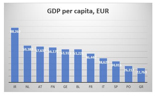
AT=Austria, BL=Belgium, FN=Finland, FR=France, GE=Germany, GR=Greece, IR=Ireland, IT=Italy, NL=Netherlands, PO=Portugal, SP=Spain
More or less, as expected, the bottom is taken by the four Mediterranean countries, while the north and core are at the top. However, GDP is a flow variable, measuring how much economic activity was created during a specific year. It tells us nothing about pre-existing wealth or, in fact, current debts.
A much better measure to use for that purpose, would be CSFB data for net wealth per adult. CSFB publishes two sets of data: mean and median net wealth per adult. Here is the data for the same set of countries as above.

The two data sets give a slightly different view. Looking at the mean net wealth, the bottom three countries in 2000, Finland, Greece and Portugal, are still the bottom three countries in 2019, though in slightly different order. The Netherlands was the wealthiest country in both 2000 and 2019. However, the top three in 2000 was also comprised by Italy and Belgium, while in 2019, they were replaced by France and Austria.

According to median net wealth, however, two things stand out. First, the Netherlands was top three in 2000 but last in 2019 (the data for the Netherlands does look strange; the median net wealth collapses after 2011; I wonder if it is a question of CSFB changing something in their model). Second, Italy was top in 2000 but right in the middle of the rankings in 2019.
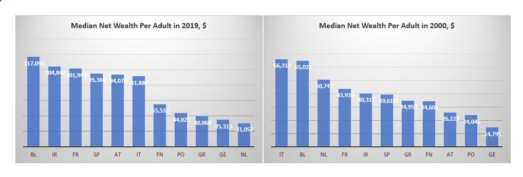
The other striking takeaway is that whether we look at mean or median net wealth, Germany is not that rich at all: it is much closer to the bottom of both sets of data. What about the North vs South divide? Portugal and Greece do seem poor but Span and Italy are more often seen in the top half of the rankings than in the bottom.
Part of the confusion when it comes to classification between the ‘rich’ North and the ‘poor’ South comes from looking only at the asset side of household balance sheets. Using BIS data for household debt and World Bank population statistics we can also calculate household debt per capita for each of these countries. This is the ranking according to this measure (the lower debt per capita the better).
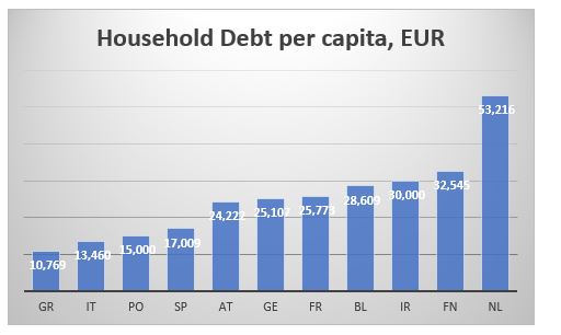
The Mediterranean countries are better off than the core and the north as they have much less household debt per capita. This might be almost counterintuitive: the more assets one has, the more liabilities, they might also have.
We can also cross check the CSFB data above by combining the GDP per capita and the household debt per capita data to arrive at an approximation of a net wealth per capita. As discussed, we have to bear in mind that GDP is a flow variable, while debt is a stock variable, so we are not comparing exactly apples to apples. Here is the ranking according to the difference between GDP and Debt per capita.
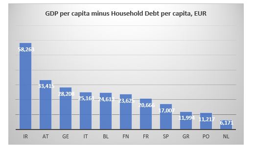
The Netherlands is bottom just like in the median net wealth data from CSFB. Portugal and Greece bring up the rear which is also consistent with previous findings. The top three are slightly different. Ireland is top here and was second in the median net wealth data from CSFB. But here Germany is third while it was more towards the bottom in the previous case.
And here is the ranking according to ratio of household debt to GDP to capita ratio.

The Netherlands is bottom again, with Portugal and Finland bringing up the rear, so, similar to the CSFB data. The top is a bit more mixed but Ireland still figures in both sets of data.
Bottom line is that there is a much less clear differentiation between the North and the South when it comes to net wealth per adult/capita than what we tend to assume.
How have some of the other major countries fared?
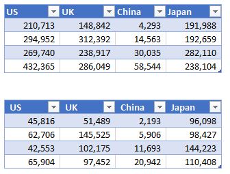
Mean wealth (top table below) in the US is almost twice as big as the average mean wealth of these European countries, but median US wealth (bottom table) is less than that respective average. Japan’s median wealth has barely risen from 2000 (at least compared to any of the other countries shown here) but it is almost twice as big as US’. The median Brit is richer than the average median European but only marginally so compared to the Spanish or Italian. Finally, despite its phenomenal growth since 2000, China is still twice less rich that Greece, which is the ‘poorest’ of the European countries above.
