• About
  • BeyondOverton Travel
    • Silk Road (1): If Turkey is in crisis, it’s not obvious visiting it
    • Silk Road (2): Could beautiful nature and ancient history create a false sense of entitlement?
    • Silk Road (3): Fast Car
    • Silk Road (4):We took a bus ride to Iran
    • Silk Road (5): Border bothers
    • Silk Road (6): Chevrolet Land
    • Silk Road (7): Free-roaming camels and wild horses
    • Silk Road (8): China West to East
    • Silk Road (9): I have not told half of what I saw
  • BLOG
  • g88kboy Travel
    • On the Silk Road
    • Bulgaria : The Chicken crossed the Road
    • Turkey : The Country, not the Bird
    • Georgia on my Mind
    • Armenian Ayran
    • Iran – The Curious Land
    • An American in Azerbaijan
    • Uzbekistan: Golden Teeth and Neon Signs
    • Kazakhstan: Thirty Sweating Seniors
    • China Part One – Pandas Are Extinct
    • China Part Two: My TED Talk (Deep Analysis)
    • Phillipines – They Relax, I (pretend to😉) Study
    • Singapore: flashing trees and a torrent of tears
    • Malaysia: That ain’t no croc, it’s a log
    • Brunei: The Instinctive Fight for Superior Domination
    • Phillipines: Hello Friend Again
  • Outside the window
    • Bulgaria
    • Turkey
    • Georgia
    • Armenia
    • Iran
    • Azerbaijan
    • Uzbekistan
    • Kazakhstan

BeyondOverton

~ let's move this window

BeyondOverton

Category Archives: Debt

Who owns US Treasuries?

21 Thursday Sep 2017

Posted by beyondoverton in Debt, Questions

≈ 1 Comment

Source: Z1 Flow of Funds, US Federal Reserve

2016

  • The biggest owner of US Treasuries (UST) are foreigners at 37.6% of total. Relative to other holders, their ownership actually peaked in 2008 at 44.2% and they have been net seller in the last two years.
  • The second biggest owner of UST is the Fed at 15.4%. If we add state and local governments to it, the government, as a whole owns, 20.6% of UST.
  • In the domestic sector, pension funds own the most at 14.5%, followed by mutual funds at 11% and households at 8.8%.

Over the years

Source: Z1 Flow of Funds, US Federal Reserve

  • The ownership of UST has changed significantly over the years. For example, at the start of the data in 1945, the financial sector (banks, broker-dealers, etc.) owned 41.9% of the total; in 2016 that had fallen down to 4.8%.
  • Households, the corporate sector and insurance companies have also substantially reduced their UST holdings over the years.
  • Mutual funds and pension funds, on the other hand, have increased them.
  • The elephant in the room, however, is the foreign sector, which in 1945 was the second smallest owner of UST (after mutual funds) at 1%. There was a big jump in foreign ownership in the 1970s and then starting in the mid-1990s.

T-Bills vs long dated US government securities

Source: Z1 Flow of Funds, US Federal Reserve

  • Majority of US government debt has historically been in long-dated instruments.
  • However, in the mid-1970s, there were about as many T-Bills as long-dated government paper. Nevertheless, over the last couple of years, the issuance of T-bills has declined to all-time low.

Who owns US debt?

19 Tuesday Sep 2017

Posted by beyondoverton in Debt, Questions

≈ 1 Comment

…and how it is distributed

Source: Z1 Flow of Funds, US Federal Reserve

There was $41.3Tn of US debt in 2016 compared to $26.8Tn in 2006 and $12.4Tn in 1996.

Instruments

In terms of instruments, in 2016 total US debt was split as follows: 38.7% was in US Treasuries (UST), 29.3% was in US Corporates (USC), 20.6% was in Government Sponsored Agencies (GSA), 9.3% was in Municipal Bonds (Munis) and 2.6% was in Open Market Paper (OMP)

Source: Z1 Flow of Funds, US Federal Reserve

US Treasuries issuance as a % of total reached its all-time low in 2008 at 20%; the high was 1945 at 86%. There was a drastic reduction is US Treasuries issuance in the 1990s as Clinton’s administration decided to eliminate the US budget deficit. US Treasuries issuance picked up significantly after the 2008 financial crisis and almost doubled as a % of total by 2016.

Source: Z1 Flow of Funds, US Federal Reserve

US corporate issuance, on the hand reached an all-time high in 2007 at 36%; the all-time low was 1945 at 9%. Between 1999 and 2010 there were more US corporates bonds issued than US Treasuries.

Source: Z1 Flow of Funds, US Federal Reserve

Sectors

In terms of sectors, the largest owner of US debt is the US financial domestic sector at almost 60% of total, followed by the Rest of the World (RoW) at 26%, and the US nonfinancial domestic sector at 14%. Both domestic sectors have declined at the expense of the foreign sector as globalization spread after the mid-1990s.

Source: Z1 Flow of Funds, US Federal Reserve

The biggest holder of US debt in 2016 were indeed foreigners, followed by mutual funds, banks and households. While foreigners’ holdings are close to an all-time high, both banks’ and households’ holdings of US debt are at an all-time low.

Between 2008 and 2016, Fed’s holdings increased by almost x10 (1.6% to 10.2%). The rest of the government’s holdings however halved from 9% to 4.5%. Households and banks both reduced their holdings while foreigners increased them.

Source: Z1 Flow of Funds, US Federal Reserve

Margin call

12 Tuesday Sep 2017

Posted by beyondoverton in Debt, Quotes

≈ 3 Comments

“So, you think we might have put a few people out of business today. That it’s all for naught. You’ve been doing that every day for almost forty years Sam. And if this is all for naught then so is everything out there. It’s just money; it’s made up. Pieces of paper with pictures on it so we don’t have to kill each other just to get something to eat. It’s not wrong. And it’s certainly no different today than it’s ever been. 1637, 1797, 1819, 37, 57, 84, 1901, 07, 29, 1937, 1974, 1987-Jesus, didn’t that fuck up me up good-92, 97, 2000 and whatever we want to call this. It’s all just the same thing over and over; we can’t help ourselves. And you and I can’t control it, or stop it, or even slow it. Or even ever-so-slightly alter it. We just react. And we make a lot money if we get it right. And we get left by the side of the side of the road if we get it wrong. And there have always been and there always will be the same percentage of winners and losers. Happy foxes and sad sacks. Fat cats and starving dogs in this world. Yeah, there may be more of us today than there’s ever been. But the percentages-they stay exactly the same.” John Tuld in Margin Call

Source: NYSE. Leverage is calculated as the following ratio: NYSE firms debit balances in margin accounts (or margin debt)/ (NYSE free credit balances in cash accounts + credit balances in margin accounts)

Are stocks overvalued? This is the longest stock bull market without a X% drop since XXXX (input your own numbers; they are meaningless, anyway)…  Sure, you must know your history and you must know your valuations. That’s the minimum when it comes to investing money. But none of them provides an edge. History is a pattern recognition puzzle, and, nowadays, as long as you provide the right inputs, even a simple algo would be able to sort it out. Valuation, on the hand, is just simple math. But again, you need the right variables. Knowing what to include and what to omit is tough but it is what would make a difference.

There is one thing, however, which I think beats all other ‘basic’ variables when it comes to figuring out the turning points in investment trends. I think that is leverage. Leverage matters especially in situations like we have today with stocks hitting all time highs and smart people questioning the sustainability of this long bull market. The thing is, we believe history and valuations provide the answers but it is a mind trick – we get the impression they do because that’s what we have been told and because it looks like this… but only in hindsight.

The market, however, can go down on anything that scares people if leverage is high. And it would not be one particular thing: everyone might have a different reason to sell. It could be a geo political event or it could be even something personal. But the underlying reason for selling would be the same – they had to sell!

“Everything needs to change, so that everything can stay the same” (‘Il Gattopardo’, Guiseppe Tomasi di Lampedusa). In other words, what is the context? The same event that happened 50 years ago might provide a totally different outcome now. If it was otherwise and life was linear, investing would have been too easy and life would have been too boring.

For example, history ‘changed’ in 1982 when rule 10B-18 was introduced providing ‘safe haven’ for US companies to buy back their own shares. Corporate buybacks were almost non-existent before. After this rule came into place, US corporates became the biggest buyers of US shares. The result has been negative net-issuance of US shares since at least 2000. Let me repeat that, the net supply of US shares (IPOs, etc. minus buybacks, etc.) has been negative for the last 17 years or so. How many people are taking this into account when they do their valuation analysis?

On the other hand, given how much the composition of stock indices has changed throughout time, how relevant is it to look at a time-series of index-based valuation variables?  Aren’t we comparing apples to oranges? Should US Steel, for example, trade at the same multiples as IBM, Apple, Amazon? I do not have answers to these questions. And even if I did, it would be irrelevant because what matters is what everyone else also thinks, and even if I knew what everyone else thinks, it would be still irrelevant because people do not always do the things they should be doing or thinking. But people always act when they do not have a choice.

When your broker calls you to post some extra margin, which you cannot do, you do not have a choice but to sell. But, don’t worry, this is not going to happen when stocks are hitting all-time highs. So, don’t get too excited about getting the top of the market even if you know what the leverage is. But knowing that the leverage is too high and that, maybe, just maybe, people do not have a choice, will help you sell AFTER the market has gone down 2%, 5%, 10%… Whatever that number is, whenever you think the ‘pain’ becomes unbearable. This is when the trend changes and the buy-on-dip guys get buried and it becomes sell-on-pops.

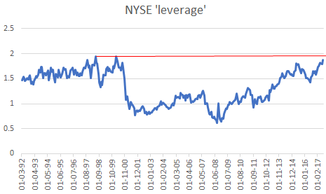
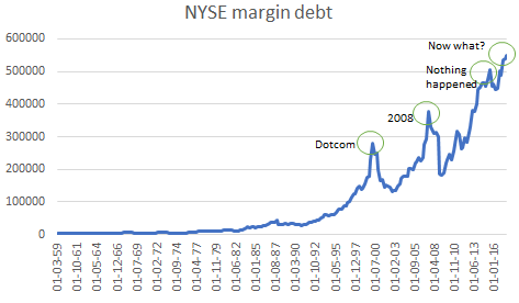
So, the trick is to measure the leverage or to at least to get an idea of how extended it is. One widely cited measure is the NYSE margin debt (the debit balances in margin accounts – chart below). I remember it was a compelling chart to look at in the summer of 2013 when margin debt was approaching the pre-2008 highs. But then it kept going and going, hitting new highs ever since… In the spring of 2015, after it had hit yet another high, it started dropping all the way until the beginning of 2016. And what happened to stocks? Nothing. Margin debt  is sitting on a new high even now but anyone shorting stocks using this measure of leverage has not done that well recently.

Source: NYSE

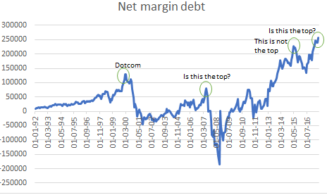
We can also look at the difference between the credit (+ cash) and debit balances of firms’ margin accounts on the NYSE. I call that net margin debt (chart below). That’s even more confusing as we can see the pre-2000 top but for some reason NYSE firms were in net credit (big negative spike) just before the Lehman Brothers bankruptcy. And again, since the summer of 2013 this measure of leverage has been hitting new highs.

Source: NYSE

Alternatively, we can look at the ratio between the two, or what I called, NYSE ‘Leverage’ (chart at the top of the post). This measure is approaching the highs reached at the peak of the Russia crisis and Dotcom crisis. Should we sell? How well would we have done if we followed this signal in 2008? Quite bad actually as this ratio hit the bottom the month before Lehman’s bankruptcy. But of course, 2008 was a ‘debt’ problem, not an ‘equity’ problem like 2000 was. Still US equities had a peak-to-trough decline of more than 50% back then. The bottom line is still that there was not much in the equity valuations and ‘nothing’ in equity accounts leverage that would have helped us predict such an outcome.

These charts above are not especially useful and would not have been much help in our investment decisions. That’s because even leverage has to be taken into context when looking at history. Because even if you have to post extra margin but you can still borrow at a reasonable rate (somewhere else) you might decide to choose the latter instead of selling. So, ceteris paribus, high leverage and high interest rates are the worst possible combination, but high leverage and low rates (the status quo since 2013 at least) means nothing.

Source: NYSE

Indeed, in the context of US interest rates, NYSE leverage actually looks reasonable, not too far from the lows post 2008 financial crisis (chart above). This is purely a function of how low rates have been in that period. Notice, for example, the high leverage throughout the 1990s when we also had a booming stock market. Which opens up another angle of thought. If rates do rise, as the base rate is indeed right now, then high leverage can quickly become a problem.

When it comes to debt stock, the data still favors EM, but flow dynamics matter

09 Saturday Sep 2017

Posted by beyondoverton in Debt

≈ Leave a comment

In this post I am looking at debt sustainability, or the horizontal axis of the debt matrix presented here, using data from 36 countries of which 20 are developed markets (DM) and 16 are emerging markets (EM). Source: BIS

Total non-financial debt is composed of Private Debt and Government Debt. Private Debt can be further broken down between Households and Corporates.

Summary

  • In terms of total debt as a % of GDP, the most vulnerable 14 countries are all DM with Ireland (379%), Japan (371%) and Portugal (324%) taking the lead; on the other hand, the least vulnerable 13 are all EM with Indonesia (68%), Argentina (74%), and Mexico (82%) bringing in the rear. However, in terms of debt flow dynamics, EM has generally put on more debt after the 2008 financial crisis than DM.
  • We cannot see the latter development in the government debt picture. The 9 countries with the highest government debt to GDP are all DM, while the bottom 5 are all EM. In addition, the gap between DM and EM government debt since the 2008 debt crisis has widened (i.e. DM put on more government debt than EM).
  • But we can see that in the private debt picture. Yes, in terms of debt stock, the worst 7 countries are still all DM and the best 11 countries are all EM, but in terms of flows, the gap between DM and EM since the 2008 financial crisis has substantially narrowed – i.e., EM countries have accumulated substantially more private debt than DM countries.
  • The reason for that is EM private corporate debt, which has surpassed that of DM.
  • Nevertheless, if we strip the effect of China, the increase in EM corporate debt is not that dramatic.
  • There is one area in which EM private debt is still in much better shape than DM. That is household debt, where, in terms of stock, EM’s indebtedness is still half that of DM’s.

(Please click to enlarge for all chats in this post)

Details and charts

Total Debt

The worst indebted country is Ireland with its total debt as a % GDP doubling between 2008 (250%) and 2015 (500%), before settling in at 379%. There was a similar spike in indebtedness with most European countries in the top echelon of the above chart. Japan’s debt, on the other hand has been steadily increasing throughout the period.

The debt stock of the best EM countries is still several magnitudes less than that of the worst DM countries above. However, while DM’s overall debt levels have been more or less unchanged in the years after the crisis, EM has been putting on debt.

EM debt as a % GDP has increased from 140% (2009) to 185% (2016), while DM debt has been relatively stable at 265% of GDP.

Government Debt

Overall, EM debt stock as a % of GDP (46%) is more than half that of DM’s equivalent (98%).

And the gap has widened after the 2008 financial crisis, with DM government debt increasing while EM’s generally stable.

Private Debt

The latest private debt stock figures do not give us any additional information other than what we have already seen in total and government debt above: the most indebted countries being DM and the least EM.  The private non-financial debt service ratios confirm that as well (chart below).

However, the flow picture looks very different.

The gap between DM and EM private debt to GDP has substantially narrowed. If before the crisis, EM debt was less than half of DM debt (84% vs 176%), now they are almost on top of each other (138% vs 158%): EM has leveraged while DM has deleveraged.

(As per BIS, Credit-to-GDP gap is defined as the difference between the credit-to-GDP ratio and its long-term trend.)

After 2008, while DM has generally de-levered private debt at the expense of public debt, EM has levered private debt while public debt has remained the same. As a result, EM has levered while DM has de-levered. But where exactly has EM put on debt?

Both EM household and corporate debt have increased since the 2008 crisis but the bigger change is in the latter.

DM, on the other hand, has de-levered both household as well as corporate debt.

EM corporate debt surpassed DM corporate debt in 2014. However, if we strip the effect of China, the rest of EM’s corporate debt does not seem to have risen that much since 2008 (chart below).

In addition, EM households’ balance sheet still seems relatively much cleaner compared to DM’s (chart below).

The bottom line is that while DM’s debt stock is hitting extreme levels, EM’s still has room to grow. In addition, while all public and private debt levels are very high in DM, EM can in theory de-lever its corporate debt at the expense of either household debt or government debt and still keep its total debt level in check.

Conclusion: EM debt picture still looks generally healthier than DM’s equivalent. In fact, EM government debt dynamics have improved relative to DM’s after the 2008 financial crisis. The opposite has, however, happened in private debt dynamics. Nevertheless, despite worries of an increase in EM private debt indebtedness after 2008, this is mostly constrained to China’s corporate debt. EM household debt dynamics are also in much better shape than DM’s.


Not all debt is created equal

06 Wednesday Sep 2017

Posted by beyondoverton in Debt

≈ 1 Comment

Following up from a previous post which looked at a breakdown of US debt, here are my thoughts on a more general framework of assessing a country’s debt vulnerability.

I suggest we look at debt along the lines of debt sustainability (private vs public) and sovereignty (foreign vs domestic). Everything else being the same, in terms of the ability of repayments, public debt is better than private debt, and domestic debt is better than foreign currency denominated debt. This is because it is possible to monetize the debt in the former (public and domestic), while not (directly) possible in the latter (private, foreign).

In the diagram below as one moves from left to right on the horizontal axis the country’s debt sustainability becomes worse; on the other hand, as one moves from top to bottom on the vertical axis, the country is deemed less sovereign (less able to monetize its debt).

(Data source to construct the diagram: BIS on private and public domestic debt, BIS/IMF/OECD/WB on foreign/external debt)

Therefore, one can discern the worst possible combination as being private and foreign debt (Quadrant 4 in the diagram above). An example of that would be Asian corporates/countries in the 1990s: because the countries had a pegged exchange system, i.e. they were not fully sovereign, even the domestic public debt would have been considered ‘foreign’, i.e. no monetization was possible. This, of course, led to the Asian crisis in 1997/98. On the other hand, the best possible combination is a sovereign country with mostly public and domestic debt. Actually, a lot of those same Asian and other emerging market (EM) countries now fall in this category (Quadrant 1). Even though, some of these countries still maintain a ‘dirty’ float, for example Indonesia (therefore not completely sovereign), their debt level is not only much smaller than before but it is also much smaller than a lot of the developed market (DM) countries. In addition, most of the EM countries have very little foreign debt.

Most of EU countries not only have a lot of private debt but they are also not sovereign because they are dependent on the ECB for monetization. In a sense, they all have only ‘foreign’ debt as their central bank is not allowed to create money and monetize. I have put Germany a bit higher than the rest of the EU countries simply because of its deemed influence on the ECB. However, Germany does have much less debt than most of the other EU countries, therefore, it is to the left of them. Actually, because the ECB ‘monetization’ came way too late, we had the EU sovereign crisis of 2011/12. And it was a sovereign (public debt) crisis for some countries directly because they had too much public debt (Greece, Italy) and for some it was indirectly because they also bailed out the private sector first (Ireland).

Japan has a lot of both private and sovereign debt but it is only domestic and the country is fully sovereign. Both US and UK have a lot of private debt but not as much public debt like Japan. However, just like Japan, their overall debt is mostly in their domestic legal tender, so they are fully sovereign.

China is a special case and it requires its own separate blog post. Suffice to say that it has a lot of ‘private’ debt in a foreign currency. However, it also has very little public debt and massive foreign currency reserves. Therefore, in theory, China can deleverage much easier the private debt (which is, actually, ‘quasi-public’ in many cases) by leveraging the sovereign – much easier than the way US, UK or EU had done during their own crises recently, or, in fact, Japan’s in the 1990s. China’s government balance sheet is cleaner in a way.

When it comes to debt vulnerability EM fairs much better than DM in general.

US student loan debt increase: dramatic but not a systematic financial concern

04 Monday Sep 2017

Posted by beyondoverton in Debt

≈ 1 Comment

Summary

  • Even though total US debt is up in nominal terms since the 2008 financial crisis ($54.7Tn vs $66.5Tn), total debt as a % of US GDP is down (368% vs 353%)
  • It is the financial sector that has deleveraged both in nominal terms and as a % of US GDP ($18.2Tn vs $15.7Tn and 122% vs 83%, respectively)
  • Of the nonfinancial sector private debt holders, households have deleveraged relative to GDP (97% vs 79%), while business have leveraged but only from 72% to 73%, even though both of their nominal debt levels have gone up ($14.3Tn vs $14.9Tn and $10.7Tn vs $13.7Tn).
  • The public sector (federal and state government) has leveraged both in nominal terms (the overall debt levels have doubled from $9.8Tn to $18.9Tn) and relative to GDP (66% vs 84%)
  • Households have reduced their mortgage debt from $10.7Tn to $9.8Tn, while increased their consumer credit debt from $2.6Tn to $3.8Tn
  • Out of consumer credit, households reduced marginally their credit card debt ($983Bn vs $959Bn), increased their auto loans ($802Bn vs $1.1Tn) and more than doubled their student loans ($659Bn vs $1.4Tn)
  • The media and some financial analysts are focusing on these latter increases in auto and student loans as a sign that households are increasingly leveraging again, however, the reality is that a large part of the increase in consumer credit debt is offset by the decrease in mortgage debt
  • In addition, neither student (8% GDP) nor auto (6% GDP) – nor the two combined – have the systematical and strategic significance of mortgage debt which was the cause of the 2008 financial crisis (72% of GDP at the time)

Charts and details

There is a lot of confusion sometimes when it comes to analyzing debt. From a macro point of view there are two main distinctions: private (household and businesses) vs public (sovereign) and domestic (denominated in the sovereign currency) vs foreign (foreign currency). The distinction above is important because for a fully sovereign country it is the private and foreign debt that one should be really concerned about.

The public sovereign debt can always be repaid because the sovereign can print the currency at will, even though in extreme cases that may mean currency devaluation and possibly hyperinflation. The private domestic borrowers have no choice but to find means of acquiring the legal tender to repay the debt. However, in some extreme cases, as in during the 2008 financial crisis, the sovereign can choose to bail the private sector out (the financial sector in this case) by resorting to creating currency ‘ex nihilo’.

Neither public nor private foreign borrowers (i.e. entities which have borrowed foreign currency) can resort to such privilege and, just like the private domestic sector, have to find means to obtain the foreign currency to repay their debt. Again, sometimes in extreme cases, as in during the Greek crisis, international institutions can choose to bail out the sovereign foreign borrower. This normally happens after the sovereign foreign borrower has first bailed out a private foreign borrower in their own country (as it happened for the financial sector in Portugal, Ireland and Greece during the European sovereign crisis).

Here I focus on US domestic nonfinancial debt, i.e. both public as well as private but denominated in the sovereign legal tender. Here is a big picture view of that debt:

(Click to enlarge for a better view)

The numbers above are the latest available (Q1, 2017) from the US Fed Z1 Flow of Funds Report. All the data in this note are sourced from the above report. In the analysis below, which uses the above diagram as a basis, I have chosen to look at the relevant debt levels now as well as just before the 2008 and 2000 US crises.

Level 1 Analysis:

Relative to GDP, the US has deleveraged, even though the domestic non-financial sector has continued to leverage.

However, the US financial sector has deleveraged in nominal terms as well, which is quite extraordinary indeed.

Level 2 Analysis:

Here we drill down the US domestic non-financial sector debt. Relative to the overall domestic non-financial sector total debt, both households and the corporate sector have deleveraged.

It is the government (mostly the federal government) which has continued to leverage. Public sector debt has more than doubled since 2008 and almost quadrupled since 2000. But as per the above, even though the increase of public sector debt is an issue (see Japan), it is not a systematic issue (again, see Japan). Our concern is drilling further into the private debt story, more specifically the household sector.

Level 3 Analysis:

Mortgage debt as a % of overall household debt has decreased at the expense of consumer credit. The polar opposite of what happened between the 2000 and 2008 crises.

But in nominal terms, between 2000 and 2008, both mortgage debt and consumer credit debt increased (and mortgage debt more than doubled from $4.7Tn to $10.7Tn). That is why the 2008 financial crisis was so massive. Still, what is causing the increase of consumer credit debt?

Level 4 Analysis:

It seems out that the media, etc. does have a reason to focus on the ‘extraordinary’ rise in student loans, especially when they hit, and surpassed, the trillion dollar mark. Relative to overall household consumer credit, student loan is the only item which has increased.

In nominal terms, auto loans also surpassed the trillion dollar mark, but it is nevertheless the sheer increase in student loans which has captured the attention. Perhaps, there is much more to the student loan story than the financial implications. There is also the moral/emotional side of the fact that the cost of education has increased disproportionally to what it can offer in terms of advantages in the job market in the age of the sophisticated machine. While it is still true that a person with a higher education would generally fair better professionally, there must be a heavy discount to the fact that this person would have to also pay down the student debt which he/she acquired in the process. Once we draw the line, who is better off?

There is no doubt though that there is little in the above numbers to be concerned from a systematic point of view. At least relative to previous financial crises. A collapse of the student loan market would certainly affect consumer confidence and economic growth but it is unlikely to have the same catastrophic effect as the mortgage crisis of 2008.

Newer posts →

Subscribe

  • Entries (RSS)
  • Comments (RSS)

Archives

  • January 2023
  • December 2022
  • November 2022
  • August 2022
  • February 2022
  • April 2021
  • November 2020
  • October 2020
  • September 2020
  • August 2020
  • July 2020
  • June 2020
  • May 2020
  • April 2020
  • March 2020
  • February 2020
  • January 2020
  • December 2019
  • November 2019
  • October 2019
  • May 2019
  • March 2019
  • February 2019
  • January 2019
  • December 2018
  • November 2018
  • October 2018
  • September 2018
  • August 2018
  • June 2018
  • May 2018
  • March 2018
  • February 2018
  • January 2018
  • November 2017
  • October 2017
  • September 2017
  • August 2017
  • July 2017
  • June 2017

Categories

  • AI
  • Asset Allocation
  • blockchain
  • China
  • De-urbanization
  • Debt
  • Decentralization
  • EM
  • Energy
  • Equity
  • FX
  • g88kboy
  • Monetary Policy
  • Politics
  • Questions
  • Quotes
  • The last man standing will laugh
  • Travel
  • UBI
  • Uncategorized
  • VR

Meta

  • Create account
  • Log in

Blog at WordPress.com.

  • Subscribe Subscribed
    • BeyondOverton
    • Join 74 other subscribers
    • Already have a WordPress.com account? Log in now.
    • BeyondOverton
    • Subscribe Subscribed
    • Sign up
    • Log in
    • Report this content
    • View site in Reader
    • Manage subscriptions
    • Collapse this bar
 

Loading Comments...